11/27/22

Швеция справилась с пандемией лучше США

 OECD.Stat предоставляет еженедельные данные о смертности и показатели за период с начала пандемии. Эти данные можно использовать для сравнения результатов различных антипандемических стратегий. В этом посте мы сравниваем США и Швецию, так как у этих двух стран практически противоположная политика в отношении COVID-19. Оценки, связанные с COVID-19, представлены двумя разными способами: абсолютное отклонение от долгосрочных средних недельных значений и доля (процентное изменение от среднего). Доступны два основных параметра: общие значения и значения, связанные с COVID-19 (определения случаев, связанных с COVID-19, вероятно, различаются в разных странах ОЭСР). На рисунке 1 показаны долгосрочные средние недельные показатели, общие недельные показатели смертности и недельные показатели, связанные с COVID-19. OECD.Stat дает отклонение от среднего, и мы просто складываем базовые еженедельные средние значения и отклонения, чтобы получить фактические цифры смертности. В качестве проверки основных средних (с учетом сезонных колебаний) значений мы рассчитали общее количество смертей смертности за каждую неделю между 2020 г. и последней оценкой в 2022 г., как показано на Рисунке 1 синей кривой. Затем мы сдвинули эту кривую на 53 месяца (2020 год — високосный) вперед (красная линия) и сравнили средние значения за ту же неделю со сдвигом на один год. Видно, что все средние значения являются допандемическими, и это позволяет оценить влияние COVID-19 на избыточную смертность.


Рис. 1. Статистика ОЭСР по США с 2020 по 2022 год. Показаны общие цифры.

В США кривая избыточной смертности, связанная с COVID-19, почти всегда находится ниже общей кривой, но есть участки, где эти две кривые почти совпадают. Самая высокая смертность наблюдалась в начале 2021 года и этот пик полностью связан с COVID-19. Показательно, что первый пик 2020 г. оказался единственным, не связанным с (осенне-зимним) сезонным подъемом.

Абсолютные значения важны для данной страны, но их нельзя использовать при сравнении между странами. На рис. 2 представлено процентное изменение (доля), полученное из рис. 1. Можно видеть, что все пики на рис. 2 имеют одинаковую амплитуду, поскольку базовые средние значения периодически меняются со временем. Мы рассчитали показатели, используя те же средние оценки для общего числа случаев и случаев COVID-19, которые представлены на рисунке 1. OECD.stat предлагает другой подход и использует фактические числа смертей (черная кривая на рисунке 1) вместо средних чисел для расчета доли COVID-19 в общей избыточной смертности. В результате оценки ОЭСР не согласуются с нашими и занижают амплитуды пиков, как показывает красная пунктирная линия: чем выше разница между фактическими и средними значениями, тем ниже кривая избыточной смертности ОЭСР. Причина такого подхода не ясна, но он определенно приводит к сравнению яблок (общий показатель) и апельсинов (показатель COVID-19). Цифры COVID-19 не отделены от общих цифр, в то время как используя средние многолетние данные, легко разделить влияние COVID-19 и всех остальных причин. Неспециалисты могут быстро запутаться при сравнении разных стран, не имея возможности детального анализа реальных данных.


Рис. 2. % изменения общей и связанной с COVID-19 смертности в США.


Та же процедура была применена к Швеции. Рисунки 3 и 4 повторяют соответственно рисунки 1 и 2. Общее отклонение от средних значений в Швеции было отрицательным в течение относительно длительных периодов времени, тогда как число избыточных смертей, связанных с COVID-19, почти всегда положительны.


Средняя кривая и смещенная средняя кривая практически совпадают с точностью расчетов по данным ОЭСР всего с одним десятичным знаком. Изменение в % от среднего на рис. 4 предлагает неожиданную картину: общая смертность в условиях пандемии падает ниже среднего! Показатели, связанные с COVID-19, положительны в обоих представлениях — используемых в этом исследовании и предложенных ОЭСР. Этот показатель должен быть неотрицательным, потому что не может быть отрицательных отклонений в количестве случаев, связанных с COVID-19. Общие числа включают все причины, и поэтому отклонение в случаях, не связанных с COVID-19, может быть большим отрицательным числом, поскольку эти причины отстают от самой средней кривой. В целом данные ОЭСР по Швеции показывают, что пандемия COVID-19 была тяжелой для страны, а избыточная смертность высока в основном из-за самого вируса. В то же время пандемия, видимо, подавила тяжесть всех других болезней вместе взятых, а общие показатели смертности, несмотря на пандемию, упали ниже средних многолетних значений! Движущие силы такого выдающегося результата неясны и требуют более глубокого изучения различных причин смерти и соответствующих определений.


Рис. 3. Статистика ОЭСР по Швеции за период с 2020 по 2022 год. Показаны общие цифры.


Рис. 4. Процентное изменение общей и связанной с COVID-19 смертности в Швеции.


Динамический вид на рисунках с 1 по 4 не отражает долгосрочных тенденций эффективности конкретной политики по борьбе с COVID-19 во время пандемии. На рисунках 5 и 6 представлено интегральное поведение всех избыточных смертей и смертей, связанных с COVID-19. Общие кривые представляют собой отношение скользящей суммы всех избыточных смертей и соответствующей суммы всех средних чисел смертей с 14-щй недели 2020 года. Кривые COVID-19 представляют собой отношение скользящей суммы чисел COVID-19 и соответствующую сумму всех средних показателей смертности с 14-ой недели 2020 года. На рисунке 5 показано, что Швеция выбрала лучший долгосрочный подход, гарантирующий более низкие общие потери жизней в период пандемии. В августе 2022 года интегральная избыточная смертность во время пандемии составила 23% в США и менее 4% в Швеции. В то же время результаты COVID-19 ближе для обеих стран, как показано на Рисунке 6. Преимущество Швеции не в лечении COVID-19 как такового (здесь Германия и Австралия намного лучше), а в снижении других рисков для здоровья.

Рис. 5. Интегральный общий коэффициент избыточной смертности с 14-й недели 2020 г.


Рис. 6. Интегральный коэффициент избыточной смертности от COVID-19 с 2020 г.

COVID-19. Comparison of results in Sweden and the USA. OECD.stat data

OECD.Stat provides weekly mortality numbers and rates for the pandemic period. This data can be used to compare the outcome of various anti-pandemic strategies. In this post, we compare the USA and Sweden, as the two countries have almost opposite policies against COVID-19. The COVID-19-related estimates are presented in two different ways: the absolute number of the deviation from the long-term weekly averages and the rates (% change from average). There are two parameters: total values and those related to COVID-19 (definitions of COVID-19-related cases are likely to vary between the OECD countries). Figure 1 shows the long-term average weekly numbers, the total weekly numbers, and the COVID-19-related weekly numbers. OECD.Stat gives the deviation from the average and we just add the basic weekly values and the deviations to obtain the actual death numbers. As a check of the basic average (seasonally adjusted) values we have calculated the total weakly death numbers for each week between 2020 and the last estimate in 2022 as shown in Figure 1 by a blue curve. Then we shifted this curve 53 months (2020 is the leap year) ahead (the red line) and compared the average values for the same week with a one-year shift. One can see that the average values are all pre-pandemic and this makes it possible to estimate the COVID-19 effect on excess mortality.


Figure 1. OECD statistics for the USA between 2020 and 2022. The total numbers are shown.

In the USA, the COVID-19-related curve is almost always below the total curve, but there are some segments where these two curves almost coincide. The highest mortality was observed at the beginning of 2021 and this peak is fully related to COVID-19. Instructively, the first peak in 2020 was the only one not related to the (fall-winter) seasonal increase. The absolute values are important for a given country but cannon be used from the cross-country comparison.  Figure 2 presents the % change (rate) as obtained from Figure 1. One can see that all peaks in Figure 2 have the same amplitude because the basic average values vary with time periodically. We have calculated the rates using the same average estimates for the total and COVID-19 cases as presented in Figure 1. OECD.stat proposes a different approach and uses the actual death numbers (black curve in Figure 1) instead of the average numbers. As a result, the OECD estimates are not consistent and underestimate the peak amplitudes as the red dotted line shows: the higher the difference between the actual and average numbers the lower the OECD curve. The reason for this approach is not clear, but it definitely leads to the comparison of apples (total rate) and oranges (COVID-19 rate). The COVID-19 numbers are not separated from the total numbers and the same average basis is straightforward to separate the COVID-19 and all other reasons.  The lay public will be rather confused without digging into the real data.


Figure 2. The % change in the total and COVID-19-related mortality in the USA.   


The same procedure was applied to Sweden. Figures 3 and 4 repeat Figures 1 and 2, correspondingly. The total deviation from the average values in Sweden was negative during relatively long periods of time while COVID-19-related deviation numbers are almost always positive. The average curve and the shifted average curve almost coincide with the accuracy of calculations using the OECD data with just one decimal digit. The % change from the average in Figure 4 draws an unexpected picture: the total mortality rate drops below the average in the pandemic conditions! The COVID-19-related rates are positive in both representations – used in this study and proposed by the OECD. This rate has to be non-negative because there can be no negative deviations in the number of COVID-19-related cases. The total numbers include all reasons and thus the deviation in non-COVID-19 cases can be a large negative number since these reasons are behind the average curve itself. 

Overall, the OECD data for Sweden shows that the COVID-19 pandemic was harsh for the country and the excess death rate is high mainly because of the virus itself. At the same time, the pandemic suppressed the severity of all other illnesses taken together and the total death rates fell below the long-term averages despite the pandemic. The driving forces behind such an outstanding finding are not clear and need deeper investigation of various death causes and corresponding definitions.


Figure 3. OECD statistics for Sweden between 2020 and 2022. The total numbers are shown.


Figure 4. The % change in the total and COVID-19-related mortality in Sweden.   

The dynamic view in Figures 1 through 4 does not present the long-term trends in the efficiency of the specific anti-COVID-19 policies during the pandemic. Figures 5 and 6 present the integral behavior in the total excess deaths and those related to COVID-19. The total curves are the ratio of the running sum of all excess deaths and the corresponding sum of all average numbers of deaths from week 14 of 2020. The COVID-19 curves are the ratio of the running sum of the COVID-19 numbers and the corresponding sum of all average numbers of deaths from week 14 of 2020. Figure 5 shows that Sweden has chosen a better long-term approach that guarantees lower total life losses over the pandemic period. In August 2022, the integral excess death rate during the pandemic was 23% in the USA and less than 4% in Sweden. At the same time, the COVID-19 results are closer for both countries as Figure 6 demonstrates. The advantage of Sweden is not in the treatment of COVID-19 as such (here Germany and Australia are much better) but in the reduction of other health risks.  


Figure 5. Integral total excess death rate since week 14, 2020.

Figure 6. Integral COVID-19-related excess death rate since 2020. 

11/26/22

Не доверяйте статистике ОЭСР по COVID-19. Общее количество избыточных смертей по сравнению со смертями, связанными с COVID-19: Австралия, Канада, Израиль, Великобритания и США

 OECD.Stat (ОЭСР) сообщает об избыточных (отклонениях от долгосрочных средних) смертях и смертях, связанных с COVID-19, еженедельно с начала пандемии. В этом посте мы сравниваем данные из Австралии, Канады, Израиля, Великобритании и США и пытаемся понять эти данные. Есть два важных показателя: число и процентное изменение от среднего. Эти два числа позволяют рассчитать среднее количество смертей за данную неделю и за весь изучаемый период. На рис. 1 представлено процентное изменение общего значения смертности в зависимости от времени. Видно, что в Великобритании отклонение превышает 100% в течение нескольких недель в начале пандемии. США имеют пик около 45% в начале и еще три пика такой же амплитуды в 2021 и 2022 годах.

Рисунок 1. Процентное изменение избыточной смертности: слабые оценки.

Рисунок 2. То же, что и на рисунке 1, для оценок, связанных с COVID-19. На рис. 2 представлен тот же параметр для значений, связанных с COVID-19. Можно увидеть значительное падение амплитуды в Великобритании и США. Поэтому было бы поучительно исследовать числовые значения и сравнить разницу между общим числом избыточных смертей и числом смертей, связанных с COVID-19. На рис. 3 показаны эти значения для Великобритании и США. Можно видеть, что существует разница между значениями изменения в процентном представлении и подсчитанными значениями количества смертей за неделю. Большой разницы между количественными оценками нет, но разница между процентными значениями более чем в 2 раза (рис. 1 и 2). В чем причина такого несоответствия? Наиболее вероятное объяснение состоит в том, что средние значения для расчета процентного изменения различны, и среднее значение для расчетов COVID-19 должно быть намного больше. При просмотре ежемесячных оценок CPI (индекса потребительских цен) часто можно увидеть два значения: с учетом сезонных колебаний и без учета сезонных колебаний. Причина такой разницы проста. Например, летние месяцы отличаются от зимних по многим видам деятельности, и нет смысла сравнивать значения, связанные с сельским хозяйством, в июле и феврале. Нужно сравнить июль данного года с июльскими данными предыдущих лет. Тогда тенденции и вариации становятся более ясными. Вместо сравнения с каждым прошлым годом отдельно BLS (Бюро трудовой статистики США) вводит средние значения за последние 5 лет. Можно предположить, что та же процедура применяется к еженедельным данным, публикуемым ОЭСР, и они сравнивают избыточную смертность со средними значениями до пандемии за весь период пандемии, поскольку значения за годы пандемии будут смещать оценку влияния пандемии. Это предположение, вероятно, верно для общего числа на Рисунке 1, и можно рассчитать средние значения на основе прошлых оценок.
Однако это не относится к избыточной смертности, связанной с COVID-19. Чтобы понять процедуру ОЭСР и результаты на рисунке 2, давайте возьмем пример 16-й недели в 2020 году. Общее количество избыточных смертей в США составляет 23552,4 (среднее значение необязательно является целым числом), и это составляет 44,2% избыточных смертей. Среднее значение, взятое в качестве базового для сравнения, составляет примерно 100 * 23552,4/44,2 = 53285 в течение 16 недели года. Для этого среднего значения можно оценить избыточный уровень смертности от COVID-19: 17221/53285 = 32,3%. ОЭСР дает 21% на той же неделе. Это огромное несоответствие. Но у нас достаточно данных, чтобы объяснить его. Возьмем общее количество смертей (не избыточных смертей) за 16-ю неделю как сумму среднего и избыточного значений и получим 53285+23552=76837. Для этого текущего значения получается избыточная смертность в 22,4%, т.е. точно так же, как в таблице ОЭСР. Для этого значения общая избыточная смертность 23552/76387 = 30,7%, а не 44,4%. Очевидно, что при использовании случаев, связанных с COVID-19, в расчете влияния COVID-19 на изменение общего коэффициента смертности получается сильно смещенная оценка. Влияние COVID-19 можно оценить только при использовании базовых недельных значений до пандемии, но за ту же неделю, чтобы убрать все известные сезонные эффекты. Данные ОЭСР нельзя считать надежными. Они скорее созданы для того, чтобы скрыть высокий уровень смертности от COVID-19 в странах ОЭСР.
Рисунок 3. Число избыточных смертей в Великобритании и США: общее и связанное с COVID-19.

Do not trust the OECD statistics on COVID-19. Total excess deaths vs. COVID-19 related deaths: Australia, Canada, Israel, UK, and USA

 OECD.Stat reports excess (deviation from the long-term average) deaths and COVID-19-related deaths on a weekly basis since the start of the pandemic. In this post, we compare data from Australia, Canada, Israel, the UK, and the USA and try to understand the data. There are two important measures: number and percentage change from average. These two figures allow for calculating the average number of deaths for a given week and for the whole studied period. Figure 1 presents the % change as a function of time for the overall value. One can see that in the UK the deviation is above 100% for some weeks at the beginning of the pandemic. The US has a peak of around 45% at the beginning and another three peaks of the same amplitude in 2021 and 2022. 

Figure 1. Percentage change of excess deaths: weakly estimates. 


Figure 2. Same as in Figure 1 for COVID-19-related estimates

Figure 2 presents the same parameter for the COVID-19-related values. One can see a significant drop in amplitude in the UK and US. Therefore, it would be instructive to look into the numbers and compare the difference between the total excess deaths and COVID-19 related. Figure 3 displays these values for the UK and US. One can see that there is a difference between the % change values and the counted values. There is no big difference between numbers but the difference between percentage changes is larger than 2 times (Figures 1 and 2). What is the reason behind such a discrepancy? The most likely explanation is that the average values to calculate the % change are different and the average for the COVID-19 calculations has to be much larger. 

When looking into the monthly CPI estimates one often sees two values: seasonally adjusted and not seasonally adjusted. The reason for the difference is simple: summer months are different from winter months for many activities and there is no sense to compares agriculture-related values in July and February. One has to compare July for a given year with the July data in the previous years. Then the trends and variations become clearer. Instead of comparison with each year in the past separately the BLS introduces the average values for the last 5 years. One can suppose that the same procedure is applied to the weekly data reported by the OECD and they compare excess deaths with the average values before the pandemic through the whole pandemic period since the values from the pandemic years will disturb the estimation of the pandemic influence. This assumption is likely accurate for the total numbers in Figure 1 and one can calculate the average values from past estimates.

This is not the case for COVID-19-related excess deaths. To understand the OECD procedure and the results in Figure 2, let us take the example of week 16 in 2020. The total excess number in the USA is 23552.4 (the average value is not necessarily an integer) and this makes a 44.2% excess rate. The average value is roughly 100*23552.4/44.2= 53285. For this average value, one can estimate the excess rate for COVID-19 deaths: 17221/53285=32.3%. The OECD gives 21% for this week. This is a tremendous discrepancy. But we have enough data to explain it. Let us take the total number of deaths (not the excess deaths) for week 16 as a sum of the average and excess values and get 53285+23552=76837. For this current value, one obtains the excess death rate of 22.4%, i.e. exactly as in the OECD table. For this value, the total excess death rate 23552/76387=30.7%, not 44.4%. When using COVID-19-related cases in the calculation of the influence of COVID-19 on the change in the overall mortality rate one obtains a highly biased estimate. The COVID-19 effect can be estimated only when using the averaged weekly values before the pandemic, but for the same week in order to remove all known seasonal effects.

The OECD data cannot be considered reliable. They are rather constructed to hide high COVID-19 death rates in the OECD countries.

Figure 3. Numbers of excess deaths in the UK and USA: total and COVID-19 related.

11/19/22

From man to woman and back with stops. "The Whole World Needs to Pay Attention to This!!!" | Jordan Peterson 2022

I would recommend following the WHO definition of gender as "the characteristics of women, men, girls and boys that are socially constructed. This includes norms, behaviours and roles associated with being a woman, man, girl or boy, as well as relationships with each other. As a social construct, gender varies from society to society and can change over time. " At the same time: "Gender interacts with but is different from sex, which refers to the different biological and physiological characteristics of females, males and intersex persons, such as chromosomes, hormones and reproductive organs. Gender and sex are related to but different from gender identity. ..." Gender identity and sexual orientation can be fluid as such but change neither the definition of gender as "norms and behaviours" nor the definition of sex as a set of "chromosomes, hormones and reproductive organs". It is likely that the sets of "chromosomes, hormones and reproductive organs" are not distributed discretely as one may suggest. Intersex persons are just ultimate cases of the smooth distribution of various parameters defining sex. In a sense, we are all different in terms of these "sex sets" and can claim individual sex by virtue of these differences. There are more than 8 billion sexes now and we could order them from 1 to 8+ billion. Then there will be no arguments against the increasing number of sexes introduced into common practice. The extreme "sex sets" express "the characteristics of women, men, girls and boys..." and are defined as "normal" by virtue of statistical predominance. I would refrain to call these people "statistically dominant" or "normal" but this is how it is in nature. There are probably hundreds of millions of other ways to define gender identity and sexual orientation as related to that "person’s deeply felt, internal and individual experience of gender, which may or may not correspond to the person’s physiology or designated sex at birth."


11/14/22

Imputed rent in the USA on its way to 10% in 2050 from 4% in 1947

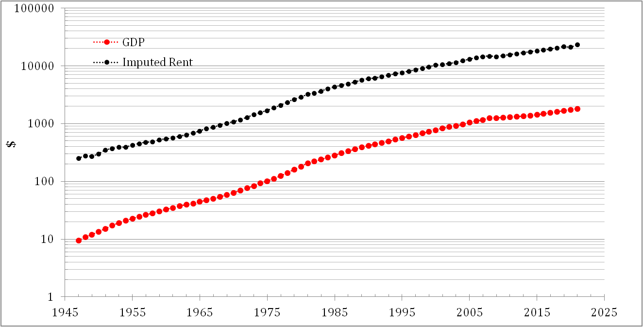
The Bureau of Economic Analysis (BEA) makes the official estimates of the National Income and Product Accounts (NIPAs).  Two key aggregates in these accounts are the nation’s gross domestic product (GDP).  The rental value of owner-occupied housing is an important component of both.  It accounts for about 8 percent of GDP.  Figure 1 presents the evolution of nominal GDP and imputed rent from 1947 to 2021. Figure 2 demonstrates the growth in the imputed rent/GDP ratio. In 1947, it was below 4% and reached 8.7% in 2009. The trend in the imputed rent share is positive and its share will likely reach 10% around 2050. 


Figure 1. Nominal GDP and imputed rent in the USA from 1947 to 2021

Figure 2. Share of the imputed rent in the US GDP


Statistics Finland defines imputed rent as follows: 

Imputed rent describes the benefit gained by the household compared with a corresponding household living in a rental dwelling with market rent. Imputed rent is formed also when people live in a dwelling owned by another household without payment, and when a rent lower than the market rent is paid for dwellings owned by municipalities and non-profit corporations. In the income distribution statistics, imputed rent is a separate income item outside the income concept, on which statistics are compiled as a memorandum item from the statistical reference year 2011 onwards. As an exception, a company accommodation based on employment relationship is considered wages and salaries according to the taxation data.

Imputed rent (or more precisely, imputed net rent) from housing is derived when the housing costs paid by the household for its dwelling (e.g. owner-occupiers' maintenance charges, insurance, maintenance costs) and interests on housing loans are deducted from the so-called imputed gross rent. The imputed net rent obtained as the result may be negative for households with housing loans because of interests on housing loans.
Imputed net rent is calculated as follows:

+ Gross rent (= market rent for a corresponding dwelling)
– housing costs (dwelling income possibly becoming negative at this stage is set to zero)
– possible interests on housing loans.

In the international recommendations on income distribution statistics, imputed rent is a separate income item as part of disposable income (Canberra Group: Handbook on Household Income Statistics, Second Edition 2011, United Nations). In practice, it is not, however, included in the income concept of international sources (Eurostat, OECD). In national accounts, imputed rent corresponds to households' operating surplus from which interests on housing loans are deducted as part of property income. It is counted as part of disposable income in national accounts. Imputed rent is not formed at all in the total statistics on income distribution.


11/13/22

We accurately predicted the fall in the labor force participation rate since 2000 at a two-year horizon

In 2008, we published a working paper titled "The driving force of labor force participation in developed countries" in the ECINEQ (Society for the Study of Economic Inequality) Working Paper Series also available at  Research Papers in Economics (RePEc/IDEAS). In this paper we proposed a simple model of the change in the labor force participation rate, dLFP/LFP, as a nonlinear function of the real GDP per capita, G: 

N(t2) = N(t1){ 2[dG(t1-T)/G(t1-T) - A2/G(t1-T)] + 1}                                                (1)

dLFP(t1)/LFP(t1) = N(t1-T)/B + C                                                     (2)

where N(t) is the number of people with a specific age (just the operational variable for this equation), A2, B, and C are empirical coefficients dependent on the measuring units of the G, which is prone to multiple updates. The model also includes the possibility of a time delay, T,  between the G and LFP change.  Figure 6 from the paper demonstrates the overall fit between the measured LFP and that predicted by equation (1) since 1964. The predicted time series is obtained from (1) with the following constants and coefficients: N(1959)=4.5E+6, A2=$350, B=-1.23E+8, C=0.04225. The goodness-of-fit between the predicted and observed LFP is extremely high: R2=0.99. More important is that the timing of main turns in the observed time series is well predicted at a two-year horizon – the predicted series is still two years ahead of the observed one: T=2 years. In Figure, 6 both curves are synchronized due to a two-year back-shift of the predicted curve. There are three major deviations between the curves – all are associated with large revisions to the original LFP. The root-mean-square forecasting error (RMSFE) of the LFP at a two-year horizon for the period between 1968 and 2006 is 0.28%. This accuracy is slightly larger than that inherent to the original time series (from 0.1% to 0.2%) and, noticeably, obtained using raw data. The elimination of the most obvious (artificial) deviations induced by the revisions to the CPS results in RMSFE=0.2%.

Figure 6. Observed and predicted LFP in the U.S. The latter is obtained from the growth rate time series presented in Figure 5. Notice the largest deviation between the curves is associated with the years of major revisions to the LFP - 1980 and 1990. 

We did not revisit the original model since the paper was published in 2008 with the data available only for 2006. Currently, the LFP and G data sets are available for 2021 and we can check the predictive power of the model for the last 15 years. The original G data were based on the 2003 revision and the current G estimates are based on the 2012 chained dollars. Therefore, the coefficient  A2=$570 now and C=0.04222, i.e. slightly corrected relative to the 2008 model. Figure 2 presents the observed and predicted LFP for the whole period between 1966 and 2024. The 2-year (actually 2.5) prediction horizon is still valid. The fit between the measured and predicted curves is excellent. This is an extraordinarily accurate economic prediction for a simple nonlinear relationship between well-measured economic variables. The meaning of this relationship is suggested in the paper. We are happy that the model is so successful and will continue to follow its predictive power in the future. The previous 15 years proved that the causal link (with a 2-year delay) does exist with a very high probability. 

Figure 2. Same as in Figure 6 above for the period between 1966 and 2024. The 2-year prediction horizon is still working. 


Now on arXiv.org "Effects of stochastic and natural seismic noise on the performance of waveform cross-correlation used to recover low-magnitude seismicity prior to the July 29, 2025, Kamchatka earthquake"

arXiv.org link :  [2607.16226] Effects of stochastic and natural seismic noise on the performance of waveform cross-correlation used to reco...