Sweden and Denmark face a difficult problem. They are the countries where the terrorist attack on the Nord Stream pipelines happened. The close proximity of the pipelines to the territories of Sweden and Denmark and the recent announcement by a NATO member that the Baltic Sea is the NATO sea makes them fully responsible for the security of the pipelines. Essentially, NATO is the only party who had full control over the region and all possibilities to hide the preparation for terrorist operations. In case this was not NATO or its individual member(s), who detonated the underwater bombs, it would be an indication that NATO sees nothing in front of its nose, does not have appropriate control over critical infrastructure, and is unable to provide adequate security to this and likely other infrastructure objects.
9/29/22
9/28/22
Катастрофа газопровода «Северный поток». Запад — единственная сторона, способная и приверженная делу его уничтожения. Отсутствие непосредственной реакции на взрывы является доказательством
Логично предположить, что место, время и схема подрыва соответствуют провозглашенной целью Запада (особенно США) (см. выступления Байдена и Нуланд) и их способности разрушить газопровод «Северный поток». На острове Борнхольм расположена база ЦРУ. ВМС США полностью контролируют Балтийское море и особенно район узкого прохода из Балтийского моря в Северное.
Первая реакция на взрывы исходила от сейсмологического сообщества (сначала Швеции, а затем Норвегии, Германии, ...), которая последовала на следующее утро. Сообщалось об относительно крупных сейсмических событиях с магнитудой от 2,3 до 2,7, что соответствует нескольким сотням кг тротила вблизи морского дна. Такая мощность взрыва соответствует подводной мине, и это делает отсутствие немедленного оповещения неадекватным поведением морских властей соседних стран. Если бы это была подводная бомба Второй мировой или времен холодной войны, все корабли в Балтийском море были в большой опасности.
Только точное знание природы взрыва могло быть причиной отсутствия реакции. Гидроакустические волны в Балтийском море точно обнаруживались в течение десятков секунд после взрыва тысячами (если не десятками тысяч) чрезвычайно чувствительных детекторов (для поиска подводных лодок) и моментально определялось место взрыва с точностью до нескольких метров. Ни сообщения о взрыве, ни сообщение о его местоположении не было, что свидетельствует о точном знании природы этого источника.
The Nord Stream pipeline catastrophe. The West is the only party able and committed to destroying it. The absence of immediate reaction to the explosions is the evidence
Logically, the place, time, and detonation scheme matches the West (especially the US) commitment (refer to Biden and Nuland speeches) and capability to destroy the Nord Stream pipeline. Within Bornholm island, a CIA base is situated. The US navy has complete control over the Baltic sea and especially in the vicinity of the narrow passage from the Baltic sea into the North sea.
The reaction to explosions first came from the seismological community (first Sweden and then Norway, Germany, ...) that reported next morning relatively large seismic events with magnitudes of 2.3 to 2.7 corresponding to several hundred kg of TNT near the sea bottom. Such a yield is similar to an underwater bomb and this makes the absence of an immediate alert to be inappropriate behavior of the maritime authorities of the surrounding countries. If it would be a WWII underwater bomb, all ships in the Baltic sea were at high risk.
Only accurate knowledge of the explosion's nature could be the reason for no reaction. The hydroacoustic waves in the Baltic sea were definitely detected within tens of seconds after the explosion by thousands (if not tens of thousands) of extremely sensitive detectors (search for submarines) and the location of the explosion was immediately determined within a few meters.
9/25/22
I am lost in the WHO sex, sexual orientation, gender, and gender identity definitions
I am a bit lost in gender/sex definitions for sports. I took a brief look at the WHO gender definition. Gender is a social construct. WHO:"Gender refers to the characteristics of women, men, girls and boys that are socially constructed. This includes norms, behaviours and roles associated with being a woman, man, girl or boy, as well as relationships with each other. As a social construct, gender varies from society to society and can change over time."
WHO defines the word "sex": "Gender interacts with but is different from sex, which refers to the different biological and physiological characteristics of females, males and intersex persons, such as chromosomes, hormones and reproductive organs." So far so good. Then "gender identity" appears as "Gender and sex are related to but different from gender identity". There is also a long sentence on inequality/discrimination. "Gender is hierarchical and produces inequalities that intersect with other social and economic inequalities. Gender-based discrimination intersects with other factors of discrimination, such as ethnicity, socioeconomic status, disability, age, geographic location, gender identity and sexual orientation, among others. This is referred to as intersectionality." here, I found a new notation "sexual orientation". Each person has at least four qualities, q, which define something in the person: sex, sexual orientation, gender, and gender identity. In such a four-q combination, what does mean “transgender”? Is that the change in the social construct as the word trans-gender suggests? But is the change in gender also the change in gender identity? The WHO clearly explains that gender and sex are related to but different from gender identity. The change in gender is not the change in gender identity and a trans-gender may change gender but not gender identity. And vice versa. Moreover, any change in one, two or three q from the total of four does not mean that the left q change.
These definitions have applied aspects. For top sportive achievements, both gender and gender identity means nothing as the social construct cannot change personal physical performance. I doubt if sexual orientation can be of special service to sports. Finally, sex as defined by chromosomes, hormones and reproductive organs is the only defining factor. Gender, gender identity, and sexual orientation (as defined by WHO) cannot change sex. Intersex persons who may or have to choose sex are not transgenders as the sex change does not imply the change in the other three q. My confusion is why the term transgender is used when applied to sports?
Italy can be a prosperous country. But likely not in the EU.
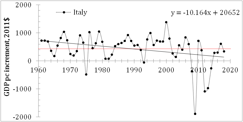
Italy chooses the future today in the elections. This future can be prosperous but also may continue the epic economic failure observed during the period of EU membership. This post explains in simple numbers the extremely poor economic performance. As an economy, Italy demonstrated the worst performance in the 21st century among developed countries, and this observation is strictly related to its participation in the EU.
In this post, data and general consideration are partially borrowed from my paper "Real GDP per capita: global redistribution of economic power" published in 2021 and available on arxiv.org. Our paper presents the performance of many countries as measured by the annual increment in the real GDP per capita. The main source of data for the Figures below is Maddison Project Database 2020. | Releases. Groningen Growth and Development Centre. University of Groningen - rug.nl. In a good country, people have to have more and more money in their pockets. The annual money increment is the best measure of personal and country-wise prosperity growth. Italy was not the worst in Europe in the second part of the 20s century but lost its momentum after joining the EU.
Figure 1 illustrates the shift in Italy to slower growth around the year 2000 with negative figures in the real GDP per capita, GDPpc, increment in 2008, 2009, and from 2012 to 2014. (The period covered in the paper is limited to 2018 and the COVID-19 recession is not included, but it definitely made the Italian economic performance much worse in the 21st century. The events in 2022 will likely result in another recession which will be especially deep in Italy as the 2008-2009 recession was.) Figure 1 also shows that the GDPpc level in 2018 is lower than the peak value observed in 2007. (Currently, Italy is likely below the 1999 level.)
The length and extent of this failure have not been observed in the data for Italy after 1960. The average annual increment for the whole period between 1960 and 2018 is $430±$546, and in the most recent period after 2001: $92±$740. The average annual increment of $92 is only 15% of that observed in Italy between 1961 and 2000. (Italians have much lower annual money increments than Germans or even the French, which is another loser of the EU.) The scattering is much larger than in France after 2001 (see paper). We also used the OECD and TED (Total Economy Database) estimates for the period between 2001 and 2018 and they are both negative -$43±$727 and -$61±$926, respectively, and much lower than +$92 reported by the MPD, which is likely in favor of Italia. (The OECD does not report the GDPpc before 1970 and it is not possible to compare estimates for the period between 1961 and 2000.) The regression line in the upper panel in Figure 1 has a negative slope and the annual increment decreases by $10.1 per year on average. The dependence of the growth rate of the GDPpc (lower panel) is characterized by loops for negative increments and the cycle of deep falls and quick rebounds generate high scattering as measured in the most recent period.


The European
Central Bank may cause an uneven reaction of the previously independent
economies with various economic measures undertaken against inflation and slow growth rate.
Germany significantly increased its annual increment in real GDP per capita
since the mid-1990s. Spain, Italy, and France suffer a painful decrease in the
annual increment in the 21st century. There is no direct evidence
that EU participation is the only cause of the drop in economic performance
but the difference between the periods before and after 2000 makes the Economic
and Monetary Union the main suspect.

Figure 3. Real GDP per capita (2011 prices) in
selected EU countries. Data are obtained from the Maddison Project database.
Figure 3 compares several EU countries and splits the
period from 1960 to 2018 into three sub-periods: 1960-1979, 1980-1999, and
2000-2018. Statistically, variations in the annual increment in the GDPpc
between these periods are important for the estimates of the linear regression,
i.e. the long-term behavior. We have
formulated this decay in terms of the gradual loss of economic competitiveness
(efficiency) compared to Germany within the EU. This situation is likely fixed
and neither Italy nor France is able to get back to the pre-EU level. The case of the UK, which is also
demonstrating lower performance than Germany and the Kingdom of the
Netherlands, gives a reasonable solution – to leave the EU and fight for the
efficiency out of the EU framework which they actually do not control. Portugal
and Spain should probably join such a move.
If the EU is a multi-speed union then Italy and Portugal are driving in
first gear.
9/24/22
Recession in the USA. Which measure is more accurate?
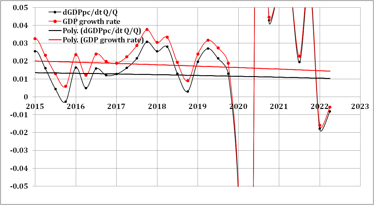
In my previous post, several measures of the long-term economic decline in the USA were presented. One of the important ways of comparison is related to the difference between the real GDP and real GDP per capita, GDPpc. Figure 1 shows the annualized Q/Q growth rate for these two measures of real economic growth. (In the previous post, the estimates of Q/Q one year before were presented.) There is a clear technical recession as marked by two consequent quarters of negative growth rates: 2022Q1 and 202Q2. Two polynomial trendlines illustrate the difference between total and per head GDP estimates. The former includes mechanical population growth of 2% in the 1970s and ~0.5% in the 2010s. This is an important difference in the understanding of economic growth. Imagine a country with a population growing by 5% per year and having a real (total GDP) economic growth of 3% per year. In such a country, the population is getting poorer and poorer with time as everyone gets 2% less income every year. This example shows that the real GDP growth rate is not the best indicator of real growth in population prosperity. For the USA, the population growth rate and thus the GDP-GDPpc difference is large enough to be estimated for the recession definition. It is worth noting that the population in developed European countries has been growing at a much slower pace since the 1960s and the difference between real GDP and GDPpc growth rates was much lower with a lower integral effect during the whole period since 1960.
Figure 2 presents the most recent period to illustrate the difference between the real GDP and the GDP per capita growth rate. The estimates during the COVID-19 period are too large to be presented and they are not related to real economic evolution. The 2022Q1 and 2022Q2 growth rate estimates for the real GDP are -0.0158 and -0.0058 1/y; for the GDPpc -0.0178 and -0.0081 1/y. The difference is small as the population growth rate was extremely low in the 2020s (see the previous post). Instructively, if the population growth would be at the level of the 1970s, there would be no recession in 2022 due to mechanical GDP growth with increasing population, but it would be a recession for all individuals in the USA as their share of real GDP would be decreasing.
The USA was a country with extremely healthy population growth from the 1960s to the 1990s. The mechanical GDP growth was a big (say, 1% from 3% or 1/3 in the 1980s) part of the total growth. Currently, this driving force is fading away and technical recessions may happen much more frequently as the real GDP and real GDP per capita practically coincide. For the capital part of the US economy, there is no difference between the sources of growth - mechanical population growth or technical progress with increasing productivity. For the labor part, this difference is crucial.
9/23/22
The US economy is on a long-term descent
The US economy was and is successful, as many people think. Such a view on the economy prevails because the long-term evolution is not discussed by the economic and financial authorities and mainstream experts. Here, I would like to present the US economic performance with the long-term trends in key economic parameters since 1960. These parameters are the growth rate of the civilian noninstitutional population, CNP, the rate of real GDP growth, the rate of real GDP per capita growth, the labor force growth rate, and the labor force participation rate. The population-related parameters are key to the understanding of long-term evolution.
We start with the CNP as the source of mechanical economic growth, i.e. the economy is growing even if the labor productivity does not increase. Figure 1 shows the rate of CNP growth between 1960 and 2022, as reported by bls.gov. The CNP growth rate curve is weird due to population corrections, especially popular in the 21st century. The polynomial trendline gives a clear picture of the long-term decline in the population growth rate from approximately 2% per year near 1970 to the current level below 0.05% per year. The period after 2012 is the worst since 1960. Therefore, the mechanical growth of the US economy was around 1% to 1.5% per year between 1980 and 2010 and then dropped by a factor of 2 or more. It is worth noting that the rate of population growth in European countries was much lower since 1960 and the mechanical part of economic growth was small.

Figure 1. The rate of CNP growth with a polynomial trendline. The growth rate is calculated for the monthly estimates relative to the previous year. The population corrections are clearly seen in the curve as one-year-long spikes smoothing the year-to-year jumps in the CNP estimates.
The population influence on real economic growth can be well illustrated by the comparison of the real GDP and GDP per capita as presented in Figure 2. Two trendlines in Figure 2 demonstrate an almost constant difference between 1960 and 2010 supported by a healthy population growth above 1% per year and a sudden convergence as driven by a quick decline in the CNP growth rate. The mechanical growth of the US economy suffers a dramatic decline and the open border policy of the current administration may bring the mechanical part of economic growth back to the pre-2010 level. Some European countries also follow this kind of wisdom to speed up their economic growth.
In any case, Figure 2 shows that the US economy lost its historic momentum and the future is not clear as demonstrated by the long-term decline in the growth rate (both real GDP and GDP per capita). For example, the GDPpc growth rate fell from 3% per year in the 1960s to 1.3%-1.5% in the 2010s. Correspondingly, the real GDP growth rate was around 2% per year in the 2010s while the CNP growth rate was around 0.5% per year. The long-term decline in the real GDP per capita has a fundamental character as explained by the observation that the GDPpc growth rate is inversely proportional to the attained level of GDPpc. The following functional dependence describes this relationship: dGDPpc/dt= A/GDPpc, where A is a country dependent constant. We thoroughly discussed this relationship in this blog and in our book. This decline in growth rate is the cost of real economic growth. The countries with lower GDP per capita can grow much faster in relative terms, but the annual increment per capita, A, is the fundamental parameter defining the efficiency of economic performance. For example, the economic growth in China is very quick in relative terms but is lower in absolute terms. For one person, the increment in dollars in China is lower than in the USA. For the most recent estimates, we recommend the following paper.


9/21/22
Soviet Union, the USA and the UK won WWII. France was a witness
I've just learned that François Sevez, a Major General in the French Army, signed the “Act of Military Surrender,” as witness. France was not among the winners of WWII as the following documents show -GERMANS SIGN UNCONDITIONAL SURRENDER - World War II Day by Day (ww2days.com) Essentially, this means that there was no winner except the Soviet Union in continental Europe. The best among European countries was a witness, then victims like Austria (where Hitler was born), and then losers and war criminals such as Germany and Italy.
The FED fails to control inflation. The long-term view
In January 2022, we wrote in this blog about the strict proportionality between the CPI inflation and the actual interest rate defined by the Board of Governors of the Federal Reserve System, R. This previous post continued the thread of posts related to this issue. Briefly, the cumulative interest rate since the mid-50s is just the cumulative CPI times 1.37. Interestingly, there are periods when the interest rate deviates from the long-term inflation trend, which has been almost linear since 1972. Here, we extend the observational dataset to the period of the quickest inflation rise since the second part of 2021, and discuss the most probable reason why the FRS actually does not control inflation as such by presenting the actual economic force behind price inflation, as we described in a series of papers [e.g., 1, 2, 3, and 4]. Overall, inflation is a linear lagged function of the change in the labor force. The latter is driven by a secular change in the participation rate in the labor force (LFPR) together with a general increase in the working-age population. In other words, increasing the labor force pushes inflation up, and decreasing the labor force leads to price deflation. The period of the COVID-19 pandemic is the first one when helicopter money flooded the US economy and the inflation effect observed in 2021 and 2022 is fully explained by the natural dollar devaluation related to money excess (see this post).
Introducing
new data obtained in 2022, we depict in Figure 1 the effective FED rate, R, and the CPI inflation as expressed
in the relative growth rate (1/year). In Figure 2, R is divided by a factor of 1.37 (see our previous post for
details) to match the long-term trend in consumer price inflation. Before
1980, R was rather in the leading
position. Since the late 1970s, R
lags behind the CPI, i.e. inflation grows at its own rate and R just follows. The sought level of price inflation was flexible. The idea of interest rate adjustment is that a higher
R should suppress price inflation.
During deflationary periods with a slow economy, low (in some countries
negative) R has to channel cheap
money into economic growth. The reaction of inflation is also expected not
shortly but with some time lag.


Figure
2. The CPI inflation rate (monthly y/y CPI inflation rate) and the Federal
Reserve effective rate, R, divided
by 1.37 (R/1.37).
The
cumulative influence of the interest rate should produce a desired effect in
the long run, and inflation should go in the direction of acceptable
values or target inflation. Figure 3 displays the cumulative effect, i.e. the
cumulative values of the monthly estimates of R/1.37 and CPI. This is an intriguing plot. In the long run, the
cumulative R/1.37 curve fluctuates
around the CPI one and returns to it. It is hard to believe that the sign of
deviation of R/1.37 from the CPI
curve affects the behaviour of the CPI, which is practically linear. Therefore,
the efficiency of monetary policy is in doubt. The FRS has tried all means
to return the CPI to R without any success and has to return R/1.37 to the CPI!

Figure
4 shows the difference between the two cumulative curves in Figure 3 – CPI-R/1.37. One can observe a periodic
character of the difference and unreasonably high correlation of the recessions
with the peaks and kicks in the difference curve. Currently, the difference is
close to the peak value observed in 1980. The recession observed in 2020 is
likely related to the COVID-19 socio-economic collapse. With the current high inflation and low R, a recession in the new future seems to
be a highly likely event. The FED lost control of inflation despite their
long-term task being extremely easy – just retain R at the level of 1.37CPI.

Figure 4. The difference between the cumulative R/1.37 and CPI. Notice the correlation of the peaks and kicks in the difference curve and the US recessions.
We
will present the labor force and inflation relation in the second part of this
post.
-
 These are two biggest parts of the Former Soviet Union. To characterize them from the economic point of view we borrow data from the Tot...
 -
These days sanctions and retaliation is a hot topic. The first round is over and we will likely observe escalation well supported by po...
-
 Yesterday I missed the absolute hero of deflation in the US – the consumer price index of information technology, hardware and software (see...