Showing posts with label CPI. Show all posts

10/6/12

The rate of unemployment in the U.S. will fall to 6.2% by 2014

On March 1, 2012 we predicted (in a Seeking Alpha post) the rate of unemployment in the U.S. to fall down to 7.8% by 2013. The BLS announced 7.8% for September 2012. Here we present our basic model and predict the evolution of unemployment in 2013.

In 2006, we developed three individual empirical relationships between the rate of unemployment, u(t), price inflation, p(t), and the change rate of labour force, LF(t), in the United States. We also built a general relationship balancing all three variables simultaneously. Since measurement (including definition) errors in all three variables are independent it may so happen that they cancel each other (destructive interference) and the general relationship might have better statistical properties than the individual ones. For the USA, the best fit model for annual estimates was a follows:

u(t) = p(t-2.5) + 2.5dLF(t-5)/dtLF(t-5) + 0.0585 (1)

where inflation (CPI) leads unemployment by 2.5 years (30 months) and the change in labor force leads by 5 years (60 months). We have already posted on the performance of this model several times.

For the model in this post, we use monthly estimates of the headline CPI, u, and labor force, all reported by the US Bureau of Labor Statistics. The time lags are the same as in (1) but coefficients are different since we use month to month-a-year-ago rates of growth. We have also allowed for changing inflation coefficient. The best fit models for the period after 1978 are as follows:

u(t) = 0.63p(t-2.5) + 2.0dLF(t-5)/dtLF(t-5) + 0.07; between 1978 and 2003

u(t) = 0.90p(t-2.5) + 4.0dLF(t-5)/dtLF(t-5) + 0.30; after 2003

There is a structural break in 2003 which is needed to fit the predictions and observations in Figure 1. Due to strong fluctuations in monthly estimates of labor force and CPI we smoothed the predicted curve with MA(24).

The structural break in 2003 may be associated with the change of sensitivity of the rate of unemployment to the change of inflation and labor force. Alternatively, definitions of all three (or two) variables were revised around 2003, which is the year when new population controls were introduced by the BLS. The Census Bureau also reports major revisions to the Current Population Survey, where the estimates of labor force and unemployment are taken from.

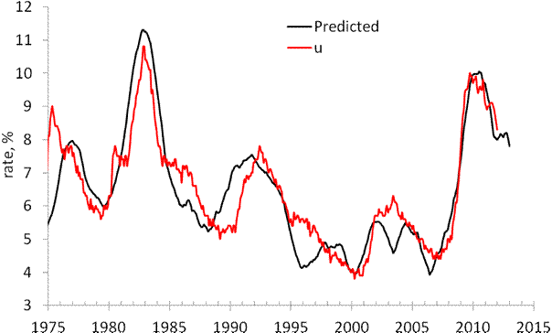
On March 1, 2012 the monthly model predicted a drop from 8.3% in February to 7.8% by the end of 2012. Figure 1 depicts the original prediction (upper panel) and the observed fall in the rate of unemployment (lower panel). Figure 2 shows that the observed and predicted time series are well  correlated (Rsq.=0.81). This is a good statistical support to the model.

Figure 3 depicts the predicted rate of unemployment for the next 12 months. The model shows that the rate will fall to 6.2% by September 2013. For 105 observations since 2003, the modelling error is 0.4% with the precision of unemployment rate measurement of 0.2% (Census Bureau estimates in Technical Paper 66).
 
Hence, one may expect 6.2% [±0.4%].
 
 
Figure 1. Observed and predicted rate of unemployment in the USA as obtained in March and October 2012.


Figure 2.  Observed vs. predicted rate of unemployment between 1967 and 2012. The coefficient of determination   Rsq=0.81.


Figures 3. The predicted rate of unemployment. We expect the rate to fall down to 6.2% in September 2013.

10/5/12

7.8% unemployment was predicted in April 2012


In 2006, we developed three individual empirical relationships between the rate of unemployment, u(t), price inflation, p(t), and the change rate of labour force, LF(t), in the United States. We also built a general relationship balancing all three variables simultaneously. Since measurement (including definition) errors in all three variables are independent it may so happen that they cancel each other (destructive interference) and the general relationship might have better statistical properties than the individual ones. For the USA, the best fit model for annual estimates is a follows:

u(t) = p(t-2) + 2.5dLF(t-5)/dtLF(t-5) + 0.0585 (1)

where inflation (CPI) leads unemployment by 2 years and the change in labor force by 5 years. We have already posted on the performance of this model several times.

Here a model with monthly estimates of CPI, u, and labor force is presented. The time lags are the same as in (1) but coefficients are different since we use month to month a year ago rates of growth. We have also allowed for changing inflation coefficient. The best fit models for the period after 1978 are as follows:

u(t) = 0.63p(t-2) + 2.0dLF(t-5)/dtLF(t-5) + 0.07; between 1978 and 2003

u(t) = 0.90p(t-2) + 4.0dLF(t-5)/dtLF(t-5) + 0.30; after 2003

There is a structural break in 2003 which is needed to fit the predictions and observations in Figure 1. Due to strong fluctuations in monthly estimates of labor force and CPI we smoothed the predicted curve with MA(24). The rate of unemployment became more sensitive to the change of inflation and labor force. Alternatively, definitions of all three (or two) variables were revised around 2003, which is the year when new population controls were introduced by the BLS.

All in all, the monthly model predicts the observed rate of unemployment which has recently dropped to 8.3%. We expect the rate to fall further to the level of 7.8% by the end of 2012.


Figure 1. Observed and predicted rate of unemployment in the USA.

10/1/12

Japan - my scenario of consumer price fall was too optimistic

I've found a new projection of labor force in Japan between 2010 and 2050. It says that the rate of labor force participation will be decreasing together with the depopulation of Japan. This means that the level of labor force will be falling much faster than it was used in my recent prediction. Considering the multiplication factor of 1.4, the rate of CPI inflation will reach -1% per year on average in 2020. By 2050, it will reach almost 2% per year (1.89%). The overall drop in consumer prices will be more than 2/3 by 2050.  This fall will be accompanied by the decrease in real GDP at a rate of 1% per year and the debt rise to 500% of GDP.

9/30/12

Exploring Japan: on dismal perspectives of consumer prices

In this post, we continue to validate our predictions of the rate of consumer price inflation (CPI) in Japan by the estimate for 2011. The Japan Bureau of Statistics has estimated the rate of CPI inflation as -0.3%. Now we have an estimate of labour force for 2011 and are able to compare the observed and predicted  figures.  
We have been following inflation in Japan since 2005 when our first paper on the Japanese economy was published and covered the period through 2003. We have revisited inflation in Japan in 2010 and confirmed the predictions of deflation as expressed by the negative GDP deflator. In this blog, we also reported on deflation (both CPI and GDP deflator) several times.  
The case of Japan is the best illustration of our concept linking inflation to the change in labour force. (In a sense, all developed countries stay on the brink of deflation because of the threat of falling labour force.) Therefore we do not suggest the liquidity trap in Japan or any mistakes in monetary policy (inflation does not depend on monetary policy as our model shows.). The evolution of inflation is completely driven by the change in labour force. This is an unfortunate situation for Japan since the level of labour force can only fall in the long run due to the decreasing working age population.   
Previously, we carried out an estimation of empirical relationship between the change rate of labour force, dlnLF(t)/dt, and inflation, p(t).  
First, we test the existence of a link between inflation and labour force. Because of the structural (likely related to definition and measurement procedure) break in the 1980s, we have chosen the period after 1982 for linear regression. By varying the lag between the labour force and inflation one can obtain the best-fit coefficients for the prediction of CPI inflation, p(t),  according to the following relationship (updated with new data since 2009): 
p(t) = 1.39dlnLF(t-t0)/dt + 0.0004                                (1)
where the time lag t0=0 years; standard errors for both coefficients are shown in brackets.  Figure 1 (upper panel) depicts this best-fit case. (The period after 2003 is highlighted.) There is no time lag between the inflation series and the labour force change series in Japan. Free term in (1), defining the level of price inflation in the absence of labour force change, is statistically undistinguishable from zero.
A more precise and reliable method to compare observed and predicted inflation consists in the comparison of cumulative curves. Short-term oscillations and uncorrelated noise in data as induced by inaccurate measurements and the inevitable bias in all definitions should be smoothed out in cumulative curves. Any actual deviation between two cumulative curves persists in time if measured values are not matched by the defining relationship.
The predicted cumulative values shown in the lower panel of Figure 1 are very sensitive to the free term in (1). For Japan, the cumulative curves are characterized by complex shapes. There are periods of intensive inflation and a deflationary period. The labour force change, defining the predicted inflation curve, follows all the turns in the measured cumulative inflation.
One can conclude that relationship (1) is valid and the labour force change is the driving force of inflation. Statistically, the evolution of the overall level of consumer prices in Japan is fully defined by the change in labour force. Hence, no other variable or process can affect the change in price. Otherwise, the statistically reliable link would not exist.  
Having the projection of labour force borrowed from the National Institute of Population and Social Security Research, one can predict the future of CPI inflation in Japan. It will be decreasing to the level of -1% per year in 2050.  
Conclusion: invite immigrants and start a baby boom today! Otherwise, the level of consumer prices in 2050 will be a half of that of today.  
 
Figure 1. Measured inflation (CPI) and that predicted from the change rate of labour force. Upper panel:  Annual curves. Lower panel: Cumulative curves between 1982 and 2011. A good agreement between the cumulative curves illustrates the predictive power of our model.
 
Figure 2. Scatter plot: predicted vs. measured rate of CPI inflation.
Figure 3. Projection of the labour force evolution between 2005 and 2050.

Figure 4. The rate of CPI inflation in Japan through 2050.

9/29/12

CPI and core CPI. A half-year report


We have been routinely reporting on the difference between the headline and core CPI since 2008. Figure 1 illustrates our general finding that this deference can be well approximated be a set of linear trends. The last trend likely finished in 2009. That’s why we expected a new trend to evolve since 2010 into the late 2010s.
The U.S. Bureau of Labor Statistics has reported the estimates of various consumer price indices for August 2012. Figure 2 shows the predicted trend and the actual difference since 2010. The difference has been fluctuating around zero between June 2011 and  January 2012 and then showed a turn to the predicted trend.  Essentially, the zero difference suggests that the core and headline CPI are practically equal and evolve at the same monthly rate, i.e. the joint price index of energy and food has been following the price index of all other good and services (the core CPI) one-to-one.
Currently, the price index of energy slowly falls together with oil price. We expect them to fall deeper and thus the headline CPI to decelerate a bit together with energy. If the core CPI will retain its current cohesion with the headline CPI, we will have a period of very low inflation in all goods and services less energy and food. 

Figure 1. Two trends in the difference between the healine and core CPI.


Figure 2. The evolution of the difference between the core and headline CPI since 2002.

8/31/11

Halliburton's shares

We have already presented updated pricing models for ConocoPhillips and ExxonMobil as based on the differences between CPI and PPI components. Our share pricing concept was introduced two years ago and predicted share prices for a few energy companies. ConocoPhillips (COP) and Exxon Mobil (XOM) from the S&P 500 list were the biggest and demonstrated almost no difference in the sensitivity to the difference between the core and headline CPIs. Halliburton’s share (HAL) was also modeled showed a dramatically different sensitivity. We made a tentative conclusion that COP and XOM might have a larger return to an investor considering energy stocks.
Basically, we demonstrated that the time history of a share price, p(t), (for example, HAL) could be accurately approximated by a linear function of the difference between the core CPI, cCPI(t), and the headline CPI in the United States. At the initial stage of our research, this difference was found to be the best to predict share prices in the energy subcategory.
Mathematically, a share price, HAL(t), (we use a monthly closing price adjusted for dividends and splits) can be approximated by a linear function of the lagged difference between the core and headline CPI:
HAL(t) = A + BdCPI(t+t1)                                       (1)
where dCPI(t+t1)=cCPI(t+t1)–CPI(t+t1), A and B are empirical constants. In the original model for HAL for the period between 1999 and 2009, A=43, B=-3.5; t is the elapsed time; and t1=0 year is the time delay between the share and the CPI change, i.e. the CPI has a lag behind the share price.
In this article, we test several pricing models for Halliburton, HAL(t), with the same CPI and PPI components tested for ConocoPhillips and ExxonMobil. The set of defining indices includes: the core and headline CPI, the consumer price index of energy, eCPI, and the producer price index of crude petroleum, pPPI, together with the overall PPI. Thus, we test model (1) for HAL(t) using two different differences for the period between 2001 and 2011: 
HAL(t) = A1 + B1(cCPI(t) - eCPI(t))  (2)   
HAL(t) = A2 + B2(pPPI(t) - PPI(t))         (3) 
All coefficients in (1)-(3) were estimates by the least squares for the period between January 2001 and July 2011. As for ConocoPhillips and ExxonMobil, we found no time delay between the share price and defining differences, i.e. t1=0. 
Figures 1 through 3 compare three HAL models. Corresponding coefficients are given in Figure captions. As in our original study, the best model (in sense of RMS residual, s) for the period between 2001 and July 2011 is based on the core and headline CPI (s=$4.18). Almost the same accuracy is associated with the model based on the core and energy CPI (s=$4.44).
At the same time, model (3) based on the producer price indices is the worst (s=$9.31). This may mean that Halliburton does not depend much on the producer price indices. Interestingly, the change in oil price does accurately describe the period of the financial crisis. However, the model fails to predict slow changes in the share price. Currently, the deviation between the observed and predicted prices is $20.

Halliburton’s shares were less sensitive to the change in consumer prices during the financial crisis than those of XOM and COP. However, the overall agreement between the observed and predicted prices is very good for the past ten years. One can expect that the current deviation from the predicted price will disappear in the near future and the observed price will fall down to $40 per share. In the long-run, the expected fall in oil price at a five-year horizon down to $30 per barrel will likely result in a proportional decrease in HAL’s shares.
Figure 1.  The observed HAL price and that predicted from the core and headline CPI.  A=$43, B=-3.4.
Figure 2.  The observed HAL price and that predicted from the core CPI and the consumer price index of energy.  A1=$30, B1=-0.3.
Figure 3.  The observed HAL price and that predicted from the overall PPI and the producer price index of crude petroleum (domestic production).  A2=$25, B2=-0.13. 

8/27/11

Share prices: ExxonMobil vs ConocoPhillips

In a previous post we have extended our original pricing model for ConocoPhillips and found that the evolution of its share can be best approximated by a linear function of the difference between the core CPI, coreCPI, and the consumer price index of energy, eCPI.  Originally, the model for a share price, p(t), (we use a monthly closing price adjusted for dividends and splits) was based on the difference between the core and headline CPI:

p(t) = A + B (coreCPI - CPI(t))                                 (1)
where A and B are empirical constants; t is the elapsed time.  
Here we test pricing models for ExxonMobil, XOM(t), with the same CPI and PPI components as we used for ConocoPhillips. The set of defining indices includes the core and headline CPI, the consumer price index of energy, eCPI, and the producer price index of crude petroleum, pPPI, together with the overall PPI. Thus, we test model (1) with p(t)=XOM(t) and two different models for the period between 2001 and 2011: 
XOM(t) = A1 + B1(coreCPI - eCPI(t))  (2) 
XOM(t) = A2 + B2(pPPI - PPI(t))         (3) 
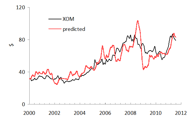
Figures 1 through 3 compare three XOM models. Coefficients in (1) through (3) are given in corresponding Figure captions. The best model (in sense of RMS residual, s) for the period between 2001 and July 2011 is based on the core and headline CPI (s=$9.32). Almost the same accuracy is associated with the model based on the core and energy CPI (s=$9.84). At the same time, model (3) based on the producer price indices is the worst (s=$10.9).
There is a dramatic difference between ExxonMobil and ConocoPhillips. The former company was less sensitive to the change in consumer prices during the financial crisis. The predicted amplitude is much higher than that observed between 2008 and 2009. ConocoPhillips has followed up the change in the difference between the core and energy CPI. When the behavior between 2008 and 2009 is extrapolated into the 2010s, the expected fall in oil price at a five-year horizon down to $30 per barrel will likely not result in a proportional decrease of XOM’s shares.
Figure 1.  The observed XOM price and that predicted from the core and headline CPI.  A=$86, B=-5.8.
Figure 2.  The observed XOM price and that predicted from the core CPI and the consumer price index of energy.  A1=$56, B1=-0.27.
Figure 3.  The observed XOM price and that predicted from the overall PPI and the producer price index of crude petroleum (domestic production).  A2=$68, B2=-0.55. 
8/26/11

ConocoPhillips share price to fall

Our original pricing model states that a share price, for example, that of ConocoPhillips, COP(t), can be approximated by a linear function of the difference between the core CPI, coreCPI, and headline CPI:
COP(t) = A + B (coreCPI - CPI(t))                          (1)
where A and B are empirical constants; t is the elapsed time.  Here we extend the set of defining indices by the consumer price index of energy, eCPI, and the producer price index of crude petroleum, pPPI, together with the overall PPI. Thus, we test the following models for the period between 2001 and 2011:

COP(t) = A1 + B1(coreCPI - eCPI(t))  (2)   
COP(t) = A2 + B2(pPPI - PPI(t))         (3) 

Figures 1 through 3 compare the original and new predictions for COP. Coefficients in (1) through (3) are given in Figure captions. The best model for the period between 2001 and July 2011 is based on the index of energy and core CPI. Practically the same accuracy is associated with the original model as based on the core and headline CPI. At the same time, model (3) based on the producer price indices is the worst and has failed to predict the amplitude of the largest oscillation in 2008.  

We have predicted oil price to fall through 2016. In 2011, we expect oil price to fall down to $70 per barrel. Considering these short- and mid-term predictions one can conclude that ConocoPhillips share price will be falling as well. 

Figure 1.  The observed COP price and that predicted from the core and headline CPI.  A=75, B=-5.5.

Figure 2.  The observed COP price and that predicted from the core CPI and the consumer price index of energy.  A1=58, B1=-0.54.
Figure 3.  The observed COP price and that predicted from the overall PPI and the producer price index of crude petroleum (domestic production).  A2=45, B2=-0.3.

7/18/11

Gasoline price in 2011

On December 21, 2010 we revisited the evolution of the price index of motor fuel (a component of the transportation consumer price index). It is time to test our predictions and make new projections.
 Here we follow our concept of deterministic and sustainable trends in the differences of consumer price indices. The model implies that the difference between the headline (or core) CPI and a given individual price index, iCPI,  can be described by a linear time function over time intervals of several years:

CPI(t) – iCPI(t) = A + Bt (1)
 where A and B are empirically estimated coefficients, and t is the elapsed time. Therefore, the “distance” between the CPI and the studied index is a linear function of time, with a positive or negative slope B. Free term A compensates the difference related to the start levels for a given year.
 On December 21, 2010 we presented Figure 1 and suggested that the difference reached some new trend and would follow it in the future. However, the evolution since January 2011 has been following another trajectory which resembles the fluctuation in 2008. We have already mentioned in this blog that the volatility in commodity prices has been extraordinary since 2005. This might be associated with speculative capital and/or quant funds. In any case, the swing in 2011 has come to its peak, as we expected a month ago, and not is returning to the trend. We expect the price index of motor fuel to grow at a lower rate than the headline CPI in order the difference to reach the trend by the end of 2011. In physical terms, the motor fuel price will likely be falling together with crude oil.
Figure 1. The difference between the headline CPI and the index for motor fuel. Solid diamonds represent the prediction given in March 2009 through December 2009. The total increase in the difference is +60 units of index or +35%: from 173 in March to 233 in December 2010. Dashed line represents the new trend, which is a mirror reflection to that between 2001 and 2008 shown by solid black line. In 2010, the difference has been fluctuating around the trend and thus should return to the trend in the beginning of 2011.
Figure 2. Same as in Figure 1with data through June 2011.

7/17/11

Food price. Quarterly update

This is a quarterly update. We continue reporting on the evolution of the difference between core CPI and the index for food (beverages not included). In several previous posts we confirmed that this difference had been following a long-term (negative) quasi-linear trend since 2001.  There is no important change so far.

In 2008, the trend line was much steeper than predicted and crossed the zero line. In the beginning of 2009, the trend reached the bottom and turned to a positive one, although not for long. The growth in food prices restarted in 2010 and has been in place since.
In June 2011, the trend (black) line crosses the zero line in the end of 2010. Therefore, Figure 1 demonstrates that the difference between the core CPI and the index of food has been slowly approaching to its original trend (red line) since 2009.

Here we suggest that the intercept with the zero line and the pivot to the decreasing food price may start any time in 2011 or 2012 depending on the bottom (resistance) level. Since the previous negative/positive pivot was at the level of -10, as displayed in Figure 2, one cannot exclude that the negative trend may change only after 2016. This case is less likely, however.

Figure 1. The difference between the core CPI and the price index of food. The pivot point to a positive trend is likely in 2011 or 2012.

Figure 2. The difference between the core CPI and the price index of food between 1960 and June 2011.

CPI and core CPI. Quarterly update

The U.S. Bureau of Labor Statistics has reported the estimates of various consumer price indices for June 2011. According to our quarterly schedule, we have to revisit the difference between the headline and core CPI in July 2011. As expected, these new estimates reveal a crucial turn in the difference. After 10 consecutive months of fall, the difference started to grow.  This turn manifests the beginning of a new period leading to price deflation in 2012. We expect the rate of consumer price inflation to fall below zero somewhere in 2012.  

Figures 1 and 2 briefly repeat our concept of sustainable (quasi-linear) long-term trends in the difference between the headline and core CPI in the U.S. There were two clear periods of linear behaviour: between 1981 and 1999 and between 2002 and 2009. A natural assumption of the future evolution of the difference was that a new trend has to emerge around 2010 after a short period of very high volatility. (However, the difference is very volatile also in 2011.  There is no sign that the higher volatility will calm down any time soon.)

Figure 1. Linear regression of the difference between the core CPI and CPI for the period from 1981 to 1999 (R2=0.96, the slope is 0.67) and a regression of the difference between the core CPI and CPI between 2002 and 2009 (R2=0.91 and the slope is -1.59). 

Accordingly, Figure 2 illustrates this hypothesis with the reversion (like mirror reflection) of the trend between 2002 and 2009. We expected this new trend with a positive slope to be developed between 2008 and 2011, as shown by the solid red line. Against our early expectations, after a year of “right” evolution in 2010 the difference fell to the zero line again in 2011. After a slight growth in May 2011, which we discussed a month ago, the difference made a large step up in June 2011. Hence, May 2011 was a pivot point for the difference and it will likely be approaching the trend through the end of 2011.

Figure 2. The evolution of the difference between the core and headline CPI since 2002.

Figure 3 depicts the most recent period with the turn in May 2011. It is not excluded that the difference will return to the long-term trend by the end of 2011. This return should be accompanied by a remarkable drop in the index price of energy which was the driver of the headline CPI in the first quarter of 2011.  As a result, oil price will be falling in 2011 and food price will likely grow at a very low pace if grow at all. We are preparing some updates for the difference between the price index of energy and the core CPI.

Figure 3. The evolution of the difference between the core and headline CPI since 2010.

5/31/11

Motor fuel price to fall in the near future

Our task is to estimate relative growth in a given price with time.  We use the ratio of price index, P(t), and GDP per capita in current prices, Y(t) (the idea borrowed from V.Kossov): 

Z(t)=P(t)/Y(t)

Figure 1 presents the evolution of the price index of motor fuel since 1935 (obtained from the BLS) and Figure 2 – nominal GDP per capita.   The share of motor fuel price in GDP per capita can be presented as a function of Y as well as time.  Figure 3 shows that there exist a long-term negative trend for Z(t) (notice the log-log scale) with two major fluctuations.  The trend looks sustainable and deviations seem to be of transient character.  Therefore, one can expect the fall in Z in the near future – motor fuel will be falling against GDP per capita. Oil price is likely to fall as well.  Figure 4 presents log(Z) as a function of time.
Figure 1. The consumer price index of motor fuel (not seasonally adjusted).
Figure 2. Nominal GDP per capita
Figure 3. LogZ vs. GDP per capita.
Figure 4. LogZ vs. time

Food is getting cheaper

Food is getting more and more expensive. Everybody knows that.  Figure 1 illustrates the evolution of the price index of food since 1913. At the same time, the US economy also grows including the growth in real GDP per capita which is shown in Figure since 1929 (chained, in 2005$).  One can easily estimate which of these two variables grows faster. Figure 3 depicts the ratio of CPI and GDP per capita relative to that in 1929. Overall, the food price falls relative to the GDP per capita, i.e. one has to pay a lower share of income (a fixed portion of GDP per capita)  for the same amount of food (we do not consider nomenclature and quality of food here).  Food is getting cheaper with time. It is interesting that the ratio in Figure 3 has not been falling much since 1975.

Figure 1.

Figure 2.

Figure 3.

5/14/11

Overall and core CPI in April 2011

The surge in oil and energy price (19% from April 2010) has ignited a fierce discussion on the future of the overall price inflation and the actions needed from the Feds in response to the danger associated with hyperinflation. The FOMC has decided not to change the overnight interest rate in order to help real economy to recover quickly and thus got under severe criticism.  Let’s look at the data on prices and inflation and evaluate the near future of the CPI.

The Bureau of Labor Statistics has published an estimate of consumer price index and its components for April 2011. The rate of headline CPI inflation (year-on-year) jumped to 3.13 percent from 2.70 percent in March, and the rate of core inflation has slightly increased to 1.34% from 1.2% in March. Figure 1 compares these rates from 1985 to 2011. What can we say about the influence of the overall price growth on core inflation, which excludes energy and food prices?  The most important observation is that there is no correlation between the high-amplitude fluctuations in energy/food prices and the core CPI. Even the biggest deviations in 2008 and 2009 have no effect of the trajectory of the rate of core inflation. Moreover, the current gap between the rate of core and headline inflation is by far lower than it was in 1986. Why should the current deviation influence the core CPI? All in all, the Federal Open Market Committee had and has a good reason to believe that oil price will fall in the near future and the curve of overall inflation will cross that of core inflation during 2011 at the level below 2% without any specific actions.  

We still expect that the core CPI inflation will fall below the zero line in 2012 and the headline CPI will rebound from its current higher level below the core CPI manifesting a deflationary period in the US.

Figure 1. The rate of price inflation as defined by the headline and core CPI.

Update. See also a similar post by Paul Krugman

4/29/11

Krugman's misinterpretation of long-term inflation

Paul Krugman has shown the evolution of headline CPI (level) since 2000 in order to demonstrate that the current trend manifests upcoming inflation. His conclusion is likely wrong due to couple mistakes in the presentation and interpretation.
  1. He narrowed the period to ten years and thus implied that the headline CPI trend was the same before 2000 and will be extended into the 2010s. Both assumptions are not true.
Figure 1 definitely shows that the trend before 2000 was different from the current one. Between 1980 and 1998, the headline CPI grew at a lower rate than the core CPI and they diverged. In 2000, the indices started to converge and the CPI curve intercepted the core CPI one in 2009. Very likely that the future trend will repeat that observed between 1980 and 2000, not continue the trend observed in the 2000s.
Therefore, the core CPI will be growing at a higher rate again and the headline CPI will sink below the core CPI level. Then the CPI inflation rate will be smaller than that defined by the core CPI. 


Figure 1.  Upper panel: The headline and core CPI levels between 1980 and 2011. Lower panel: the difference between the core and headline CPI demonstrates linear trends. One may expect the next trend to be positive and the headline inflation rate will be lower that the core inflation rate.  Krugman's assumption on the long-term trend in the headline CPI was not correct.

  1. The core inflation rate has been on decline since 2007, as Figure 2 shows. Despite very high volatility, the headline CPI always returned to the core CPI level. Our inflation model [1] shows that the current trend in the core CPI will be retained in the next decade below the zero line. Hence, the overall inflation rate will be also negative. An extended deflationary period will be observed.

Figure 2. The rate of price inflation as defined by the headline and core CPI.

  1. Kitov, I. (2006). Exact prediction of inflation in the USA, MPRA Paper 2735, University Library of Munich, Germany

Он раб моды ...

"  Вот, например, когда в моде было загорать, он загорел до того, что стал черен, как негр. А тут загар вдруг вышел из моды. И он решил...