6/16/11

The IEA projection for oil

The International Energy Agency has issued a new oil price projection through 2016:
For oil, the projections are based on prevailing futures prices, which form an assumption as opposed to a price forecast. The crude price assumption used in the outlook averages $103 per barrel, or around $20 more than in last year’s MTOGM.

We also presented a projection for oil price through 2016 which is based on the presence of a sustainable linear trend in the difference between the core and headline CPI in the USA. This price will be progressively decerasing to the level of $35 to $50 per barrel in 2016. It would be interesting to compare these prejections in, say, 3 years.

6/15/11

Oil price will be decreasing through the rest of 2011. CPI vs core CPI

The U.S. Bureau of Labor Statistics has reported the estimates of various consumer price indices for May 2011. According to our schedule, we have to revisit the difference between the headline and core CPI only in July 2011. However, the new estimates likely manifest a short-term turn in the difference which is worth mentioning.
Figures 1 and 2 briefly introduce our concept of sustainable (quasi-linear) long-term trends in the difference between the headline and core CPI in the U.S. There were two clear periods of linear behaviour: between 1981 and 1999 and between 2002 and 2009. A natural assumption of the future evolution of the difference was that a new trend has to emerge around 2010 after a short period of very high volatility. 
Figure 1. Linear regression of the difference between the core CPI and CPI for the period from 1981 to 1999 (R2= 0.96 the slope is 0.67) and linear regression of the difference between the core CPI and CPI between 2002 and 2009 (R2=0.91, and the slope is -1.59). 
Accordingly, Figure 2 illustrate this hypothesis with the reversion (like mirror reflection) of the trend between 2002 and 2009. We expected this new trend with a positive slope to be developed between 2008 and 2011, as shown by the solid red line. Against our expectations, after a year of “right” evolution in 2010 the difference fell to the zero line again.
Figure 2. The evolution of the difference between the core and headline CPI since 2002.
The May 2011 estimates suggest the end of the fall in the difference and a pivot to the long-term trend (solid red line in Figure 2). Figure 3 depicts the most recent period with a clear turn in May 2011. Thus, we expect the difference will return to the long-term trend by the end of 2011. This return should be accompanied by a remarkable drop in the index price of energy which was the driver of the headline CPI in 2011.  Hence, ol price will be falling during the rest of 2011.

Figure 3. The evolution of the difference between the core and headline CPI since 2010.

Recession? In 2012-2013!

Is a new recession coming? This is currently one of hot questions in economic blogosphere. We expect it in 2012 and 2013. Our prediction is based on a quantitative growth model.

The first post in this blog was devoted to real GDP growth and its relation to the change in a specific age population. We have presented a number of growth models for various developed counties and validated them by new data. The original model  for the U.S. links the change rate of real GDP per capita, dlnG/dt, to the change in the number of 9-year-olds, dlnN9/dt, and the reciprocal value of the attained level of GDP per capita, A/G:

dlnG/dt= A/G + 0.5dlnN9/dt (1)

where A is an empirically derived constant. One can rewrite (1) relative to N9 and obtain the following equation in a discrete form:

N9(t) = N9(t-1)[2.0( dlnG - A/G) + 1] (2)

where dt=1 year.

Figure 1 presents the result of the N9 modeling between 1960 and 2005. The agreement between the measured and predicted N9 is excellent and we have shown that these time series are cointegrated. Our model has passed all rigorous econometric tests and can be used for GDP forecasts when the quality of population estimates is good enough.
Figure 1. Measured number of 9-year-olds in the U.S. and that predicted from real GDP per capita.

After 2003, the U.S. Census Bureau has been publishing extremely smoothed and thus biased population estimates, which are not appropriate for the purposes of real GDP prediction. This unfortunate situation might be resolved only after the 2010 census. We do not have quantitative estimates of the 9-year-old population yet but can use the age pyramid presented in Figure 2, which we borrowed from the U.S. Census Bureau.

At first glance, the 2008-2009 recession was induces by a negative value of dlnN9/dt, as one can judge from the number of 12- and 11-year olds. These people were 9-year-olds three and two years ago. One should not forget that younger cohorts accumulate more and more people with time due to intensive immigration and thus the numbers of people above 12 years of age are all biased up relative to the younger generations.
 
The number of 10- and 9-year-olds is slightly higher than in two older cohorts, and thus, we observe a period of positive real economic growth in 2010 and in 2011(the growth rate of real GDP per capita is about 1% per year lower than that of the overall GDP). However, the fall in N8 and N7 (male) almost guarantees a new recession in 2012-2013. Hence, a new recession is around the corner. We will present a more accurate quantitative estimate when the 2010 census data are available.

6/14/11

Oil price in May

In 1 minute, the BLS will report a number of producer price indices, icluding  the price index of crude petroleum.  Oil price in May was fluctuating around $100 per barrel. In April, the average price was closer to $110. Hence, we expect a dramatic fall in the oil price index from its current level.

Update. June 14, 14:33
As expected, the oil index has fell from 309.8 to 275.8, i.e. by ~11%. In June, this trend is extended. As we forecasted, oil price and thus the price index of motor fuel will be decreasing into 2011. It may be the cause of employment-population ratio growth and fall in the rate of unemployment. 

6/13/11

The age of the highest income inequality

In Figure 1, we present the evolution of age dependent Gini ratio in the U.S. as reported by the Census Bureau. These estimates were obtained during the annual current population surveys. It is instructive to compare Gini ratios in various age groups.
Before 2003, the group with the highest ratio was between 55 and 64 years of age. Currently, the highest ratio belongs to the youngest (15 to 24 years of age) age group at the level of 0.51.  The smallest Gini ratio (~0.43) is shared by the age group between 25 and 34 years of age and the oldest group over 75 years.  The former group is characterized by a very stable Gini ratio between 1994 and 2009.

Figure 1. Evolution of Gini ratio in various age groups as reported by the Census Bureau.

Angry Bear on the relation between S&P 500 and GDP

A month ago Mike Kimel had a post on Angry Bear dealing with the relationship between the S&P 500 market index and nominal GDP. His naive regression showed correlation of ~94%. One should not forget that Clive Granger introduced the idea of spurious regression 30 years ago. (A surrogate Nobel Prize for this finding in 2003.) This correlation is a good example; both variables are nonstationary, I(1), and are not cointegrated. Hence, the above correlation is spurious.

Actually, the S&P 500 returns are coitegrated with the change rate of real GDP per capita and this correlation is not spurious as shown in this blog and our paper on S&P 500.

On decreasing income inequality in the US

Five years ago I published a working paper arguing that the measures of income inequality derived from the IRS data are highly biased as estimated from a varying share of population. Physics students are well aware that no conservation laws are applicable to open systems with unknown exchange with environment. For economists, it is not a good hint and they continue to present lots of inequality estimates associated with highly fluctuating population basis.  Figures 1 shows the evolution of the share of population with income and Figure 2 depicts the share of personal income in real GDP as determined by the IRS and by the Census Bureau during the Current Population Survey. One can see that the IRS population basis varying around 60% from the level of working age population and the CB covers around 90% of the population. Moreover, the share of personal income in real GDP is only 55% for the IRS and 70% for the CB. For a physicist, the estimates based on the CB data look more reliable than those from the IRS data. It should be noted, however, that people without income have to be included in the estimates of inequality to cover the whole working age population. (We have estimated the Gini ratio for the whole population.)
The Census Bureau has been reporting detailed results of the CPS since 1994. Figure 3 depicts the evolution of Gini ratio for the U.S.  It has been decreasing since 1994 with a clear minimum in 2007.   We also included the share of population without income in order to illustrate the decreasing basis for the Gini ratio estimate. When these people without income are included the Gini estimates should increase and the inequality should be slightly higher.    
Figure 1. Share of population with income as estimated by the IRS and Census Bureau.
Figure 2. Share of personal income in total GDP as estimated by the IRS and Census Bureau.
Figure 3. Evolution of Gini ratio and the share of population without income as estimated by the U.S. Census Bureau.  

6/12/11

People without income. Worrying trends.

The U.S. Census Bureau conducts a Current Population Surveys (CPS) every March. The CPS includes a number of questions related to personal incomes. A new questionnaire   was introduced in 1994 and many detailed tables have been published since. People not reporting any personal income during the previous year are considered as people without income. We have plotted the share of people without income as a function of time for various age groups. In all groups, the share has been growing over time. The most prominent increase was observed in the youngest group between 0 and 9 years of work experience marked in Figure 1 as “5”. (All other groups are marked by the relevant central points of 5 years bins of work experience.) The share grew from 25% to 38% between 1994 and 2009, i.e. by 0.9% per year, as the slope in Figure 1 shows. This is a worrying tendency.  

Young men do not feel real economic growth


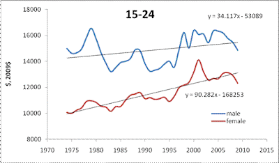
The U.S. Census Bureau publishes many tables on income distribution. One of many reported features is the evolution of the age and gender distribution of real incomes. In several figures below we illustrate the time history of real mean income since 1974. The most striking feature is that young men between 15 and 24 do not see any improvement in the mean income – only $34 per year. Despite the level of mean income for young women is lower than that for young men the former experience a three times faster growth.   
An interesting feature, which is likely the legacy of the 1960s and 1970s, is a much faster growth of mean income for men over 65 years of age. Other age groups are characterized by steady improvements in income inequality.  The most successful women (in relative terms) are between 25 and 34 years of age. Their mean income has been increasing by ~$400 per year compared to only $70 per year for men of the same age. If this tendency holds beyond 2040, the mean income trends will intercept. For other age groups it may happen after 2050.
We have described these and many other phenomena of personal income distribution in our previous posts and papers.


Shimmy in economic gear. How far is the U.S. economy from a runaway?

Shimmy is a well-known mechanical effect in aircraft landing gear. During landing and take-off, the nose wheel oscillates about the vertical axis, sometimes with increasing amplitude. In the case of severe resonance oscillation, shimmy may result in the wheel  destruction.  Instructively, shimmy usually occurs in a specific band of aircraft velocities.  (A much safer but typical case of shimmy is observed in a shopping trolley.) The shimmy effect is well known and relatively well understood and modelled, although not completely.  

As an economic analogue of shimmy, we propose to take a look at the current oscillations in commodity prices.  Is it actually an economic shimmy? In several figures below we present the evolution of relative prices, pi, of selected commodities, iPPI. In order to remove the base effect we calculate the deviation from the overall PPI, PPI, and normalize it to the PPI:
pi(t)= (PPI-iPPI)/PPI
where i corresponds to iron&steel, gold ores, crude petroleum (domestic production),  copper ores, aluminium base scrap and grain. Four from these six basic commodities demonstrate a clear start of shimmy around 2005.  Aluminium base scrap and grain had higher oscillations in the past, but can be also characterized by an elevated volatility during the past 5 years.

Overall, a higher volatility is not a surprise for the market but since 2005 is has a coherent driving force behind all commodities. It is likely that there is a positive feed back in the loop of commodity pricing with money flooding into the commodity market without any restriction. For a nose wheel, similar mechanical feedback leads to shimmy and aircraft accidents. For the U.S. economy, one can expect a price runaway (gold is a candidate) if the positive feedback observed since 2005 is further retained. How far is the current situation from an accident?


6/11/11

Krugman on the effect of quantitative easing in Japan

Paul Krugman shows in this post that the original quantitative easing (QE) in Japan did not help at all. Money supply did not react to an artificial increase in the monetary base. This observation raises a question on the effectiveness of a similar monetary policy in the U.S.

We have a simple explanation of the observed insensitivity of price inflation on QE:  inflation depends on the change in labor force, LF, not on monetary policy. The following models for the GDP deflator, DGDP, and CPI inflation, CPI, were obtained and presented in our previous posts:

DGDP(t) = 1.9d(lnLF(t))/dt – 0.0084      

CPI(t) = 1.3d(lnLF(t))/dt + 0.0004

Two figures below illustarte these models. There is no room for the BOJ to influence deflation after 1995.  

How long will last the crisis in Greece?

In our previous posts, we discussed the evolution of real GDP per capita in selected developed countries. One of striking examples of dramatic changes is Ireland, where we predicted a deep fall many years ago. This prediction was based on the empirically justified concept of constant annual increase in real GDP per capita, G, in developed countries. We found that in the long run the trajectory of G is a linear function of time:
G(t-t0)= G0+B(t-t0) 
where G0 is the initial level of GDP per capita at time t0 in a given country, B is the country dependent increment measured in (chained) dollars. Because of the constancy of the annual increment of real GDP per capita (in the long run) in developed countries we call this type of real economic growth the inertial growth. It is an analog of mechanical notion of inertia.
It should be noticed that the rate of growth, dlnG/dt, has to decelerate with time:
dlnG/dt = B/G
Empirically, the introduction of a constant increment gives excellent statistical results and explains the evolution of real GDP per capita in the biggest developed countries. For Greece, we first calculated coefficients A and B in 2003 using data from the Conference Board (http://www.conference-board.org/economics/database.cfm). Figure 1 depicts two curves dG/dt vs G. The original curve is based on the published data. The corrected curve takes into account the ratio between total and working age population. Technically, one should not calculate per capita values using total population since only working age population produces all goods and services. In 2002, the slope of the annual increment (also show in the Figure) was large and positive. It was lower than that for Ireland or Norway but larger than in the biggest European countries. Since we predicted a deep fall in Ireland, we also could expect a smaller drop in the increment for Greece. It was not our primary interest, however.
Fig. 1. Annual increment of real GDP per capita in Greece as obtained from the Conference Board database. The mean value for the period between 1951 and 2002 is shown for the population corrected time series.
 The current economic and financial crisis in Greece has attracted enormous attention. The reasons behind the crisis were actively discussed and we propose a simple explanation as based on the inertial economic growth.  Figure 2 demonstrates that the constancy of annual increment is a fundamental feature of real GDP growth. Several years of extraordinary fast growth in Greece observed in the 2000s must be finished in order to return the trend of the increment curve back to the mean value. The slope in Figure 2 is much smaller than that in Figure 1. Thus, one can expect that the annual increment of real GDP per capita in Greece may return to the level of $520 any time soon. The fall between 2008 and 2010 has played its stabilizing role and the Greek economy is almost ready to continue its healthy growth.

Figure 2. The increment of real GDP per capita vs. real GDP per capita in Greece between 1951 and 2010.

6/6/11

On the slow growth of working age population

There is a discussion on the Seeking Alpha of my post on the last Employment Situation Summary issued by the BLS several days ago. Lee Adler asked about the evolution of working age population, WAP, in the U.S. during the past 50 years. This question has arisen because I had shown only the last ten years in the post. These were the years of a steady decrease in the annual increment of the working age population, which is defined as the number of people of 16 years of age and over.  Lee is right; the annual increment has two peaks - in the 1970s and between 1998 and 2003 as Figure 1 shows.  During the 1980s and 1990s, the increment was at the level of 2,200,000 per year, and in the 2000s it fell from 3,000,000 and more per year to ~2,000,000 per year in 2008 and 2009. One should not trust the peaks in 2000 and 2003. These are caused by one-sided revisions of the total population after the 2000 census. The numbers were corrected after 2000 and 2003 but not before what created severe steps in the WAP.
Figure 2 depicts the evolution of the change rate of the WAP, dWAP/WAPdt or dlnWAP/dt. This is to show that in relative terms (the rate of unemployment and employment-population ratio are defined in relative terms) the current growth of the WAP is not fast from the historical point of view. The 2008 through 2010 values are the smallest since the early 1950s when the aftermaths of the Great Depression and WWII were the most painful. Thus, the current decrease in the growth rate of working age population is one of the reasons behind the slow employment recovery.

Figure 1. Annual increment of the working age population (black line) and its 5-year moving average (red line).

Figure 2. The rate of growth of the working age population (black line) and its 5-year moving average (red line).

What's happened to the economy?

There is an old joke. One economist asks another economist:

- Do you understand what's happened to the economy?
-O'k.  I'll explain you.
- I can explain myself, but do you understand? 

Before one starts explaining the current state of economy it is always good to think a bit about understanding.
In my view, if one can not predict quantitatively what will happen in the near future (a sort of understanding) s/he should not start explaining.  

6/5/11

Is the U.S. economy above or below the long term growth trend?

The 2008/2009 recession in the U.S. is perceived as a deep and painful fall in real GDP.  It is now a common place to show the current estimate of real GDP far below the long term growth trend. Many experts consider the point of complete recovery of the U.S. economy as the intercept with this trend somewhere in the future. This is a wrong assumption. One should exclude the extensive factor of total population growth from real GDP since the total population does not grow at the same rate as before. One confuses real economic growth with demographic fluctuations.  Here we present the history of economic growth in terms of real GDP per capita.
Previously in this blog, we found that real GDP per capita in developed countries grows as a linear function of time. Similarly to classical mechanics, we interpret this linear growth as “inertial” growth. When the population pyramid does not change over time one can write the following relationship for real GDP per capita, G(t):
G(t) = At + C           (1)
Relationship (1) defines the linear trajectory of the GDP per capita, where C=Gi(t0)=G(t0) and t0 is the starting time. In the regime of inertial growth, the real GDP per capita increases by the constant value A per time unit. Figure 1   shows that the annual increment A in the U.S. is practically constant between 1950 and 2010. (All data are borrowed from the Bureau of Economic Analysis.) This plot validates our empirical finding. Overall, 19 biggest developed countries demonstrate the same behavior between 1950 and 2010.
It is time to compare the trends in real GDP and GDP per capita. Figure 2 depicts the evolution of both variables between 1950 and 2010 and also presents the relevant trends. The real GDP curve has an exponential shape as related to the growth in total population. One can easily observe the current deviation from the exponential trend and blame poor economic conditions after 2007.
The real GDP per capita evolves along a straight line. There is no significant deviation from the linear trend in the past 4 years. Moreover, during these years the observed curve returned to the long-term trend.  In this sense, the current downward correction is a natural consequence of the fundamental law of inertial economic growth. One should not confuse economy with demography.  The latter is responsible for 200 per growth in real GDP from 1950 to 2010, i.e. the total population has increased by a factor of 2 since 1950.

Figure 1. Annual increment of real GDP per capita in the U.S. between 1950 and 2010.
Figure 2. The evolution of real GDP and real GDP per capita between 1950 and 2010.

Forecasting S&P 500 returns. Quarterly update

Three months ago we revisited our prediction of the S&P 500 return including the estimate of real GDP for the fourth quarter of 2010. Here, we update our model and include the GDP estimate for the first quarter of 2011 and the monthly closing prices through May 2011. As discussed in our working paper on S&P 500, there exists a trade-off between the growth rate of real GDP, G(t),  and the S&P 500 returns, R(t). The predicted returns, Rp(t), can be obtained from the following relationship: 
Rp(t) = 0.0064dlnG(t) - 0.03   (1) 
where G(t) is represented by the Q/Q (annualized) growth rate, because only quarterly readings of real GDP are published by the BEA. 
Figure 2 displays the observed S&P 500 returns and those obtained using real GDP. As before, the observed returns are MA(12) of the monthly returns. The period after 2003 is relatively well predicted. Therefore, it is reasonable to assume that G(t) can be used for modeling of the S&P 500 index and returns. Reciprocally, current S&P 500 may be used for the estimation of real GDP. The predicted return is lower than that observed in April and May 2011. We can assume that the level of S&P 500 should be corrected downwards or the preliminary estimate of GDP should be revised up.
Figure 1. Observed S&P 500 return and that predicted from real GDP. For a given quarter, all monthly values of the growth rate relative to the previous quarter are equal.  

6/4/11

The rate of unemployment in the U.S. may fall to 6% by the end of 2011

As in the previouspost, we refer to our model which links the rate of participation in laborforce, LFP, to the change in real GDP per capita. For short time intervals, one replaced labor force with employment, E, and GDP per capita with GDP. Now we use the rate of unemployment, UE, instead of the employment-population ratio, E/P. Unlike the E/P, unemployment negatively depends on real economic growth, i.e. should fall when dGDP/GDP is large. Thus, we scale the UE in the following way: dGDP/GDPdt = 1.1(8.0-UE), where coefficients 1.1 and 8.0 were estimated empirically.   Figure 1 shows the evolution of dGDP/GDPdt and UE) in the U.S. after 1990. The latter variable is shifted 12 months back in order to fit the peaks and troughs in the dGPG/GDP between 1990 and 2010.
 The overall agreement between the curves is excellent and allows forecasting the UE since the dGDP/GDPdt curve leads by 12 months. Then, the current UE (9.1%) value corresponds to May 2010 in the DGDP/GDP curve. Therefore, the rate of unemployment should fall to the level of 5% to 6% by the end of 2011.
Figure 1. The annual change rate of real GDP, dGDP/GDP, and the scaled rate of unemployment, UE.

The employment/population ratio may rise to 63% by the end of 2011

Our model links the rate of participation in labor force, LFP, to the change in real GDP per capita. The latter leads by two years, and we have successfully predicted the fall in LFP in 2009. For short time intervals, one can replace labor force with employment, E, and GDP per capita with GDP. Figure 1 shows the evolution of dGDP/GDPdt and E/P (employment population ratio) in the U.S. after 1990. The latter variable is reduced by 60% and shifted 12 months back in order to fit the level of dGPG/GDP between 1990 and 2010.
The overall agreement between the curves is excellent and allows forecasting the E/P, the dGDP/GDPdt curve leads by 12 months. Then, the current E/P value corresponds to May 2010. Therefore, the E/P should jump to the level of 63% by the end of 2011.
Figure 1. Annual change rate of real GDP, dGDP/GDP, and the monthly estimated ratio of employment and working age population, E/P.

6/3/11

Why the employment situation is not disappointing

The Bureau of Labor Statistics has published an “Employment Situation Summary” for May. The nonfarm payroll employment has increased by 54,000. The number of employed in the U.S. increased by 105,000; from 139,674,000 to 139,779,000.  These low numbers have come as a surprise for many experts, who predicted 170,000 (http://online.wsj.com/mdc/public/page/2_3064-446888.html) for the nonfarm payroll employment in May. Therefore, the market and general public feel some disappointment> Should they?
In the previous post, we demonstrated that the level of labor force in the U.S. has been experiencing an unprecedented fall since 2008. Figure 1 reminds us that the reason for the fall is not the current financial crisis and recession but rather a new trend in the rate of labor force participation, LFP. This is not a short- or mid-term transient process but the change in the long-term tendency. The LFP had been growing between 1955 and 2000, when it reached its peak. One can consider 2001 as a pivot point manifesting a fundamental change in the labor market behavior in the U.S. It is worth noting that the change in LFP behaviour started ten years ago, not in 2008. (The reader might be interested in the explanation of this phenomenon. We had accurately predicted the 2010/2011 fall in the LFP many years before it happened.)
As a result of the new long-term tendency, one should not expect the same pace of employment growth as it was between 1960 and 2000. In addition to the fundamental shift in the secular LFP evolution, one should not forget another source of employment growth – the level of working age population. Figure 2 depicts monthly increments of the working age population, i.e. 16 years old and over.  One can clearly see that the influx of the population has been decelerating since 2000 as well. The deep negative corrections in Figure 3 are associated with annual revisions to population controls. It is not wise to wait that the growth in employment will exceed the influx of working age population in the situation with the falling LFP.   
It is important that even decreasing unemployment can not compensate the effects of LFP and population. Figure 3 shows the evolution of monthly increments in employment, E, after 2003 with MA(12). One should not expect that E will be growing at a pace which was considered as a healthy one before 2000 any time soon. In that sense, the today’s BLS news is not disappointing. Really disappointing is the unjustified expectation of any large increase in the U.S. employment.  
Figure 1. Measured LFP in the U.S.

Figure 2. Monthly increment in working age popualtion (16 years of age and over) in the U.S.
 
Figure 3. Monthly increment of employment in the US with its MA(12). 

6/1/11

Catastrophic fall in labor force in the U.S.

Labor force in the U.S. experiences unprecedented fall. With total population growing at a healthy pace of ~1% per year, the number of people in labor force has been physically decreasing since 2009. The reason behind this effect is the labor force participation rate, LFP, plummeting down. Figure 1 shows that LFP dropped from 66.4% in 2008 to 63.9% in the first quarter of 2011. This 2.5% is equivalent to 6,000,000 people out of the working force in 2011 relative to 2008.  Event the growth in the total working age population from 235,000,000 to 239,000,000 has failed to compensate the fall in the LFP. Figure 2 shows that the decline in the labor force, LF, is a unique feature since the very beginning of observations in 1948.  Except the current fall, there were only two short intervals with dLF/LFdt<0 after WWII, in 1951 and 1962, as Figure 3 shows.

The negative growth rate of labor force is the cause of a higher rate of unemployment and lower rate of price inflation. It should be noted that we predicted the current decline in the LFP many years ago. 
However, the fall in LFP is not the cause but a consequence of the low rate of real GDP  (per capita) growth after 2008. When the growth rate of real GDP per capita regains its normal pace of 2% per years the LFP will start to increase, with a two-year delay.

 
Figure 1. Measured LFP in the U.S.

Figure 2. Labor force in the US.

Figure 3. The change rate of labor force, dLF/LFdt