1/30/11

On real GDP growth in the US

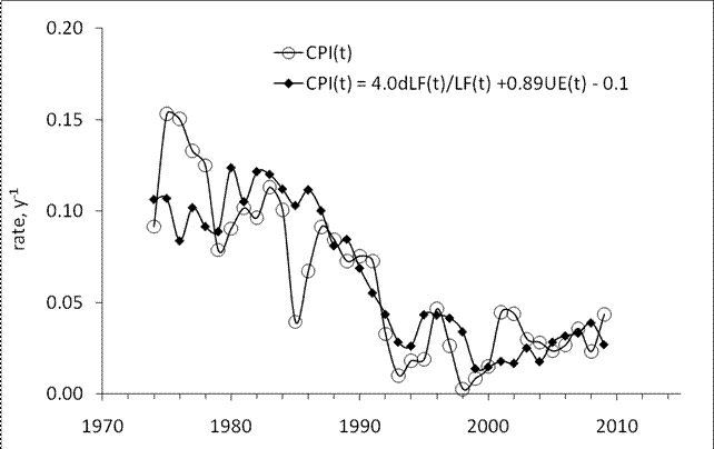
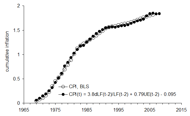
The U.S. Bureau of Economic Analysis (http://www.bea.gov) has reported an estimate of real GDP in the fourth quarter of 2010. Accordingly, a new estimate of the growth rate in 2010 is available. It looks not so bad: +2.9% per year. Let’s ignore the rates of growth for a while and find out where the U.S. stays in terms of real GDP level. Below is a table with quarterly real (in billions of chained 2005 US dollars) GDP estimates since 2007:


2007q1 13,089.3
2007q2 13,194.1
2007q3 13,268.5
2007q4 13,363.5
2008q1 13,339.2
2008q2 13,359.0
2008q3 13,223.5
2008q4 12,993.7
2009q1 12,832.6
2009q2 12,810.0
2009q3 12,860.8
2009q4 13,019.0
2010q1 13,138.8
2010q2 13,194.9
2010q3 13,278.5
2010q4 13,382.6

Well, the US has finally overcome by a 19 billion margin the level of 2007q4. At a healthy pace of 2.5% per year, the rise since 2007 should be around 1 trillion. Moreover, approximately 1% of real economic growth in the U.S. is associated with the overall population increase by 1% per year. In the fourth quarter of 2007, real GDP per capita was $44.292 (civilian population in December 2007 - 301,710,949) and in the same quarter of 2010 - only $43.255. The overall decrease in real GDP per capita since 2007 is 2.3%.

1/25/11

Autodesk stock price to rise in 2011Q1

When modeling stock prices by decomposition into two CPI components and linear time trend we exercise two different  time periods: after January 1994 and after June 2003. The reason for this separation is simple – the difference between individual CPI components is usually characterized by the presence of several linear trends. When linear trend in the difference between two defining CPI components has a pivot point relevant stock model also has a break in all coefficients. Therefore, we usually prefer to avoid this type of bias and limit our modeling to the period after June 2003 when all turns in many CPI difference did happen after the 2001 recession. This shorter modeling period significantly influences the resolution of the model and we would prefer to use longer time series when possible.

The model for Autodesk (ADSK) is an excellent example of the possibility to extend the modeling period back to 1994. The resulting model has a deterministic character and predicts the share price evolution at a several month horizon. Our model for ADSK is stable over the past year and is defined by expected indices: the consumer price index of motor vehicle maintenance and repair (MVR) and the index of information technology, hardware and software (IT). The latter defining index definitely has tight relations to ADSK.

The MVR index leads the share price by 5 months and the IT one - by 8 months. Figure 1 depicts the overall evolution of the difference between the involved indices. As discussed above, no change in the trend has been observed since 1994. Hence, the final share price model for ADSK should not be biased by the change in the trend.

These two defining CPI components provide the best fit model between June 2010 and December 2010. The MVR coefficient is negative and thus the increasing price of motor vehicle maintenance and repair causes the share price to fall. The IT index has a positive coefficient but the long-term decrease in this index also causes the share to fall. The slope of time trend is positive revealing the price tendency to increase over time. The best-fit 2-C model for an ADSK(t) share price is as follows:

ADSK(t) = -3.97MVR(t-5) + 2.18IT(t-8) + 35.25(t-1990) + 265.90

where t is calendar time.

The predicted and observed curves are presented in Figure 2. The residual error is $4.75 for the period between January 1994 and December 2010. The model provides a relatively good prediction of the share price in the past. Currently, the predicted price shows a strong tendency to rise. One should expect the ADSK price to grow fast in the first quarter of 2011.


Figure 1. Evolution of the difference between MVR and IT. No change in the long-term sustainable linear trend is observed.


Figure 2. Observed and predicted ADSK share prices.

Unemployment in Australia

Following the previous post on inflation in Australia, we present a similar model for the rate of  unemployment .

It has been empirically revealed and statistically tested that the rate of unemployment, in developed countries is a linear function of the change in labor force. We expect the same relationship to be valid for Australia. A simple trial-and-error method applied to cumulative unemployment published by the Australian Bureau of Statistics at a monthly rate (see Figure 1) allows to accurately estimating both coefficient in the linear relation:

UE(t) = -2.1dLF(t)/LF(t) + 0.0977; t>1995
UE(t) = -2.1dLF(t)/LF(t) + 0.131; t<1996 (1)

Because of the change in monetary policy around 1995, we had to split the modeled period into two segments: before and after 1995. The above relationships show that only free term did change in 1996 from +0.131 to +0.099. The slope in the linear relationship is the same over the entire period. All in all, the agreement between the annual and cumulative curves is excellent. One can predict the rate of unemployment at any time horizon using labor force projections. We have failed to find any projection published by the Australian Bureau of Statistics except the one between 1999 and 2016. Unfortunately, this projection was all wrong and heavily underestimated the growth in labor force. It predicted the level of labor force in 2016 at 10,800,000. In December 2010, the level of labor force was 12,132,900. This is good news, however. According to (1), a higher rate of labor force results in a lower rate of unemployment.
Figure 1. Upper panel. Monthly estimates of the rate of unemployment in Australia and that obtained from labor force using (1). Due to high-amplitude fluctuations in the monthly estimates of dLF/LF, the predicted curve is smoothed by a twelve-month moving average, MA(12). Lower panel. Cumulative values of the observed and predicted curves in the upper panel. Notice excellent agreement between the cumulative curves.

1/24/11

Inflation in Australia

This is an earlier report on the quantitative model of  price inflation in Australia. We use our general approach well described in this blog.

Introduction
To create an inflation model for Australia we use our concept linking inflation solely to the change in labor force. As for other developed countries we use data obtained from various sources. Because of definitional and measuring problems data compatibility over time is not routinely provided by statistical agencies and one has to check for artificial breaks in data series. The OECD reports the following:

Series breaks: A new questionnaire was introduced in 2001 and employment and unemployment series were re-estimated from 1986. From April 1986, employment data include unpaid family workers having worked less than 15 hours in a family business or on a farm. Previously, such persons who worked 1 to 14 hours or who had such a job but were not at work, were defined as either unemployed or not in the labor force, depending on whether they were actively looking for work.
Many central banks shifted their monetary policy to inflation targeting around 1995. This can also introduce a break in underlying time series and the generalized dependence between three economic variables under study. This is the case for France.

The data
Here we introduce the estimates of all variables used in the study. There are two time series for inflation, unemployment and the level of labor force. Figures 1 and 2 introduce the overall behavior of all time series.


Figure 1. Upper panel: Comparison of CPI inflation and GDP deflator in Australia. Lower panel: Comparison of two estimates of unemployment according to US and OECD definitions.

Figure 2. Comparison of two estimates of the change rate of labor force level – according to the OECD and US definition (BLS).

The Phillips curve
Here we plot the rate of unemployment in Australia against reduced CPI inflation. The period between 1974 and 1994 shows a relatively good agreement, but then the curves diverge. This might be related to the new central bank monetary policy, as observed in France. All in all, the Phillips curve does not exist in Australia for the entire period between 1978 and 2009, i.e. for the period of accurate measurements presented by the Australian Bureau of Statistics.


Figure 3. Upper panel: Comparison of the measured unemployment (US definition) and that predicted from the CPI inflation according to the relationship obtained in the lower panel. The curves are close between 1974 and 1994. The following deviation might result from changes in monetary policy after 1994 and also be associated with revisions to corresponding definitions and measuring procedures. Lower panel: Scatter plot and linear regression of the CPI inflation and unemployment between 1974 and 1994.

Inflation as a linear function of the change in labor force
According to the change in definition of labor force in 1986, as described above, we have slit the period after 1978 (the start of reliable measurements (as reported by the Australian Bureaus of Statistics) into two segments and obtained the following models for inflation (GDP deflator) :

DGDP(t) = 4.2dLF(t)/LF(t) – 0.042; t>1985
DGDP(t) = 7.8dLF(t)/LF(t) – 0.024; t<1986 (1)

Figures 4 and 5 display the observed DGDP curve and that predicted according to (1).


Figure 4. Modeling of unemployment using the change rate of labor force level. Coefficients in the linear relationship are presented in the text and obtained by the trial-and-error method to fit the cumulative curves in Figure 5 between 1978 and 2009.


Figure 5. Modeling the cumulative GDP deflator as a function of the change rate of labor force level. The break in 1985 is explained by the changes in definition the labor force definition and corresponding measurement procedure.


Figure 6. Absolute and relative modeling error for the cumulative inflation in Figure 5. The curves converge in relative terms and one can replace the price deflator with the growth in labor force with the accuracy incrasing with time.

Generalized model for the link between labor force, inflation and unemployment
Because of breaks in the definition of labor force and unemployment/inflation relationship in 1995 (as shown in Figure 3) we spit the entire period of modeling into three segments:

CPI(t) = 3.9dLF(t)/LF(t) +0.88UE(t) - 0.1; t>1995
CPI(t) = 3.9dLF(t)/LF(t) +0.97UE(t) - 0.1; 1985
CPI(t) = 8.3dLF(t)/LF(t) +0.97UE(t) - 0.1; t<1986 (2)

Figure 7 presents the model.

Figure 7. Upper panel: Illustration of the generalized relation between inflation, unemployment and the change rate of labor force leveling Australia. The CPI inflation is modeled using the change rate of labor force level and unemployment. Lower panel: Cumulative curves use to estimate all coefficients in defining relationships (2).

Conclusion
Price inflation in Australia is a one-off function of the change in labor force. This conclusion validates earlier models for many developed countries: the US, Japan, Germany, France, Italy, Canada, the Netherlands, Sweden, Austria, and Switzerland.

1/22/11

Dominion Resources' model

Dominion Resources (D) is a company associated with production and transportations of energy in the United States. The model for D is stable during the past ten months. It is a deterministic one and has been defined by the consumer price index of pets, pet products and services (PETS) and transportation services (TS). The former CPI component does not lead the share price and the latter one leads by 4 months. Figure 1 depicts both involved indices. Relevant coefficients are both negative. Therefore the growth in both indices causes the share price to fall. The slope of time trend is positive. The best-fit 2-C model for CI(t) is as follows:

CI(t) = -2.55*PETS(t) – 2.01*TS(t-4) + 29.29(t-2000) + 343.52

where t is calendar time.

The predicted curve in Figure 2 repeats the measured one. The residual error is $3.26 for the period between June 2003 and December 2010. The model provides an excellent and very stable prediction of the share price.


Figure 1. Evolution of the price of PETS and TS.

Figure 2. Observed and predicted CI share prices.

Income inequality: age-gender dependence

We have demonstrated the difference in mean income between men and women and the evolution of mean income over work experience (age). In this post we join both representation and display the evolution of mean income with work experience for each sex and for both sexes together. As before, we use personal income measurements published by the U.S. Census Bureau (CB). These data come from the CPS Annual Social and Economic Supplement of the Current Population Surveys (http://www.census.gov/cps/). It is worth noting that approximately 90% of working age population, i.e. 15 years of age and over, reports nonzero incomes. This portion is much higher than the rate of participation in labor force (~65% in the USA). Obviously the number of people with income is much higher than the number of employed. This makes consideration of income inequality based on wages slightly weird. There are many people having large incomes but not in the employment. Since employment is not the only way to get reasonable income why should we consider it as a crucial economic variable? In this sense, the rate of participation in labor force strongly varies across developed countries, with higher amplitudes than the rate of real GDP growth.


Figure 1 shows mean income as a function of work experience for male and female group separately since 1967. The male curves demonstrate a clear shift in the age of peak income, as was presented in the previous posts. The female mean income has a more stable shape and clear jump around 1987. It might be associated with new income definition introduced in 1987.


Figure 1. Mean income vs. work experience (i.e. age-15 years) for men and women since 1967.

Figure 2 displays the mean incomes presented in Figure 1 as normalized to the peak mean income for each year. The jump of the peak mean income from the age group between 35 and 44 years into the group between 45 and 54 years of age is well seen in the male curves. For women, the peak age is lower and one can observe the change from the group between 10 and 20 years of work experience to the group between 20 and 30 years. This is in line with the dependence of the peak age on mean income. With time the peak mean income will be drifting into elder age groups. Therefore, people with highest income become older over time. The youngest age group has been suffering relative decrease in the portion of total income, i.e. younger people are getting poorer in relative terms.


Figure 2. Same as in Figure 1 normalized by the peak mean income for given year.

Finally, Figure 3 displays the normalized mean income dependence on age for both sexes. The observed curves also show the increase in the work experience with peak income.
Figure 3. Same as in Figure 2 for the overall population with income.

Yahoo! share in January 2011

The model for Yahoo! (YHOO) is a weird example of the deterministic character of share price evolution. Our model for YHOO is stable over the past year but is defined by somewhat unexpected indices: the consumer price index of meat, poultry, fish and eggs (MEAT) and the index of motor vehicle parts and equipment (MVP). Both defining indices seem to have no relation to the internet services. On the other hand these CPIs are the most basic ones and are in the root of any economic activity.

The MEAT index leads the share price by 6 months and the MVP one - by 1 month. Figure 1 depicts the overall evolution of both involved indices. These two defining components provide the best fit model between June 2010 and December 2010. The MEAT coefficient is positive and thus the increasing price of meats, poultry, fish and eggs causes the share price to grow. The MVP index has a negative coefficient and causes the share to fall. The slope of time trend is positive revealing the price tendency to increase over time. The best-fit 2-C model for YHOO(t) is as follows:

YHOO(t) = 0.49*MEAT(t-6) – 3.27*MVP(t-1) + 10.47(t-2000) + 145.67

where t is calendar time.

The predicted and observed curves are presented in Figure 2. The residual error is of $2.51 for the period between June 2003 and December 2010. The model provides a relatively good prediction of the share price in the past. Currently, the predicted price shows no tendency to rise. All in al, one should not expect the YHOO price to grow fast.

Figure 1. Evolution of the price of MEAT and MVP.


Figure 2. Observed and predicted YHOO share prices.

Wal-Mart share in 2011

Here we present a pricing model for Wal-Mart Stores (WMT), as based on the decomposition of a share price into a sum of two selected consumer price indices. This is a new model defined by the index of hospital and related services (HOSP) and the price index of miscellaneous personal services (MISS), as reported by the US BLS. The former CPI component leads the share price by 10 months and the latter one evolves in sync with the price. Figure 1 depicts the overall evolution of both involved indices. These two defining components provide the best fit model between June 2010 and December 2010. Relevant coefficients are both positive. Therefore the growth in both indices causes the share price to increase. The slope of time trend is negative. The best-fit 2-C model for WMT(t) is as follows:

WMT(t) = 0.50*HOSP(t-10) + 1.42*MISS(t) - 28.39(t-2000) – 158.12

where t is calendar time. The predicted curve in Figure 2 evolves in sync with the observed price. The residual error is $1.99 for the period between June 2003 and December 2010, as Figure 3 presents. Since both defining components are on a steady rise one can expect the WMT price to grow in 2011.

Figure 1. Evolution of the price of HOSP and MISS.

Figure 2. Observed and predicted WMT share prices.

Figure 3. Residual error of the model.

1/21/11

Price model for H.J. Heinz Company

The model for H.J. Heinz Company (HNZ) is another example of the deterministic character of share price evolution. Our model is stable over the past year and is defined by the consumer price index of other food less beverages (FB) and the index of miscellaneous service (MISS). The former CPI component leads the share price by 4 months and the latter evolves in sync with the share price. Figure 1 depicts the overall evolution of both involved indices. These two defining components provide the best fit model between January 2010 and December 2010. The FB coefficient is negative and thus the increasing food price leads to a decline in the share price four months later. The MISS index has a positive coefficient and causes the share price to grow. The slope of time trend is negative revealing the price tendency to decline over time. The best-fit 2-C model for HNZ(t) is as follows:

HNZ(t) = -1.21*FB(t-4) + 1.19*MISS(t) - 2.34(t-2000) – 64.78

where t is calendar time.

The predicted and observed curves are presented in Figure 2. The residual error is of $1.70 for the period between June 2003 and December 2010. The model provides and an excellent and very stable prediction of the share price in the past. Currently, the predicted price is lower than the observed one. One can expect a slight correction of the price down.


Figure 1. Evolution of the price index of FB and MISS.

Figure 2. Observed and predicted HNZ share prices. Black diamonds present the contemporary prediction to fit actual data.

Deterministic prediction of CVS share price

Deterministic prediction of share prices has been long considered as an impossible task in the current market paradigm. Stochastic approach to market prices has really won the hearts of market participants. This conclusion has been made in rash, however. Logically, no finite number of failures to describe and predict a measurable process is enough to prove that it has deterministic nature. People do fail to describe processes and events in scientific way, but this is the characteristic of people not processes. On the contrary, one (or several) example is enough to demonstrate that the link between share prices and CPIs is deterministic in principle, and thus, to demonstrate that the stochastic approach is not fully correct.

The model for CVS Caremark Corporation has been very stable over the past two years and helps to prove the deterministic character of share price setting. A very exciting feature of the CVS price model we developed two years ago is the possibility of prediction at a 4 months horizon. As with Avery Dennison Corporation we have been following the CVS share of since 2009, i.e. since we started to develop our concept of share pricing as related to consumer price indices.

The CVS model has not been changing much and is still defined by the consumer price index of other food at home (OFH) and that transportation services (TS). The former CPI component leads the share price by 4 months and the latter one - by 5 months. Figure 1 depicts the overall evolution of both involved indices. These two defining components provide the best fit model between August 2009 and December 2010. Relevant coefficients are both negative. Therefore the growth in both indices causes the share price to fall with a several month delay. The slope of time trend is positive. The best-fit 2-C model for CVS(t) is as follows:

CVS(t) = -0.51*OFH(t-4) – 1.23*TS(t-5) + 12.15(t-2000) + 195.93

where t is calendar time.

The predicted curve in Figure 2 leads the observed price by 4 months with the residual error of $1.88 for the period between June 2003 and December 2010. The model provides and an excellent and very stable prediction of the share price in the past. Moreover, it foresees a period of no growth in the first quarter of 2011. It is necessary to stress again that the model has been predicting the CVS share price since August 2009 with the same accuracy. The prediction for the first quarter of 2011 is the next step to validate the model.

Figure 1. Evolution of the price of OFH and TS.

Figure 2. Observed and predicted CVS share prices. Black diamonds present the contemporary prediction shifted 4 months ahead to fit actual data.


1/20/11

Avery Dennison in 2011Q1

We have been following the share of Avery Dennison Corporation since 2009. The model for AVY has not been changing much and is still defined by the index of food (F) and that of new and used motor vehicles (NUMV). The former CPI component leads the share price by 5 months and the latter one - by 3 months. Figure 1 depicts the overall evolution of both involved indices. These two defining components provide the best fit model between August 2009 and December 2010. Relevant coefficients are both negative. Therefore the growth in both indices causes the share price to fall with a several month delay. The slope of time trend is also positive.

So, the best-fit 2-C model for AVY(t) is as follows:

AVY(t) = -4.10*F(t-5) – 2.95*NUMV(t-3) + 22.62(t-2000) + 754.97

where t is calendar time. The predicted curve in Figure 2 leads the observed price by 3 months with the residual error of $2.66 for the period between June 2003 and December 2010. The model does predict the share price in the past and foresees a period of no growth in the first quarter of 2011.

Figure 1. Evolution of the price of F and NUMV.

Figure 2. Observed and prdicted AVY share prices. Black diamonds present the contemporary prediction shifted 3 months ahead to fit actual data.

Figure 3. Residual error of the model.

Personal income inequality: age factor

Another traditional inequality topic is associated with age. We again use personal income measurements published by the U.S. Census Bureau (CB). These data come from the CPS Annual Social and Economic Supplement of the Current Population Surveys (http://www.census.gov/cps/). Figure 1 shows the age-dependent mean income since 1967. As mentioned in the previous post, mean income (as expressed in 2009 US$) in the age group between 15 and 24 years has been growing since 1974. The largest growth is observed in the elder age groups between 45 and 54 (marked 50) and between 55 and 64 (marked 60).
Figure 1. Age dependent mean income since 1967.

Figure 2 displays the same curves as in Figure 1 but normalized to the peak (among all age groups) mean income for each year. The overall picture is clear: peak mean income drift in the direction of larger ages. Extrapolating the curve “60” one can estimate that the peak mean income will be measured in this group in approximately 5 to 7 years. All these effects were well described by our model of personal income distribution.

Figure 2. Same as in Figure 1 normalized to the peak mean income for each year.

Personal income inequality: gender factor

There is a traditional inequality topic - men vs. women. We use personal income measurements published by the U.S. Census Bureau (CB). These data come from the CPS Annual Social and Economic Supplement of the Current Population Surveys (http://www.census.gov/cps/).


Figure 1 shows absolute numbers of population with income since 1967, as defined by the CB. A quick rise near 1974 is related rather to new definition of personal income than to real breakthrough in the female participation in economic life. Currently, the curves are very close showing approximately the same shares of people with income in both gender groups.

Figure 1. Absolute number of men and women with income since 1967.

Figure 2 displays male/female mean incomes (2009 US$) as measured for all people with income. We have also added relevant mean incomes in the age group between 15 and 24 years of age in order to stress age-dependent gender differences. The difference between the mean incomes seems to decrease with time, especially after 2000: the male mean income was on a slight decrease with the female mean income still growing. It is interesting that the male mean income in the youngest age group has not been growing since 1967 and the female one has been slowly increasing.


Figure 2. Male/female mean incomes for all populations of 15 years of age and over and those in the age group between 15 and 24 years.

Figure 3 depicts the share of women and their mean income relative to the overall population and mean income, respectively. The population share is close to 0.5 since 1977. The share of mean income has been increasing since 1977. It was only 0.42 in 1997 and reached 0.64 in 2009. Despite the increase the share does not look like decent.

Finally, Figure 4 illustrates the fall in the portion of population with income since 1990. It reached the peak of 0.94 in 1990 and then has been declining to 0.87 in 2009. This effect is not easy to explain.

Figure 3. Shares of female population and mean income in the overall mean values.


Figure 4. The portion of population with income

1/16/11

Price deflation in Switzerland?

We have already presented several empirical quantitative models of price inflation in developed countries in this blog. Our major result is the existence of a long-term equilibrium link between price inflation and the rate of change of labour force. Statistically, these two macroeconomic variables are cointegrated in such countries as the USA, France, Canada, and Austria. In some countries, e.g. the UK and Japan, the length of reliable data is too short for cointegration tests to be significant. However, cumulative inflation is accurately predicted in all countries.

Switzerland is one of the most important (although a middle size one) world economies. The country's statistics is characterized by relatively lengthy observations of labour force (Figure 1) and inflation (Figure 2). Apparently, the labour force series has two breaks: one in 1974 of unknown nature and one in 1991, as the OECD (2008) informs:

Series breaks: From 1998, data are adjusted in line with the 2000 census. Prior to 1991, data refer only to persons who are gainfully employed at least six hours per week.

The link between inflation and labour force also has a break around 1987, as Figure 3 depicts. Same effect was observed in Austria, where the change in the link is completely explained be the introduction of the ILO definition of labor force and unemployment instead of national ones. Linear regression of the observed series on the predicted one is characterized by slope 0.74, free term 0.003, and R2=0.82. According to the well-know problem with OLS, the slope is underestimated. Otherwise, the agreement is excellent. We did not use the cumulative curves for the estimation of coefficients in the linear link between labor force and inflation for Switzerland since corresponding time series are not long enough to provide a robust estimate. Fortunately, the original inflation curve (CPI) oscillates with a significant amplitude, and one only needs to fit the peaks of the oscillations in order to find appropriate coefficients, as shown in the Figure.

Hence, we have price inflation defined by a linear function of labor force with both coefficients changing in 1987:

CPI(t)= 1.1*dLF(t-2)/LF(t-1) + 0.005, before 1987
CPI(t)= 2.0*dLF(t-2)/LF(t-1) + 0.055, after 1987

It is worth noting that the predicted curve has two segments and covers the period between 1967 and 2008. All in all, the predictive power of the model is good and timely fits major peaks and troughs. Because the lag between the change in labor force and inflation is two years one can foresee the change in prices at this time horizon. In Switzerland, one should not expect high price inflation since the level of labor force has not been growing fast enough during the last two decades. It is very likely that inflation will be very low or even negative (deflation) in Switzerland over the next decade due to demographic problems and ageing population.


Figure 1. The rate of labour force change in Switzerland according to national definition (NAC) and the definition adopted in the US.


Figure 2. Two definitions of the rate of price inflation in Switzerland: GDP deflator and CPI inflation according to OECD definition.


Figure 3. Upper panel: The rate of CPI inflation in Switzerland as predicted by the  model with a structural break neat 1987 related to the change in measuring units. Notice that the predicted series is smoothed with MA(3). Lower panel: Linear regression of the data in the upper panel.

1/15/11

On the likelihood of deflation in Canada

Three years ago we published a paper on inflation and unemployment in Canada, where we presented a model linking inflation and unemployment with the change in labor force. This earlier prediction was revisited in 2010 and demonstrated excellent predictive power of the original model. Today we add two more readings, for 2008 and 2009, to all time series and extend the prediction.

Skipping the part introducing data and presenting individual models linking inflation and unemployment to labor force separately, we revisit our generalized relationship. It gathers all individual ones. We find the best-fit coefficients for the generalized equation:

pi(t) = 3.8dLF(t-2)/LF(t-2) + 0.79UE(t-2) - 0.095 (1)

Figure 1 depicts the case associated with the data provided by the BLS. Both cumulative curves are very close. Moreover, these curves reveal three periods of different behaviour and prove that there was no change in the long-term equilibrium relation between these three studied variables.

The difference between the cumulative curves is very small compared to the net change between 1969 and 2004. Moreover, this difference decreases with time as Figure 2 shows. One can easily find that the coefficients obtained by linear regression of the CPI on the LF and UE do not provide such a closeness between cumulative curves as those coefficients, which are estimated by visual fit between the cumulative curves.

Figure 1. Comparison of cumulative curve for the measured CPI and that predicted using the BLS definition of labour force.


Figure 2. The difference between the cumulative curves in Figure 1.

Figure 3 demonstrates the advantages of the moving average technique applied to the annual measurements of labour force, unemployment, and CPI inflation in Canada. As discussed above, these measurements are characterized by random errors, which are weighted through years in accordance with benchmark measurements. It means that the average measurement error approaches zero for the increasing length of time series. Therefore, a five-year moving average, MA(5), should significantly suppress random errors and provide close cumulative curves, as one can observe in Figure 1.


Figure 3. Comparison of MA(5) curve for the measured CPI and that predicted according to relationship (1).

Considering the accuracy of the CPI prediction between 1971 and 2009, one can expect the rate of consumer price inflation in Canada to fall very close zero on average during the next 5 years. It is very likely that few years will bring negative inflation rates, i.e. formal deflation.

1/14/11

IBM share in 2011 and 2012

In July 2010 we presented a share price model for IBM for the period between July 2003 and May 2010:

IBM(t) = 4.93MVR(t-12) – 3.51TS(t-4) - 10.39(t-2000) + 39.39

where MVR is the index of motor vehicle maintenance and repair (CUUR0000SETD) and TS is the index of transportation services ( CUUR0000SAS4). The former CPI component led the share price by 12 months and the latter one led by 4 months.

Here we extend the modeling period in both directions - between January 1995 and December 2010. As before, the model coefficients are obtained by minimizing the RMS residual error. Current IBM model is as follows:

IBM(t) = -4.32*H(t-1) – 1.48*MVI(t-1) + 40.69(t-2000) + 779.0

where H is the index of housing and MVI is the index of motor vehicle insurance. Figure 1 depicts the overall evolution of both involved indices. The index of housing was on rise before 2009. Since December 2008, this index has been slightly decreasing. Since it has negative influences on the share price, one can expect an increase in IBM price. The MVI index has been quickly growing over the entire period, except during some short segments. Thus, did not allow the share to increase to fast since linear trend also has positive influence on the price. All in all, these two defining components provide the best fit model between December 2009 and December 2010.

The predicted curve in Figure 2 leads the observed price by 1 month with the residual error of $9.49 for the period between January 1995 and December 2010. Currently, the price is slightly underestimated by the model, as Figure 3 shows, and one cannot exclude a downward correction in the first quarter of 2011.

In the long run, the index of housing will be decreasing during the next 10 years. This is a helpful background for IBM share. The MVI has a clear rise/plateau structure. The next segment is likely to be a shelf, starting in 2011 of 2012. Hence, the price share looks good at a two-year horizon.

Figure 1. Evolution of the price of H and MVI.

Figure 2. Observed and predicted IBM share prices.

Figure 3. Residual error of the model. Mean residual error is 0 with standard deviation of $9.49.