Showing posts with label Gini. Show all posts

9/29/12

The effect of measuring procedure on Gini ratio estimates


The Census Bureau publishes Gini ratio for households as based on the Current Population Surveys conducted every March. Unfortunately, the CPS data are not compatible over time. (Actually, the CB mentions that in footnotes, but this is not the best place for general public and even for experts.) Therefore, the estimates of Gini ratio are biased and cannot be used in order to characterize the evolution of income inequality in the US. At the same time, each estimate is accurate to the extent the data and calculation procedures allow. Here we present the case of changing data granularity in 2009 which affected the estimates of Gini ratio for various household sizes.  

It is well known that the total income increases with time due to the increase in nominal GDP and population growth. The Census Bureau was measuring the household income distribution in $2500 bins with the upper limit of $100,000 since 1994. All households with income above $100,000 were counted in the open-ended ”$100,000 and above” bin. In 1994, there were 6,581,000 households in this bin and the portion of income was only 26%. This is not good for the Gini ratio estimation since one bin cover a quarter of all total income. In 2008, this bin accommodated 51% of total income. Such a bin counting is too crude and it makes the Gini ratio calculations almost worthless. Since the higher incomes are distributed according to the Pareto law, i.e. a power law, the CB can and does calculate the Gini ratio analytically for higher incomes.

In any case, the Census Bureau had to increase the bins to $5000 and the upper limit to $200,000 together with calculation of Gini ratio with bin counting up to $250,000 (the readings in the bins above $200,000 are not published!).   For the convenience of the CB, this change is appropriate. But it induced a step in the Gini ratio time series. Figure 1 displays the jumps for households of various sizes – from one person to seven+ people. Since households with more people have higher incomes one can expect that the portion of households with $100,000+ income increases with household size. The change in bin granularity and the upper limit from 2008 to 2009 has to change this portion and induce a step in the Gini ratio series.  Table 1 lists these portions for 2008 and 2009 as well as their ratios.

Table 1. The portion of households with income above $100,000 in 2008 and $200,000 in 2009.
2008
2009
ratio
One person
0.054
0.008
6.52
Two people
0.213
0.037
5.69
Three people
0.270
0.048
5.61
Four people
0.339
0.068
4.99
Five people
0.311
0.071
4.36
Six people
0.282
0.057
4.90
Seven people or more
0.278
0.053
5.20


We illustrate the step in Gini ratio using the overall income distribution. The overall Gini was calculated using the Pareto law approximation for the higher incomes and thus is not biased as the estimates of individual household sizes.  Figure 2 depicts three Lorentz curves based on the relevant CB estimates of household income distribution in 1994, 2008, and 2009. One can see a dramatic difference in Lorentz curves in 2008 and 2009. The high income bin with a half of total income makes the 2008 Gini ratio to be highly underestimated compared to the 2009 estimate. Both curves are identical for 85% of population, however. The 1994 curve also coincides with the 2009 one up to the last bin. Table 2 compares our estimates of Gini ratio and those reported by the CB. One can see that the 2008 CB estimate is corrected, but the step of 0.023 well reproduces the step observed for the individual household sizes in Figure 1.

Table 2. The estimates of Gini ratio in this post and those reported by the CB.
Gini ratio
CB Gini ratio
2009
0.466
0.465
2008
0.443
0.466
1994
0.457
0.456


Figure 1. The evolution of Gini ratio for individual household sizes. Notice the step between 2008 and 2009.

Figure 2. The Lorentz curves for household income distribution in 1994, 2008, and 2009, as constructed from the CB income distributions without approximation of the higher incomes by the Pareto law.

9/28/12

How the household split affects the household Gini ratio

The average household size has been decreasing since the start of measurements in 1967. Between 1994 and 2007, the average household size fell from 2.61 to 2.55, and the overall household Gini ratio increased from 0.456 to 0.463. In 2009, a new measuring procedure was introduced and all estimates of Gini ratio were subject to artificial corrections due to the change in data granularity and the overall coverage by income bins.
Here we argue that the change in Gini ratio results from the change in the household size distribution. We demonstrate the effect of the average household size on Gini ratio using the household size distribution measured in 2011.  This year is convenient since it covers with $5000-wide bins incomes up to $200,000.  This leaves 5,106,000 households from 121,084,000 in the income bin above $200,000.  The average household size in 2011 was 2.55. Figure 1 presents the distribution of households over sizes. One can calculate that with the given size distribution and average size, the mean size in the 7+ (seven and more people) group is 11.9 people.  
Figure 1. The distribution of households over sizes in 2011. Total number 121,084,00, with the average size 11.9 people in the 7+ group.
In order the average household size to decrease, bigger households should split and create an excess of smaller size households with lower incomes. As an alternative, a larger number of smaller households (with lower mean income) should be created. Both processes reduce the relative number of households with many people and increase the number of small-size households.  
Without loss of generality, we split all six people households with incomes below $100,000 into two equal households having a half-income. Therefore, instead of one six people household with $50,001 income we have two three people households with $25,000.5 income. These two households are now in the group of three people households with incomes between $25,000 and $30,000. One can expand this procedure to any household size and to any permutation of sizes. (For example, a six people household might be split into two households of 2 and 4 people, or three two-people households, etc.)  The only requirement is the same total income of the pieces. This process is linear and the final mean size is a function of all splits. Here we just demonstrate the principle. Figure 2 presents the original income distribution of six people households. Figure 3 depicts the original income distribution of three people households and that obtained after the split of all six people households in Figure 2 into equal (size and income) pieces.
Figure 2. Income distribution of six people households between $0 and $100,000.
Figure 3. Original (red) and corrected (blue) income distribution of three people households between $0 and $50,000.
We have split 1,953,530 households and obtained extra 1,953,530 households with the total number of 123,037,000 households.  The average household size decreased from 2.55 to 2.51 since bigger households were replaced by a larger number of smaller ones.
The total income does not change since all new households retain the income of split households. The income distribution has changed, however. When calculating the Gini ratio for the new income distribution we have to take into account the change in the mean income in all income bins between $0 and $50,000 due to additional three people households.
We have calculated the Lorenz curve (Figure 4) and then estimated the Gini ratio for the new income distribution. The original Lorenz curve (red) lies above the new one (blue). This is the reason why the Gini ratio is higher for the new income distribution: it increased from 0.4697 to 0.4746. This gives an increment of 0.005 as related to the 0.04 fall in the average household size (2.55 to 2.51).  Considering the overall decrease in the average size by 0.06 between 1994 and 2007, one may expect the Gini ratio rise by 0.0075. The actual figure is 0.007. Hence, the change in Gini ration can be fully explained by the change in the average household size.
Figure 4. The Lorenz curve for the original (red) and new (blue) income distribution.

9/27/12

The jump in Gini ratio in 2009 is fully artificial


Figure 1 depicts the evolution of Gini ratio for various sizes of households. We mentioned before that in 2009 there was a revision to the procedures and bins of household income measurements during the Current Population Survey.  One can see that there is a jump in all household sizes between 2008 and 2009. Effectively, this jump is fully artificial and there is no change between 2010 and 2011 as mentioned in blogs and academic papers.  Also notice that there was a fall in 2006 also induced by major revision in 2005. For all changes, the reader may check the Census Bureau web site.

All in all, the household Gini has not been really changing over time.

 Figure 1. The evolution of Gini ratio for various household sizes between 1998 and 2011.

Comparison of Gini ratios for various household sizes: 1998 vs. 2007.


In the previous post, we presented the difference in income distributions for household sizes from one person to seven and more people as observed in 1994 and 2007. Unfortunately, there are no Gini ratio estimates in 1994 for specific household sizes. The first year when the Census Bureau reported these estimates was 1998 and here we compare Gini ratios for 1998 and 2007 together with now standard presentations of normalized income distributions. We use 2007 because in 2009 the CB changed the width of income bins to $5000 and increased the high-end limit to $200,000. Therefore, the measurements before and after 2008 are not compatible. Since nominal GDP was higher in 2007 than in 2008 it is reasonable to use 2007 as a reference year.

Again, we do not repeat the technical part which was well described in this post. Briefly, we showed that the household Gini is biased up in 2007 relative to 1994 because the portion of smaller and thus lower income households increased. Accordingly, the average size decreased. To do this, we normalized the household income distribution to the total number of households and corrected the income bins to the total increase in nominal GDP and the change in the total number of households. This operation is similar to that used for the Lorenz curve calculation.


Figure 1 compares Gini ratios in 1998 and 2007. For all sizes except the one-person-households, the Gini ratio slightly fell since 1998. The increase in one-person households might be related to the increase in the portion of population without income (see this post). In any case, the claim of increasing income inequality among households is not supported by these observations. The dispersion of household incomes (with two or more people) has been decreasing. This is the change in size distribution what actually induced the reported increase in the overall Gini ratio. Since the data granularity increased in 2009, the upper open-ended interval for Gini calculations increased to $250,000, and the interpolation within income bins was changed to the Pareto law, one should not compare the years before and after 2008.


Figure 1. Comparison of Gini ratios in various household sizes: 1998 vs. 2007.

As in our previous post, Figure 2 compares the household income distributions (density functions).. There were relatively more small-size households with one and two people in expense of mid-income households of 3 and more people. Not having the 1998 Gini estimates, we may say that the Gini for the small-size households increased and accordingly decreased for the larger households. But the effect of changing dispersion (and thus Gini) in any household size is likely smaller than the effect of larger households split with the creation of an excess of smaller households.


Figure 2. The evolution of income distribution density functions in various household sizes.

9/26/12

The evolution of income inequality in households of various sizes


In one of our previous posts we addressed the issue of the household Gini ratio dependence on the average household size. We demonstrated that the Gini has not been increasing, as many economists say, but was actually constant as the Gini for personal incomes [1, 2].

We would not repeat the technical part of the post. Briefly, we showed that the household Gini is biased up in 2007 relative to 1994 because the portion of smaller and thus lower income households increased. Accordingly, the average size decreased.  To do this, we normalized the household income distribution to the total number of households and corrected the income bins to the total increase in nominal GDP and the change in the total number of households.  This operation is similar to that used for the Lorenz curve calculation. 

In this post, we present the evolution of income distribution in various household sizes and the same procedure as for the whole distribution. Unfortunately, there are no estimates of Gini ratio in all household sizes for 1994, but Figure 1 depicts these estimates for 2007. 


Figure 1. Gini ratio as a function of the household size in 2007.

Figure 2 compares the household income distributions (density functions) in 1994 and 2007. There were relatively more small-size households with one and two people in expense of mid-income households of 3 and more people.  Not having the 1994 Gini estimates, we may say that the Gini for the small-size households increased and accordingly decreased for the larger households. But the effect of changing dispersion (and thus Gini) in any household size is likely smaller than the effect of larger households split with the creation of an excess of smaller households.


Figure 2. The evolution of density functions in various household sizes. 

9/25/12

Young people are getting poorer in real terms

The Census Bureau reports (real and current) mean income in various age groups. Figure 1 presents the evolution of real mean incomes (in 2010 US dollars) normalized to the highest mean income, i.e.  to the mean income  in 2000 measured in the age group between 45 and 54 years (marked as 50 in Figure 1).
The mean income in the age group between 65 and 74 years has been healthy rising since 1987 (first reading available). In the youngest age group (from 15 to 24 years of age), there is no change since 1967. This observation is often discussed in blogs - poor youngsters.   
Actually, the situation is even worse.  The CB does not include people without reported income in the calculation of mean income. Figure 2 presents the portion of people with income in the same age groups as in Figure 1.  The portion of young people with income has been falling since 1978. I do understand that the Census Bureau has no responsibility for people without income, but to report 33,000,000 people as having no income puts the CB’s questionnaire under doubt.  There is no explanation why all those people have no income. More outrageous, there is no intention to include those sources of income which may resolve this issue. In terms of physics, the Census Bureau reports measurements of an open system, which may fluctuate with the changing portion of population.
In Figure 3, we correct the curves in Figure 1 for the portions without income.  Actually, the mean income has been falling since 2001. This effect has been explained in my book - Mechanics of personal income distribution: The probability to get rich.
Figure 1. The evolution of real mean income in various age groups normalized to the peak income of $54,177 (2010 US dollars) as observed in 200 in the age group between 45 and 54.
Figure 2. The portion of people with income in various age groups.


Figure 3. The evolution of mean income in the youngest age group, the original one and that corrected for the portion of people without income.  

9/23/12

The evolution of household size distribution and income inequality

There is an important problem raised by Coding Monkey in the comments to this post  on the evolution of household sizes (supported by the Arthurian).  With the mean size of household decreasing since 1967, who is responsible for the fall – poor or rich households?  I did not study this problem before and my first guess is that richer (and bigger) households have to split first. Their pieces are financially and logistically more viable than poor households. The latter have to retain their sizes in order to save money for living.
 
The Census Bureau provides some data to answer this question quantitatively. Unfortunately, the CB changes its rules and procedures as other statistical agencies. This makes impossible a direct comparison of data from different years. For example, the CB changed the bin size in 2009 to $5000 from $2500 between 1994 and 2008. It is difficult to compare mean household sizes in different bins and there is no possibility to merge two mean sizes in $2500 bins in one mean household size in $5000.  Thus we can directly compare only 1994 and 2008. However, the choice of 2007 seems more attractive because it provides the highest real GDP. 
 
Figure 1 directly compares mean household sizes in $2500 bins between $0 and $100,000 in 1994 and 2007.  One can see that the mean household size fell in all bins. A quick and wrong interpretation is that poor households merged and created bigger ones residing above $100,000.  This is not true because of several important changes between 1994 and 2007. The total number of households rose from 98,990 to 116, 783. The level of nominal GDP rose by a factor of 1.98, including real GDP increased by a factor of 1.49. 
All these changes are not taken into account in Figure 1. The total number of households may not affect the mean size when all newly created households repeat the overall distribution. This means that the mean size is retained the same in any income bin if the size distribution in this bin does not change.  
The change in nominal GDP does change the distribution in Figure 1. What we want to know is what did happen to the 2007 households that would occur in 1994 bins? One can imagine that $2500 in 1994 is not equal to $2500 in 2007. We have to scale the income axis according to the total change in GDP per one household. There are two components of the change – price inflation and real GDP growth per household. The former process shrinks the income scale by the factor of 1.30, i.e.  the overall change in prices between 1994 and 2007.  The growth in real GDP from 1994 to 2007 is 1.49.  If the number of households is the same, a 2007 household should have income by a factor of 1.98 higher than in 1994. However, there are 1.18 times more households in 2007 and an average household would have income by a factor of 1.68 larger than it would have in 1994.  All households with income $100,000/1.68= $59,523 in 1994 have to move above $100,000 in 2007 and to fall in the bin “$100,000 and above”.  
After scaling by a factor of 1.68, all bins in 2007 repeat the bins in 1994. Figure 2 displays the dependence of the mean household size on income with the scaled axis for 2007. Effectively, the 2007 curve in Figure 1 has been shrunk and shifted left.  As a result, one cannot distinguish between two curves except the very low income bins.  This is an obvious result that the low income bin is populated by one-person-households.  We again have a problem of the changing average household size. These estimates do not help much to resolve this problem.
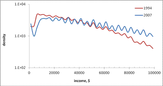
Another way to address this problem is to estimate the density of households in all income bins.  Figure 3 displays the number of households in a given bin normalized to the total number of households in 1994 and 2007, respectively.  The income bins in 2007 are also scaled as discussed above.  Therefore, the graphs present the portion of household in a given bin.  The 2007 curve is below that of 1994.  The reason is simple – bins are different in 1994 and 2007. In order to compare curves in Figure 4 in an appropriate way, we have to calculate the distribution density, i.e. the portion of households per $1. In Figure 5 we normalized the curves in Figure 4 to their respective widths and obtained two density curves, which are very close.   The 2007 curve seems to be higher at lower incomes and lower at higher incomes. Therefore, the average size in 2007 has to be smaller than in 1994 because the density of households at higher incomes fell since 1994.  Economically, this is an expected result – when broken, high-income households create sustainable households. The assumption of the low-income households split due to poverty would result in the same portion of high-income households in 2007 and a sharp peak at very low incomes.  
Figure 6 shows cumulative curves from Figure 5. The deviation becomes higher with income and then the curves converge to 0.008 (1/$1250 the width of 1994 bin). This is a version of Lorenz curve which shows a higher Gini for 2007 because of lower density of the high-income households. We cannot continue the curves beyond $100,000 ($59,523 in 2007) since no size distributions are available.  (As always with the CB and other statistical agencies.)  This is one of the reasons for economics not to be a hard science. Measurements are made (or published) by a March hare.

Figure 1. The mean household size as a function of income for 1994 and 2007.

Figure 2.  Mean household size as a function of scaled bin width.

 Figure 3. Income distribution for households in 1994 and 2007.

 Figure 4. The portion of the households total number in a given bin.

Figure 5. Household distribution density, i.e. the normalized number of households per 1$ (in 1994), in 1994 and 2007.

Figure 6. Cumulative distributions from Figure 5. The 2007 curve is higher for lower incomes and lower for higher incomes. It has to intesect the red line at the level 0.008  at the highest income for one household, which is not reported by the CB.

9/16/12

The size of household and the rise in Gini ratio from 2010 to 2011

Yesterday, I showed that the average size of household in the US has been decreasing since the start of measurements in 1967. This is the reason behind the decreasing average household income and increasing Gini ratio. The Census Bureau (CB) should not publish these figures without correction for the average household size. The reported values are definitely biased and used for political games. This is unacceptable for a nonpartisan statistical agency.  

The CB does publish the size distribution of households and the mean household size. For 2011 and 2010, Figure 1 shows the number of households in the USA. It is worth noting that both numbers are obtained as a projection from the figures obtained during the CPS (around 75,000 households selected in a “scientific” way) with population controls taken from the 2010 census. The number of households is not a directly measured value!  From Figure 1, one can observe that the number of one- , two-, and three-person households increased from 2010 to 2011. Obviously, smaller households should be characterized by lower incomes. Therefore, more low-income households should produce higher inequality raising the share of low-incomers. 

However, the total number of households also grew from 2010 to 2011 and one needs relative values instead of absolute in order to estimate the input of household size. Figure 2 shows the probability distribution function for two distributions in Figure 1, i.e. the original distributions normalized to the associated total numbers. One can observe that the share of two and three-person households increased with the portion of one-person household slightly smaller in 2011.  

The Census Bureau also publishes the average household sizes. In 2010, it was 2.58 per household and only 2.55 in 2011. (In my previous pos , I used the total household population, and the CB likely used the civilian population to estimate the size. ) The mean size fell by 1.2% with the Gini ratio increased from 0.47 to 0.477, i.e. by 1.4%.  As we discussed before, the change in mean size should manifest itself in increasing Gini ratio. This is the reason for the step in the household Gini ratio as observed in 2011.

Figure 3 depicts two distributions of Gini ratio as a function of household size: for 2010 and 2011. These figures are borrowed from the CB.  Except the one-person households, Gini ratio increased for all household sizes in 2011.  Interestingly, the rise in Gini ratio in two groups with different average incomes does not necessary result in increasing Gini ratio for the joint group. The increasing inequality may be accompanied by decreasing difference between the average incomes and thus reduce the overall income dispersion.

Figure  1. The number of households (thousands) as a function of size. All households with seven and more people are gathered in one bin “7+”.

Figure 2.  Probability distribution function for the distributions in Figure 1.

Figure 3. Gini ratio as a function of household size.

9/15/12

Income inequality for households: a long biased history of Gini and mean income. The Census Bureau's failed again


The Census Bureau measures incomes and reports figures. Experts discuss and panic. The fame depends on the claim of disaster with inequality. It must grow; otherwise economic commenter would lose public power. Who is interested in the topic when no change is observed?  Let’s try to dig into raw data and find the reason for the observed tendency. Our first point is that the Gini ratio ( the most famous measure of inequality)  for personal incomes reported by the Census Bureau from the very same data set (CPS ASEC conducted every March) does not change much since 1994. Figure 1 reproduces the Gini ratio, which varies from 0.494 to 0.512 – a relatively narrow window.

Figure 1 .  Personal incomes:  Gini ratio evolution since 1994.

In Figure 2, we present  a sad history of Gini ratio for households.  We intentionally normalized the ratio to its maximum value (0.477 in 2011) in order to show that this inequality measure has risen by 20% since 1967. This dramatic increase is interpreted as harm for the US. Unlike personal incomes, the household data are collected for entities which can evolve in size. (A person always has a unit size.) The Census Bureau does not explicitly reports the distribution household sizes and one has to make an own estimate, which is easy, however. Figure 3 presents the total household population (different from civil population or residential population) and the number of households reported by the CB.  Figure 4 depicts the evolution of the average household size since 1967. Actually, it was quite spectacular: from 3.2 in 1967 to 2.49 in 2011.

Does it matter for the income inequality?  Sure - yes. The simplest ways is a household split - instead of one big household one gets two smaller households. The Gini ratio depends of the distribution of sizes. More low-income households result in a higher Gini ratio. The fall in  average size says that one gets more and more smaller households over time  and … the Gini ratio increases accordingly. There is no linear link between the average size and the Gini ratio but Figure 5 shows the product of the Gini curve for households and the curve in Figure 4. Now we see a corrected Gini history.  This corrected Gini is not fully compensated for the household size changeover time but  tells a different story to the educated audience: the Gini for households has not been changing since the 1970s. In 1993, there was a revision to income definition and all time series were subject to dramatic chances. This step is fully artificial.
Overall, the Gini ratio for households has not been changing as the CB estimate say because these estimates do not take into account the change in household size distribution.
This is a methodological (i.e. unprofessional) mistake. 
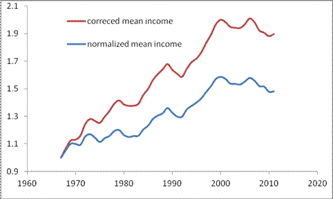
The same corerction logic must be applied to the family income distribution  - also biased in its current version.  Another sufferer is the mean (and aslo median) income.  Since the size of household has been decreasing the number of households has been growing faster than the total household  population.  The mean household income must also be corrected for the  changing size.  Figure 6 shows the actual evolution of the mean income (median income is harder to recover).  The history is much brighter than many experts would like to comment on. 

Figure 2. The evolution of normalized Gini ratio for households.

Figure 3. The evolution of total household population and the number of households (both in thousands)  

Figure 4. The evolution of an average household size.

Figure 5. Corrected Gini ratio.

Figure 6. The growth of normalized (household ) mean income and that corrected for the fall in the household average size.

Drang nach Osten — «натиск на Восток»

ИИ гугла написал « Drang nach Osten — «натиск на Восток») — это исторический термин, обозначающий германскую экспансию на славянские и восто...