9/24/24

Inflation and the Fed rate decisions between 1954 and 2024. Should we expect recession?

Abstract

A strict linear proportionality between the CPI inflation and the actual interest rate defined by the Board of Governors of the Federal Reserve System is studied. During the last 70 years, the cumulative CPI is just the cumulative interest rate  times 1.37. There are periods when the Fed interest rate deviates from the long term inflation trend driven by the CPI. In this paper, we use the observational dataset provided by the Economic Resources & Data  of the Federal Reserve Bank of St. Louis. The difference between the cumulative curves of the CPI and the Fed rate divided by 1.37 is periodic. The recessions observed after 1955 are well synchronized with the kinks and turns in the difference curve. The most recent recession as related to the peak in the difference was expected in 2020, but was likely mixed with the COVID-19 induced recession. The current Fed rate is not high enough to return the difference to the zero line in before 2030-2040.


Observations

The CPI and the Federal Funds effective rate data between 1954 and 2024 are available from the Economic Resources & Data of the Federal Reserve Bank of St. Louis [1]. In Figure 1, we depict the effective rate, R, and the monthly estimate of the consumer price inflation, CPI, for the previous 12 months (not seasonally adjusted). One can see that R lags behind the CPI since 1980, i.e., inflation grows at its own rate and R has to follow up. The idea of interest rate is that a higher R should suppress price inflation when it is high due to the effect of expensive money. During the low inflation or deflationary periods with slow economy, low (in some countries negative) R has to channel cheap money into the economic growth. The reaction of inflation is also expected not immediately but with some time lag.


Therefore, the idea of the Fed rate influence on the consumer price inflation is based on some cumulative effect of the change in money price for the economy. It would be instructive to look into the cumulative curves of both the CPI and the Fed rate in an attempt to confirm the influence of the latter on the former parameter. The cumulative influence of the interest rate should produce a desired effect in the long run and inflation should go in the direction towards the values acceptable for the FRS. Figure 2 displays the cumulative curves of the monthly estimates of R and CPI. At first glance, both curves are very similar and evolve in sync but at different rates, i.e., with different slopes.


We have estimated the best coefficient to fit both curves as 1.37 (interestingly, this is similar to the fine structure constant α=137 in physics). Figure 3 displays the resulting curves. We have added vertical lines to present the recession periods as reported by the National Bureau of Economic Research (NBER) Business Cycle Dating Committee [2]. This is an intriguing plot. In the long run, the R curve fluctuates around the CPI one and returns to it. (We consider CPI as an independent endogenous economic variable.)


Finally, Figure 4 presents the difference between the cumulative curves. Most recently, this difference peaks in March 2023 and then slightly falls. This peak was expected and is a genuine reaction of the Fed to the dramatic surge in inflation during and after the pandemic. The money pumping into the economy was extraordinary, and money devaluation was a natural reaction. The peak in the difference in March 2023 was 3 quarters after the technical recession: two subsequent quarters with negative growth rates in Q1 and Q2 2022. If to consider the Fed behavior as based on rules and precedents, one can expect that the positive deviation between the inflation and the Fed rate curves has to be closed within the next 20 years. The Fed rate has to be higher than CPI inflation times 1.37.  


Figure 1. The monthly estimates of the Federal Funds effective rate, R, the rate of consumer price inflation, CPI, between July 1954 and August 2024.


Figure 2. Cumulative values of the two curves in Figure 1.

 The broader picture in Figure 4 is even more interesting to discuss in details. Firstly, the difference is very close to periodic behavior. The previous peak was near 1980, i.e., ~45 years ago.  The previous trough was observed in the beginning of 2000s. The amplitudes of the peaks and troughs are similar: from 1.8 in 1980 to 2.0 for the most recent. The amplitude of the latter could be an artifact of the longer zero-Fed-rate policy during the very slow recovery after the 2008 recession and the COVID-19 pandemic.

When looking into the recession periods observed since 1955 and comparing them with the kinks and turns in the CPI-Fed rate difference in Figure 4 one may have an impression that the former are most often coincide with the latter. The only important exclusion is that the 2023 peak was not marked any recession. The 2020 recession is exogenous and fully related to the COVID-19 pandemic. Or not? Can it be that the peak in 2023 is not linked to a new recession, but the 2020 recession was forced by the expected 2020 CPI-Fed rate peak smashed by the Fed actions forced by COVID-19?


Figure 3. Same as in Figure 2, but R is divided by 1.37. Vertical lines present the recession periods as reported by the National Bureau of Economic Research (NBER) Business Cycle Dating Committee.


Figure 4. The difference between the CPI and R curves in Figure 3.

The 2023 peak was artificially high, but it has to be followed by a fast fall in the difference. With high inflation in 2022-2023 the Fed rate has to be high as well. It seems this rate was not high enough to suppress inflation in sense the lower and earlier peak in the difference and further drop according to the slope observed in the 1980s. With the Fed decision to quickly reduce the interest rate in the next 4 to 6 quarters, one can expect that the difference will not be falling at all. The effect of high difference during extended periods is not clear, but the difference has to come back to the zero line at some point in the next 10 to 15 years. One needs to follow these phenomena.


References

1.  Economic Resources & Data  of the Federal Reserve Bank of St. Louis (Consumer Price Index for All Urban Consumers: All Items in U.S. City Average (CPIAUCSL) | FRED | St. Louis Fed (stlouisfed.org)). Retrieved on September 15, 2024.

2. The National Bureau of Economic Research (NBER) Business Cycle Dating Committee. Business Cycle Dating | NBER. Retrieved on September 15, 2024.


9/22/24

The USA and Russia are the leaders in the immigration because the real economic growth is linear. Not exponential!

 The speed of economic growth is often discussed as being exponential. This mean that the growth rate is constant, i.e. the percentage of growth is constant per year. The figure below demonstrates that the growth was linear in the developed countries (two periods are obsereved, however). This is the ecolotion of real GDP per capita. It removes the popualtion growth that was exponential in the US, for example (>1% per year). Personal growth was linear, i.e. a person has constant increment of real GDP (income) per year. This makes the rate of growth to be an inverse fucntion of the attained level of GDP per capita. The rate of real economic growth has been decaying as an inverse fuction of GDP per capita, which is practically the inverse function of time considering the linear GDP pc growth. There is no possibility to retain constant rate of (total) real GDP growth when population does not grow. In the 21st century, the USA suffers very low population growth below 1% and even 0.5% per year. Biden has successfully resolved this problem - immigramtion! Russia also has a very high input from work immigration. Both countries are attaractive for people looking for work and better life.


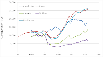
Kazakhstan is slightly better than Russia in real GDP per capita growth in the 21st century!

Among the independent (Baltic states are not idependent as having large EU subsidies) post-Soviet countries Kazakhstan (according to the Maddison Project Database) outperfroms (by a small margin) Russia in the 21st century (2000 to 2022). Figure 1 compares Russia, Kazakhstan, Azerbaijan, Armenia, and Moldova. The latter 3 countries are poor, even Azerbaijan, which showed excellent results in the 2000s.  Figure 2 illustrates the fact that Azerbaijan is still much better than Moldova and Armenia - bad post-Soviet era perfromers.


Figure 1. The growth of real GDP per capita since 2000. 


Figure 2. Real GDP per capita in 5 countries as listed by the MPD.


Real GDP growth in India 20 years ago

In 2008, I published a paper on real GDP per capita in developed countries and also mentioned some developing ones. The main finding was that (in 2003) China has reached the pace of the most developed countries in the world and India was far-far below its potential growth rate which was >15% per year considering the per capita GDP values.

Citation from this paper:

"Developing counties also can be evaluated according to their compliance to the principal 

characteristic for developed countries. One may often hear about a “fast” growth of some 

developing countries like China and India. There is not criterion, however, to compare their growth 

rate to that expected in the USA, for example, at the same level of economic development. Using 

the mean increment, one can easily estimate a pace for any developing country compared to that 

observed in the developed world. For China, India, and the USSR, the increment evolution 

compared to that for France is represented in Figure 27. One can see that the countries demonstrate 

the per capita GDP increment far below the French mean value (1990 dollars are used as only 

available for all the countries). Having an intention to catch up a developed economy, any 

developing country has to analyze its time history of the GDP per capita increment [Kitov, 2005b]. 

No deficiency has to be allowed on the way to prosperity because any gap is created forever judging 

from the history of such successful developed countries as the USA, France, and others."

Fig. 27. GDP per capita increment for China, India and the USSR for the period between 1950 and 2003 compared to that for France. GDP is expressed in $ 1990, the only available estimates for the non-OECD countries. India is far below the mean increment for France, but China has just reached the pace of leading developed countries. For the period of existence (between 1950 and 1990 in the study), the USSR was only about a quarter as effective as France.


Baltic countries are the major beneficiaries of the EU

The Baltic states are the main gainers in the 21st century. They are by far above top European economies as the figure below shows. Lithuania is even above Russia! How can it be possible?


India is an economic loser, Italy much worse, and Ukraine is catastrophically bad

The next step in the economic comparison after the two previous posts is to find a country even worse than India and Italy. This is Ukraine. As of 2022, its total real GDP per capita  gain in the 21st century was $2998. Italy had  $4884. Interestingly, Ukraine was on a healthy growth path before 2006-2008. Shame on the Ukrainian leadership. 


India is an economic loser of the 21st century but Italy is much worse

 In my previous post, India was mentiones as an economic loser of the 21st century. It's a true statement considering the four largest (real GDP PPP) economies. There are, however, other economies of interest. I published a paper in 2021 "Real GDP per capita: global redistribution of economic power" describing all economies with estimated GDP in terms of real GDP per capita and presented the case of Germany as the vampire of the EU and the other economies as its victims. In 2024, the situation is almost the same with the only change - Germany stalled in eocnomic development. Figure 1 compared the growth in real GDP pc in 8 economies since 2000. The leader is still Russia, but the main loser is Italy with only $4884 added in the 21st century to personal GDP pc. India has $5058 !  

The UK and France are still in the underperformance mode.

Figure 1. GDP per capita since 2000 in 8 countries.


Он раб моды ...

"  Вот, например, когда в моде было загорать, он загорел до того, что стал черен, как негр. А тут загар вдруг вышел из моды. И он решил...