On December 19, I published a post discussing the major global powers and the near-future competition between the USA and the implicit China-Russia alliance. I have mentioned the competition for the most important and very narrow straits and channels - Malacca, Panama, and Suez. On December 22, Guardian published an article on the more aggressive protection of the Malacca strait (called the South China Sea in the article) by the US Navy. Psychologically, it is obvious that aggressive behavior (e.g. barking) is a feature of weakness and fear. Stronger dogs bite first and then bark. It seems that the US is losing the strait of Malacca.
12/25/20


Italy and France have to leave the EU because of negative effects on their real economic growth
Brexit forces us to think about the future of the EU. We have presented a series of posts analyzing economic growth in selected countries using one invariant - constant annual increment in the real GDP per capita. This invariant defines the inertial part of real economic growth as observed in all large developed economies since the 1950s (no accurate data before). Statistical analysis demonstrates that this invariant is actually a constant for a given country but varies between the countries. Therefore, it might be used to evaluate the relative performance of a given country.
Figure 1 compares several EU countries and splits the
period from 1960 to 2018 into three sub-periods: 1960-1979, 1980-1999, and
2000-2018. Statistically, variations in the annual increment in the GDPpc between
these periods are important for the estimates of the linear regression, i.e.
the long-term behavior. For example, France and Italy demonstrate a significant
decrease in the average increment from around $600 in the first period to $330
in France and $160 in Italy between 2000 and 2018. We have formulated this
decay in terms of the gradual loss of economic competitiveness (efficiency) compared
to Germany within the EU. This situation is likely fixed and neither Italy nor
France is able to get back to the pre-EU level. The case of the UK, which is also demonstrating
lower performance than Germany and the Netherlands, gives a reasonable solution –
to leave the EU and fight for the efficiency out of the EU bureaucratic framework
which they actually do not control. Portugal and Spain should probably join such
a move. If the EU is a multi-speed union
then Italy and Portugal are driving in first gear.

Figure 1 Real
GDP per capita (2011 prices) in selected EU countries. Data are obtained from
the Maddison Project Database.
12/24/20
Russia and China successfully fight for own piece of the global economic profit. This fight may come to a hot stage
In our previous posts, we formulated and illustrated the idea that the countries with larger annual increment of the real GDP per capita, GDPpc, are also characterized by the CPI growing faster than the GDP deflator. The most striking examples of such dependence are the USA and Japan. In support of these observations, the most unsuccessful countries with low annual GDPpc increment are characterized by faster growth in the GDP deflator, e.g. Italy.
In this post, we analyze Russia and China within the
same framework. Figure 1 compares both countries with Germany for the period
between 1995 and 2018. The OECD provides dGDP data for this period and Russia
started an independent economic history in 1991. In addition, the drop in real GDP
between 1991 and 1998 in Russia was related to the
transition from socialism to capitalism. The curves in Figure 1 demonstrate
that all three countries were successful in real economic growth since 1995 and
can be considered as having “strength”
needed to participate in the division of global profit. Obviously, there are
several countries fighting for the global/regional economic dominance and the highest benefits in non-equivalent exchange of goods and services, which is
called robbery in normal life. Just a few countries have the potential to continue
with (nuclear) armed brigandage. In the world of shrinking marginal profit, these
countries will likely be the winners in the future Darwinian competition.

Figure 1. Annual increment of the real GDP per capita in Germany, Russia, and China between 1995 and 2018. The average increments are presented. All three countries belong to the club of successful economies since 1995.
There is an important signature of a successful economic player – CPI curve above the dGDP one. Figures 2 and 3 present these curves for China and Russia. Within the limited period since 1993, China has a segment with the dGDP above the CPI curve, but since 2004 the situation is the opposite and the CPI is growing faster. For Russia, the CPI and dGDP were very close before 2004, and then the same pattern as in China and other successful economies is observed.
Therefore, China and Russia are two countries that definitely joined the club of economies with large enough “strength” to participate in the process of division of global economic profit. The club extension is not welcome by the old club members and we currently observe the fight for dominance. Potentially, it may go to a hot war stage, and nowadays is the best time to check that “gunpowder is dry”. Marx said - “ …100 percent will make it ready to trample on all human laws; 300 percent, and there is not a crime at which it will scruple, nor a risk it will not run, even to the chance of its owner being hanged.”

Figure 2. CPI
and dGDP price growth in China since 1993 (OECD data available)

Figure 3. CPI
and dGDP price growth in Russia since 1995 (OECD data available)
12/23/20
“ No division can be effected otherwise than in “proportion to strength”, and strength changes with the course of economic development”: Germany
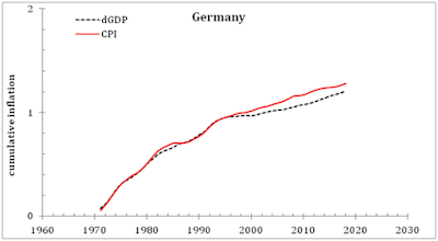
In this post, we present significant breaks in the linear dependence between the CPI and dGDP (i.e. between two measured time series) in Germany as related to new definitions of inflation. The case of Germany, however, has a very specific meaning – this country is the economic leader of the European Union. In the Annex below, we present an independent opinion on the behavior of economic leaders, including Germany, formulated 105 years ago.
Figure 1 presents 4
panels illustrating the process of the definitional break findings as applied
to Germany. Panel a) depicts two inflation curves – for CPI and GDP deflator.
One can see that the CPI curve is slightly above the dGDP curve from the mid-1990s.
Panel b) presents similar curves, but for cumulative inflation as the running
sum of inflation readings. The slightly higher CPI inflation is now producing a significant deviation of the cumulative curves. Pane c) shows the difference
between the curves and panel a) and panel b). The difference between the two
cumulative curves reveals a break followed by deviation as a linear function of
time. Using the slope of the difference, one can calculate the coefficient of the linear
correction (1.5) needed to fit the CPI and dGDP curves. Panel d) shows the
original CPI curve and the corrected dGDP curve, i.e. the dGDP curve multiplied
by a factor of 1.5 since 1997. There is still some deviation between the curves
after 2013. It might be a manifestation of a new break. We are going to follow
the new deviation and will report on it in the future. The presence of
definitional breaks is similar to those observed in different countries.
However, timing and circumstances related to the ECB creation win the
headquarters in Frankfurt make the case of Germany suspicious. We wrote about
the potential benefits of German leadership in previous posts. Here, we are
going to support the case.
Figure 2 depicts curves
of the real GDP per capita growth in several European countries between 1960
and 1996. In order to provide a consistent
view of the total growth, we normalize all curves to their respective (GDPpc) levels
in 1960. Two champions are Spain (ESP) and Portugal (PRT), and this is natural
because of the low GDPpc level in 1960 in both countries. Germany (red line) is close to the bottom
together with the Kingdom of the Netherlands (NLD) and the United Kingdom. Figure
3 displays similar curves but for the period between 1997 and 2018. Since 1997,
Germany (DEU) is by far the leader of the race. Cumulative GDPpc growth is 1.51
compared to the second place occupied by NLD - 1.42. It is important that the agreement
of the ECB was signed in 1997. Instructively, Italy and France are much close
to the bottom of the list. The UK is in the middle. As we mentioned in previous
posts, the higher is the real GDPpc growth rate the lower is dGDP relative to
CPI. Germany, Netherlands, France, and Italy are the best examples.
In Figure 4, I am
trying to understand the influence of EU subventions on East European
countries. The overall real GDP growth since 1997 is spectacular in Poland,
Hungary, and Bulgaria. Their corresponding curves are much above Germany and The Netherlands. One might suggest that the EU financial and other assistance has a positive
impact on real economic growth in these countries. However, Serbia demonstrates
almost the same growth rate since 1997. It might be an indication that the EU
help is not so much effective.

b)

d)

Figure 1. See text for details

Figure 2.
Evolution of GDP per capita normalized to 1960 in selected EU countries between
1960 and 1996.

Figure 3. Evolution of GDP per capita normalized to 1997 in selected EU countries between 1996 and 2018.

Figure 4.
Evolution of GDP per capita normalized to 1997 in selected EU countries between
1996 and 2018.
“A United States of Europe under
capitalism is tantamount to an agreement on the partition of colonies. Under
capitalism, however, no other basis and no other principle of division are
possible except force. A multi-millionaire cannot share the “national income”
of a capitalist country with anyone otherwise than “in proportion to the
capital invested” (with a bonus thrown in, so that the biggest capital may
receive more than its share). Capitalism is private ownership of the means of
production, and anarchy in production. To advocate a “just” division of income
on such a basis is sheer Proudhonism, stupid philistinism. No division can be
effected otherwise than in “proportion to strength”, and strength changes with
the course of economic development. Following 1871, the rate of Germany’s accession of strength was three or four times as
rapid as that of Britain and France, and of Japan about ten times as rapid
as Russia’s. There is and there can be no other way of testing the real might
of a capitalist state than by war. War does not contradict the fundamentals of
private property —on the contrary, it is a direct and inevitable outcome of
those fundamentals. Under capitalism the smooth economic growth of individual
enterprises or individual states is impossible. Under capitalism, there are no
other means of restoring the periodically disturbed equilibrium than crises in
industry and wars in politics.” Lenin V.I., 1915, “On the Slogan for a United
States of Europe”.
New EU members have no chance to catch up the most developed countries
In 2005, we published a paper quantitatively describing the transition of the former socialist countries to a new state similar to capitalism. In 2009, we extended our model and predicted the evolution of real GDP per capita in 27 countries, including two virtual countries: the U.S.S.R and Czechoslovakia. Briefly, despite different social, cultural, ethnical, racial, demographical, religious, and technological histories our model demonstrates general success in the overall prediction between the start point (1989 to 1991) and the year of 2006(7). In all cases, the most accurate prediction is associated with the initial segment of the transition, when socialism was dynamically replaced by capitalism. The initial stage is characterized by the largest changes in the GDP per capita, and thus, provides a wide dynamic range as a crucial condition for accurate modelling.
At later
stages, some exogenous forces, such as economic recession, might disturb the
agreement between measured and predicted GDP, and introduce some bias in the
estimation of the defining parameters. This later stage, however, is of lower
relevance to the transition itself and rather demonstrates the behavior of a
regular capitalist economy.
Here, we
revisit our old predictions and compare them with actual observations with the
real GDP per capita estimates borrowed from the Maddison Project Database. In 2009,
we concluded that the transition process has effectively finished in Central
and East European countries. Thus, the long-term growth rate of GDP per capita
in these countries is limited by the attained level of the GDP per capita, as
in developed countries (see
this post). Any deviations from the long-term rate can be explained only by inefficient economic performance. In
fact, many developed countries are characterized by lower values of an economic trend than that in the U.S. at the same level of GDP per capita. We
assume that the future economic growth in the FSC will follow either the potential or current value of the annual GDPpc increment. When no inefficiency
is allowed, the best-case scenario of economic growth is realized.
Figure 1 displays
Figure 10 from the 2009 paper - the past and future evolution in Hungary and
Poland compared to that the U.S. All other FSC have time histories similar to
those in Hungary and Poland, but with different initial values and actual
slopes. In the current study, all theoretical slopes are equal: A=$370, i.e.
annual increment in GDP per capita is $370 (1990 $).
The U.S. theoretical
curve with A=$370 is much higher. Before 2008, it had no prominent horizontal
or downward segments, as observed in Hungary and Poland. In 2008, the recession
moved the US GDPpc curve down and it was below the theoretical curve as Figure
2 shows. In Poland, the stagnation process started in the late 1970s. Hungary
is characterized by a shorter period of weak performance. Apparently, the years
between 1950 and 1989 are characterized by a lower rate of economic growth with
an increasing gap between the FSC and the U.S. The best-case scenario would
allow maintaining a constant lag behind the U.S., X. In relative terms, the lag
will decrease as a function GFSC/(X+GFSC), where GFSC
is the GDP per capita in a given FSC.
Figure 2 compares the predicted
and observed GDPpc curves in Hungary. The MPD data (2011 prices) are used
instead of the TED. All MPD readings are reduced to 1990$. The drop in the US
curve was observed in 2008. The upper panel of Figure 2 shows the 2016 revision
with TED data and the lower panel uses the MPD data. There is some discrepancy
in the GDP per capita estimates in 2016 and 2020. The observations show that
the economic performance in Hungary has been approaching its perfect trajectory
with A=$370 (1990$) since 2012. Figure 3
presents the case of Poland, which shows a better performance likely related to
the EU financial support. Figure 4 is for Bulgaria.
Overall, our prediction
is still valid – the new EU countries lag behind the US and this lag will not
be closed any time soon.


Figure 1.
Upper panel: The evolution of per capita GDP in Hungary compared to that in the U.S. The gap between countries has been increasing since


Figure 2. Comparison of
predicted and observed GDPpc curves in Hungary. The MPD data (2011 prices) are
reduced to 1990$. The drop in the US curve was observed in 2008. The upper panel
shows the 2016 revision with TED data and the lower panel uses the MPD data. There
is some discrepancy in the GDP per capita estimates in 2016 and 2020. The observations
show that the economic performance in Hungary has been approaching its perfect
trajectory since 2012.


Figure 3. Same as in Figure 2 for Poland


Figure 4. Same as in Figure 2 for Bulgaria
Economic comparison: Ukraine vs Russia. Real GDP per head in Ukraine is still below the 1989 level. Russia doubled the GDP per head
In 2014, we compared the evolution of real GDP per head in Russia and Ukraine since 1980. The Total Economy Database (TED) of the Conference Board was used. In this post, we revisit our estimates from 2014 with a new dataset – now TED is replaced by the Maddison Project Database (MPD). Three figures below present different sides of the relative evolution. The upper figure shows the absolute GDP per capita values since 1980, and the Russia curve is still much above Ukraine. In 2018, Russia had $24,669 (2011 prices) and Ukraine only $9,813. The growth is absent in Ukraine since 2008 and the level observed in 1989 ($10,082) has to be reached in the future. The middle (both curves normalized to 1980) and lower (both curves normalized to 1991) figures show that the real GDP per capita in Russia is by a factor of 2.05 larger in 2018 than in 1991 and by a factor of 2.01 compared to 1980. The actual problem is that this lag is forever.


12/22/20
Real GDP is likely not correct as the inflation estimates are weird
We revisited several times our original post published in 2011 on biased metrology of macroeconomic measurements. New data are needed to validate the original hypothesis or to reject it. It is important to retain in mind that economics as science often fails and gives counterproductive results due to inaccurate or biased measurements of the most basic macroeconomics variables – price inflation, labor force, unemployment, nominal GDP. In one of our previous posts, we focused on the estimates of real GDP in the USA before and after 1979 and here we extend the US case by several other cases. As mentioned before, we have devoted enough efforts to reveal and recover many trivial cases in our book “mecħanomics. Economic as Classical Mechanics”.
Real
GDP (see Concepts and Methods of the U.S. NIPA for details) is the difference between nominal GDP
and GDP deflator (price index). The latter is not easy to calculate or even
evaluate. In this post, we showed that it is so much a sophisticated problem that before
1980 there was no practical difference between the cumulative inflation values
of the CPI and the GDP deflator in the US, as originally was demonstrated in Figure 1 of the 2011 post. (The cumulative inflation, i.e. the cumulative sum
of inflation rates, is different from the price index when differently calibrated
in the beginning.)
In this post, we are trying to find significant breaks in the linear dependence
between the CPI and dGDP (i.e. between two measured time series) as related to new
definitions of inflation. It is important that our observation of a linear
relationship between CPI and dGDP in the USA is also valid for other studied
developed countries. For our model of the linear and lagged relationship between labor force, unemployment, and inflation, such definitional breaks in economic parameters are equivalent to
the breaks in the statistically estimated relationship. In other words, the
breaks in the general relationship are not related to the change in the economic behavior
of the involved parameters. These breaks are fully artificial and induced by major
economic agencies (BLS, BEA, etc.) on their eternal way to perfect definitions
of economic variables.
Figure
1 presents the case of the USA (here we use the OECD data) : upper panel - CPI and dGDP inflation rates since 1971; middle panel –
price change with time relative to 1970 (both variables are normalized to their
respective 1970 levels); lower panel – the difference between the curves in the
middle panel. We have changed the
reference year for the USA from 1929 to 1970. Effectively, the CPI and dGDP curves
in Figure 1 diverge from 1978. As we have already mentioned many times, before
1978 the CPI was used to estimate of the overall price inflation. Since 1978,
the GDP deflator has been used. The difference between these two variables cannot
be neglected: the cumulative price change between 1978 and 2018 is 1.3 units or
25%. The lower panel of Figure 1 demonstrates that the cumulative CPI and dGDP price
change differences is very close to linear dependence. As we reported before,
the coefficient of linear dependence is 1.2 for the USA data (BLS and BEA). For
the OECD data, the coefficient is 1.26, i.e. another set of definitions is used
by the OECD.
Figure 2 presents the same curves as in the middle panel of Figure 1, but the dGDP time-series is multiplied by a factor of 1.26. Now, the fit between the two curves is almost perfect. There is a small deviation from this linear link after 2008. It might be related to the formation of a new link after some change in dGDP definition in 2008. The potential change in the regression coefficient related to the period after 2008 is small and one has to wait for new data to estimate this coefficient statistically. In Figure 3, we present a tentative model with the dGDP additionally (to 1.26) multiplied by 0.8 after 2008. The fit is much better and the total multiplication factor compared to the pre-1978 definition is 1.008, i.e. practically 1. Are we in the pre-1978 definition era again? When analyzing the linear and lagged dependence between labor force, unemployment rate, and the inflation we have to introduce “non-structural” or artificial breaks (structural breaks are equivalent to the change in economic behavior) in 1978 and 2008.


Figure
1. Upper panel: The evolution of the CPI and GDP deflator in the USA since 1970
according to OECD data. The CPI
inflation curve is higher than the GDP inflation one. Middle panel: Cumulative price
change according to price indices: CPI and GDP deflator. Lower panel: The
difference between curves in the upper (running) and middle (cumulative) panels.

Figure
2. The evolution of the cumulative inflation (the sum of annual inflation
rates) for the CPI and GDP deflator in the USA since 1970. The dGDP is
multiplied by a factor of 1.26.

Figure
3. Same as in Figure 2, but the dGDP after 2008 is additionally multiplied by a
factor of 0.8. In fact, the total
multiplication coefficient (1.26*0.8) = 1.0, i.e. the same as before 1978.
Figure
4 presents the case of the UK. Panel a) repeats the plot published
in 2011. We reported the deviation between the CPI and dGDP since 1978 as
in the USA. Panel b) presents the same case with the OECD data for the period
between 1955 and 2018. One can see a clear kink in the dGDP curve between 1994 and 1996, which is
absent in panel a). This is likely a later OECD revision. Interestingly, the
dGDP curve is above the CPI one. In the USA, the order is the opposite. The
difference between the CPI can be overcome by two corrections: the dGDP is multiplied by a factor of 0.98 since 1978, as
shown in panel c), and the kink is corrected by a constant -0.055 – panel d).
As a result, the overall fit since 1955 is excellent and we have to take the
break in 1978 into account when assessing our model statistically.
a)

b)

c)

d)

Figure 4. The case of the UK. Described in the text.
Figure 5 presents the case of Austria. The cumulative price change (CPI and dGDP) curves in panel a) demonstrate the start of deviation around 1990. Panel b) shown the running (inflation) and the cumulative difference between the curves in panel a). The pivot point is 1991. We have corrected both time periods – before and after 1991. The pre-1991 period has a very small multiplication factor of 1.005 and the after-1991 period is the best fit with coefficient 1.17 – panel c). The model linking the dGDP inflation with labor characteristics definitely needs a data-driven brake in 1991.
a)

b)

c)

Figure
4. The case of Austria. There is a break in 1991.
Figure 5 presents the Kingdom of the Netherlands. The CPI curve is above the dGDP one. The relatively good fit between the curves needs three breakpoints – 1982 (coefficient 1.2), 1997 (0.8) (both changes are shown in panel c), and 2009 (2.0) - panel d).
a)

b)

c)

d)

Figure
5. The Kingdom of the Netherlands
In Figure 6, we present Japan. The CPI is above the dGDP – panel a). The cumulative difference in panel b) is an almost linear function of time. The multiplication factor between 1974 and 2018 is 1.25, but the CPI is constant after 1996 – panel b). This constant can be fit only with a 0 linear coefficient or a constant added to all dGDP or CPI inflation readings after 1996. In panel d) we added -0.011 to each reading of the CPI inflation since 1997 and obtained a good fit between the CPI and dGDP. We are sure that the Japan Statistics did not add 0.011 to the CPI inflation estimates in order to keep it above 0. It would be a good trick to avoid formal deflation, which is observed in the dGDP since the mid-1990s, but it would be a bad trick for the economic models we have been developing for Japan.
a)

b)

c)

d)

Figure 6. Japan
Italy is a perfect case with one constant describing the whole difference between 1970 and 2018. Figure 7 presents the original CPI and dGDP time-series – panel a), the difference – panel b) and the overall fir when the dGDP is corrected by a factor of 0.94. The overall fit is excellent through the studied interval and no breaks are needed in the model. For Italy, the CPI is below the dGDP curve.
a)

b)

c)

Figure
7. Italy
Subscribe to:
Posts (Atom)
-
 These are two biggest parts of the Former Soviet Union. To characterize them from the economic point of view we borrow data from the Tot...
 -
These days sanctions and retaliation is a hot topic. The first round is over and we will likely observe escalation well supported by po...
-
 Yesterday I missed the absolute hero of deflation in the US – the consumer price index of information technology, hardware and software (see...