12/14/20

Growth rate of the GDP per capita revisited. 4. Developed countries - cntd

In this section, we present the results of real GDP per capita analysis for eleven developed countries: France, Italy, Japan, Netherlands, Spain, Sweden, Switzerland, UK, USA, New Zealand, and Germany. This set includes economies of different sizes, start conditions in 1960, and the rate of growth as represented by the annual increment of real GDP per capita. The period of data coverage is the same as in the previous posts: from 1960 to 2018. The data are borrowed from the Maddison Project Database. The biggest economies, which can be considered as complete is a sense of all principal industries and services developed at a high level (the USA, Japan, the UK, France, Italy, Spain) are characterized by the trend in the annual increment to be close the average increment (dashed red) line or negative (i.e. the linear regression slope is close to 0 or negative). Germany is one of the biggest economies, but it has a reunification history and the accuracy of the joint statistics might be slightly biased. 

Some mid-size economies with only several specific sectors of industry and/or services well developed (e.g., Sweden, Switzerland, Netherlands, etc.) may currently have positive trends in the annual GDPpc increment.  Instructively, the period of high-speed growth in these successful countries was observed between the mid-1990s and mid-2000s. Between 2008 and 2018, all developed countries slightly underperform. The current economic fall will extend the underperformance period further in the 2020s. The smallest economies are not specifically analyzed here as they are fully controlled by the overall economic conditions and have no opportunity to influence global economic growth. For example, smaller oil-producing countries fully depend on oil prices, which, in turn, are driven by global demand.

 Overall, the concept of constant annual GDPpc increment is supported by the MPD data. In the long run, the biggest (complete) developed economies all demonstrate a decaying rate of economic growth as expressed by our model of inertial economic growth of the real GDP per capita. At the same time, these countries are characterized by quite different economic performance as represented by the mean annual increment. For example, the average annual GDPpc increment in the USA is $643 per year (2011 prices) between 1960 and 2018, i.e. every US citizen virtually gets every year by $643 dollars more than in the previous year (we do not discuss the disparity in income distribution in this post). In France, the average increment is only $461 and, in the long run, the US citizens become richer than the French citizens. This difference increases in time but the growth rate of the GDP per capita may be larger in France because the base (GDPpc level) is lower than in the USA. The difference between actual increment and growth rate deceives French people, who may be confused by the rate as the only indicator of real growth. 

There are a few developed countries that demonstrate exceptional economic growth in the studied period. We are going to discuss these super successful examples in the next post.


Figure 1. France. The upper panel: the annual GDPpc increment between 1961 and 2018 with the average value for the studied period of $461 (2011 prices). The middle panel: the same annual increment as a function of GDPpc level. The lower panel: the relative growth rate of the GDPpc as a function of the GDPpc.


Figure 2. Same as in Figure 1 for Italy.


Figure 3. Same as in Figure 1 for Japan. 


Figure 4. Same as in Figure 1 for the Netherlands. 


Figure 5. Same as in Figure 1 for Spain. 


Figure 6. Same as in Figure 1 for Sweden.


Figure 7. Same as in Figure 1 for Switzerland


Figure 8. Same as in Figure 1 for the UK.


Figure 9. Same as in Figure 1 for the USA.


Figure 10. Same as in Figure 1 for New Zealand.


Figure 11. Same as in Figure 1 for Germany. The period before 1990, i.e. before the reunification,  is characterized by a much lower annual GDPpc increment. Statistics might be slightly biased.


12/13/20

Growth rate of the GDP per capita revisited. 4. Developed countries

 In this section of the series of posts devoted to the evolution of real GDP per capita, we present results of analysis based on the Maddison Project Database (MPD) data. The period of data coverage is 1960 to 2018. Since we have demonstrated the difference between the original (2008) and later (2012) studies based on the Total Economic Database data and the current dataset using Austria and the USA, we are not going to compare the MPD and TED data for other countries. Figure 1 shows three plots for Australia. The upper panel depicts the annual GDPpc increment between 1961 and 2018 with the average value for the studied period of $618 (2011 prices). The middle plot presents the same annual increment as a function of GDPpc level with the same mean value. In the lower panel of Figure 1, the relative growth rate of the GDPpc is a function of the GDPpc, where the relative rate is the ratio of the GDPpc increment and the level at the beginning of the one year period, i.e. the growth rate in 1961 is [GDPpc(1961)-GDPpc(1960)]/GDPpc(1960). The straight average increment (red dashed) line in the middle panel is converted in the line $618/GDPpc(t). Australia demonstrates excellent (much above the average) economic growth between 1992 and 2007. The global recession reduced the rate of growth but did not harm the growth much. The 2020 catastrophic fall induced by COVI-19 may also push the GDPpc growth rate in Australia below the zero line and thus the slope 0.115 $/$ in the middle panel may drop closer to the mean GDPpc line. The Australian GDPpc level in 1960 was $14013 (2011 prices). The start GDPpc value is an important parameter used in this study. Our model suggests that the total growth in a fixed period depends on the start value and the mean annual increment. For the same annual increment, a larger start value results in lower total growth.


Figure 1. The upper panel: the annual GDPpc increment between 1961 and 2018 with the average value for the studied period of $618 (2011 prices). The middle panel: the same annual increment as a function of GDPpc level. The lower panel: the relative growth rate of the GDPpc as a function of the GDPpc.


 Figure 2. Same as in Figure 1 for Austria.

Figure 2 presents the case of Austria. The mean annual GDPpc increment line ($562) is practically the same as the regression line for the increment with a slightly negative slope indicating that the annual increment has been decreasing since 1960. This observation is close to the findings in the previous post, but the years between 1950 and 1959 were less successful for Austria and the slope for the longer period since 1951 is positive and the mean increment is only $547.  The GDPpc level in 1960 was $10391, i.e. is much lower than in Australia.


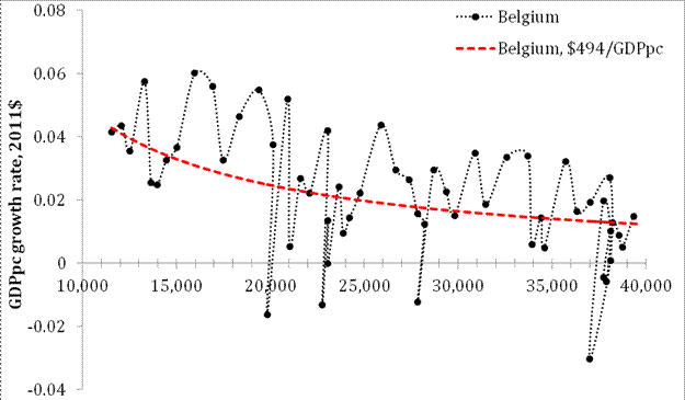
Figure 3. Same as in Figure 1 for Belgium.

 Figure 3 presents the case of Belgium. The mean annual GDPpc increment ($494) is lower than that observed in Australia and Austria for the same period and the GDPpc level in 1960 was $11081, i.e. close to that in Austria.  In Belgium, there were 6 years with a negative growth rate, and the corresponding recessions were slightly deeper than in Austria. This is one of the reasons behind the lower mean annual increment. A similar pattern is observed in Canada (Figure 4), but the mean annual increment is higher $533 and the level measured in 1960 was  $13952, i.e. almost the same as in Australia.


Figure 4. Same as in Figure 1 for Canada.


Figure 5. Same as in Figure 1 for Denmark.

The GDPpc level in Denmark (Figure 5) in 1960 was $14046 and the annual increment between 1960 and 2018 is $556. This is a successful country with a high start value and healthy annual growth.

Growth rate of the GDP per capita revisited. 3. The results from 2007, 2009, and 2012 revisited. The model

 GDP per capita data revisited

We start with a revision of the period after 1950. Originally, we estimated the evolution of annual increment before 2003. Then data for the period between 2004 and 2007 were added the prediction of the model was estimated. In 2012, 4 new readings were added for all involved countries. In 2006, we made a model-based assumption (see Appendix in this post for the model description) that all large deviations from the linear trend in the annual GDP per capita should fade away in the near future. In this post, we claim that this assumption was an extremely successful one and it statistically validates the model of linear GDP per capita growth.

The upper panel of Figure 1 is borrowed from the 2012 paper and presents the comparison of GDP per capita in Austria for the period between 1950 and 2011. The positive slope reported in 2008 (black line, slope=0.012 $/$) decreased between 2007 and 2011 (red line, slope=0.0064 $/$), as predicted. Since 2007, the period of low economic performance with an extended recession resulted in a further decline in the speed of economic growth and the lower panel of Figure 1 shows that the slope (the MPD data are used for this analysis) fell to 0.0014 $/$. In 2018, the linear regression (black) line is not much different from the mean value (red dotted) line.  Figure 2 presents similar analysis made for the USA where the slope for the period between 1951 and 2018 is close to that observed for the period between 1950 and 2011 because the major fall in economic growth was between 2008 and 2010. The mean value between 1951 and 2018 is $569, i.e. slightly higher than that in Austria.


Figure 1. The upper panel: annual increment of real GDP per capita (in 1990 US dollars) as a function of real GDP per capita in Austria for the period between 1951 and 2011.  The regression (red) line slope is $0.0064 per dollar.  For the period between 1951 and 2007, the regression (black) line has a larger slope of $0.012 per dollar. The lower panel: Same as in the upper panel for the period between 1951 and 2018. The slope fell to $0.014 per $ (2011 prices).  The mean GDPpc annual increment value is $547.4. 


Figure 2. Same as in Figure 1 for the USA. The slope for the period between 1951 and 2018 is close to that observed for the period between 1950 and 2011 because the major fall in economic growth was between 2008 and 2010. The mean value between 1951 and 2018 is $569, i.e. slightly higher than that in Austria. 

In the future post we will revisit other countries and present the evolution of annual GDPpc increment between 1960 and 2018. The change is the studied period is justified in the previous post. Our principal aim is to prove that the model we have developed accurately predicts the economic growth in developed countries. Moreover, it gives an unbiased and theoretically justified view on the current rate of relative growth in GDPpc in various countries depending on the GDPpc level. One should not compare the relative rate of economic growth in China (GDPpc is $13102 in 2018) and in the USA (GDPpc=$55335 in 2018). One should compare the annual increments in the GDPpc and corresponding rates predicted by the model for inertial economic growth. In that sense, the USA growth rate is much higher than that observed in China. However, the population in China is 4 times larger than in the USA and this gives an impression of faster economic growth in the former.   

Appendix. The model

Let me repeat the major features of our concept describing the evolution of real Gross Domestic Product (GDP). The principal claim is simple – the growth rate, g(t), of real GDP per capita, G(t), is driven by the attained level of real GDP per capita and the change in a country dependent on a specific age population, Ns. The growth rate of the real GDP per capita in developed countries is characterized by a constant annual increment, A. All fluctuations around this constant increment can be explained by the change in the number of people of the country-specific age: 

g(t) = dlnG(t)/dt  = A/G(t) + 0.5dlnNs(t)/dt                                                                      (1) 

Equation (1) is a quantitative model that has been constructed empirically and proved statistically by cointegration tests.

In economic statistics, usually, the relative growth rate is published, as represented by dG(t)/G(t)=dlnG(t). For the sake of simplicity, we assume that the second term in (1) is zero. Accordingly, the economic system under study is in a stationary or inertial growth, i.e. A/G(t) is “the inertial growth” as in physics. The adults between 15 and 64, i.e. in the working-age population, can be also considered as living in a stationary regime since no dramatic organic and functional changes happen to their life process out of the margins of natural variations.  

For the inertial growth, the real GDP per capita grows as a linear function of time: 

g(t) = dlnG(t)/dt(given dNs(t) = 0)   = A/G(t)

G(t) = At + C                                                                                                                     (2) 

where G (t) is completely equivalent to the inertial growth, Gi(t), i.e. the first component of the overall growth as defined by (1).  Relationship (2) defines the linear trajectory of the GDP per capita, where C=Gi(t0)=G(t0) and t0 is the starting time. In the regime of inertial growth, the real GDP per capita increases by the constant value A per time unit. Relationship (3) is equivalent to (2), but holds for the inertial part of the total growth: 

Gi(t) = Gi(t0) + At                                                                                                              (3) 

The relative rate of growth along the inertial linear growth trend, gi(t), is the reciprocal function of Gi or, equivalently, G: 

gi(t) = dlnGi/dt  = A/Gi = A/G(t)                                                                                     (4) 

Relationship (4) implies that the rate of GDP growth will be asymptotically approaching zero, but the annual increment A will be constant. Moreover, the absolute rate of the GDP per capita growth is constant and is equal to A [$/y]. This constant annual increment thus defines the constant “speed” of economic growth in a one-to-one analogy with Newton’s first law. Hence, one can consider the property of constant speed of real economic growth as “inertia of economic growth” or simply “inertia”.  Then the growth, which is observed without the change in the specific age population, can be called the “inertial growth”.

In physics, inertia is the most fundamental property. In economics, it should also be a fundamental property, taking into account the difference between the ideal theoretical equilibrium of space/time and the stationary real behavior of the society. Mechanical inertia implies that no change in motion occurs in the absence of net external force and without a change in internal energy. (In the real world, the net force is zero for constant speed, but one should apply extra forces in order to overcome the net traction force and to keep the body (e.g., car) moving at a constant speed.) For a society, the net force applied by all economic agents is not zero but counteracts all dissipation processes and creates goods and services in excess of the previous level. The economy does grow with time and its “internal energy” as expressed in monetary units does increase at a constant speed.


Figure 3. Illustration of the growth model for real GDP per capita

 Figure 3 depicts an arbitrary GDP evolution curve, lnG(t), which shows episodes of rapid growth (t1) and recession (t2). It is easier to illustrate the performance of the model on extreme cases and then to proceed by showing how GDP growth relates to the two defining components at t1 and t2.

The growth rate is nothing but the first derivative of the function lnG(t). So, we are interested in how the tangent of the curve behaves. Let’s first consider the case of the rapid growth in t1. The overall growth rate g(t1) is the tangent to the curve at point t1. Please notice that if the age-specific population is fixed (dNs(t1) = 0), the inertial growth rate gi would be the tangent to the lnG(t). Nevertheless, we observe that dlnNs(t) > 0 what results in a rise in the GDP above the inertial level of growth.

The second case is similar but differs in the direction of the overall growth. Please notice that gi(t1) > gi(t2) as the attained level of real GDP per capita is higher at t2 and A/G(t1)>A/G(t2). Furthermore, the rate of change of age-specific population is negative, which leads to the overall negative growth as the GDP declines

12/12/20

Growth rate of the GDP per capita revisited. 2.GDP per capita growth rate before WWI and after WWII

 Following our previous post, we would like to refresh the overall data characteristics with the new set of MPD data (we use only the MPD data now as having the highest accuracy). The most developed countries have a privilege of the GDP time series reconstructed into the past despite the GDP concept was introduced in the first part of the 1900s and this concept is still under development. Such GDP reconstructions are a little bit fictitious and usually represent almost linear time growth without larger disturbances well observed in the 20s century.  Figure 1 presents GDPpc curves for two countries – Austria (AUT) and the USA for the period between 1870 and 2018. There are two distinct periods of quasi-linear growth: before 1910 and after 1950. There is also an extended transition period between the linear growth periods – the turbulence is associated with two World Wars (1913 to 1939) and the Great Recession (1929).


Figure 2 depicts the GPPpc growth in the USA and Austria with the slope estimates in both time periods made separately.  Between 1870 and 1929, the growth rate in the USA was around $117 (2011 prices) per year. For Austria, it was only $35.4, and the gap with the USA had been increasing fast. After WWII, the growth rate in the USA jumped to $622 (by a factor of 5.3). In Austria, the increase was even larger – to $585 or by a factor of 16.5! Therefore, the gap between the USA and Austria has been increasing at a slower speed compared to the 19s century. 

We trust the MPD data for the period after 1950 and suggest that they are more or less accurate and represent actual economic growth in both countries. This assumption is necessary when one analyses data and compares observations with model predictions.  Our model is simple – the growth in real GDPpc is fully described by a linear function of time and the annual increment is constant with possible fluctuations around the average level. For the USA, the growth rate is $622 per year between 1950 and 2019. For Austria, the growth rate for the same period was $585 per year.


Figure 1. GDPpc time series for Austria (AUT) and the USA. There are two distinct periods of linear growth separated by turbulent economic history between 1913 and 1950. The time series in the 19s century might be just a crude linear approximation of actually highly fluctuating data.  

Figure 2. The growth rate in the USA was around $117 (2011 prices) per year between 1870 and 1929. For Austria, it was only $35.4. After WWII, the growth rate jumped to $622 (by a factor of 5.3). In Austria, the increase was even larger – to $585 or by a factor of 16.5!

Growth rate of the GDP per capita revisited. 1. Comparison of the TED 2013 and Maddison Project Database 2020

The history of physics has many examples when the measured values of fundamental physical constants were corrected according to new measurements using more sensitive instruments and methods. A good example is a change in the gravitational constant. In economics, the changing time series is commonplace. Moreover, most of the economic time series are accompanied by disclaimers that the measurements in adjacent years are incompatible due to change in measurement methodology and/definition of parameters. This is true even for such a simple process as population counting, and the population estimates are corrected many times back in the past. That's why I admire people who spend enormous efforts and time to correct economic time series and provide an unbiased set of economic parameters for all measurable economies.  Here, I would like to express my admiration to Angus Maddison and his excellent team, they continued this extremely important study after Angus passed away in 2010.  I hope that any study with the data borrowed from the Maddison Project Database (MPD) is an expression of deep respect and trust to the quality of the MPD data. The MPD  was the Total Economy Database (TED) of the Conference Board before it was renamed in 2016.

In many previous posts in this blog (e.g., 1, 2, 3), in a number of papers [123] and a book, we presented an extensive analysis of the linear growth in the GDP per capita (GDPpc)  in developed countries. This analysis was based on the GDPpc time series from the Total Economy Database and, in some cases,  covered the time period since the 19th century as allowed by the TED data. Here, we have to return to the first paragraph and to estimate the changes in the MPD time series relative to the 2013 TED, which was used in our previous publications. This is a mandatory methodological step in any study based on alternating data, e.g. the difference between the 2010 and 2013 TEDs is dramatic for some countries.

Figure 1 presents the evolution of the GDPpc in the USA and Austria and compares the 2013 TED and 2020 MPD. The relative values are needed, i.e. all 4 time series are normalized their respective levels in 1960,  since the reference year in the chained dollar time-series changes with new editions. Both time series for the USA is practically identical with very low-amplitude deviations since 1990 (total growth since 1960 is 2.65 for the TED 2013 and 2.68 for the MPD, i.e. (2.65-2.68)/2.68 =0.9988 or -1.1% ), as Figure 2 shows, where the difference between the MPD 2020 and TED 2013 is depicted. For Austria, the difference since 1990 has a larger amplitude, and the overall growth in the GDPpc since 1960 is 3.82 in the TEB 2013 and 4.00 for the MPD, i.e. 4.4%. In absolute values, the difference in the total growth is 0.03 units in the USA and 0.18 units in Austria. Therefore, the GDPpc evolution in Austria has important updates in the MPD, which may result in not negligible differences in the estimation of growth rates. 

In a series of future posts, we are going to revisit our previous estimates of the GDPpc growth (and the accuracy of the corresponding model) in developed countries and  some countries with data available in the OECD database.  It is important to use data from the same source for all countries in order to avoid the bias introduced by definitions and estimation procedures. The MPD has data on GDPpc and total population, but has no times series for the working-age population, which we use to correct the GDPpc data for the difference between total and economically active (with income) population. Therefore, we have to use the OECD data on population age pyramid, and thus, to limit the set of studied countries. Another constraint from the OECD is that the population time series starts in 1960 and we use the time interval between 1960 and 2018 (the last year with data in the MPD). The choice of this time interval might guarantee a more accurate estimation since the period of the dramatic and turbulent change in GDPpc trend covers the years between 1940 and 1950, but some aftermaths of such a turbulent change might be observed a few years after 1950. In any case, we are going to check if the MPD 2020 has significant differences with the TED 2013 for all studied countries and to report such differences in case they introduce game-changing disturbances.

Figure 1. Comparison of the MPD and TED(2013) GDPpc time series for Austria (AUT) and the USA. The GDPpc evolution in Austria has important updates in the MPD, which may result in not negligible differences in the estimation of growth rates.   

Figure 2. The difference between the MPD 2020 and TED 2013 presented in Figure 1. For Austria, the difference in 2012 was 0.18 units of GDPpc total growth. This is a significant change in the time series.

Now on arXiv.org "Effects of stochastic and natural seismic noise on the performance of waveform cross-correlation used to recover low-magnitude seismicity prior to the July 29, 2025, Kamchatka earthquake"

arXiv.org link :  [2607.16226] Effects of stochastic and natural seismic noise on the performance of waveform cross-correlation used to reco...