9/19/12

Statistical question


The importance of income inequality for public, politics, and economy is high. There are many surveys and estimation programs to measure incomes and inequality, including the level of poverty. There is no one complete income survey, however. Figures 1 and 2 show the shares of GDP and total population covered by major statistical agencies: the Census Bureau, the IRS, and the Bureau of Economic Analysis. No one is complete.
Why so? Why to have many incomplete data sets instead of one complete?
Looks incompetent.


Figure 1. Shares of personal income estimated by the CB (MI – money income), IRS, and BEA.

Figure 2. Shares of population reporting income covered by the CB and IRS.

9/18/12

A surprise from the Census Bureau - 'no-earners' with $200,000 income


This time I’d like to present some features of household income distribution reported by the Census Bureau for 2011. First, the size of mean household has been decreasing since 1967. Thus, we have to look into the evolution of each size independently, i.e. one-person, two-person, … households. Moreover we have to present relative evolution since the number of households of a given size does not change proportionally to the total population. The falling mean size implies a lower and lower portion of bigger households. Figure presents the income distribution of households for all reported sizes. All distributions are normalized to the total number of households of corresponding size.   
 
Figure 1. Probability density functions (PDFs) for income distribution of households from one- to seven+ persons.
We do not present here the evolution of these distributions over time. It’s a task for a quantitative study. There are two features deserving to be mentioned. The distributions for all households with size of two and more persons are very similar. The one-person households are distributed in a different way – the associated PDF fall much faster. This implies a higher inequality. The Gini ratio calculated for the one-person households is 0.479 with all other sizes characterized by Gini between 0.417 (7+) and 0.443 (5 people).
Another feature is associated with the size of CPS universe.  There are around 75,000 households surveyed every March. This puts a severe constraint of the accuracy of measurements in the higher income bins. The total number of 121,084,000 households is not a counted one but is projected from the CPS set using the total population of 308,764,000 and the mean household size (2.55).  Therefore, one household in the CPS is multiplied by ~2500 to project to the total population reported by the CB. To obtain a statistically reliable estimate one needs quite a few measurements (say 100) in any income bin. However, there are many bins with 5,000 to 10,000 households, i.e. from 2 to 4 actually measured households in the CPS. This is inacceptable for any reliable statistical estimate of income inequality. The incredibly high uncertainty of the number of households in high-income bins is expressed in the strong oscillations of the PDFs.  All high income estimates are biased and one should not calculate Gini ratio at all.  

Figure 2 presents another puzzle. The CB published income distributions depending on the number of earners in the households. Figure 2 depicts the normalized curves (PDFs) for all categories in the CPS report.  There is no surprise in the PDFs unless the failure to understand the households with “no earners” and $200,000 income. I do not understand how a household can have $200,000 income without people who earn money according to the CB definition.

Figure 2. PDFs for the income distributions with various numbers of earners.

9/16/12

The size of household and the rise in Gini ratio from 2010 to 2011

Yesterday, I showed that the average size of household in the US has been decreasing since the start of measurements in 1967. This is the reason behind the decreasing average household income and increasing Gini ratio. The Census Bureau (CB) should not publish these figures without correction for the average household size. The reported values are definitely biased and used for political games. This is unacceptable for a nonpartisan statistical agency.  

The CB does publish the size distribution of households and the mean household size. For 2011 and 2010, Figure 1 shows the number of households in the USA. It is worth noting that both numbers are obtained as a projection from the figures obtained during the CPS (around 75,000 households selected in a “scientific” way) with population controls taken from the 2010 census. The number of households is not a directly measured value!  From Figure 1, one can observe that the number of one- , two-, and three-person households increased from 2010 to 2011. Obviously, smaller households should be characterized by lower incomes. Therefore, more low-income households should produce higher inequality raising the share of low-incomers. 

However, the total number of households also grew from 2010 to 2011 and one needs relative values instead of absolute in order to estimate the input of household size. Figure 2 shows the probability distribution function for two distributions in Figure 1, i.e. the original distributions normalized to the associated total numbers. One can observe that the share of two and three-person households increased with the portion of one-person household slightly smaller in 2011.  

The Census Bureau also publishes the average household sizes. In 2010, it was 2.58 per household and only 2.55 in 2011. (In my previous pos , I used the total household population, and the CB likely used the civilian population to estimate the size. ) The mean size fell by 1.2% with the Gini ratio increased from 0.47 to 0.477, i.e. by 1.4%.  As we discussed before, the change in mean size should manifest itself in increasing Gini ratio. This is the reason for the step in the household Gini ratio as observed in 2011.

Figure 3 depicts two distributions of Gini ratio as a function of household size: for 2010 and 2011. These figures are borrowed from the CB.  Except the one-person households, Gini ratio increased for all household sizes in 2011.  Interestingly, the rise in Gini ratio in two groups with different average incomes does not necessary result in increasing Gini ratio for the joint group. The increasing inequality may be accompanied by decreasing difference between the average incomes and thus reduce the overall income dispersion.

Figure  1. The number of households (thousands) as a function of size. All households with seven and more people are gathered in one bin “7+”.

Figure 2.  Probability distribution function for the distributions in Figure 1.

Figure 3. Gini ratio as a function of household size.

9/15/12

Income inequality for households: a long biased history of Gini and mean income. The Census Bureau's failed again


The Census Bureau measures incomes and reports figures. Experts discuss and panic. The fame depends on the claim of disaster with inequality. It must grow; otherwise economic commenter would lose public power. Who is interested in the topic when no change is observed?  Let’s try to dig into raw data and find the reason for the observed tendency. Our first point is that the Gini ratio ( the most famous measure of inequality)  for personal incomes reported by the Census Bureau from the very same data set (CPS ASEC conducted every March) does not change much since 1994. Figure 1 reproduces the Gini ratio, which varies from 0.494 to 0.512 – a relatively narrow window.

Figure 1 .  Personal incomes:  Gini ratio evolution since 1994.

In Figure 2, we present  a sad history of Gini ratio for households.  We intentionally normalized the ratio to its maximum value (0.477 in 2011) in order to show that this inequality measure has risen by 20% since 1967. This dramatic increase is interpreted as harm for the US. Unlike personal incomes, the household data are collected for entities which can evolve in size. (A person always has a unit size.) The Census Bureau does not explicitly reports the distribution household sizes and one has to make an own estimate, which is easy, however. Figure 3 presents the total household population (different from civil population or residential population) and the number of households reported by the CB.  Figure 4 depicts the evolution of the average household size since 1967. Actually, it was quite spectacular: from 3.2 in 1967 to 2.49 in 2011.

Does it matter for the income inequality?  Sure - yes. The simplest ways is a household split - instead of one big household one gets two smaller households. The Gini ratio depends of the distribution of sizes. More low-income households result in a higher Gini ratio. The fall in  average size says that one gets more and more smaller households over time  and … the Gini ratio increases accordingly. There is no linear link between the average size and the Gini ratio but Figure 5 shows the product of the Gini curve for households and the curve in Figure 4. Now we see a corrected Gini history.  This corrected Gini is not fully compensated for the household size changeover time but  tells a different story to the educated audience: the Gini for households has not been changing since the 1970s. In 1993, there was a revision to income definition and all time series were subject to dramatic chances. This step is fully artificial.
Overall, the Gini ratio for households has not been changing as the CB estimate say because these estimates do not take into account the change in household size distribution.
This is a methodological (i.e. unprofessional) mistake. 
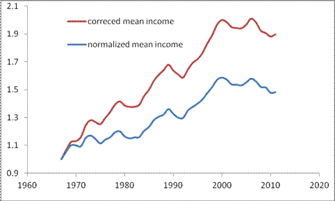
The same corerction logic must be applied to the family income distribution  - also biased in its current version.  Another sufferer is the mean (and aslo median) income.  Since the size of household has been decreasing the number of households has been growing faster than the total household  population.  The mean household income must also be corrected for the  changing size.  Figure 6 shows the actual evolution of the mean income (median income is harder to recover).  The history is much brighter than many experts would like to comment on. 

Figure 2. The evolution of normalized Gini ratio for households.

Figure 3. The evolution of total household population and the number of households (both in thousands)  

Figure 4. The evolution of an average household size.

Figure 5. Corrected Gini ratio.

Figure 6. The growth of normalized (household ) mean income and that corrected for the fall in the household average size.

Income inequality: a sharp fall for the youngest age group


The Census Bureau reported an overall increase in personal income inequality as expressed by Gini ratio jump from 0.503 to 0.510. This is a significant change considering the uncertainty of ~0.002 as reported by the Bureau. It is interesting to know how this rise is distributed over age pyramid. Figure 1 displays the change in Gini from 2010 to 2011 in various age groups from 15 to 75 years. The overall increase of 0.007 is unevenly distributed over the pyramid. The youngest age group between 15 and 24 years, is the gainer  - the Gini has dropped by 0.015. This is a significant drop since the uncertainty of the measurement is 0.006. Another age group characterized by a fall in income inequality is between 65 and 69 years of age. The Gini has dropped by 0.012 (±0.006). 


An intriguing observation is the difference in the change in Gini ratio between adjacent age groups 60-64 and 65-69. The difference has changes by 0.032 – a huge amount which needs special explanation from the Census Bureau. This difference looks spurious but it is likely responsible for the overall rise.


9/14/12

10% return since May, but time to halt


In April 2012, we predicted a drop in the S&P 500 to the level of 1300 by the end of May. Figure 1 shows the predicted behavior in April and May 2012, with the predicted segment shown by red line. We expected that the path observed in the previous rally would be repeated with the bottom points coinciding.  When this prediction realized, I invested, say, one unit at the average price 1320. The expected exit level was 1500 in October 2013.

Figure 1. The original S&P 500 curve (black line) and that shifted forward to match the 2009 trough (blue line). Red line – expected fall in the S&P 500: from 1400 in March to 1300 in May.  
Figure 2 shows the evolution of the S&P 500 monthly closing price since May 2012. The current level (September 14th) is above 1465 with the overall return of 10% during the past 4 months. One can see that the observed level is far above the expected one and the level, when repeating the blue curve, may have a small correction in December. Both these observations make me think that the time to exit and capitalize is approaching. I’ll definitely sell at 1500 or by the end of October. Bonds are looking more and more attractive as a safe haven till the new S&P 500 rally due in spring 2013.  

Figure 2. Same as in Figure 1 with an extension between May and August.

Data compatibility: Census Bureau

There is a document published by the Census Bureau every year. For 2011 -   Source and Accuracy of Estimates for Income, Poverty, and Health Insurance Coverage in  the United States: 2011 

It says "Be careful":

Comparability of Data.
Data obtained from the CPS and other sources are not entirely comparable. This results from  differences in interviewer training and experience and in differing survey processes. This is an example of nonsampling variability not reflected in the standard errors. Therefore, caution should be used when comparing results from different sources.

Data users should be careful when comparing estimates for 2011 in Income, Poverty, and Health Insurance Coverage in the United States: 2011 (which reflect Census 2010‐based controls) with estimates for 1999 to 2010 (from March 2000 CPS to  March 2011 CPS), which reflect Census 2000‐based controls, and to 1992 to 1998 (from March 1993 CPS to March 1999 CPS),  which reflect 1990 census‐based controls. Ideally, the same population controls should be used when comparing any estimates.

In reality, the use of the same population controls is not practical when comparing trend data over a period of 10 to 20 years. Thus, when it is necessary to combine or compare data based on different controls or different designs, data users should be aware that changes in weighting controls or weighting procedures can create small differences between estimates. See the discussion following for information on comparing estimates derived from different controls or different sample designs.

Drang nach Osten — «натиск на Восток»

ИИ гугла написал « Drang nach Osten — «натиск на Восток») — это исторический термин, обозначающий германскую экспансию на славянские и восто...