9/15/12

Income inequality for households: a long biased history of Gini and mean income. The Census Bureau's failed again


The Census Bureau measures incomes and reports figures. Experts discuss and panic. The fame depends on the claim of disaster with inequality. It must grow; otherwise economic commenter would lose public power. Who is interested in the topic when no change is observed?  Let’s try to dig into raw data and find the reason for the observed tendency. Our first point is that the Gini ratio ( the most famous measure of inequality)  for personal incomes reported by the Census Bureau from the very same data set (CPS ASEC conducted every March) does not change much since 1994. Figure 1 reproduces the Gini ratio, which varies from 0.494 to 0.512 – a relatively narrow window.

Figure 1 .  Personal incomes:  Gini ratio evolution since 1994.

In Figure 2, we present  a sad history of Gini ratio for households.  We intentionally normalized the ratio to its maximum value (0.477 in 2011) in order to show that this inequality measure has risen by 20% since 1967. This dramatic increase is interpreted as harm for the US. Unlike personal incomes, the household data are collected for entities which can evolve in size. (A person always has a unit size.) The Census Bureau does not explicitly reports the distribution household sizes and one has to make an own estimate, which is easy, however. Figure 3 presents the total household population (different from civil population or residential population) and the number of households reported by the CB.  Figure 4 depicts the evolution of the average household size since 1967. Actually, it was quite spectacular: from 3.2 in 1967 to 2.49 in 2011.

Does it matter for the income inequality?  Sure - yes. The simplest ways is a household split - instead of one big household one gets two smaller households. The Gini ratio depends of the distribution of sizes. More low-income households result in a higher Gini ratio. The fall in  average size says that one gets more and more smaller households over time  and … the Gini ratio increases accordingly. There is no linear link between the average size and the Gini ratio but Figure 5 shows the product of the Gini curve for households and the curve in Figure 4. Now we see a corrected Gini history.  This corrected Gini is not fully compensated for the household size changeover time but  tells a different story to the educated audience: the Gini for households has not been changing since the 1970s. In 1993, there was a revision to income definition and all time series were subject to dramatic chances. This step is fully artificial.
Overall, the Gini ratio for households has not been changing as the CB estimate say because these estimates do not take into account the change in household size distribution.
This is a methodological (i.e. unprofessional) mistake. 
The same corerction logic must be applied to the family income distribution  - also biased in its current version.  Another sufferer is the mean (and aslo median) income.  Since the size of household has been decreasing the number of households has been growing faster than the total household  population.  The mean household income must also be corrected for the  changing size.  Figure 6 shows the actual evolution of the mean income (median income is harder to recover).  The history is much brighter than many experts would like to comment on. 

Figure 2. The evolution of normalized Gini ratio for households.

Figure 3. The evolution of total household population and the number of households (both in thousands)  

Figure 4. The evolution of an average household size.

Figure 5. Corrected Gini ratio.
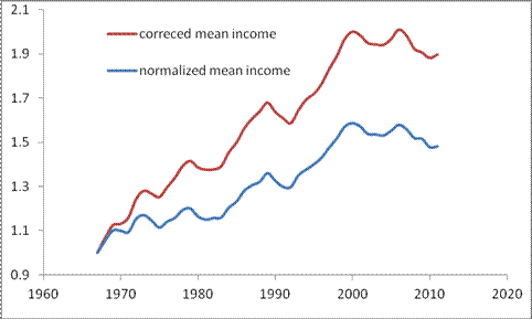
Figure 6. The growth of normalized (household ) mean income and that corrected for the fall in the household average size.

Income inequality: a sharp fall for the youngest age group


The Census Bureau reported an overall increase in personal income inequality as expressed by Gini ratio jump from 0.503 to 0.510. This is a significant change considering the uncertainty of ~0.002 as reported by the Bureau. It is interesting to know how this rise is distributed over age pyramid. Figure 1 displays the change in Gini from 2010 to 2011 in various age groups from 15 to 75 years. The overall increase of 0.007 is unevenly distributed over the pyramid. The youngest age group between 15 and 24 years, is the gainer  - the Gini has dropped by 0.015. This is a significant drop since the uncertainty of the measurement is 0.006. Another age group characterized by a fall in income inequality is between 65 and 69 years of age. The Gini has dropped by 0.012 (±0.006). 


An intriguing observation is the difference in the change in Gini ratio between adjacent age groups 60-64 and 65-69. The difference has changes by 0.032 – a huge amount which needs special explanation from the Census Bureau. This difference looks spurious but it is likely responsible for the overall rise.


9/14/12

10% return since May, but time to halt


In April 2012, we predicted a drop in the S&P 500 to the level of 1300 by the end of May. Figure 1 shows the predicted behavior in April and May 2012, with the predicted segment shown by red line. We expected that the path observed in the previous rally would be repeated with the bottom points coinciding.  When this prediction realized, I invested, say, one unit at the average price 1320. The expected exit level was 1500 in October 2013.

Figure 1. The original S&P 500 curve (black line) and that shifted forward to match the 2009 trough (blue line). Red line – expected fall in the S&P 500: from 1400 in March to 1300 in May.  
Figure 2 shows the evolution of the S&P 500 monthly closing price since May 2012. The current level (September 14th) is above 1465 with the overall return of 10% during the past 4 months. One can see that the observed level is far above the expected one and the level, when repeating the blue curve, may have a small correction in December. Both these observations make me think that the time to exit and capitalize is approaching. I’ll definitely sell at 1500 or by the end of October. Bonds are looking more and more attractive as a safe haven till the new S&P 500 rally due in spring 2013.  

Figure 2. Same as in Figure 1 with an extension between May and August.

Data compatibility: Census Bureau

There is a document published by the Census Bureau every year. For 2011 -   Source and Accuracy of Estimates for Income, Poverty, and Health Insurance Coverage in  the United States: 2011 

It says "Be careful":

Comparability of Data.
Data obtained from the CPS and other sources are not entirely comparable. This results from  differences in interviewer training and experience and in differing survey processes. This is an example of nonsampling variability not reflected in the standard errors. Therefore, caution should be used when comparing results from different sources.

Data users should be careful when comparing estimates for 2011 in Income, Poverty, and Health Insurance Coverage in the United States: 2011 (which reflect Census 2010‐based controls) with estimates for 1999 to 2010 (from March 2000 CPS to  March 2011 CPS), which reflect Census 2000‐based controls, and to 1992 to 1998 (from March 1993 CPS to March 1999 CPS),  which reflect 1990 census‐based controls. Ideally, the same population controls should be used when comparing any estimates.

In reality, the use of the same population controls is not practical when comparing trend data over a period of 10 to 20 years. Thus, when it is necessary to combine or compare data based on different controls or different designs, data users should be aware that changes in weighting controls or weighting procedures can create small differences between estimates. See the discussion following for information on comparing estimates derived from different controls or different sample designs.

9/13/12

Income inequality raised! Blame the Census Bureau

The Census Bureau has reported income distribution in the USA for 2011. There is a number of posts and comments on increasing income inequality. Before writing writing on inequality one should first learn some definitions and measuring procedures. The reason behind the reported rise in (household) Gini ratio is not the change in income inequality per ce, but new population controls introduced after the 2010 census. All statistical agencies in the US (and supposedly in other countries as well) are famous for producing time series incompatible in time. Due to change in definitions, survey procedures and coverage the time series for inflation (and thus real GDP), unemployment, productivity, and so on, are not continuous. This is like to change from mph to km/h and back every five to ten years and then average the speed. Interestingly, all  these agencies are not guilty since they openly describe this incompatibility in their documents. These are the commenters who are careless.

In the CB's report for 2011, the Gini ratio for individuals has jumped to 0.510 in 2011 from 0.503 in 2010. (  It was near 0.503 through the 2000s. ) This would be the most dramatic jump in income inequality in the USA since  the start of measurement in 1947, if a not a  pure artifact.
If you would like to know the truth do not trust experts! Dig into raw data and documentation.


9/10/12

The use of “grand master” events for waveform cross correlation

This is for the 2012 AGU Fall Meeting.

Abstract
More than 90% of seismic events recorded at teleseismic and regional distances are from a few relatively small geographic regions, causing the distribution of seismic events in the Reviewed Event Bulletin (REB) of the International Data Centre (IDC) to be inhomogeneous. When considering the waveform cross correlation technique for the detection, phase association and event building processes that are performed as part of monitoring compliance of the Comprehensive Nuclear-Test-Ban Treaty one is confined to the areas with historical seismicity. The backbone of the waveform cross correlation method is the set of master events (earthquakes or explosions) with high quality waveform templates that have been recorded at array stations of the International Monitoring System (IMS). These master events have to be evenly distributed and their template waveforms should be representative and pure (ie., with negligible noise input). The coverage and characteristic of historical seismicity observed by the IMS seismic network since 2001 does not match these requirements. The current REB allows selection of a number of master events in seismically active areas but even in these areas the quality of templates varies from master to master. In this study, we propose to replicate waveforms from the best master event over a regular grid expanding several hundred kilometers from its epicenter. We call this master event the “grand master”. For each grid point, i.e. replicated grand master event, the template has the relevant theoretical time delays between individual sensors at the involved array stations. Since the empirical deviations from the theoretical arrival times at these sensors are inherently related to seismic velocity structure beneath the station, they are fully retained for all replicated master events within several hundred kilometers. These empirical travel time residuals are small but play a key role in the waveform cross correlation method for weak signals. They define a higher sensitivity for the cross correlation method relative to beam forming method where the channels are stacked with the theoretical delays. As a result, the waveform cross correlation technique detects more valid signals at local, regional, and global levels.

In assessing the performance of the grand master approach the aftershock sequence of the April 11, 2012 Sumatra earthquake (Ms(IDC)=8.2) was used, with16 master events (actual aftershocks) distributed over an area of 500x500 km. Waveform templates from the best master event over a regular grid with 1o spacing have been replicated. There are two principal procedures in comparing the performance of actual and replicated master events as associated with various characteristics/distributions of detections, as well as with the number of event hypotheses built with the varying sets of stations and locations. Both methods have shown the superiority of the replicated events distributed over a regular grid. Such distributions also reduce the volume of calculations by two orders of magnitude. When appropriately chosen, the grand master allows a reduction in the magnitude threshold of seismic monitoring and improving the accuracy and uncertainty of event locations at the IDC to the level of the best located events. When a ground truth event is available, one can expand its influence over hundreds of kilometers.


Key words: array seismology, waveform cross correlation, seismicity, master events, IDC, CTBT

Sumatera 2012 aftershocks: REB vs. waveform cross-correlation bulletin

I am working on an exiting problem associated with my professional duties - waveform cross correlation. Unfortunately, have no time to blog on economics. This post is to attract attention to our poster to be presented at the Monitoring Research Review 2012.

 Our objective is to assess the performance of waveform cross-correlation technique, as applied to automatic processing of the aftershock sequence of the 2012 Sumatera (Mw=8.6) earthquake, relative to the Reviewed Event Bulletin (REB) issued by the International Data Centre. The REB includes ~1150 aftershocks between April 11 and May 23 with (IDC) body wave magnitudes from 3.05 to 6.19. The aftershocks cover a slightly unusual V-shaped area. The cross correlation technique allows a flexible approach to signal detection, phase association and event building. To automatically recover the sequence, we selected sixteen aftershocks with mb(IDC) between 4.5 and 5.0 from the IDC Standard Event List (SEL3) available on April 13. These events evenly but sparsely cover the whole area. After a superficial manual review these aftershocks were designated as master events. Waveform templates from only seven array stations with the largest SNR for the signals from the main shock were used to calculate cross-correlation coefficients. All detections obtained by cross-correlation were then used to build events according to the IDC definition, i.e. at least three primary stations with accurate arrival times, azimuth and slowness estimates. The qualified events populated the cross-correlation Standard Event List (XSEL). The XSEL was compared with two IDC products: the final automatic bulletin (SEL3) and the interactive bulletin (REB). There are some valid events missed in the REB but found in the XSEL. As a bootstrap exercise to confirm the significance of the XSEL findings, a large portion of the newly built events was reviewed interactively by experienced analysts. In order to investigate the influence of all defining parameters (cross correlation coefficient threshold and SNR, F-statistics and F-K analysis, azimuth and slowness estimates, relative magnitude, etc.) on the final XSEL we have constructed relevant frequency distributions for all detections and only for those which were associated with the XSEL events. These distributions are also station and master dependent. This allows the introduction of accurate threshold for all defining parameters.


Key words: cross-correlation, IDC, REB, Sumatera

Drang nach Osten — «натиск на Восток»

ИИ гугла написал « Drang nach Osten — «натиск на Восток») — это исторический термин, обозначающий германскую экспансию на славянские и восто...