2/15/12

Paradoxes of labor productivity

We continue to analyze the Total Economy database, TEDI, maintained by the Conference Board. This time we compare two similar estimates of labor productivity. The TEDI provides labor productivity estimates in 2011 EKS dollars per worker (person employed), Pw, and per hour, Ph,  i.e. the ratios of total GDP and the number of workers and the number of hours worked, respectively.  The former estimate depends on the evolution of employment/population ratio and the latter also depends on working hours per person (say, the length of average working week).  We also depict real GDP per capita, G, which formally is not a measure of productivity but provides a conservative reference.

Three figures below present the USA, France, and Australia – the countries with different behavior of labor productivity. To facilitate the analysis, all time series are normalized to their respective values in 1950. In the USA, all three curves had been evolving in sync between 1950 and 1970, when the Pw curve started to lag behind. This deviation is explained by the increasing employment/population ratio between 1965 and 2000.  Since 1978, the G curve has been growing faster than the Ph curve. This is a big surprise which cannot be explained by the increasing length of working week only. As we reported before, the GDP deflator and CPI also started to deviate in 1978. This is not a coincidence and the statistics of real GDP is likely biased. Another important issue is the trend of all variables. We show linear regression lines for all time series. As we discussed many times, real GDP per capita has a linear trend. Both productivity curves also oscillate around linear trends. Currently, the Ph and Pw curves are above the relevant trends and will likely to fall down.  When extrapolated back into the past, all trends intercept 0 between 1916 and 1930. What a surprise!
France has been demonstrating an outstanding growth in Ph; it has grown by a factor of 6.7 since 1950. This is a double US growth rate and twice as large as the overall growth in real GDP per capita in France. In other words, the hours worked to produce the same portion of real GDP per capita have fallen by a factor of 2.  This is an extraordinary performance.  It should be also noted that the G curve is below both productivity curves and all curves have reliable linear trends (regression lines). When extrapolated, the Ph curve intercepts 0 in 1944.  Currently, all curves are below their long term trends. They have to grow at an elevated rate to return to the trends.
In Australia, the G curve was similar to the Pw curve before 1982 and then jumped to the Ph curve.  The linear regression lines intercept 0 between 1924 and 1934 and the observed curves are very close to these lines over the whole period between 1950 and 2011.  The reason they do not follow the trends before 1950 is not clear. Currently, both productivity curves are on their long term trends and the G curve is far above its trend. One might expect real GDP per capita to grow slowly during the next five years.
This is a superficial analysis (more qualitative than quantitative) and we do not pretend to explain all suspicious and obvious features of the evolution of productivity in developed countries. We just illustrate general behavior and stress some problems with data. Quantitatively, the evolution of labor productivity in all developed countries is accurately described in our paper 


2/14/12

Real GDP per capita - the danger of fast growth

Having presented real GDP per capita in Germany, we continue with three more developed countries: Ireland, Greece and Norway. They are different from the economies earlier presented. Figure 1 depict the available historical estimated made by Angus Madison and Groningen University, and also the most recent update of the Total Economy Database maintained by the Conference Board.

As for other developed countries, we expected that real GDP per capita, G, follows a linear trend in the long run:
G(t) = At + C (1)

Ireland has a relatively short historical time series started in 1921. The period after 1945 is better to approximate by two linear segments with a kink near1990 and a sharp fall in 2007. We have presented the case of Ireland in this blog and actually has predicted this deep fall many years ago – the real GDP curve must return to the long term linear trend. Interestingly, the TEDI and historical curve deviate from 2000 signalling some problems with the GDP estimation procedures – both time series are given in 1990 Geary-Khamis dollars. We expect the TEDI curve to fall even deeper but the annual increment of $359 dollars, i.e. the slope of the linear trend, is quite good for developed countries. In any case the countries experienced fast growth due to sharp peaks in age pyramids always suffer longer period of very slow growth. Japan just leads Ireland by 20 years in the peak age.

Greece is currently below its long term trend and likely to start growing at an elevated rate to return to the trend. We wrote about this possibility in May 2011. Hence, Greece needs a few years to recover to the trend.

Norway is the fastest economy in terms of real GDP per capita - $398 per year. And it follows the long term linear trend since 1945. It is slightly above the trend and therefore the economy can move any direction, i.e. to grow fast of to fall slightly.


Figure 1. The evolution of real GDP per capita in Ireland, Greece, and Norway

Real GDP per capita in Germany: 1871-2011

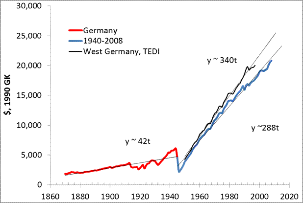
We have not presented the case of Germany because of the change in real GDP time series in 1989. However, the historical time series does not differ from those in other developed countries. Figure 1 shows that real GDP per capita, G, in Germany also has two branches – before and after 1940. The Total Economy Database (TEDI) gives two estimates for Germany – for West Germany only, which goes back into the 1950s, and for Germany since 1989. We have plotted the West Germany time series since it is different from the historical time series which is identical to Germany after 1989.

As expected, G follows a linear trend in the long run:

G(t) = At + C (1)

Currently, real GDP in Germany is on the trend line. This means no output gap. We also predicted a recession in Germany.


Figure 1. The evolution of real GDP per capita in Germany between 1871 and 2011

2/12/12

Advice needed: the paradox of real GDP growth after the Second World War


We’ve just presented the historical estimates of real GDP per capita developed by Angus Maddison at the Groningen Growth and Development Centre. Figure 1 summarizes all graphs of our previous post and illustrates the inherent mastery of the GDP evolution after WWII. The rate of real economic growth jumped by a factor of 10 between 1940 and 1950. If to extrapolate the linear trend observed after 1950 into the past, the level of real GDP per capita intercepts the time line between 1920 and 1940. Does that mean that there was no or negative real economic growth in the 19th century or the rate of economic growth after 1950 has been dramatically biased? If to extrapolate the growth rates observed before 1940, the current level of real GDP per capita in developed counties would have been below $15,000 or even $10,000. Does that mean that the rate of price inflation has been highly underestimated since 1940?
This is a major paradox of the historical GDP time series. Can anybody explain it?

Figure 1. The evolution of real GDP per capita in developed countries: Austria, Australia, Belgium, Canada, France, Italy, Japan, Spain, Switzerland, the US, and the UK.

Another 1000 arguments against the Solow growth model


In May 2011, we presented 1000 arguments against the Solow growth model, which states that the rate of change in real GDP per capita must approach some constant level. Here we present new arguments against the Solow model as based on the historical GDP data developed by Angus Maddison at the Groningen Growth and Development Centre. In two previous posts we presented the cases of USA and Austria. We showed that the annual increment of GDP per capita is constant from 1871 to 2010 with an artificial structural break between 1940 and 1950. In other words, the slope of linear trend in real GDP per capita and thus the mean annual increment jumped by a factor of 10 between 1940 and 1950. Here we summarize numerous observations for the developed counties presented in the May’s post and validate our model.   

Under our empirical framework [1,2,3], real GDP per capita in developed countries grows as a linear function of time, we call it inertial growth, when population pyramid does not change much in the long run: 

G(t) = At + C                             (1) 

Relationship (1) defines the linear trajectory of the GDP per capita, where C=Gi(t0)=G(t0) and t0 is the starting time. In the regime of inertial growth, the real GDP per capita increases by the constant value A per time unit. The relative rate of growth along the inertial linear growth trend, g(t), is the reciprocal function of G:

g(t) =  A/G(t)               (2) 

Relationship (2) implies that the rate of GDP growth will be asymptotically approaching zero, but the annual increment A will always be constant. This is different from the Solow model where the rate of growth is a positive (nonzero) value. Moreover, the absolute rate of GDP growth is constant and is equal to A [$/y]. This constant annual increment thus defines the constant “speed” of economic growth in a one-to-one analogy with Newton’s first law. Hence, one can consider the property of constant speed of real economic growth as “inertia of economic growth” or simply “inertia”.   

In Figure 1 (borrowed from the post in May 2011), we present annual increments of real GDP per capita (borrowed from the Conference Board Total Economic database, TEDI) in the biggest developed economies as a function of real GDP per capita in sense of equation (1). These plots validate our empirical finding and reject the Solow model. Overall, there were 19 countries analyzed in the study and no one has any distinct positive trend over the past 60 years, i.e. between 1950 and 2010. So, we had 1000 years supporting the hypothesis of a constant (but country dependent) annual increment.

Figure 2 extends all time series back to 1871 by using the Maddison’s historical estimates of real GDP and population in developed courtiers. All estimates are in 1990 International Geary-Khamis dollars which allow a cross-country comparison. These dollars are different from 2010 EKS dollars in Figure 1. Thus the mean values may not coincide between these Figures. We have also plotted the estimates of real GDP per capita from the Total Economic Database (TEDI) now available through 2011. Essentially, this is the same data set as in the historical database and all curves after 1950 have to coincide, but Japan and Spain show significant discrepancy during the most recent period. For Japan, the TEDI and historical curve started to deviate in 1993.  

Overall the time series before 1940 and after 1950 are both well approximated by linear time trends with slopes suddenly increasing by approximately a factor of 10.  Not considering the reasons for this break in the tie series we just conclude that the annual increment is constant before 1940 and after 1950, as stated by our model of real GDP growth. This validates our model and rejects the possibility for the Solow model to be right.  

There are important implications of the constant annual increment for economic policy in developed countries. Economists and economic authorities (like FRB and CBO) are waiting for a significant increase in the rate of real economic growth to close so called output gap, i.e. the difference between the measured level of real GDP and that expected form exponential extrapolation of the trend observed before 2007. In reality, there is not output gap, as Figure 1 and 2 demonstrate.  Only Italy and Japan are far below the linear trend in real GDP per capita and Australia is above the expected level. France is also slightly below its long term linear trend. These countries might expect a recovery to the trend in the long run, depending on the evolution of their age pyramids. 

The US and UK have been returning to the trend during the recent crisis and should not wait for any elevated rate of real economic growth.  The expectation of a growth rate of 3.5% per year (in terms of GDP per capita) which has been explicitly articulated by the FRB and CBO in their economic outlooks is a naïve extrapolation of exponential growth related to the exponential population growth.   


Figure 1. Dependence of annual GDP increment on GDP (both real per capita) for select developed countries. Original GDP data are extended by those corrected for the ratio of total and working age population (the latter must be used in GDP per capita calculations). For both time series linear regression lines and equations are shown with corresponding slopes. For the biggest countries these slopes are very close to zero but can be positive or negative. A zero slope corresponds to constant annual increment.


Figure 2. The evolution of real GDP per capita in developed countries between 1871 and 2011.  

2/11/12

Real GDP per capita in Japan: 1871-2008

We continue presenting historical estimates of real GDP per capita in developed countries. The USA and Austria have demonstrated that the period between 1871 and 1940 supports our model of constant annual increment of real GDP per capita. We have also found that there was a transition period between 1940 and 1950 when the mean annual increment rose by a factor of 5. It might be the result of a new measurement procedure introduced during this period after the concept of GDP had been developed by Simon Kuznets. The next country we would like to present is Japan. For the period from 1871 to 1940, Japan also has a constant annual inctement.
All measurements in developed countries do support the concept of constant annual increment in real GDP per capita, G(t), which can be described by a simple model: in the long run, the GDP growth as a linear function of time:

G(t-t0)=G0+A(t-t0) (1)
where G0 is the initial level of GDP per capita at time t0 in a given country, A is the country dependent annual increment measured in PPP dollars. Unlike in the Solow model and its successors, the rate of growth of real GDP per capita, dG/Gdt, has a decelerating nonlinear trend. Differentiating with respect to time and dividing both sides of (1) by G(t), one obtains

dG/Gdt = A/G (2)

This model has given excellent statistical results and explained the evolution of real GDP per capita in developed countries [1,2] since 1950. Figure 1 presents the case of Japan: annual increment in real GDP per capita is plotted against the level of real GDP per capita. (Equation (2) uses time implicitly.) It demonstrates the accuracy of our concepts. Since the increment is assumed to be constant, the mean value of the annual GDP increment should coincide (at least should be very close to) with its linear trend. The linear regression line for Japan is very close to the constant level. Actually, it slightly oscillates around the mean value over time, as the cases for 2007 (upper panel) and 2009 (lower panel) demonstrate. The hypothesis of the constant increment looks sound.

Figure 1. Annual increment of real GDP per capita (2007 and 2009 US$) vs. real GDP per capita in Japan for the period between 1950 and 2007 (upper panel) and between 1950 and 2009 (lower panel). Two sets are presented - the original (open circles) and that corrected for population (filled diamonds). Subsequent values of the latter set are connected by a solid line for illustration of the evolution in time. Bold lines represent the mean value of $605 (2007 US$) and $596 (2009 US$) for the population corrected sets. Two solid lines show linear regressions lines. Corresponding linear relationships are displayed, the lower relationship being associated with the original data set.
Figure 2 presents the whole period between 1871 and 2008. There is a spurious time trend which can be split into to segments and one transition period. Before 1945, the mean annual increment was $32 (1990 International Geary-Khamis dollars) as Figure 3 shows and practically no increase in the annual increment with time (no linear time trend). After 1950, the mean increment jumped to $341 also without linear trend (see Figure 1).
All in all the case of Japan validates our model of inertial economic growth by its 130-year history of measurements. One should not expect the rate of growth observed in the second part of the 20th century to extent into the 21st century. 

Figure 2. Annual increment of real GDP per capita (historical data) between 1871 and 2008. There is no linear trend.
Figure 3. Annual increment of real GDP per capita (historical data) between 1875 and 1944. There is no linear trend.

Real GDP per capita in Austria: from 1871 to 2010.

In our previous post, we have started to present historical GDP data which were estimated by Angus Maddison from Groningen University. We have demonstrated that there was no linear time trend in the annual increment of real GDP per capita in the USA between 1871 and 1940. The year of 1940 was selected to introduce a short transition period between two long intervals of constant annual increment. The Second World War and the development of the GDP concept clearly cut the period from 1871 and 2011 in two pieces. One can consider the transition between 1940 and 1950 as a structural break or change in measurement units.  

Here we continue testing our model of the real economic growth by presenting the case of Austria. The model is based on an extensive set of observations in developed countries which show that real GDP per capita, G(t), evolves along a linear time trend with all fluctuations related to the change in age pyramid. In our article, we calculated the inertial term A in

G(t-t0)= G0+A(t-t0)   (1)

where G(t) is real GDP per capita as observed in developed countries; G0 is the initial level of GDP per capita at time t0 in a given country; and  A is the country dependent annual increment measured in PPP dollars. Since the empirical model and is based only on observations of real GDP in developed countries its predictive power depends on how well it fits observations.  
 

Several years ago we presented a model for Austria. Figure 1 depicts annual increment in real GDP per capita as a function of the level of real GDP per capita instead of time. Since the increment is assumed to be constant, the mean value of the annual GDP increment should coincide (at least should be very close to) with its linear trend. In 2002, the linear regression line for Austria shows a distinct positive trend of +0.0041. According to (1) such deviations must be compensates in the long-run by negative rates of growth. However, the years after 2002 have been demonstrating increasing positive trend. This deviation has been compensated by a severe decline in 2009. Therefore, the inertia of real economic growth has won again. Any deviation creates a returning force likely proportional to the size of the deviation. In 2009, the trend is almost 0 and the hypothesis of the constant increment looks sound.


Figure 1. Annual increment of real GDP per capita (2002 and 2009 US$) vs. real GDP per capita in Austria for the period between 1950 and 2002 (upper panel) and between 1950 and 2009 (lower panel). Two sets are presented - the original (open circles) and that corrected for population (filled diamonds). Subsequent values of the latter set are connected by a solid line for illustration of the evolution in time. Bold lines represent the mean value of $548 (2002 US$) and $700 (2009 US$) for the population corrected sets. Two solid lines show linear regressions lines  

In Figure 2, we have plotted all historical GDP data (annual increments) from 1871 to 2008 (138 years). All historical data are estimated in 1990 International Geary-Khamis dollars which are different from 2002 US$ and 2009 US$ in Figure 1. One might suggest that there is a linear trend in the time series, but we have to remove the transition period between 1940 and 1950 and plot only the estimates between 1871 and 1950. Figure 3 evidences that there was not positive trend in this time series. Hence, the overall period has two lengthy periods of constant annual increment and a short transition period,  During the transition, the mean increment jumped from $30 (from 1871 to 1940) to $353 (from 1951 to 2008). In other words, there two shelves and a ladder.

The case of Austria validates our model of inertial economic growth with a constant annual increment. This is equivalent to the rate of real GDP per capita grows decays inversely proportionally to the attained level:

dG/dt = A  or dG/Gdt=A/G. 

Therefore, the rate of real economic growth should asymptotically approach the zero line. It should also be noted that the gap in real GDP per capita between developed countries can hardly be closed and the lag of developing courtiers is forever. In relative terms, convergence is possible when the rate of growth in all countries approaches zero. Empirically speaking, the Solow model is wrong.
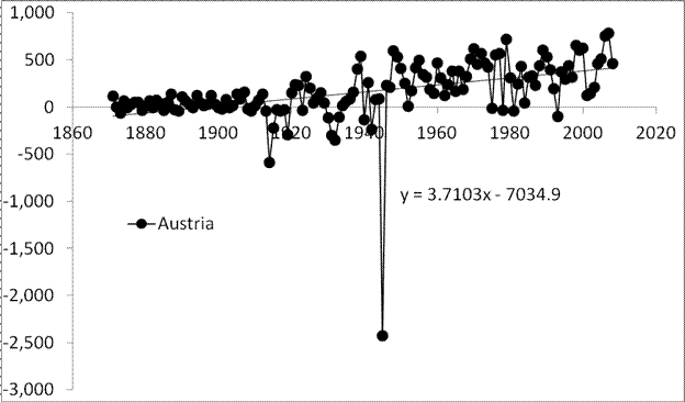
Figure 2. Annual increment in real GDPper  capitafrom 1871 to 2008.

Figure 3. Annual increment in real GDP per capita from 1871 to 1940.

Recovery of low-magnitude seismic events before the July 29, 2025, Kamchatka megathrust earthquake using waveform cross-correlation enhanced by the addition of stochastic noise

 Recovery of low-magnitude seismic events before the July 29, 2025, Kamchatka megathrust earthquake using waveform cross-correlation enhance...