7/1/10

S&P 500 in July 2010

We continue tracking the evolution of the S&P 500 and our prediction made in the beginning of 2009 for the next six years. Since March 2009, the prediction fits the observed S&P 500 with minor deviations likely related to the emotion component of the stock market. However, the trend and its turn in May 2010 were forecasted precisely. All in all, fifteen months in a row we are right and do not see any source which may disturb our prediction for the period between June 2010 and 2014. The prediction was documented in a working paper (S&P 500 returns revisited) and several posts .

The original model links the S&P 500 annual returns, Rp(t), to the number of nine-year-olds, N9. To obtain a prediction we use the number of three-year-olds, N3, as a proxy to N9 at a six-year horizon:


Rp(t+6) = 100dlnN3(t) - 0.23


where Rp(t+6)is the S&P 500 return at a six-year horizon. Because of the properties of the N3 distribution one can replace it with linear trends for the period between 2008 and 2011, as Figure 1 shows. The model shown in Figure 1 predicts that the S&P 500 stock market index will be gradually decreasing at an average rate of 37 points per month. (Correction from the previous post where 46 points per months was used by mistake.) In June, actual closing level was 1030 (-60 relative to May 2010). This level is about 90 points below that predicted in Figure 1. This is the continuation of the May’s panic. Such dynamic "overshoot" in the beginning of a new trend is a common feature.


Figure 1. Observed S&P 500 monthly close level and the trend predicted from the number of nine-year-olds. The slope is of -37 points per month. The same but positive slope was observed between February 2009 and April 2010.

The deviation from the new trend is a big one and one can expect the end of panic in July/August 2010. This is a nice feature of the trend. Any deviation, whatever amplitude it has, must return to the trend. So, by the past experience we may judge that 90 points should be compensated quickly. This means that the level of S&P 500 should not change much in July and August 2010. We would expect the close level between 1020 and 1050 in July 2010.

Then, the index will continue gradual decrease into 2011. Figure 2 demonstrates that the S&P 500 annual return will sink below zero in the third-fourth quarter of 2010.

Figure 2. Observed and predicted S&P 500 returns.

6/29/10

Journal of Applied Research in Finance: summer 2010 issue

JARF Summer 2010 Issue (pdf file)

Anand BANSAL, J.S. PASRICHA

Impact of Foreign Capital on Economic Growth in India: 1992 – 2009 … 9

Gustavo FERRO

Insurance Regulation and the Credit Crisis. What’s New? … 14

Francesco GUIDI

Modelling and Forecasting Volatility of East Asian Newly Industrialized Countries

and Japan Stock Markets with Non-Linear Models … 27

Drama Bedi Guy HERVE, Yao SHEN, Amzath AMED

The Effects of Real Exchange Rate on Trade Balance in Cote D’ivoire:

Evidence from the Cointegration Analysis and Error-Correction Models … 44

Taisei KAIZOJI

Modelling of Stock Return Volatility … 61

Nader NAIFAR

Does the Subprime Crisis affect Credit Default Swap Markets? … 68

Nobuyoshi YAMORI, Yoshihiro ASAI

Did Market Reform make Risk Evaluation on Japanese Firms Easier?:

An Evidence from Credit Ratings … 74

Xiaolou YANG

The Effect Of Annual Earnings Announcement Delay On Stock Returns … 84

6/26/10

New issue of JAES

Volume V of the Journal of Applied Economic Sciences has been issued. I am proud to co-author one of the papers.

Alessio Emanuele BIONDO, Growth Rate for a Sustainable Economy … 7

Maria BOBROVA, Arndt KÜMPEL, Reasoning on Evolution of Culture and Structure

… 21

A.B. BONACHE, J. MAURICE, K. MORIS, A Best Evidence Synthesis on the Link between Budgetary Participation and Managerial Performance … 34

Ginters BUSS, Forecasts with Single-Equation Markov-Switching Model: An Application to the Gross Domestic Product of Latvia … 48

Lisi GAETANO, The Unemployment Volatility Puzzle: The Role of the Underground Economy … 59

Giuseppe GAROFALO, Patrizio MIRGANTI, The Financing of R&D Investments: Effects on Growth and Financial Structure … 70

Ivan O. KITOV, Oleg I. KITOV, Dynamics of Unemployment and Inflation in Western Europe: Solution by the 1-D Boundary Elements Method … 94

Abstract

Using an analog of the boundary elements method in engineering and science, we analyze and model unemployment rate in Austria, Italy, the Netherlands, Sweden, Switzerland, and the United States as a function of inflation and the change in labor force. Originally, the model linking unemployment to inflation and labor force was developed and successfully tested for Austria, Canada, France, Germany, Japan, and the United States. Autoregressive properties of neither of these variables are used to predict their evolution. In this sense, the model is a self-consistent and completely deterministic one without any stochastic component (external shocks) except that associated with measurement errors and changes in measurement units. Nevertheless, the model explains between ~65% and ~95% of the variability in unemployment and inflation. For Italy, the rate of unemployment is predicted at a time horizon of nine (!) years with pseudo out-of-sample root-mean-square forecasting error of 0.55% for the period between 1973 and 2006. One can expect that the unemployment will be growing since 2008 and will reach ~11.4% [0.6 %] near 2012. After 2012, unemployment in Italy will start to descend.

Evgenia MOTCHENKOVA, Daniel LELIEFELD, Adverse Effects of Corporate Leniency Programs in View of Industry Asymmetry … 114

Rajesh K. PILLANIA, Indo-China Trade: Trends, Composition and Future … 129

Georg QUAAS, Was the Worldwide Asymmetry in Current Accounts Caused by the Macroeconomic Policy of the Global Economy’s Leader? … 138

6/11/10

Is your breakfast getting cheaper?

The study of consumer price index sometimes gives more fun than regular research. This morning is formulated a question: Is my breakfast getting cheaper? In addition to the general knowledge of the CPI behavior, which is always good, and the quality of food, which is beyond the CPI coverage, one can enjoy the thought that every morning the meal costs less and less. Because the presence of price inflation is a part of our wisdom, the cost is assumed in relative terms, i.e. with the overall CPI as a reference.

The approach is straightforward:

1. To calculate the overall price inflation, p. We prefer monthly estimates taken on year to year basis. So, we calculate the relative increase in corresponding price index during the past 12 months:

p(t)= [P(t)-P(t-12)]/P(t-12),
where P(t) is the consumer price index, t is time in months.

2. To calculate individual price inflation, pi, for given subcategory of the CPI. Without loss of generality, I have chosen eggs, butter, juice, and coffee. (The index of bread was started only in 2005 and thus omitted.) It is also instructive to estimate the price inflation of food.

3. To calculate the relative price inflation, i.e. subtract the p(t) from all pi(t).

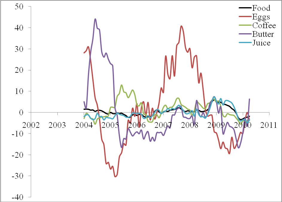
Figure 1 displays the differences between individual rates of price inflation and the overall inflation. In 2010, all prices, except that for butter, have been growing at a lower rate than the overall price index. In relative terms, each breakfast is getting cheaper, if you do not eat butter.
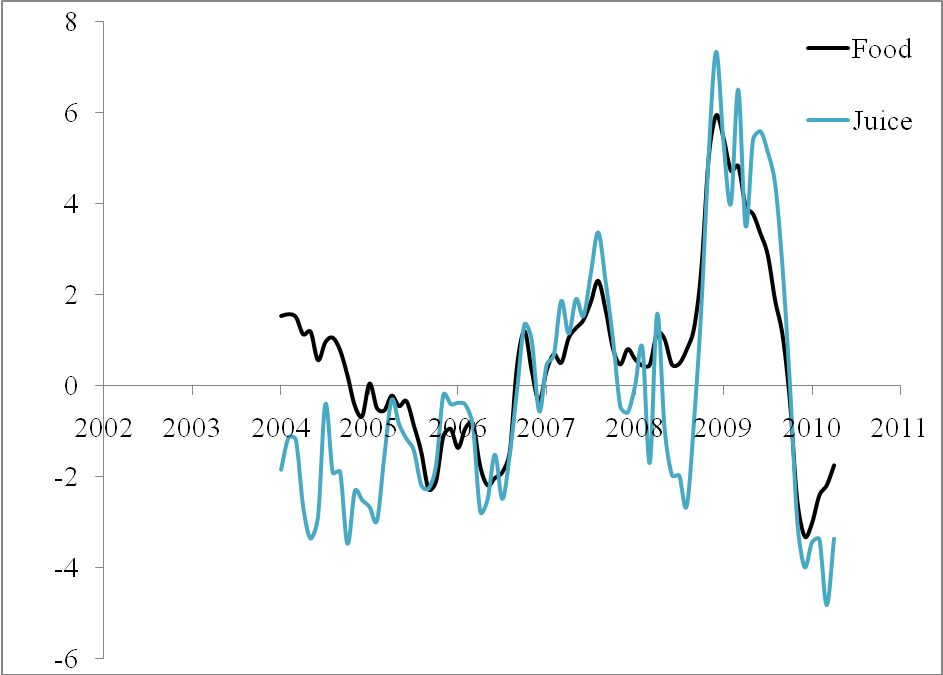
A researcher and likely investor may have additional fun from Figure 2, where the relative inflation of food and juice is shown. Since 2005, both curves are similar in timing of main peaks and through and their amplitudes. I would say that juice price has been chasing the overall price.


Figure 1. Relative price inflation of food, eggs, coffee, juice, and butter. Since the beginning of 2010, all prices have been growing at a lower rate than the CPI, except that of butter.


Figure 2. Same as in Figure 1 for food and juice

6/10/10

Real GDP in Ireland

Four years ago I published a paper [1] introducing the concept of constant annual increment in real GDP per capita, G, as observed in developed countries. In the long run, the GDP growth as a linear function of time:


G(t-t0)= G0+B(t-t0)

where G0 is the initial level of GDP per capita at time t0 in a given country, B is the country dependent increment measured in dollars. Therefore, the rate of growth of real GDP per capita, dG/G, has a decelerating trend:


dG/G = B/G


This assumption gives excellent statistical results and explains the evolution of real GDP per capita in developed countries, as also was confirmed in our 2008 paper [2].
In 2004, when the first results were obtained, there were few countries which demonstrated lager deviations from the constant increment model. The worst example was Ireland, which had demonstrated an outstanding performance in the 1990s and the beginning of the 2000s. Five years ago, I wrote

An opposite example of an excellent recovery gives Ireland with corresponding results displayed in Figure 11. A slow start was quickly compensated and the last twenty years of an extremely fast growth resulted in the leading position in the world economy with the mean increment $678. There are some doubts, however, that future will be so successful. Such a long and quick growth always ends up in a depression. This was observed in Japan and is related to the long-term decrease in the number of the specific age population [Kitov, 2005a]. Ireland has managed to increase birth rate for a very long period and has an age structure similar to that observed in Japan 20 years ago. The population distribution is currently peaked near 20 years with the defining age of 18 years. The years to come will demonstrate only decrease in the defining age population.

Fig. 11. Same as in Figure 4 for Ireland. The mean value is $678. The growth of the real GDP per capita is outstanding during the last twenty years. There is a downward tendency during the last four years, however.


So, we put the progress of the Irish economy under doubt. The reason was its similarity to the Japanese case and the underlying model of real GDP growth, which includes population of a country specific age. Neglecting fluctuations induced by the population change, we now depict the same Figure with six new readings between 2004 and 2009.


Figure. The increment of real GDP per capita vs. real GDP per capita in Ireland. As before, all data are borrowed from the Conference Board data base (http://www.conference-board.org/economics/database.cfm).


The slope of +0.06, observed between 1950 and 2003, now has reduced to 0.027, i.e. by a factor of 2. The near future of the Irish GDP per capita is under question as well: it will likely to decrease as in 2008 and 2009. We will keep reporting on the case of Ireland, but is does not represent an exclusion to our approach with constant increment. Ireland provides a higher volatility in the GDP growth, which is driven by the weird population pyramids with a strong peak at one age. Same shape is observed in Japan, but the peak age is 25 years larger.


References

[1] Kitov, I., (2006). Real GDP per capita in developed countries, MPRA Paper 2738, University Library of Munich, Germany, http://ideas.repec.org/p/pra/mprapa/2738.html

[2] Kitov, I., (2009). The Evolution of Real GDP Per Capita in Developed Countries, Journal of Applied Economic Sciences, Spiru Haret University, Faculty of Financial Management and Accounting Craiova, vol. IV(1(8)_ Summ), pp. 221-234.

6/9/10

Does crude drive the price index of steel and iron?

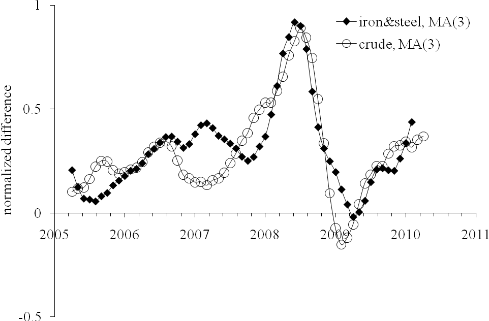
In September 2009, we reported that the price index of crude oil had been likely evolving in sync with that of iron and steel, but with a lag of two months. In order to present both indices in a comparable form, the difference between a given index, iPPI, and the overall PPI was normalized to the PPI: (iPPI(t)-PPI(t))/PPI(t). The normalized differences represent the evolution of the rate of deviation from the PPI over years.
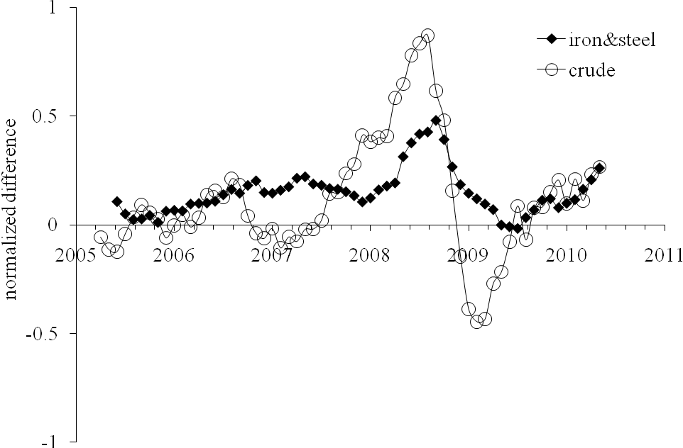
Figure 1 depicts corresponding time histories of the normalized deviations from the PPI. Simple visual inspection reveals the following feature: the (normalized deviation from the PPI of the) index of iron and steel lags by two months behind the (normalized) index of crude oil.

Figure 1. The deviation of the iron and steel price index and the index of crude oil from the PPI, normalized to the PPI.
In order to reduce both deviations to the same scale we additionally normalized the curves in Figure 1 to their peak values between 2005 and 2009:
(iPPI(t)-PPI(t))/[PPI(t)*max{iPPI-PPI)}]
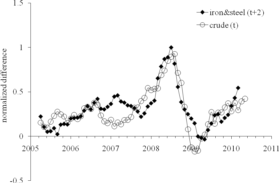
This scaling allows a direct comparison of corresponding shapes. In Figure 2, we display the normalized index of iron and steel shifted by two months ahead to synchronize its peak with that observed in the normalized index for crude petroleum. The scaled index of crude demonstrates just minor discrepancies from the index of iron and steel in the overall shape and timing of the peak and trough. Simple smoothing with MA(3) makes the curves resemblance even better. As an invaluable benefit of the resemblance, one can use the two-month lag to predict the future of the iron and steel price index.

Figure 2. Deviation of the iron and steel price index from the PPI, normalized to the PPI and the peak value after 2005 as compared to the deviations of the index for crude petroleum normalized in the same way. The normalized index for iron and steel is shifted two months ahead.
Conclusion
Between 2006 and 2010, the deviation of the price index of iron and steel from the PPI in the USA repeats the trajectory of the deviation of the index of crude petroleum (domestic production) with a two-month lag. Therefore, the prediction of iron and steel price for at this horizon is a straightforward one. It is likely that in 2010 the index of iron and steel will approach closely the level attained in August 2008. From this level, it will be declining in the long run following the new trend of oil price, as shown in our previous post.
References
Kitov, I., Kitov, O., (2009). Sustainable trends in producer price indices, Journal of Applied Research in Finance, Spiru Haret University, Faculty of Financial Management and Accounting Craiova, vol. I(1(1)_ Summ), pp. 43-51

6/8/10

Copper ores and grains. A year after

About a year ago we published a prediction for copper and grain:

Therefore, copper price will likely not be growing to its peak in April 2008 (491.7), but will likely return to heights around 350.

In the short-run, the index for copper will be growing at least till the end of 2009. The index for grains will continue its decline relative to the PPI. As a consequence, one can expect that the index for food will be also decreasing and this decline will stretch into the 2010s.

Figure 1 compares the prediction and actual behavior for the producer price index of copper ores relative to the overall PPI. All in all, the prediction was right: by the end of 20009 the price index of copper has reached the level of 350 (375) and even higher in the beginning of 2010 (443 in April). However, it has not reached the 2008 level. It is difficult to foresee further evolution, but one cannot exclude the price to grow beyond that in 2008.

Figure 2 illustrates the accuracy of our prediction of the index of grains. The index has been falling relative to the PPI and the trajectory actually repeats that observed 142 months before, as explained the previous post:

It is instructive to compare two major spikes in the grains index in 1996 and 2008 relative to the PPI. In order to avoid comparing absolute values, which undergo secular growth, the evolution of the difference between the PPI and the price index of grains normalized to the PPI. Figure 3 presents the normalized curves. The left panel shows that the spike in the grains PPI in July 1996 is similar in relative terms to that observed in 2008. The right panel tests this hypothesis: the spikes are synchronized - for the black line is shifted forward by 142 months. From this comparison, it is likely that decline in the grains index relative to the PPI will extend into the 2010s.


Figure 1. Evolution of the price index of copper ores relative to the PPI. Upper panel: September 2009. Lower panel: April 2010.


Figure 2. Evolution of the difference between the PPI and the price index of grains normalized to the PPI. Left panel: September 2009. Right panel: April 2010.

Short term prediction

In the short-run, the index for copper will NOT be growing too long, at least NOT till the end of 2010. The index for grains will continue its decline relative to the PPI. As a consequence, one can expect that the index for food will be also decreasing and this decline will stretch into the 2011.

We can also repeat the conclusion from the post one year ago

In the long run, the producer price index for copper and that of grains both demonstrate practically unpredictable behavior with unclear future. This observation only emphasizes the importance of sustainable trends observed for other commodities. In the US economy, as in many natural systems, there exist trend components, oscillating components, and random components.

Recovery of low-magnitude seismic events before the July 29, 2025, Kamchatka megathrust earthquake using waveform cross-correlation enhanced by the addition of stochastic noise

 Recovery of low-magnitude seismic events before the July 29, 2025, Kamchatka megathrust earthquake using waveform cross-correlation enhance...