Personal income is the American dream - the measure of success. The success histories have been fading away together with the dream - more and more people moving toward the bottom of the personal income distribution. Figure 1 shows the Gini ratio which is the most famous integral measure of income inequality. This graph is retrieved from the CPS data sets published by the US Census Bureau. One important notice on this graph is that the Gini ratio in the Census Bureau definition does not include people not reporting any income during the previous year during the (March) Annual Social and Economic Supplement of the Current Population Survey (ASEC CPS). In 2021, there were 268,723,000 people 16+ and only 237,500,000 of them reported income (~12%). This contradicts the most comprehensive definition of the Gini ratio as related to the whole society. (The income inequality in the USA would be too large if the non-incomers are counted in.) Even with people with incomes, the Gini ratio is extremely large in 2021 - 0.527. This is especially weird if to take into account the helicopter money injected in 2020 and 2021. In 2007, the Gini ratio was 0.494.
2/4/23
Personal income inequality has been increasing in the USA since 2010
Figure 1. The Gini ratio for the population of 16 and above in the USA.
Figure 2 presents the evolution of the Gini ratio in 10-year-wide age groups. The increase in the Gini is observed in all age groups.
Figure 2. Gini ratio in 10-year age groups. For example, 30 is the age group from 25 to 34.
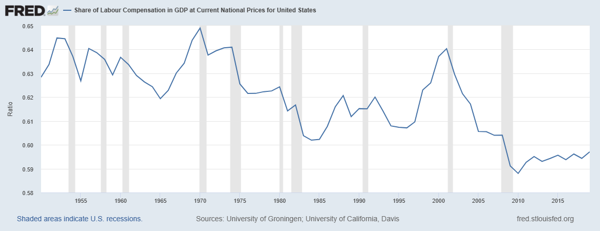
The current trend in income inequality might be related to the significant drop in the Share of Labour Compensation in GDP at Current National Prices for United States in Figure 3 and the significant fall in the labor force participation rate in Figure 4.
Figure 3. FRED data on the share of labour compensation in the GDP
Figure 4. Civilian labour force participation rate (BLS data)
Subscribe to:
Post Comments (Atom)
Trump, trap, Iran
Trump announced an ultimate goal of the agreement with Iran - no bomb. This is a trap for Trump. Imagine, Iran signs such an agreement. Trum...
-
These are two biggest parts of the Former Soviet Union. To characterize them from the economic point of view we borrow data from the Tot...
-
These days sanctions and retaliation is a hot topic. The first round is over and we will likely observe escalation well supported by po...
-
Yesterday I missed the absolute hero of deflation in the US – the consumer price index of information technology, hardware and software (see...


No comments:
Post a Comment