10/13/12

The S&P 500 returns imply real GDP growth 4% in Q3


We have been following the link between the S&P 500 and real GDP since 2008, when the first version of our S&P 500 quantitative model was published. We revisit our prediction on a regular basis and calculate a new forecast. Last time, we discussed the model on February 5, 2012 and reported a good prediction for the prior period. Here, we update our model with the revised GDP estimates and include the advance GDP estimate for the third quarter of 2012.  The monthly closing prices through September 2012 are used.  

As discussed in our working paper on the S&P 500 index, there exists a trade-off between the growth rate of real GDP, G(t),  and the S&P 500 return, R(t). The predicted returns, Rp(t), can be obtained from the following relationship: 

Rp(t) = 0.0054dlnG(t) - 0.03   (1) 

where G(t) is represented by the Q/Q (annualized) growth rate, because only quarterly readings of real GDP are published by the BEA.   Figure 1 compares the observed and predicted returns through September 2012. The third quarter of 2012 is characterized by a rapid rise in the level of the S&P 500 index and its returns over the previous 12 months. The real GDP estimate for the third quarter will be available in approximately two weeks, but one may estimate this value from the S&P 500 returns using (1). Three red diamonds in Figure 1 represent the predicted growth in the returns for the (annualized) GDP growth rate of 4%.  

Therefore, the stock market index indicates the growth rate of real GDP above the consensus estimate for the third quarter. Our estimate is also supported by the fall in the rate of unemployment to 7.8% in September from 8.1% in August, which corresponds to the GDP growth rate above 3% per year.


Figure 1. The predicted and observed S&P 500 return.  The predicted curve is smoothed by MA(4). The 12-month S&P return observed during the third quarter of 2012 implies the real GDP growth rate of 4%.

Spain: 33% unemployed in 2013?


A year ago, we described the evolution of unemployment in Spain using the LSQ technique as applied to the integral version of Okun’s law: 
 
u(t) = u(t0) + bln[G/G0] + a(t-t0)  (1)  

where u(t) is the rate of unemployment at time t, G is the level of real GDP per capita (we used TED, Conference Board, EKS PPP ), a and b are empirical coefficients.   The best-fit (dynamic) model for Spain minimizing the RMS error of the cumulative model (1) is as follows: 

du = -0.406dlnG + 2.00, t<1995
du = -1.11dlnG + 1.54, t>1994    (2)  

This model suggests a big shift in the slope and a smaller change in the intercept around 1995. Having a new unemployment estimate for 2011, we have updated Figure 1 (original Figure 1) from our previous post and confirmed the excellent predictive power of the model. The predicted value is 21.4% and that borrowed from the U.S. BLS is 21.8%.  

Figure 1 also shows a prediction (red circle) of the unemployment rate in Spain in case of a 10% fall in real GDP per capita in 2013. The current economic performance in Spain is awful and some experts see a GDP fall of 25%. We are scared to publish the number for the fall by a quarter of the current GDP level since even a 10% fall will result in a 33% rate of unemployment. Essentially a one third of labor force will be unemployed.  Unfortunately, even a zero GDP growth rate will result in a 1.5% increase in unemployment (see eq. 2).


Figure 1.  The observed and predicted rate of unemployment in the Spain between 1971 and 2011. 
In 2013, the rate may reach 33% in case of 10% fall in real GDP.  

The cumulative form of the dynamic Okun’s law is characterized by standard error of 1.68% for the period between 1971 and 2011 (0.92% after 1995). The average rate of unemployment for the same period is 13.6% (14.6% after 1995) with a standard deviation of the annual increment of 2.12%.

10/11/12

Russia: an economic projection from IMF

International Monetary Fund has issued a new "World Economic Outlook".  This is a sixty page document with lots of tables and figures. For Russia, it's not too much reported. IMF expects the Russian GDP to grow by 3.7% in 2012 and by 3.8% in 2013. This is 0.3% and 0.1% less than was predicted in July. A sad trend which may extend in the future.  Economic "activity in Russia, which has benefited various economies in the region, has also lost some momentum recently."
Central Bank Total Assets increased to 50% of the 2008 GDP, which is less than in China but higher than in India and Brazil. An important value for Russia is the difference between global oil demand and supply. With the Russian 10.7 million barrels production per day the global production excess in 1.7 millions a day (supply is 90.1 and demand - 88.1). Oil price has a downward tendency.

On the limits of economic growth


The discussion of the growth limits frightens the public. The perspective to have no growth in the near future puts the lives of our children under a great danger of having no work and fun. It is really frightening. This assumption comes from the theory of economic growth based on technological progress as the driver of real GDP. Since the inception, the technology and its progress has been mainly associated with the production of goods. The portion of workforce and capital needed to produce all goods for a given society has been decreasing over time due to millions and millions scientific inventions and major breakthroughs in engineering. When this tendency is extended years ahead one may suggest that the production of goods will require just a handful of people and a fraction of capital.

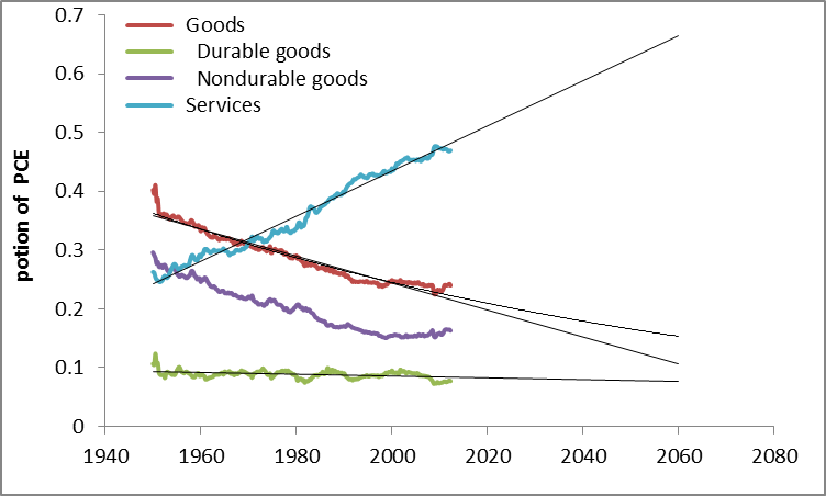
The frightening thing – this tendency does exist. Figure 1 shows the evolution of a few ratios: the portions of services and goods (also split into durable and non-durable goods) in the U.S. gross domestic product. The portion of goods in the GDP has been declining since 1951, which is the start year of our graphs. The portion of durable goods is constant (around 10%) since 1951. The fall in the goods portion is chiefly related to non-durable goods. The rate of fall has been decelerating since the start of the 1980s.

The portion of services in the GDP has been growing along a linear trend since the beginning and is about 47% in 2012. There is some room for the further growth in the 21st century. The portion of goods may decline to 25% of the GDP. Currently, the deceleration in the fall of the nondurable goods portion is explained by the increasing share of the PCE in the GDP, as Figure 2 demonstrates. This increase is compensated by a falling portion of the government consumption expenditures and gross investment.

Extrapolating all trends in the future, one may assume that there is no danger to the growth in real GDP which is defined the growing portion of services, which include not only technological progress per se but also human resources. As long as Humans have personal creativeness to please other Humans real economic growth is not in danger.


Figure 1. The portions of services and goods in PCE.


Figure 2. The portion of PCE in GDP

10/9/12

New issue of Theoretical and Practical Research in Economic Field


A new volume of TPREF (the whole journal as a pdf file ) is available now for Summer 2012. I am an author of one article and a co-editor.

A Closed Form Solution for a Growth Model with Externalities and Public Spending Oliviero A.
CARBONI
Paolo
RUSSU
University of Sassari, Italy
… 4
The Government-Taxpayer Game David
CARFI
University of California at Riverside, USA
Caterina
FICI
Business Administrator at VF of V. Fici, Italy
… 13
Institute for the Dynamics of the Geospheres, Russia
Oleg
KITOV
University of Oxford, UK
… 26
Knowledge-Based Economies and the Institutional Environment Daniele
SCHILIRĂ’
University of Messina, Italy
… 42

10/6/12

The rate of unemployment in the U.S. will fall to 6.2% by 2014

On March 1, 2012 we predicted (in a Seeking Alpha post) the rate of unemployment in the U.S. to fall down to 7.8% by 2013. The BLS announced 7.8% for September 2012. Here we present our basic model and predict the evolution of unemployment in 2013.

In 2006, we developed three individual empirical relationships between the rate of unemployment, u(t), price inflation, p(t), and the change rate of labour force, LF(t), in the United States. We also built a general relationship balancing all three variables simultaneously. Since measurement (including definition) errors in all three variables are independent it may so happen that they cancel each other (destructive interference) and the general relationship might have better statistical properties than the individual ones. For the USA, the best fit model for annual estimates was a follows:

u(t) = p(t-2.5) + 2.5dLF(t-5)/dtLF(t-5) + 0.0585 (1)

where inflation (CPI) leads unemployment by 2.5 years (30 months) and the change in labor force leads by 5 years (60 months). We have already posted on the performance of this model several times.

For the model in this post, we use monthly estimates of the headline CPI, u, and labor force, all reported by the US Bureau of Labor Statistics. The time lags are the same as in (1) but coefficients are different since we use month to month-a-year-ago rates of growth. We have also allowed for changing inflation coefficient. The best fit models for the period after 1978 are as follows:

u(t) = 0.63p(t-2.5) + 2.0dLF(t-5)/dtLF(t-5) + 0.07; between 1978 and 2003

u(t) = 0.90p(t-2.5) + 4.0dLF(t-5)/dtLF(t-5) + 0.30; after 2003

There is a structural break in 2003 which is needed to fit the predictions and observations in Figure 1. Due to strong fluctuations in monthly estimates of labor force and CPI we smoothed the predicted curve with MA(24).

The structural break in 2003 may be associated with the change of sensitivity of the rate of unemployment to the change of inflation and labor force. Alternatively, definitions of all three (or two) variables were revised around 2003, which is the year when new population controls were introduced by the BLS. The Census Bureau also reports major revisions to the Current Population Survey, where the estimates of labor force and unemployment are taken from.

On March 1, 2012 the monthly model predicted a drop from 8.3% in February to 7.8% by the end of 2012. Figure 1 depicts the original prediction (upper panel) and the observed fall in the rate of unemployment (lower panel). Figure 2 shows that the observed and predicted time series are well  correlated (Rsq.=0.81). This is a good statistical support to the model.

Figure 3 depicts the predicted rate of unemployment for the next 12 months. The model shows that the rate will fall to 6.2% by September 2013. For 105 observations since 2003, the modelling error is 0.4% with the precision of unemployment rate measurement of 0.2% (Census Bureau estimates in Technical Paper 66).
 
Hence, one may expect 6.2% [±0.4%].
 
 
Figure 1. Observed and predicted rate of unemployment in the USA as obtained in March and October 2012.


Figure 2.  Observed vs. predicted rate of unemployment between 1967 and 2012. The coefficient of determination   Rsq=0.81.


Figures 3. The predicted rate of unemployment. We expect the rate to fall down to 6.2% in September 2013.

Investing in Russia: a cross country comparison


As an investor, I have some emergent market bonds, and thus, I am highly interested in the performance of the countries in this category.  As a Russian, I always prefer to know more about its potential relative to other countries.  Below are several simple graphs showing the growth of GDP per capita in absolute and relative terms.   Per head values say more about actual potential not related to population fluctuations.
I compare Russia to four different country groups: China and India; countries from the former USSR; East European countries (former socialist countries); a few Asian countries. There are three time points of interest: 1991 (the start of transition period), 2001 (the start of sustainable growth as a capitalist country), and 2008 (the peak before the current crises). Therefore, I have normalized the GDP per capita time series to their respective values in 1991, 2001, and 2008. The normalized curves illustrate the evolution of the corresponding economies in relative terms. Figures 1 through 4 display the obtained result for four country groups (Russia is always shown by a black line).  All data are borrowed from the Total Economy Database (TED) compiled by the Conference Board (as of October 5, 2012).  The GDP per capita figures are in 2011 US$ converted to 2011 price levels with updated 2005 EKS PPPs.

There are several conclusions from the graphs:
1.       Since 1991, India and China have been doing better than Russia in relative terms but still lag behind the Russian level of GDP per capita.  Since 2001, India and Russia are close with China opening a larger gap.  Since 2008, the Russian economy has been falling apart. Hopefully, the negative deviation is an indication of a higher rate associated with a recovery growth in the near future. In any case, I am lucky to have the Indian and Chinese bonds in my portfolio together with the Russian ones.

2.       Among Former Soviet countries, Russia is not a good performer as well. It is in the middle of the growth curves since 1991, 2001, and 2008. The level is almost the highest, however.  Hence, Russia is a good representative on average. It is not the best performer, but is less sensitive to the current crisis than many of the FSU countries. Therefore, there is no reason to diversify investments over the FSU countries - one will get the result close to the Russian one.  When investing in the best performers one may meet a higher risk of slow down. The poor performers with a higher recovery potential are also characterized by a higher risk.  

3.         Russia is in the middle of the GDP per capita distribution among East European countries. It has been growing slowly since 1991, but outperformed almost all countries since 2001. As mentioned above, Russia was very sensitive to the 2008 crisis and the GDP per capita fell by 9%. It is one of the worst performances among East European countries. The rate of recovery since 2009 is the highest, however. If continued to intersect the paths of Poland and Albania, this recovery growth may bring a fortune for an investor.  

4.       Among Asian countries, Russia is a good performer since 2001, but the poorest one since 2008.


Figure 1. The level of GDP per capita (upper panel) and the evolution of GDP per capita normalized to 1991, 2001, and 2008. The case of India, China and Russia. 

 
Figure 2. The level of GDP per capita (upper panel) and the evolution of GDP per capita normalized to 1991, 2001, and 2008. The case of the countries from the former USSR.


Figure 3. The level of GDP per capita (upper panel) and the evolution of GDP per capita normalized to 1991, 2001, and 2008. The case of the East European countries.


Figure 4. The level of GDP per capita (upper panel) and the evolution of GDP per capita normalized to 1991, 2001, and 2008. The case of the selected Asian countries.

Recovery of low-magnitude seismic events before the July 29, 2025, Kamchatka megathrust earthquake using waveform cross-correlation enhanced by the addition of stochastic noise

 Recovery of low-magnitude seismic events before the July 29, 2025, Kamchatka megathrust earthquake using waveform cross-correlation enhance...