10/6/12

The rate of unemployment in the U.S. will fall to 6.2% by 2014

On March 1, 2012 we predicted (in a Seeking Alpha post) the rate of unemployment in the U.S. to fall down to 7.8% by 2013. The BLS announced 7.8% for September 2012. Here we present our basic model and predict the evolution of unemployment in 2013.

In 2006, we developed three individual empirical relationships between the rate of unemployment, u(t), price inflation, p(t), and the change rate of labour force, LF(t), in the United States. We also built a general relationship balancing all three variables simultaneously. Since measurement (including definition) errors in all three variables are independent it may so happen that they cancel each other (destructive interference) and the general relationship might have better statistical properties than the individual ones. For the USA, the best fit model for annual estimates was a follows:

u(t) = p(t-2.5) + 2.5dLF(t-5)/dtLF(t-5) + 0.0585 (1)

where inflation (CPI) leads unemployment by 2.5 years (30 months) and the change in labor force leads by 5 years (60 months). We have already posted on the performance of this model several times.

For the model in this post, we use monthly estimates of the headline CPI, u, and labor force, all reported by the US Bureau of Labor Statistics. The time lags are the same as in (1) but coefficients are different since we use month to month-a-year-ago rates of growth. We have also allowed for changing inflation coefficient. The best fit models for the period after 1978 are as follows:

u(t) = 0.63p(t-2.5) + 2.0dLF(t-5)/dtLF(t-5) + 0.07; between 1978 and 2003

u(t) = 0.90p(t-2.5) + 4.0dLF(t-5)/dtLF(t-5) + 0.30; after 2003

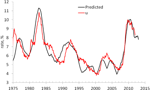
There is a structural break in 2003 which is needed to fit the predictions and observations in Figure 1. Due to strong fluctuations in monthly estimates of labor force and CPI we smoothed the predicted curve with MA(24).

The structural break in 2003 may be associated with the change of sensitivity of the rate of unemployment to the change of inflation and labor force. Alternatively, definitions of all three (or two) variables were revised around 2003, which is the year when new population controls were introduced by the BLS. The Census Bureau also reports major revisions to the Current Population Survey, where the estimates of labor force and unemployment are taken from.

On March 1, 2012 the monthly model predicted a drop from 8.3% in February to 7.8% by the end of 2012. Figure 1 depicts the original prediction (upper panel) and the observed fall in the rate of unemployment (lower panel). Figure 2 shows that the observed and predicted time series are well  correlated (Rsq.=0.81). This is a good statistical support to the model.

Figure 3 depicts the predicted rate of unemployment for the next 12 months. The model shows that the rate will fall to 6.2% by September 2013. For 105 observations since 2003, the modelling error is 0.4% with the precision of unemployment rate measurement of 0.2% (Census Bureau estimates in Technical Paper 66).
 
Hence, one may expect 6.2% [±0.4%].
 
 
Figure 1. Observed and predicted rate of unemployment in the USA as obtained in March and October 2012.


Figure 2.  Observed vs. predicted rate of unemployment between 1967 and 2012. The coefficient of determination   Rsq=0.81.


Figures 3. The predicted rate of unemployment. We expect the rate to fall down to 6.2% in September 2013.

Investing in Russia: a cross country comparison


As an investor, I have some emergent market bonds, and thus, I am highly interested in the performance of the countries in this category.  As a Russian, I always prefer to know more about its potential relative to other countries.  Below are several simple graphs showing the growth of GDP per capita in absolute and relative terms.   Per head values say more about actual potential not related to population fluctuations.
I compare Russia to four different country groups: China and India; countries from the former USSR; East European countries (former socialist countries); a few Asian countries. There are three time points of interest: 1991 (the start of transition period), 2001 (the start of sustainable growth as a capitalist country), and 2008 (the peak before the current crises). Therefore, I have normalized the GDP per capita time series to their respective values in 1991, 2001, and 2008. The normalized curves illustrate the evolution of the corresponding economies in relative terms. Figures 1 through 4 display the obtained result for four country groups (Russia is always shown by a black line).  All data are borrowed from the Total Economy Database (TED) compiled by the Conference Board (as of October 5, 2012).  The GDP per capita figures are in 2011 US$ converted to 2011 price levels with updated 2005 EKS PPPs.

There are several conclusions from the graphs:
1.       Since 1991, India and China have been doing better than Russia in relative terms but still lag behind the Russian level of GDP per capita.  Since 2001, India and Russia are close with China opening a larger gap.  Since 2008, the Russian economy has been falling apart. Hopefully, the negative deviation is an indication of a higher rate associated with a recovery growth in the near future. In any case, I am lucky to have the Indian and Chinese bonds in my portfolio together with the Russian ones.

2.       Among Former Soviet countries, Russia is not a good performer as well. It is in the middle of the growth curves since 1991, 2001, and 2008. The level is almost the highest, however.  Hence, Russia is a good representative on average. It is not the best performer, but is less sensitive to the current crisis than many of the FSU countries. Therefore, there is no reason to diversify investments over the FSU countries - one will get the result close to the Russian one.  When investing in the best performers one may meet a higher risk of slow down. The poor performers with a higher recovery potential are also characterized by a higher risk.  

3.         Russia is in the middle of the GDP per capita distribution among East European countries. It has been growing slowly since 1991, but outperformed almost all countries since 2001. As mentioned above, Russia was very sensitive to the 2008 crisis and the GDP per capita fell by 9%. It is one of the worst performances among East European countries. The rate of recovery since 2009 is the highest, however. If continued to intersect the paths of Poland and Albania, this recovery growth may bring a fortune for an investor.  

4.       Among Asian countries, Russia is a good performer since 2001, but the poorest one since 2008.


Figure 1. The level of GDP per capita (upper panel) and the evolution of GDP per capita normalized to 1991, 2001, and 2008. The case of India, China and Russia. 

 
Figure 2. The level of GDP per capita (upper panel) and the evolution of GDP per capita normalized to 1991, 2001, and 2008. The case of the countries from the former USSR.


Figure 3. The level of GDP per capita (upper panel) and the evolution of GDP per capita normalized to 1991, 2001, and 2008. The case of the East European countries.


Figure 4. The level of GDP per capita (upper panel) and the evolution of GDP per capita normalized to 1991, 2001, and 2008. The case of the selected Asian countries.

10/5/12

How many democrats are needed to bias unemployment figures?


I do not consider any possibility that the Current Population Survey conducted by the U.S. Census Bureau for September 2012 is biased by CB or by the BLS, This is not the case. There is another hypothetical way to bias the data. There are around 70000 households surveyed by the CB. These households include approximately 200000 persons (mean household is 2.5 people). All these people (excluding several percent not responding ones) answer a few questions associated with their current status: employed, unemployed or not in the labor force. There current level of civilian labor force is approximately 155,000,00 with 12,000,000 unemployed. These figures are calculated by a projection of 200,000 to 310,000,000 using population controls. In essence, one person represents 1550 people.

How many people are needed to increase the rate of unemployment by 0.1%? The rate of unemployment is calculated as the ratio of the number of unemployed and labor force.   So, 0.1% of unemployment rate with the level of labor force of 155,000,000 corresponds to 155000. Since one person in the CPS represents 1550 people, one needs only 100 people to increase the rate of unemployment by 0.1%. To decrease the rate by 0.3% , only 300 (democrats -Spartans?) are needed.

I do not say that the result for September 2012  is biased. I say that the Current Population Survey procedure is wide-open for manipulations.

7.8% unemployment was predicted in April 2012


In 2006, we developed three individual empirical relationships between the rate of unemployment, u(t), price inflation, p(t), and the change rate of labour force, LF(t), in the United States. We also built a general relationship balancing all three variables simultaneously. Since measurement (including definition) errors in all three variables are independent it may so happen that they cancel each other (destructive interference) and the general relationship might have better statistical properties than the individual ones. For the USA, the best fit model for annual estimates is a follows:

u(t) = p(t-2) + 2.5dLF(t-5)/dtLF(t-5) + 0.0585 (1)

where inflation (CPI) leads unemployment by 2 years and the change in labor force by 5 years. We have already posted on the performance of this model several times.

Here a model with monthly estimates of CPI, u, and labor force is presented. The time lags are the same as in (1) but coefficients are different since we use month to month a year ago rates of growth. We have also allowed for changing inflation coefficient. The best fit models for the period after 1978 are as follows:

u(t) = 0.63p(t-2) + 2.0dLF(t-5)/dtLF(t-5) + 0.07; between 1978 and 2003

u(t) = 0.90p(t-2) + 4.0dLF(t-5)/dtLF(t-5) + 0.30; after 2003

There is a structural break in 2003 which is needed to fit the predictions and observations in Figure 1. Due to strong fluctuations in monthly estimates of labor force and CPI we smoothed the predicted curve with MA(24). The rate of unemployment became more sensitive to the change of inflation and labor force. Alternatively, definitions of all three (or two) variables were revised around 2003, which is the year when new population controls were introduced by the BLS.

All in all, the monthly model predicts the observed rate of unemployment which has recently dropped to 8.3%. We expect the rate to fall further to the level of 7.8% by the end of 2012.


Figure 1. Observed and predicted rate of unemployment in the USA.

10/3/12

Society for the Study of Economic Inequality: working papers

Top 25 Working Papers by Total File Downloads

1 The effects of Fair Trade on marginalised producers: an impact analysis on Kenyan farmers


Leonardo Becchetti and Marco Costantino


2 GDP growth rate and population

Ivan O. Kitov


3 Poverty among minorities in the United States: Explaining the racial poverty gap for Blacks and Latinos

Carlos Gradín


4 Inflation, unemployment, labor force change in the USA

Ivan O. Kitov


5 Microsimulation as a Tool for Evaluating Redistribution Policies

François J. Bourguignon and Amedeo Spadaro


6 Theil, Inequality Indices and Decomposition

Frank Alan Cowell


7 Inequality of opportunities vs. inequality of outcomes: Are Western societies all alike?

Arnaud Lefranc, Nicolas Pistolesi and Alain Trannoy


8 The effects of inequality on growth: a survey of the theoretical and empirical literature

Christophe Ehrhart


9 The measurement of gender wage discrimination: The distributional approach revisited

Coral del Rio Otero, Carlos Gradín and Olga Cantó


10 A model for microeconomic and macroeconomic development

Ivan O. Kitov


11 Evolution of the personal income distribution in the USA: High incomes

Ivan O. Kitov


12 Modelling the overall personal income distribution in the USA from 1994 to 2002

Ivan O. Kitov


13 On analysing the world distribution of income

Anthony B. Atkinson and Andrea Brandolini


14 Modeling the evolution of Gini coefficient for personal incomes in the USA between 1947 and 2005

Ivan O. Kitov


15 All types of inequality are not created equal: divergent impacts of inequality on economic growth

Stephanie Seguino


16 The demand for socially responsible products: empirical evidence from a pilot study on fair trade consumers

Leonardo Becchetti and Furio Camillo Rosati


17 Poverty and Time

Walter Bossert, Satya R. Chakravarty and D’Ambrosio, Conchita (Conchita D'Ambrosio)


18 The Household Wealth Distribution in Spain: The Role of Housing and Financial Wealth

Francisco Azpitarte


19 Reconsidering the Environmental Kuznets Curve hypothesis: the trade off between environment and welfare

Nicola Cantore


20 Recent trends in income inequality in Latin America

Leonardo C. Gasparini, Guillermo Cruces and Leopoldo Tornarolli


21 Measuring Bipolarization, Inequality, Welfare and Poverty

Juan Gabriel Rodríguez


22 Modelling the age-dependent personal income distribution in the USA

Ivan O. Kitov


23 Multidimensional Poverty Measures from an Information Theory Perspective

Maria Ana Lugo and Esfandiar Maasoumi


23 Inequality Decompositions ?A Reconciliation

Frank Alan Cowell and Carlo Vittorio Fiorio


25 Changes in poverty and the stability of income distribution in Argentina: evidence from the 1990s via decompositions

Florencia Lopez Boo

10/1/12

Japan - my scenario of consumer price fall was too optimistic

I've found a new projection of labor force in Japan between 2010 and 2050. It says that the rate of labor force participation will be decreasing together with the depopulation of Japan. This means that the level of labor force will be falling much faster than it was used in my recent prediction. Considering the multiplication factor of 1.4, the rate of CPI inflation will reach -1% per year on average in 2020. By 2050, it will reach almost 2% per year (1.89%). The overall drop in consumer prices will be more than 2/3 by 2050.  This fall will be accompanied by the decrease in real GDP at a rate of 1% per year and the debt rise to 500% of GDP.

VOX's opened a debate: What’s the use of economics?

VOX has opened a new discussion "What’s the use of economics?"  moderated by Richard Baldwin.


It would be helpful to have opinions from professionals from the hard sciences. We know about the overall opinion of the economic profession - the role of economics has dramatically increased after the crisis [:)]. We  know the opinion of the general public - "failed once again".  But only the approach adopted in the hard sciences can reshape economics in a way appropriate for the safe usage by the society. Currently, economics is irrelevant what makes it agressive and dangerous for the ustainability of the economy and society. It is time to put the economic studies in the  bounds of quantiative responsibility. Otherwise, it will fail again and again ...

This is the announcement and invitation to participate the discussion

Economics is under fire both from outside and inside the profession for irrelevance, arrogance, and more. This new Vox debate focuses on two questions: What’s the use of economics? How should we be teaching it to the next generation?

To participate in this debate, please email your commentary to debates@voxeu.org

Lead CommentariesRecent CommentariesPopular Commentaries
Diane Coyle, 18 September 2012
What’s the use of economics? A new Vox debate


Andrew G Haldane, 28 September 2012

What have the economists ever done for us?


Drang nach Osten — «натиск на Восток»

ИИ гугла написал « Drang nach Osten — «натиск на Восток») — это исторический термин, обозначающий германскую экспансию на славянские и восто...