3/3/12

Abbot Laboratories’ share price


Here we model the evolution of Abbot Laboratories’ (NYSE: ABT) stock price since July 2003. Abbot is a company from healthcare sector of the S&P 500 index. We model a share price decomposing it into a weighted sum of two consumer price indices. Our concept presumes that there exist a trade-off between a given share price and goods and services the relevant company produces and/or provides. Obviously, the defining consumer price (or CPI) has to rely to some independent and dynamic reference, which can also be a consumer price index. The pricing power is related to the difference between the defining and reference CPIs. 

We have borrowed the time series of monthly closing prices of ABT from Yahoo.com and the relevant (seasonally not adjusted) CPI estimates through January 2012 are published by the BLS.  Instructively, the evolution of ABT share price is defined by the consumer price index of medical care commodities (e.g. the discovery, development, manufacture, and sale of health care products) and the index of transportation services (TS). The defining time lags are as follows: the MCC index leads the share price by 9(!)  months and the TS index leads by 8 (!) months. The relevant best-fit model for ABT(t) is as follows:  

ABT(t) =  0.93MCC(t-9) – 1.00TS(t-8)  + 1.92(t-1990) – 22.62,  February 2012 

where ABT(t) is the ABT share price in U.S. dollars,  t is calendar time. Figure 1 displays the evolution of both defining indices since 2002.  Figure 2 depicts the high and low monthly prices for an ABT share together with the predicted and measured monthly closing prices (adjusted for dividends and splits). The predicted prices are well within the bounds of the share price uncertainty and lead by 8 months.  However, the price has not been changing much since 2010 and the knowledge of the lead can not bring high return. 

The model residual error is shown in Figure 3 with the standard deviation between July 2003 and January 2012 of $2.38. Currently, the price is overestimated relative to its expected value and one can foresee a negative correction (~$3) in the first half of 2012.  From Figure 2, the uncertainty of $5 (between the low and high monthly prices) is applicable to our prediction. It means that one may act on the price when it is beyond the $5 range relative to the expected level.  


Figure 1. The evolution of MCC and TS indices

Figure 2. Observed and predicted ABT share prices.

Figure 3. The model residual error: stdev=$2.38.

Allstate Corporation's share price


Here we model the evolution of Allstate Corporation’s (NYSE: ALL) stock price. Allstate is a company from financial sector which is associated with the personal property and casualty insurance, life insurance, and retirement and investment products business primarily in the United States. The model has been obtained using our concept of share pricing as a decomposition of a share price into a weighted sum of two consumer price indices. The background idea is a simplistic one: there is a potential trade-off between a given share price and goods and services the company produces and/or provides. For example, the energy consumer price does influence the price of energy companies. It should be taken into account that the defining consumer price (or relevant CPI) has to be related to some independent and dynamic reference, which can also be a consumer price index. A higher relative growth of the defining CPI should be manifested in a higher pricing power for the company.  

We have borrowed the time series of monthly closing prices of ALL from Yahoo.com and the relevant (seasonally not adjusted) CPI estimates through January 2012 are published by the BLS.  The evolution of ALL share price is defined by the consumer price index of food without beverages (FB) and the index of information and information processing (INF). The defining time lags are as follows: the FB index leads the share price by 4 months and the INF index leads by 6 months. The relevant best-fit model for ALL(t) is as follows:  

ALL(t) =  -1.83FB(t-4) – 4.05INF(t-6)  + 6.21(t-1990) + 634.40,  February 2012

where ALL(t) is the ALL share price in U.S. dollars,  t is calendar time. Figure 1 displays the evolution of both defining indices since 2002.  Figure 2 depicts the high and low monthly prices for an ALL share together with the predicted and measured monthly closing prices (adjusted for dividends and splits). The predicted prices are well within the bounds of the share price uncertainty and lead by 4 months.  

The model residual error is shown in Figure 3 with the standard deviation between July 2003 and January 2012 of $2.74. 

One can foresee the price evolution at a 4 months horizon. Currently, the share price is expected to decline in the first half of 2012.   

Figure 1. The evolution of FB and INF indices


Figure 2. Observed and predicted ALL share prices. 

Figure 3. The model residual error: stdev=$2.74.

Aon Corporation's share price

Here we address the first time our stock price model for Aon Corporation (AON) which is a company from financial sector and is engaged in risk management and insurance and reinsurance brokerage. The model has been obtained using our concept of share pricing as a decomposition of a share price into a weighted sum of two consumer price indices. The intuition is simple; a faster growth in the CPI related to the share price (e.g. energy consumer price for energy companies) relative to some independent and dynamic reference should be manifested in a higher pricing power for the company. Our model seeks for the defining CPI and the reference. Ultimately, our goal is to test the underlying concept and to estimate time lags and coefficients for AON.  

We have borrowed the time series of monthly closing prices of AON from Yahoo.com and the relevant (seasonally not adjusted) CPI estimates through January 2012 are published by the BLS.  The evolution of AON share price is defined by the consumer price index of tenants' and household insurance (THI) and the index of recreation (R). The defining time lags are as follows: the THI index has no lead and the R index leads by 4 months. The relevant best-fit model for AON(t) is as follows: 

AON(t) =  -2.35THI(t-0) – 3.21(t-4)  + 9.64R(t-1990) + 503.25,  February 2012

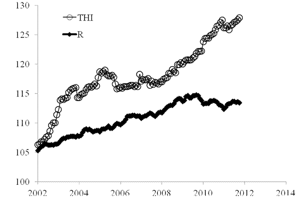
where AON(t) is the AON share price in U.S. dollars,  t is calendar time. Figure 1 displays the evolution of both defining indices since 2002.  The tenants' and household insurance index with zero months lead makes the model a sound one since AON deals with insurance. 

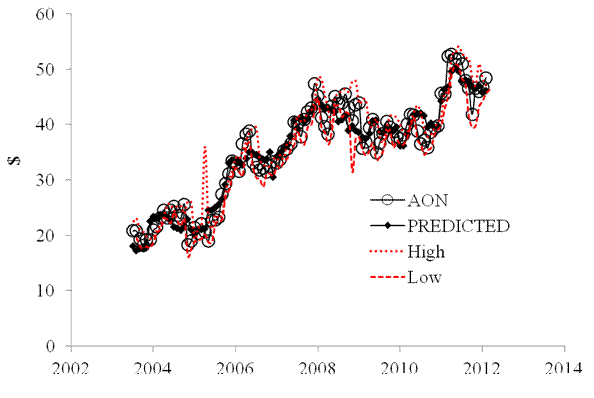
Figure 2 depicts the high and low monthly prices for an AON share together with the predicted and measured monthly closing prices (adjusted for dividends and splits). The predicted prices are well within the bounds of the share price uncertainty.  The model residual error is shown in Figure 3 with the standard deviation between July 2003 and January 2012 of $2.54.  

Both CPIs have negative influence on the share price. Therefore, the price should decrease when the indices grow fast. Fortunately, the index of recreation has been declining since 2009 to compensate the rising prices of tenants' and household insurance.  We xpect the THI index to decelerate in the near future and  AON share price to increase slightly in 2012.


Figure 1. The evolution of the index of tenants' and household insurance (THI) and the index of recreation (R).  

Figure 2. Observed and predicted AON share prices. 


Figure 3. The model residual error: stdev=$2.54.

3/1/12

How the U.S. Census Bureau fakes population data

Selected results of the 2010 census are available now. We first analyze the age pyramid. In a series of papers we have shown that the evolution of age distribution, i.e. the rate of change of some specific age, defines the rate of real economic growth [1, 2], the rate of participation labor force [3], labor productivity [4], the S&P 500 returns [5], and the level of income inequality [6]. Therefore, the page pyramid has to be measured precisely.  

In the past, we found several weird features. One of them is the deviation between the postcensal and intercensal population estimates. The latter take the advantage of decennial censuses and redistribute the so called error of the closure (the difference between estimated population and that enumerated in decennial censuses) over the previous decade. The postcensal estimates are progressively built from the reference censuses by adding net migration, birth and deaths as taken from various administrative and statistical sources.

The Census Bureau has also to retain the differences between adjacent age cohorts (one year of age) intact.  Obviously, the relative distribution over ages (the share of a given age) has to be taken from censuses (where else) and then extended in the postcensal population estimates.  The evolution of the number of people with a given age is defined by many factors, but the difference with an adjacent cohort should not significantly change over time. All these factors (e.g. migration and death rate) do not differ much for neighboring ages.   

Figure 1 shows an example of the difference between several adjacent cohorts and the artificiality of the Census Bureau’s approach. The difference between the number of five-year-olds (N5) and six-years old (N6) one year after (N5 are those who are the biggest part of the six-year-olds a year after) was very small before 2001 and is small after 2001. The difference between N7 and N8 was evenly redistributed between 1991 and 2000. Then in 2001 we observe a strange rectangular valley which ends up in the same difference after 2001 as the N5-N6 difference. Since N7-N8 is positive the number of seven-year-olds exceeds the number of eight-year-olds in one year by 100,000 to 50,000. This is highly suspicious result. The measurement accuracy of the defining age of nine years shows even a worse performance. The difference is evenly distributed between 1991 and 2000. Then a sharp step of 75,000 people in 2001 ends in the same behavior after 2001 as observed for all differences. The yearly population increment (e.g. N5-N6) should depend on age and year, but the Census Bureau has fixed it over ages and time. This is more than weird.

We have to conclude that distribution of the single year of age populations are highly biased by the Census Bureau before and after the 2000 census. This introduces a significant disturbance in the statistical estimates of the link between real GDP and age pyramid.  

Figure 2 depicts the difference between the 2010 census estimates (April 2010) and the postcensal estimates for the same month as a function of age. This is the closure error. One can conclude that the postcensal estimates of the younger population were poor. Unfortunately, the intercensal estimates with the 2010 census data will likely be biased as well.

Figure 1. The differences between populations of adjacent ages where the older population is taken one year later (e.g. N5(May 1995)-N6(May 1996)).

Figure 2. The difference between the population enumerated in the 2010 census (April 2010) and the postcensal estimates for April 2010 as a function of age.  

2/29/12

Unemployment will drop to 7.8% by 2013

In 2006, we developed three individual empirical relationships between the rate of unemployment, u(t), price inflation, p(t), and the change rate of labour force, LF(t), in the United States. We also built a general relationship balancing all three variables simultaneously. Since measurement (including definition) errors in all three variables are independent it may so happen that they cancel each other (destructive interference) and the general relationship might have better statistical properties than the individual ones.   For the USA, the best fit model for annual estimates is a follows: 
u(t) = p(t-2) + 2.5dLF(t-5)/dtLF(t-5) + 0.0585       (1) 
where inflation (CPI) leads unemployment by 2 years and the change in labor force by 5 years.  We have already posted on the performance of this model several times.  
Here a model with monthly estimates of CPI, u, and labor force is presented. The time lags are the same as in (1) but coefficients are different since we use month to month a year ago rates of growth. We have also allowed for changing inflation coefficient. The best fit models for the period after 1978 are as follows: 
u(t) = 0.63p(t-2) + 2.0dLF(t-5)/dtLF(t-5) + 0.07;  between 1978 and 2003
u(t) = 0.90p(t-2) + 4.0dLF(t-5)/dtLF(t-5) + 0.30; after 2003
There is a structural break in 2003 which is needed to fit the predictions and observations in Figure 1. Due to strong fluctuations in monthly estimates of labor force and CPI we smoothed the predicted curve with MA(24). The rate of unemployment became more sensitive to the change of inflation and labor force. Alternatively, definitions of all three (or two) variables were revised around 2003, which is the year when new population controls were introduced by the BLS.  
All in all, the monthly model predicts the observed rate of unemployment which has recently dropped to 8.3%. We expect the rate to fall further to the level of 7.8% by the end of 2012.  
Figure 1. Observed and predicted rate of unemployment in the USA.

2/28/12

The FRB, the BEA, and the BLS lie on inflation

Couple days ago we posted on the federal funds rate. The interest rate is defined by the Federal Reserve as a major instrument to control price inflation. Figure 1 depicts the cumulative values of effective rate, R, and the rate of consumer price inflation, CPI, multiplied by 1.4. In the long run, these two curves evolve along the same trend and intercept every fifteen to twenty years. We presumed that the main idea to keep R above the rate consumer price inflation is that a higher funds rate should suppress price inflation due to the effect expensive money.

On the other hand, the FRB has likely to retain the interest rate at the long term level of price inflation in order to create neutral conditions for money supply. This would be a wise prerequisite for a central bank. Then why the FRB needs that factor of 1.4? Actually it does not and the answer comes from the historical GDP data. The problem of the multiplier is in wrong estimates of inflation since 1950. Essentially, the FRB, the BEA, and the BLS lie.

Figure 2 depicts the evolution of real GDP per capita in the US since 1870. As we have already mentioned in our posts, there are two trends in the historical GDP data – before and after 1950. Before 1940, the (red) regression line with a slope of ~$61 per year in Figure 2 provides a good approximation of the actual curve. After 1950, the actual curve evolves along a straight line with a slope of $387 per year, i.e. the slope rises by a factor of 6.34 after 1950. Real GDP is defined as the ratio of nominal GDP and the GDP deflator. Both values are measured and estimated (also using a subjective hedonic factor) by the BEA and BLS. Therefore, the estimates of real GDP per capita heavily depend on the definition of price inflation.

Let’s suppose that the real GDP curve evolves along the old trend after 1940, as shown in Figure 2. Then the level of real GDP per capita in 2008 would have been $10,774 instead of $31,178 as estimated by. This means that the GDP deflator was underestimated by a factor of 2.89 (=31178/10774). The reported increase in the level of consumer prices since 1960 was of 7.27, i.e. CPI(2008)/CPI(1960) =7.27. Then we expect that the actual price increase (i.e. reported plus underestimated) would have been 7.27+2.89=10.16, and the rate of CPI inflation was underestimated by 10.16/7.27=1.4 times.

A big surprise! This is exactly the factor of the federal funds rate above the rate of price inflation. Hence, the FRB retains the interest rate at the level of actual inflation and thus does not influence inflation. The BEA, BLS and FRB lie (intentionally or not) about the rate of inflation and the growth in real GDP. The current level of GDP per capita in the US should be around $11000 not $31,000.

Figure 1. Cumulative values of the monthly estimates of R and the CPI multiplied by a factor of 1.4.

Figure 2. Historical estimates of real GDP per capita.

2/27/12

PPI of durable and nondurable goods

Three years ago we presented the difference between the PPI of durable and nondurable goods and stated that one could predict its evolution at a several year horizon. This difference is characterized by the presence of sustainable mid-term trends.  Obviously, the future of both indices is of crucial importance for industries behind relevant goods, for the stock market, and for real economy. Our analysis provides a long-term prediction. Its reliability depends on the growth in real GDP in the near future.

The evolution of the producer price index of durable and  nondurable goods is reported by the BLS at a monthly rate. In 2009, we presented Figure 1 which demonstrates that the difference has two distinct quasi-linear and both positive branches: between 1988 and 2000 (June), and from 2001 to 2008 (January). Red and blue lines highlight segments between 1988 and 2000, and from 2001 to 2008, respectively. Corresponding linear regression lines in Figure 1 have slopes of +0.05 and -6.8. The former slope is a negligible one, and the latter indicates that the index for nondurables has been growing since 2001 by 6.8 units if index faster than that for durables. In January 2008, the difference reached the level of -40, descending along the trend. Then the difference dropped to -67 in June and recovered to -20 by the end of 2008. This effect has been observed for all other commodities and is related to the financial crisis and recession.
Our naïve assumption about the next move after 2009 was that the difference would develop a new positive trend which would repeat the trend observed between 2001 and 2008, but with an opposite sign. The green line in Figure 1 predicts the expected evolution of the difference after 2009. Because the green line has a positive slope, the index for durables will be catching up that for nondurables since 2009. According to our assumption, the rate of approaching to the index for nondurable goods will be +6.8 units of index per year during the next 7 years. We also suggested that the actual trend might be different but almost inevitably with a positive slope. 
Here, we revisit this prediction. Figure 2 displays the evolution of the difference between 2009 and 2012 which is characterized by a very high level of volatility. The local peak in 2009 was followed by a sharp drop in the difference to the level of -59 in April 2011 and a relatively slow increase since then. We have introduced a new tentative trend for the difference which is less steep than in Figure 1. We expect the difference to reach -10 by 2020.  In any case the index of durables has to grow at a higher rate than the index of nondurables in the 2010s with possible (large-amplitude) fluctuations around the trend. We are going to revisit this difference in 2013.

Figure 1. Evolution of the difference between the PPI of durables and nondurables between 1985 and 2009. Red and blue lines highlight segments between 1988 and 2000, and from 2001 to 2008, respectively. Green line predicts the evolution of the difference after 2008, as a mirror reflection of the linear trend between 2001 and 2008.

Figure 2. Evolution of the difference between the PPI of durables and nondurables between 1990 and 2012. Red line highlights the segment from 2001 to 2008y. Green line predicts the evolution of the difference after 2009 which is less steep than in Figure 1.  

Recovery of low-magnitude seismic events before the July 29, 2025, Kamchatka megathrust earthquake using waveform cross-correlation enhanced by the addition of stochastic noise

 Recovery of low-magnitude seismic events before the July 29, 2025, Kamchatka megathrust earthquake using waveform cross-correlation enhance...