2/20/12

Modeling Computer Science Corporation’s share price

Two years ago, we first presented a share price (monthly closing price adjusted for splits and dividends) model for Computer Science Corporation (CSC) as based on the decomposition into a weighted sum of two consumer price indices (NSA borrowed from the BLS database). Approximately a year ago we revisited the original model using all data available through March 2011. The defining indices were obtained three years ago: the index of motor vehicle parts (MVP) and the index of sporting goods (SPO). The CPI components were leading by 0 and 5 months, respectively. Figure 1 depicts the evolution of both indices which provide the best fit model, i.e. the lowermost RMS residual error, between July 2008 and March 2011:

CSC(t) = -3.83MVP(t-0) + 3.16SPO(t-5) +16.31(t-1990) – 137.20, March 2011

where CSC(t) is the share price in US dollars, t is calendar time. In April, we predicted the curve in the upper panel of Figure 2 which is synchronized with the observed one. The residual error was of $3.28 for the period between July 2003 and March 2011. Since the MVP index has been growing since 2002 and the SPO index had a slight negative trend, we predicted that the share price would not be growing in 2011.

In reality, it has fallen slightly from $50 in March to the level of $24 per share in December 2011. Such a dramatic fall is difficult to describe with stochastic price models but our deterministic model has survived the crisis in CSC. There was a period of intensive growth in the MVP index (see Figure 1) which was converted in the share price drop. Currently, the defining indices are the same as three years ago:

CSC(t) = -3.81MVP(t-1) + 3.35SPO(t-7) +15.97(t-1990) – 158.37, January 2012

with slightly increased time delays of 1 month and 7 months, respectively. In the lower panel of Figure 2 the predicted and observed prices are depicted. The error term of the model between July 2003 and January 2012 is displayed in Figure 3 with stdev=$3.51. The residual was negative during the past quarter and we expect the price to grow in 2012Q1 for the model error to return to 0.

 
Figure 1. Evolution of the price indices MVP and SPO.


Figure 2. Observed and predicted CSC share prices.

Figure 3. Model error, i.e. the difference between the observed and predicted price; stdev = $3.51

Modeling Pepco Holdings' share price

In April 2011, we introduced a new model for Pepco Holdings (POM). The defining CPI indices were as follows: the index of food away from home (SEFV) and the index of owners' equivalent rent of residence (ORPR). (See model details in Appendix). Figure 1 depicts the evolution of these CPIs which lead the POM share price by 4 and 5 months, respectively. The best fit model, i.e. the lowermost RMS residual error, between July 2010 and March 2011:

POM(t) = -2.66SEVF(t-4) +1.06ORPR(t-5) +11.83(t-1990) + 101.35, March 2011

where POM(t) is the share price in U.S. dollars, t is calendar time. The upper panel in Figure 2 displays the observed monthly closing price and that predicted by the above relationship.

In April, we predicted that “In the second quarter of 2011, the model foresees a rise by $1.5.” Actual monthly closing price has increased from $18.55 in March to $19.63 in June 2011. The predicted price is well within the high/low monthly bounds, i.e. practically within the uncertainty bounds of the POM price.

Here we revisit the initial model with new data available through January 2012. The model is stable and is defined by the same CPIs with similar coefficients. Time delays are also similar but the SEVF leads the share price by 5 months:

POM(t) = -2.19SEVF(t-5) +0.76ORPR(t-5) +10.57(t-1990) + 95.97, January 2012

In the lower panel of Figure 2, we show the current model and the uncertainty bounds as presented high and low monthly prices. The overall fit is good and we expect the current price to fall in the 2012Q1. Figure 3 demonstrates that the model error in January 2012 is positive and it must fall back to 0 in the near future.

Figure 1. The evolution of defining CPI.


Figure 2. Observed and predicted POM share prices.

Figure 3. The model error, stdev= $0.89

Appendix
In its general form, our pricing model is as follows:

sp(tj) = Σbi∙CPIi(tj-Di) + c∙(tj-2000 ) + d + ej (1)

where sp(tj) is the share price at discrete (calendar) times tj, j=1,…,J; CPIi(tj-Di) is the i-th component of the CPI with the time lag Di, i=1,..,I; bi, c and d are empirical coefficients of the linear and constant term; ej is the residual error, which statistical properties have to be scrutinized. By definition, the bets-fit model minimizes the RMS residual error. The time lags are expected because of the delay between the change in one price (stock or goods and services) and the reaction of related prices. It is a fundamental feature of the model that the lags in (1) may be both negative and positive. In this study, we limit the largest lag to eleven months. Apparently, this is an artificial limitation and might be changed in a more elaborated model.

System (1) contains J equations for I+2 coefficients. For POM we use a time series from July 2003 to January 2012, i.e. 105 monthly readings. Due to the negative effects of a larger set of defining CPI components their number for all models is (I=) 2. To resolve the system, we use standard methods of matrix inversion. Usually, solutions of (1) are stable with all coefficients far from zero. In the POM model, we use 92 CPI components. They are not seasonally adjusted indices and were retrieved from the database provided by the Bureau of Labor Statistics.

Due to obvious reasons, longer time series guarantee a better resolution between defining CPIs. In general, there are two sources of uncertainty associated with the difference between observed and predicted prices. First, we have taken the monthly close prices (adjusted for splits and dividends) from a large number of recorded prices: monthly and daily open, close, high, and low prices, their combinations as well as averaged prices. Second source of uncertainty is related to all kinds of measurement errors and intrinsic stochastic properties of the CPI and its components. One should also bear in mind all uncertainties associated with the CPI definition based on a fixed basket of goods and services, which prices are tracked in few selected places. Such measurement errors are directly mapped into the model residual errors. Both uncertainties, as related to stocks and CPI, also fluctuate from month to month.

2/19/12

TIPS and puzzles of the CPI

The Treasury Inflation-Protected Securities, TIPS, are inherently related to the Consumer Price Index. When using TIPS, one should understand the evolution of the CPI as related to the overall economic growth.  We have already reported on the deviation between the headline CPI and the price index for Gross Domestic Product, dGDP. There should be some reason behind the overall deviation since 1978 shown   Figure 1. One can see that the CPI is approximately equal to the GDP deflator multiplied by a factor of 1.2 since 1978. The CPI (black line) and 1.2dGDP (dashed violet) lines practically coincide.

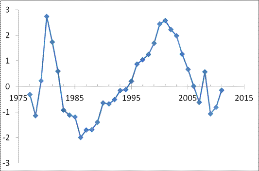
It is also interesting that the difference between the CPI and 1.2dGDP, as shown in Figure 2, has a clear oscillating character of unknown origin.  It might be an artificial feature. In 2012, the difference should rise above 0 and thus the CPI will grow at a rate slightly larger than 1.2dGDP. 
One can easily play with the well predicted difference between the CPI and dGDP, which defines the rate of real GDP growth.

Figure 1.  Cumulative rates of CPI and dGDP inflation, original and scaled by a factor of 1.2.

Figure 2. The difference between the CPI and 1.2dGDP shown in Figure 1.

Short remark on Greek economic growth

During the current turbulence in the EU and euro area it is instructive to assess relative rates of economic growth. It was envisaged that the EU countries will converge in the long run in a sustainable way. Three figures below demonstrate the performance of Greece relative to other countries   as expressed by real GDP per capita (retrieved from the Conference Board in 2011 EKS dollars). We have plotted the difference between real GDP per capita in a given country and that of Greece. After the start of the euro area, Greece demonstrated an excellent pace with almost all differences having negative trends. In other words Greece caught up almost all developed economies in the EU and outperformed east European countries.  It is surprising that Greece was very successful during the first year of the current economic and financial crisis and lost just a few dollars per capita when major economies counted losses in hundreds and thousands dollars.  

All that Greece gained in 2008 and even more was lost between 2009 and 2011. Even east European countries performed better and their respective differences have positive slopes. Greece is by far the worst performer since 2009.  On the other hand, this effect potentially puts Greece in a position of fast recover when the current crisis is over.


Modeling ConocoPhillips share price: annual report

This is an annual report on the performance of our pricing model linking share prices of energy companies with the difference between the headline and core CPI and PPI. In essence, we were trying to use the core CPI (PPI) as an energy independent (dynamic) reference to the index which includes energy. Then the difference might be related to the energy pricing power relative to other goods and services.  This idea has proven to be fruitful for oil (energy) companies and other categories of companies in the S&P 500 index and other consumer price indices.

Our original pricing model states that a share price, for example, that of ConocoPhillips, COP(t), can be approximated by a linear function of the difference between the core CPI, cCPI, and headline CPI:

COP(t) = A + B (cCPI - CPI(t))                                  (1)
where A and B are empirical constants; t is the elapsed time.  This model has proven its predictive power and we have been reporting on its performance since 2009. 

In August 2011, we extended the set of defining indices by the consumer price index of energy, eCPI, and the producer price index of crude petroleum, pPPI, together with the overall PPI. Thus, we tested the following models for the period between 2001 and July 2011:

COP(t) = A1 + B1(cCPI - eCPI(t))  (2)    
COP(t) = A2 + B2(pPPI - PPI(t))    (3)
Here we use new data through January 2012 retrieved from the BLS website. Figures 1 through 3 compare the original and new predictions for COP. Coefficients in (1) through (3) are given in Figure captions and are the same as in August 2011. The best model, as defined by standard error, for the period between January 2003 and January 2012 is based on the index of energy and core CPI.  (Same model was the best in August.) The accuracy of (1) has decreased since August and reached $8.31At the same time, model (3) based on the producer price indices is the worst and has failed to predict the amplitude of the largest oscillation in 2008.  It shoul be noted however that the difference between the index of crude oil and PPI perfectly describes the evolution of COP share price since 2009.
One can conclude that the consumer price index of energy has the largest influence on COP share price. Crude oil is well correlated with COP price but  failed to describe variations in the past. It is a good predictor  since 2009.
Figure 1.  The observed COP price and that predicted from the core and headline CPI.  A=75, B=-5.5. Stdev=$8.31.

Figure 2.  The observed COP price and that predicted from the core CPI and the consumer price index of energy.  A1=58, B1=-0.54. Stdev=$6.81. 
Figure 3.  The observed COP price and that predicted from the overall PPI and the producer price index of crude petroleum (domestic production).  A2=45, B2=-0.3. Stdev=$9.09.

2/17/12

Labor productivity champions

In our previous post, we have presented the evolution of labor productivity in three countries Australia, France and the United States in order to highlight strong differences between developed countries. Many years ago we explained these variations by the differences in the behavior of real GDP per capita. It is time to revisit our predictions, but in this post we just present the economies with the highest productivity. 

There are two estimates – dollars per hour, Ph, and dollars per employee, Pw. Figures 1 and 2 present both variables for seven larger countries. We skip Germany due to the reunification influence. Smaller economies with very high GDP, e.g. Luxemburg and Norway, are also not included. They do not drive the world’s economy.
One might find several interesting features when comparing two measures of productivity.  There are three leaders in Ph: Netherlands, France and the USA.  In the former two countries, the Ph curves have been demonstrating very fast growth rate since 1950.  Surprisingly, Japan has almost linear productivity growth with a short positive excursion between 1987 and 1993.
The US is the leader of productivity per person by a big margin. That observation should mean that people in other six countries work less hours on average. 

Figure 1. Labor productivity in dollars per hour in some developed countries between 1950 and 2011

Figure 2. Labor productivity in dollars per employee  in some developed countries between 1950 and 2011

2/15/12

Food price will stop growing in 2012

This is an annual update. We continue reporting on and predicting the evolution of the difference between core CPI and the index for food (beverages not included).  Previously, we confirmed in many posts and papers that this difference had been following a long-term (negative) quasi-linear trend since 2001.  There is an important change expected in 2012 – the predicted turn to a positive trend. In other words, the price index of food will grow at a pace lower than CPI.
In 2008, the trend line was much steeper than predicted and crossed the zero line. In the beginning of 2009, the trend reached the bottom and turned to a positive one, although not for long. The growth in food prices restarted in 2010. In the end of 2011, the difference has a short stop which might be a manifestation of the transition to a positive trend as Figure 1 depicts.
In June 2011 we found that the trend (black) line crosses the zero line in the end of 2010. Therefore, Figure 1 also demonstrates that the difference between the core CPI and the index of food has been slowly approaching to its original trend (red line) since 2009.
Here we conclude that the intercept with the zero line and the pivot to the decreasing food price will start in 2012 when the difference will reach some bottom (resistance) level (currently -5).  Considering the higher probability of deflation in 2012, food price will stop to rise in 2012.


Figure 1. The difference between the core CPI and the price index of food. The pivot point to a positive trend is likely in 2012. 
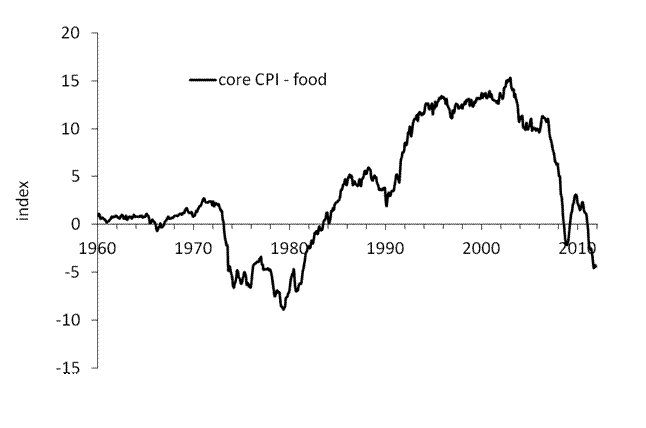
However, the previous negative/positive turn was at the level of -10, as displayed in Figure 2, one cannot exclude that the negative trend may change only after 2016. This case is less likely, however.
Figure 2. The difference between the core CPI and the price index of food between 1960 and December 2011.

Recovery of low-magnitude seismic events before the July 29, 2025, Kamchatka megathrust earthquake using waveform cross-correlation enhanced by the addition of stochastic noise

 Recovery of low-magnitude seismic events before the July 29, 2025, Kamchatka megathrust earthquake using waveform cross-correlation enhance...