2/8/12

Why Putin lies about his input to economic growth in Russia?

One of the biggest lies from Putin is that he has pulled out the Russian economy from ruins and given it a big push.  It is not true because the evolution of real GDP per capita in Russia follows the same path since 1998, i.e. the push to the economy had been given by President Yeltsin.  Figure 1 presents the measured real GDP per capita in Russia since the start of transition in 1991. We have also plotted our prediction as based on a physical model of transition from socialism to capitalism.  
The years of Putin’s presidency are characterized by inertial economic growth, which is not different from the previous years. There is no chance that Putin could make any difference. On average, the rate of real economic growth in Russia was of 4.0% per year since 1998.  According to our model, the rate should be around 5% per year for the level of GDP per capita in 1998-2007. This means that the Russian economy has been lagging behind its potential output.

Figure 1. Observed and predicted evolution of real GDP per capita in Russia.

Why income inequality is very difficult to analyze?

There are several major agencies reporting various measures of personal income. The Census Bureau, CB, measures personal incomes in household surveys (CPS ASEC) at an annual rate. This measure is called Money Income, MI, and includes various types of personal income. The CB provides these estimates to the Bureau of Labor Statistics in form of distributions over age/race/sex. 
The Bureau of Economic Analysis also carries out annual estimates of gross personal income, GPI, as based on administrative records but does not provide any dependence on age/race/sex. In that sense the BEA reports only the cumulative number and does not allow inferring any evolution of personal income distribution in time. The most important similarities and differences of the CB and BEA measures are discussed in depth in this CB document.   
The IRS also measures and reports personal incomes filed for tax purposes. Since 1996, the IRS has been publishing detailed tables of personal incomes distribution is various income bins. This is similar to the CB reports but includes capital gains as income source.  
Unfortunately, multiple purposes and multiple agencies reporting personal incomes make it difficult to follow up actual evolution of income distribution and income inequality in the US. There is no unique way to merge all data in one consistent table and to estimate the distribution of income over age/race/sex and to calculate any quantitative measure of inequality like Gini coefficient or Thile index.  We illustrate the difficulties with two plots. Figure 1 shows the portion of personal income reported by three agencies in nominal GDP. The BEA reports around 85% of GDP as personal incomes but does not include capital gains. The CB and IRS both report only 55% to 62% of GDP as personal incomes with a very large difference in sources of income.
Figure 2 shows the portion of population with income as defined by the CB and IRS. There is a dramatic difference of 30% between these agencies. In other word, the IRS does not count as personal income what approximately 30% of the total population define as money income. This might be not a big difference in total income when all personal incomes are summarized over this 30 per cent of population.
One may conclude that the way these three major agencies consider and resolve the problem of personal income and income inequality is counterproductive and confusing for any quantitative analysis.  This also means that the speculations about income inequality are mostly qualitative and thus emotional.

Figure 1. Portion of personal income in GDP.
Figure 2. Portion of people with personal income in total population.  

2/7/12

The heroes of inflation

As reported yesterday, the consumer price indices of many goods and services in the USA have been falling or at least not growing since 1991. But the overall price inflation as described by the headline CPI (we use not seasonally adjusted indices) has been growing. What are the heroes of inflation? Two Figures below illustrate the situation

Tobacco and tobacco products are the absolute leader – 847 points in December 2011. This is not a surprise – this price is controlled by the government. The index of hospital and related services is at 641! It is interesting that the BLS includes communication and education in one top-level category. As shown yesterday, communication is a leader of deflation and some of education services have been chasing medical services is the inflation race. The index of tuition, other school fees, and child care has been rocketing.

Among transportation indices, some go down and some grow. The index of motor vehicle insurance has been growing and not is at ~400, with the index of new and used motor vehicles showing no growth since 1991. The index of fruits and vegetables also grows too fast relative to other components of the food index. Motor fuel apparently grows with oil price and the index of primary residence rent leads the housing index.


Information technology - the leader of deflation

Yesterday I missed the absolute hero of deflation in the US – the consumer price index of information technology, hardware and software (see Figure 1). It has been falling since 1991 and now levels at 9 points relative to 226 points of the headline CPI. This is a fascinating behavior of the most important modern goods and services. Computers and information is the core of real economic growth.


Figure 1. The evolution of the headline CPI and the index of information technology, hardware and software.

2/6/12

What deflates?


Price inflation is always a theme discussed by public, media and experts. Life is getting more expensive and thus is a concern for everybody. This is a common place that all prices always grow with the only exception of short and exotic periods of price deflation. Do you actually know how many consumer price indices have been decreasing from, say, 1991?  Quite a few! Some of them are shown below.

High income distribution from the IRS

Three more figures to confirm that income inequality has not been changing since 1996.  Following our previous post we have calculated population density functions, PDF, for the years between 1996 and 2009.  Figure 1 depicts the overall PDF, i.e. portions of the overall income vs. portions of population with given incomes. Figures 2 and 3 illustrate the high income range and the Pareto distribution.  
In Figure 2, all years except 2000, 2001, and 2002 show almost identical distributions. The years 2000, 2001, and 2002 show larger discrepancy contradicting the other years. The reason of the divergence is not clear. When these abnormal years are excluded together with the highest income bin between $5,000,000 and $10,000,000, where measurements might be biased, one obtains an ideal power law distribution.  Between $5,000,000 and $10,000,000, the measurements show a significant fall relative to the power law line what implies a smaller number of people with very high incomes.
Figure 1. Population density functions (normalized to the total number of tax payers) for the period between 1996 and 2009.

Figure 2. High income distribution of the PDFs in Figure 1.   Upper panel: all years except 2000, 2001, and 2002 – distributions are almost identical. Lower panel: the years 2000, 2001, and 2002 show larger discrepancy contradicting the other years.
Figure 3.  High income distribution of the PDFs in Figure 1.   

2/5/12

Krugman and damned lies about income inequality. No politics

Paul Krugman and a bigger company have been speculating on the increasing economic inequality in the US.  They do not trust any data from the BLS (income measurements obtained during Current Population Surveys) and deny that income data from censuses can be used to characterize Gini coefficient since these data sets do not contain higher incomes. They claim that the most interesting processes have been evolving at very high incomes.  In this post, I am going to justify the estimates of Gini reported by the BLS.  My goal is to extend the distribution of personal incomes to as high level as possible and to demonstrate that this distribution follows up the Pareto distribution, i.e. is well described by a simple power law. This observation allows replacing (interpolate) actual measurements with a simple function when calculating the Lorenz curve and thus Gini coefficient.  

Following this direction, we have recently reported that the personal income distribution, PID,  in the USA does not change with time when normalized to the total population and total income. In other words, the relative distribution of personal income in the United States has not been changing since the start of income measurements in 1947. The accuracy of early measurements is not good enough, however, and we have to rely of the most recent results.
The US Census Bureau routinely reports income estimates obtained during the Annual Social and Economic Supplement of the Current Population Surveys. We begin with the higher income range as reported by the BLS and have retrieved the population distribution over mean income in the range from $0 to $250,000. These distributions are available only from 2000. The relevant measurements of the number of people in a given income range were carried out in $2500 bins between $0 and $100,000 and $50000 bins between $100,000 and $250,000.
The personal income distributions, as reported by the BLS in current dollars, are affected by the change in population (working age population), and nominal GDP growth. Also the width of income bins varies with income level. Therefore, one cannot directly compare PIDs obtained in different years. In order to suppress the influence of the width we have calculated the population density, i.e. the ratio of the number of people in a given bin and its width. Since the personal income is measured in current dollars we have to reduce all incomes by the total change of the GDP deflator since 2000 to a given year. Figure 1 shows the result of normalization for 2000, 2005, and 2010. In relative terms, the income distribution has not been changing since 2000. At higher incomes, all three curves are practically identical. This observation is validated by the estimates of Gini coefficient provided by the Census Bureau. There is a high income cap of $250,000 (all incomes above the cap are gather in one group), which is used by Krugman and company to deny the BLS estimates.
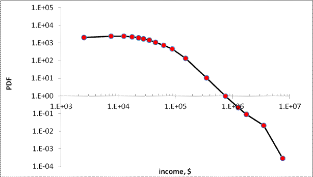
Let’s take a look the data they used to prove the increasing inequality. The IRS measured incomes are usually referred to.  Without loss of generality, we have retried “Table 1.1 Selected Income and Tax Items, by Size and Accumulated Size of Adjusted Gross Income, Tax Year 2009”. (Any other year between 1996 and 2009 is good as well.) This Table lists individual incomes in various income bins from $1 to $10,000,000. There are also 8274 reports of income above $10,000,000. We cannot use the latter incomes but definitely can plot the population density function for all incomes below $10,000,000. Figure 2 depicts the whole PID and Figure 3 its high income portion. The higher incomes are well approximated by a power low with an exponent of -3.07. (The difference of ~1.0 from the exponent for the BLS PDF (-4.1) is completely explained by the normalization to the total personal income reported by the BLS. It means that both exponents are identical.) It is likely that the same power law is valid at incomes higher than $10,000,000. Hence, there is no significant deviation (except measurement errors) from the Pareto distribution even at very high incomes and our extrapolation of the BLS incomes along the power law is valid for the calculations of Gini coefficients.

Conclusion: there is no growth in income inequality.  Krugman et al. definitely exaggerate. As a Russian physicist, I have no political or any other emotional prejudice to the income distribution in the USA. I just calculate it.
 

Figure 1. The population density function, PDF, as a function of mean income as normalized to the total personal income for a given year. At higher incomes, the curves are practically identical.

Figure 2. Population density function reported by the IRS.

Figure 3. Population density function reported by the IRS for high incomes. The Pareto distribution is obvious.  Fluctuations are likely related to measurement error.


Drang nach Osten — «натиск на Восток»

ИИ гугла написал « Drang nach Osten — «натиск на Восток») — это исторический термин, обозначающий германскую экспансию на славянские и восто...