2/5/12

Krugman and damned lies about income inequality. No politics

Paul Krugman and a bigger company have been speculating on the increasing economic inequality in the US.  They do not trust any data from the BLS (income measurements obtained during Current Population Surveys) and deny that income data from censuses can be used to characterize Gini coefficient since these data sets do not contain higher incomes. They claim that the most interesting processes have been evolving at very high incomes.  In this post, I am going to justify the estimates of Gini reported by the BLS.  My goal is to extend the distribution of personal incomes to as high level as possible and to demonstrate that this distribution follows up the Pareto distribution, i.e. is well described by a simple power law. This observation allows replacing (interpolate) actual measurements with a simple function when calculating the Lorenz curve and thus Gini coefficient.  

Following this direction, we have recently reported that the personal income distribution, PID,  in the USA does not change with time when normalized to the total population and total income. In other words, the relative distribution of personal income in the United States has not been changing since the start of income measurements in 1947. The accuracy of early measurements is not good enough, however, and we have to rely of the most recent results.
The US Census Bureau routinely reports income estimates obtained during the Annual Social and Economic Supplement of the Current Population Surveys. We begin with the higher income range as reported by the BLS and have retrieved the population distribution over mean income in the range from $0 to $250,000. These distributions are available only from 2000. The relevant measurements of the number of people in a given income range were carried out in $2500 bins between $0 and $100,000 and $50000 bins between $100,000 and $250,000.
The personal income distributions, as reported by the BLS in current dollars, are affected by the change in population (working age population), and nominal GDP growth. Also the width of income bins varies with income level. Therefore, one cannot directly compare PIDs obtained in different years. In order to suppress the influence of the width we have calculated the population density, i.e. the ratio of the number of people in a given bin and its width. Since the personal income is measured in current dollars we have to reduce all incomes by the total change of the GDP deflator since 2000 to a given year. Figure 1 shows the result of normalization for 2000, 2005, and 2010. In relative terms, the income distribution has not been changing since 2000. At higher incomes, all three curves are practically identical. This observation is validated by the estimates of Gini coefficient provided by the Census Bureau. There is a high income cap of $250,000 (all incomes above the cap are gather in one group), which is used by Krugman and company to deny the BLS estimates.
Let’s take a look the data they used to prove the increasing inequality. The IRS measured incomes are usually referred to.  Without loss of generality, we have retried “Table 1.1 Selected Income and Tax Items, by Size and Accumulated Size of Adjusted Gross Income, Tax Year 2009”. (Any other year between 1996 and 2009 is good as well.) This Table lists individual incomes in various income bins from $1 to $10,000,000. There are also 8274 reports of income above $10,000,000. We cannot use the latter incomes but definitely can plot the population density function for all incomes below $10,000,000. Figure 2 depicts the whole PID and Figure 3 its high income portion. The higher incomes are well approximated by a power low with an exponent of -3.07. (The difference of ~1.0 from the exponent for the BLS PDF (-4.1) is completely explained by the normalization to the total personal income reported by the BLS. It means that both exponents are identical.) It is likely that the same power law is valid at incomes higher than $10,000,000. Hence, there is no significant deviation (except measurement errors) from the Pareto distribution even at very high incomes and our extrapolation of the BLS incomes along the power law is valid for the calculations of Gini coefficients.

Conclusion: there is no growth in income inequality.  Krugman et al. definitely exaggerate. As a Russian physicist, I have no political or any other emotional prejudice to the income distribution in the USA. I just calculate it.
 

Figure 1. The population density function, PDF, as a function of mean income as normalized to the total personal income for a given year. At higher incomes, the curves are practically identical.
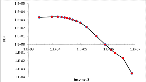
Figure 2. Population density function reported by the IRS.

Figure 3. Population density function reported by the IRS for high incomes. The Pareto distribution is obvious.  Fluctuations are likely related to measurement error.


S&P 500 in 2012

In August 2011, we routinely revisited our model of the S&P 500 returns where the driving force of the stock market is real GDP.  Our quantitative model predicted a negative correction of the S&P 500 level in August-October 2011, as shown in Figure 1 borrowed from the post in August. Figure 2 shows that our prediction was accurate and the annual S&P 500 returns dropped to the level of 0.005 and even below. Hence, the model does predict major turns in the evolution of S&P 500. From Figure 2, we expect the index to grow in the beginning of 2012. This prediction is supported by the rate of unemployment reported for January 2012. According to the link between real GDP per capita and the rate of unemployment in the US (8.3%) we expect real GDP to grow at a rate above 3% (SAAR) in the first and second quarters.   

Here, we update our model with the revised GDP estimates and include the advance GDP estimate for the fourth quarter of 2011.  The monthly closing prices through January 2012 are used. As discussed in our working paper on the S&P 500 index, there exists a trade-off between the growth rate of real GDP, G(t),  and the S&P 500 return, R(t). The predicted returns, Rp(t), can be obtained from the following relationship: 

Rp(t) = 0.0054dlnG(t) - 0.03   (1) 

where G(t) is represented by the Q/Q (annualized) growth rate, because only quarterly readings of real GDP are published by the BEA. 

Figure 2 displays the observed S&P 500 returns and those obtained using real GDP. As before, the observed returns are MA(12) of the monthly returns. For the predicted curve, we use the same GDP value for all three months in a given quarter.   

The period after 2003 is relatively well predicted. The updated GDP estimates highlighted two strong deviations from the observed trajectory started in February 2010 and February 2011. During the first excursion, the predicted curve returned to the observed one in May 2010. One might speculate that these excursions were caused by quantitative easing. In any case it was a transitory deviation.  

One of the sources of controversial information is the BEA. It routinely revises all historical estimates of real GDP and introduces significant changes affecting any model referring to GDP data.  Figure 3 depicts the prediction of S&P 500 returns carried out in March 2011 in this blog. The predicted curve fits the measured returns with a high accuracy for the period between 2007 and 2011.  After the comprehensive GDP revision published in July 2011, the fit disappeared due to much smoother time series. This is not the final revision, however, and some of the fit in Figure 3 can be still recovered in the future. 

Figure 4 illustrates the increasing volatility in the monthly closing S&P 500 returns since 2009. This is a clear sign that the economy and financial market are far from the stability observed in the mid-1990s and between 2004 and 2007.
 

Figure 1. The prediction given in August 2011. The predicted  curve is smoothed by MA(4). The annual S&P return was predicted to drop to 0.005 and below by October 2011 as shown by red diamonds. 

Figure 2. The observed S&P 500 returns and that predicted from real GDP through January 2012.  The predicted fall did happen and the current expectation is that the S&P return will grow into 2012. This prediction is supported by the fall in unemployment reported for January 2012.


Figure 3. The S&P returns predcited from real GDP in March 2011. The peak in 2010 was well described by contemporary GDP estimates. The peak disappeared (was ironed out) after the comprehensive GDP revision in July 2011.  


Figure 4. The S&P monthly (closing price) returns since 1990. It should be noted that the overal volatility has been increasing since 2009. 

2/4/12

The rate of unemployment in Italy - a well predicted rise

A new estimate of unemployment rate in 2011 is now available for Italy. In December 2011, it almost touched 9.0%. Here we validate our model of unemployment as a function of the change in labour force.    
We introduced the model of unemployment in Italy in 2008 with data available only for 2006. The rate of unemployment was near its bottom at the level of 6%. The model predicted a long-term growth in the rate unemployment to the level of 11% in 2013-2014.
The agreement between the measured and predicted unemployment estimates in Italy validates our concept which states that there exists a long-term equilibrium link between unemployment, ut, and the rate of change of labour force, lt=dLF/LFdt. Italy is a unique economy to validate this link because the time lag of unemployment behind lt  is eleven (!) years. 
The estimation method is standard – we seek for the best overall fit between observed and predicted curves by the LSQR method. All in all, the best-fit equation is as follows:
ut = 5.0lt-11  + 0.07         (1) 
As mentioned above, the lead of lt is eleven years. This defines the rate of unemployment many years ahead of the current change in labour force. Figure 1 presents two versions of unemployment as defined by the U.S. Bureau of Labor Statistics (BLS) and the OECD. We describe the estimates provided by the OECD (labour force estimates also obtained from the OECD) but have to emphasise that the divergence before 1994 makes it difficult to find a unique model for both agencies. 
Figure 2 presents the observed unemployment curve and that predicted using the rate of labour force change 11 years ago and equation (1). Since the estimates of labour force in Italy are very noisy we have smoothed the annual predicted curve with MA(5). All in all, the predictive power of the model is excellent and timely fits major peaks and troughs after 1988. The period between 2006 and 2011 was predicted almost exactly. This is the best validation of the model – it has successfully described a major turn in the evolution of unemployment near its bottom. No other macroeconomic model is capable to describe such dramatic turns many years ahead. As four years ago, we expect the peak in the rate of unemployment in 2013-2014 at the level of 11%. 
The evolution of the rate of unemployment in Italy is completely defined ten year ahead.  Since the linear coefficient in (1) is positive one needs to reduce the growth in labour force (see Figure 3) in order to reduce unemployment in the 2020s. For the 2010s everything is predefined already and the rate of unemployment will be high, i.e.  above 9%.  
Figure 1. The rate of unemployment in Italy as measured by the BLS and OECD.

Figure 2. Observed and predicted rate of unemployment in Italy.

Figure 3. The rate of growth in labour force.

Employment Situation: the effect of population controls and seasonal adjustment

When interpreting labor statistics one should be very careful with Januaries. This is the month when major changes to the population estimates (including so called population controls, i.e. the distribution of population over age/sex/race) are introduced. Briefly, all corrections to the overall population and its components gathered during the previous year, or ten years after decennial censuses, are introduced in January as a step in the relevant times series by the Bureau of Labor Statistics. The Bureau explicitly explains this trick in its documents.

Figure 1 shows how big were these corrections in January 2012. We have displayed the first differences of several time series.  The population corrections (the updated population controls) are applied to the civilian population (16 years and over), CP. The level of labor force, LF, the employment, E, and the number of unemployed, UE, is recalculated accordingly as the portions of the CP measured in the household surveys, e.g. the rate of unemployment. The 2012 correction is the highest since 2003, when the 2000 census was inserted in the time series.  The adjustments to the population estimates change these rates only slightly. For example, the unemployment rate does not change and the employment-population ration rose due to the adjustment to the population controls. In January 2012, the civilian noninstitutional population rose by 1685000 including 1510000 due to the change in the population controls.  This number is higher than in 2003, when the 2000 census was included in the CP estimates. 
Another issue is the rate of unemployment. The population controls do not change this rate much. Figure 2 compares the rates as obtained with and without seasonal adjustment. The NSA rate for January is 8.8% due to peaks in this rate in January 2010 (10.6%) and 2011 (9.8%). The NSA rate will be also above the SA rate in February as well.
Figure 3 shows the number of unemployed. In January 2012, it increased by 849,000 in absolute values and decreased by 330,000 in seasonally adjusted representation.  The absolute growth is partially related to the change in population estimates (controls) and partially to the seasonal adjustment.
  Figure 1. The first differences of the civilian population (16 years and over), CP, the level of labor force, LF, the employment, E, and the number of unemployed, UE, time series. The 2012 correction is the highest since 2003, when the 2000 census was inserted in the time series.
Figure 2.  The rate of unemployment, UER, as measured with  seasonal adjustment, SA, and without seasonal adjustment,  NSA.  The NSA value for January is 8.8%.
Figure 3.  The number of unemployed, UE, as measured with seasonal adjustment, SA, and without seasonal adjustment,  NSA.  

2/1/12

Comparison of Economic Projections Provided by Federal Reserve Board and Congressional Budget Office. Both Are Inconsistent

TheFRB  and CBO have recently projected the evolution of key macroeconomic variables including real GDP and the rate of unemployment. In our blog, we have developed a very accurate model linking the rate of unemployment in the US to the rate of real GDP (per capita) growth: (A series of posts has resulted in a working paper.) The following relationship (Okun’s law) has been estimated:
du = -0.465dlnG + 1.113,  (1) 
When integrated between t0 and t, equation (1) can be rewritten in the following form: 
u(t) = u(t0) -0.465bln[G/G0] +1.113(t-t0) + c  (2) 
Without loss of generality, we assume t0=0. The intercept c≡0, as is clear for t=t0. Instead of integrating (2), we calculate cumulative sums of the annual estimates of du and lnG with appropriate initial conditions. The cumulative sum of du’s is the time series of the unemployment rate. Figure 1 depicts the measured and observed curves for the period between 1958 and 2011. The agreement is excellent and has been obtained by a formal statistical method (LSQR). 
The FRB and CBO explicitly projected the growth rate of real GDP, rGDP, and the rate of unemployment, UE, through 2014. Table 1 lists the most probable rates for 2012 to 2014, with the FRB providing broader ranges of expected values with specially highlighted central tendencies. We have calculated the average values for the most probable ranges.  CBO gives much higher rates of unemployment for 2012 and 2013 but lower long term rate, i.e. the rate projected to 2018-2022. At the same time, the growth rate of real GDP projected by CBO is lower for 2012 and 2013. 

Table 1
Year
2011
2012
2013
2014
Long term trend
FRB rGDP
-
2.4
3.0
3.7
2.45
CBO rGDP
1.6
2.2
1.0
4.0
2.5
FRB UE
-
8.35
7.75
7.15
5.6
CBO UE
9.0
8.8
9.1
7.0
5.4
 From (1) it follows that higher rates of GDP growth decrease the rate of unemployment. Since our model is based on real GDP per capita we have to reduce the growth rates in Table 1 by 0.8% per year, which is the growth in the overall population. This gives the estimates of the growth rate of GDP per capita. Using (2) we calculate the rate of unemployment which will correspond to the projected real GDP.  
Figure 2 compares the unemployment rate in the US between 2012 and 2014 as projected by the FRB and CBO and predicted from their relevant projections of real GDP per capita. The FRB and CBO have wrongly projected the pair unemployment/GDP which is driven by Okun’s law.  The best match is observed between the unemployment projection made by CBO and the GDP projection by the FRB.
In this post, we do not state that any of these projections is right or wrong. We just show that, when interpreted jointly, the projections of UE and GDP are not consistent with each other.   In other words, the growth rate of real GDP projected by the FRB and CBO cannot provide the projected rates of unemployment.   One may check these projections in 2015.
Figure 1. The observed and predicted rate of unemployment in the USA between 1958 and 2011.
Figure 2. Comparison of the unemployment rate in the US between 2012 and 2014 as projected by the FRB and CBO and predicted from the projections of real GDP per capita.

1/29/12

Personal income distribution in the US

We are going to revisit our model for personal income distribution, PID. It was first formalized in 2003 and used income distributions through 2001. We had to convert all reports published by the Census Bureau in pdf format between 1947 and 1993 into excel tables. It took a month of hand work together with proof reading. These reports are not converted into digital format yet.

In 2006, we used new data (through 2005) and re-estimated the model. In 2010, we published a book on personal income distribution using data through 2008. It is a good time to refresh the model and evaluate its performance since 2001 with ten more years of data. All major results will be presented in this blog. 
We start with presenting original data. The distribution of personal incomes since 1994 is characterized by a higher resolution – income bins are only $2500 wide. Our model assumes that the overall income distribution depends on the age pyramid and the level of real GDP per capita. However, the evolution of PID is slow and at a twenty year horizon one actually sees a frozen PID. The frozen PID results in an almost constant Gini ratio over time, which is actually reported by the Census Bureau.
We illustrate PID in a few figures below. Figure1 presents all PID published since 1994 between $0 and $100,000 as they are.  We have included all people without income into the bin between $0 and $2500. One can observe that the number of people in higher income bins increases with time as well as the number of people with incomes above $100,000 shown in Figure 2. The portion of people with incomes above $100,000 has been increasing by 0.3% per year since 1994. Figure 3 shows the number of people with income above $100,000 as a function of work experience. The fastest growth is observed for the groups between 30 and 40 years of work experience, i.e. between 45 and 55 years of age.
Figure 4 depicts the population density functions, PDFs, for the years between 1994 and 2010. First, the estimates presented in Figure 1 were normalized to the total population for a given year. Then we reduced the income scale for individual years, i.e. from 1995 to 2010, by the total growth of real GDP. This allows normalizing the curves to the total income, i.e. we reduce all scales to that of 1994. Finally, we normalize the portions of populations in given bins to their widths for individual years and obtain the population density functions. Figure 4 proves that the distribution of personal incomes has not been changing over time in relative terms, i.e. a given portion of population always has a given portion of total income. From the PIDs one can always build the relevant Lorenz curves and estimate Gini ratios. For higher incomes, the distribution has to be described by the Pareto distribution. Figure 5 shows that the PDFs at higher incomes do follow a common power law with an exponent of -3.9.  
Our first assessment of the income data obtained after 2001 is that they do follow up the previously obtained relationships. We expect that our model for personal income distribution should perform well.

Figure 1.  Personal income distributions from 1994 to 2010.
Figure 2. Portion of people with income above $100,000. The portion increases by 0.3% per year. 
Figure 3. The number of people with income above $100,000 as a function of work experience. The fastest growth is observed for the groups between 30 and 40 years of work experience, i.e. between 45 and 55 years of age.

Figure 4. Population density function, i.e. the number of people in a given bin normalized to the total number of people and the width of income bin, as a function of income reduced by the overall GDP growth. 
Figure 5. The Pareto distribution at higher incomes.

1/28/12

Krugman on the current slump


Paul Krugman has presented a graph with real GDP for the UK. It illustrates that the current crisis is worse than it was in 1929. I’ve also downloaded data from the Maddison historical data and the Conference Board total economic database, which has inherited the Groningen (read Maddison) database.
The idea was to compare GDP per capita estimates for the same periods in order to remove the effect of population growth. Surprisingly, I’ve got a different result. Figure 1 below demonstrates that the current evolution of real GDP in the UK is much better than after 1929. Moreover, the estimates of per capita GDP after 1929 show a deeper recession than in 2007.  Unlike Krugman, I do not add GDP projections for 2012 to 2014. 
In Italy, real GDP has a deeper fall after 2007 than after 1929 (Figure 2) but the estimates of real GDP per capita say that the quick recovery of real GDP was definitely driven by increasing population. The state of per capita curve in 2010 was very close to that in 1932, i.e. three years after start of the crisis.  

Figure 1. The evolution of real GDP and GDP per capita in the UK after the 1929 and 2007 crisis.  

Figure 2. The evolution of real GDP and GDP per capita in Italy after the 1929 and 2007 crisis.  

Drang nach Osten — «натиск на Восток»

ИИ гугла написал « Drang nach Osten — «натиск на Восток») — это исторический термин, обозначающий германскую экспансию на славянские и восто...