8/27/11

Share prices: ExxonMobil vs ConocoPhillips

In a previous post we have extended our original pricing model for ConocoPhillips and found that the evolution of its share can be best approximated by a linear function of the difference between the core CPI, coreCPI, and the consumer price index of energy, eCPI.  Originally, the model for a share price, p(t), (we use a monthly closing price adjusted for dividends and splits) was based on the difference between the core and headline CPI:

p(t) = A + B (coreCPI - CPI(t))                                 (1)
where A and B are empirical constants; t is the elapsed time.  
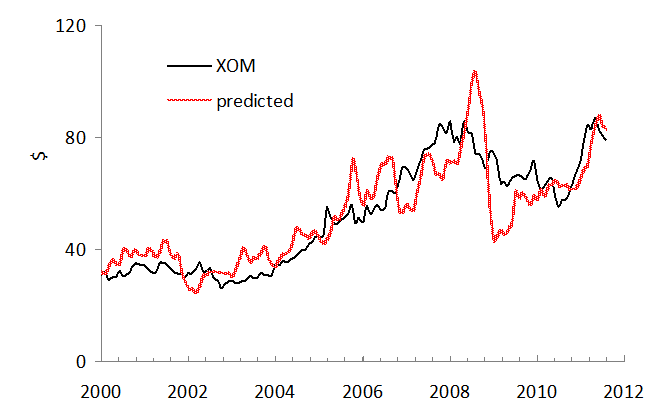
Here we test pricing models for ExxonMobil, XOM(t), with the same CPI and PPI components as we used for ConocoPhillips. The set of defining indices includes the core and headline CPI, the consumer price index of energy, eCPI, and the producer price index of crude petroleum, pPPI, together with the overall PPI. Thus, we test model (1) with p(t)=XOM(t) and two different models for the period between 2001 and 2011: 
XOM(t) = A1 + B1(coreCPI - eCPI(t))  (2) 
XOM(t) = A2 + B2(pPPI - PPI(t))         (3) 
Figures 1 through 3 compare three XOM models. Coefficients in (1) through (3) are given in corresponding Figure captions. The best model (in sense of RMS residual, s) for the period between 2001 and July 2011 is based on the core and headline CPI (s=$9.32). Almost the same accuracy is associated with the model based on the core and energy CPI (s=$9.84). At the same time, model (3) based on the producer price indices is the worst (s=$10.9).
There is a dramatic difference between ExxonMobil and ConocoPhillips. The former company was less sensitive to the change in consumer prices during the financial crisis. The predicted amplitude is much higher than that observed between 2008 and 2009. ConocoPhillips has followed up the change in the difference between the core and energy CPI. When the behavior between 2008 and 2009 is extrapolated into the 2010s, the expected fall in oil price at a five-year horizon down to $30 per barrel will likely not result in a proportional decrease of XOM’s shares.
Figure 1.  The observed XOM price and that predicted from the core and headline CPI.  A=$86, B=-5.8.
Figure 2.  The observed XOM price and that predicted from the core CPI and the consumer price index of energy.  A1=$56, B1=-0.27.
Figure 3.  The observed XOM price and that predicted from the overall PPI and the producer price index of crude petroleum (domestic production).  A2=$68, B2=-0.55. 

8/26/11

ConocoPhillips share price to fall

Our original pricing model states that a share price, for example, that of ConocoPhillips, COP(t), can be approximated by a linear function of the difference between the core CPI, coreCPI, and headline CPI:
COP(t) = A + B (coreCPI - CPI(t))                          (1)
where A and B are empirical constants; t is the elapsed time.  Here we extend the set of defining indices by the consumer price index of energy, eCPI, and the producer price index of crude petroleum, pPPI, together with the overall PPI. Thus, we test the following models for the period between 2001 and 2011:

COP(t) = A1 + B1(coreCPI - eCPI(t))  (2)   
COP(t) = A2 + B2(pPPI - PPI(t))         (3) 

Figures 1 through 3 compare the original and new predictions for COP. Coefficients in (1) through (3) are given in Figure captions. The best model for the period between 2001 and July 2011 is based on the index of energy and core CPI. Practically the same accuracy is associated with the original model as based on the core and headline CPI. At the same time, model (3) based on the producer price indices is the worst and has failed to predict the amplitude of the largest oscillation in 2008.  

We have predicted oil price to fall through 2016. In 2011, we expect oil price to fall down to $70 per barrel. Considering these short- and mid-term predictions one can conclude that ConocoPhillips share price will be falling as well. 

Figure 1.  The observed COP price and that predicted from the core and headline CPI.  A=75, B=-5.5.

Figure 2.  The observed COP price and that predicted from the core CPI and the consumer price index of energy.  A1=58, B1=-0.54.
Figure 3.  The observed COP price and that predicted from the overall PPI and the producer price index of crude petroleum (domestic production).  A2=45, B2=-0.3.

V- vs L-shaped recovery: Is CBO’s economic projection wrong?


CBO has recently published a new economic projection covering the period between 2011 and 2021. It explicitly defines the rate of real economic growth (GDP) and inflation for several segments: forecasts for 2011 and 2012, and projections for 2013 -2016 and 2017-2021. Overall, after two years of slow growth in 2011 and 2012, CBO expects a dramatic increase to the rate of 3.6% per year between 2013 and 2016 with the next five years of slow economy with the rate of 2.4% per year on average. Inflation is low over the entire period: the rate of PCE inflation varies between 2.4% and 1.3% per year and that of CPI inflation will be in the range 1.3% to 2.8% per year. Considering these figures one can conclude that CBO expects a slow version of a V-shaped recovery in the 2010s.  There is no double dip.   

We have also projected the rate of inflation and real economic growth in this blog and academic papers. Our GDP (per capita) model is based on the change in demographic characteristics (the age pyramid). Another model describes price inflation as a function of the change rate of labor force. Skipping all mathematical details, we expect the rate of real economic growth (GDP per capita) to fall slightly below zero between 2012 and 2014 (recession) and hovering around 1%  per year after 2015. The rate of price inflation (the GDP deflator and CPI) in the 2010s has to be slightly negative on average with some years of formal deflation. All in all, we expect an L-shaped recovery, i.e. no actual recovery during the 2010s.

8/20/11

Don't trust seasonal adjustment in July

The U.S. Bureau of Labor Statistics has reported the estimates of various consumer price indices for July 2011. Unexpectedly, the difference between the core and headline CPI has fallen to zero after a crucial turn to growth in June. There are many factors which allow us to consider the difference for July a blip.
The difference between the core and headline CPI, as shown in Figure 1, is for seasonally adjusted, SA, values. As a rule, seasonal adjustment allows to separate trend and fluctuations for a given month. For example, it is good to know that temperature in January and July is two degrees above their normal climatic values, but these values are different for January and July. Same is with the seasonally adjusted consumer prices – they depend on previous years. When seasonal factors are correlated over years the seasonally adjusted values are informative and help the broader audience to ignore constants.
However, when one value used in the adjustment for a given month is a spike then all further values are biased. This is the case for the headline CPI in July 2011. Figure 2 compares the seasonally adjusted headline CPI and not seasonally adjusted CPI, NSA, between 2001 and 2011. The NSA curve shows a small increase in July 2011. The large difference between the SA and NSA curves from May to July 2011 (also clearly seen in 2010) is driven by the turbulence in consumer prices in the same months in 2008 and 2009. Since August, the effect of 2008 and is opposite and the SA values will be below the NSA ones. Specifically, the SA-NSA effect is a major contributor to the fall in the difference between the core and headline CPI in July 2011.  Hence, do not trust the seasonally adjusted CPIs in July.
Figure 1. The evolution of the difference between the core and headline CPI since 2002.
Figure 2. The evolution of the difference between the core and headline CPI, both SA and NSA, since 2001.

Other factors implying a blip in the July’s difference between the core and headline CPI are related to actual changes in consumer prices. In August 2011, the price index of energy has to fall by approximately 10% as one can see from the price evolution during the past 20 days. Technically, this fall will reduce the headline CPI by at least 1% with the core CPI intact. Apparently, the fall in energy prices will indirectly affect other consumer prices which might result in a slightly larger change in the core CPI. A heavy crop in 2011 is also foreseen in the U.S. and Europe what will likely suppress the current growth in the price index of food in 2011-2012.
All in all, we foresee the difference between the core and headline CPI to grow through rest of the year. Since the core CPI will be growing at its current pace between 1% and 2% per year the headline CPI will sink below zero.
Figure 3 briefly repeats our concept of sustainable (quasi-linear) long-term trends in the difference between the headline and core CPI in the U.S. There were two clear periods of linear behaviour: between 1981 and 1999 and between 2002 and 2009. A natural assumption of the future evolution of the difference was that a new trend has to emerge around 2010 after a short period of very high volatility (see Figure 1). However, the difference is very volatile also in 2011.  There is no sign that the higher volatility will calm down any time soon.
Figure 3. Linear regression of the difference between the core CPI and CPI for the period from 1981 to 1999 (R2=0.96, the slope is 0.67) and a regression of the difference between the core CPI and CPI between 2002 and 2009 (R2=0.91 and the slope is -1.59). 

8/18/11

The performance of 10-year T-notes during deflation

In our previous article we presented a prediction of an extended period of price deflation in the U.S. since 2012. Our projection was made in 2006 and covers the period between 2006 and 2016. At least five years are characterized by negative inflation. The underlying model can also foresee beyond 2016 when some updated labour force projections are used (see Appendix). There is no expectation of a positive inflation rate at least in the 2010s. Deflation is a major risk for the U.S. economy and stock market. Therefore, one can consider a safer investment in Treasuries. Let us check various options. 
Currently (August 18, 2:15), T-notes and T-bonds have very low yields between 0.19% for 2-year T-notes and 3.55% for 30-year T-bonds. Since the predicted deflationary period will last at least 8-years one can choose between 7-year and 10-year T-notes. The former has the yield of 1.45% and the latter 2.15% (coupon 2.125%). Taking into account the predicted rate of inflation below -0.5% per year in the near future, one can evaluate the real yield as 3% in the next few years. This is a safe and relatively profitable investment during the poor years to come. The stock market will likely be stangnant if not  decaying.
 Appendix
The BLS has projected the level of labour force to increase from 154.300.00 in 2008 to 167.000.00 in 2018, i.e. by 0.8% per year on average. Considering the current fall in the rate of participation down to 64.5% (instead of 66%) which was expected only in 2018, we should decrease the projected level in 2018 by approximately 1.2%, i.e. to 165.000.000. Then, the rate of labour force growth is 0.66% on average between 2008 and 2018. According to our model the rate of consumer price inflation is driven by the change rate in labour force: 
CPI(t)=4.5dlnLF(t-3)/dt - 0.032 (1) 
where CPI(t) is the rate of consumer price inflation at time t, LF(t-3) is the level of labour force three years before the predicted rate of inflation. Using the average rate of labour force change between 2008 and 2018 one can estimate the average consumer price inflation between 2008 and 2018 as -0.3% per year. Since the years between 2008 and 2011 have a positive inflation rate the years after 2012 will have evens a smaller average inflation rate.  On average, I would estimate the future rate of inflation as -0.5% per year since 2012. However, during 2012 and 2013 it can be as low as -3%.  

8/17/11

Producer price of iron has to fall

This is a quarterly update of producer prices of crude petroleum and iron. We have been following the link between these price indices since 2009. Our previous update included PPI data for March 2011. Here we extend this set by data available for July. Otherwise, we retain the form of the report untouched.
Historically, we first reported that the price index of crude oil had been likely evolving in sync with that of iron and steel, but with a lag of two months in September 2009.  In order to present both indices in a comparable form, the difference between a given index, iPPI (i.e. iron&steel and crude), and the overall PPI was normalized to the PPI: (iPPI(t)-PPI(t))/PPI(t). These normalized differences represent the evolution of the rate of deviation from the PPI over years.
Figure 1 depicts the corresponding time histories of the normalized deviations from the PPI, including the most recent period since March 2011.  Even a simple visual inspection reveals the following feature: the (normalized deviation from the PPI of the) index of iron and steel lags by approximately two months behind the (normalized) index of crude oil.
Figure 1. The deviation of the iron and steel price index and the index of crude oil from the PPI, normalized to the PPI.
In order to reduce both deviations to the same scale we additionally normalized the curves in Figure 1 to their peak values between 2005 and 2011
(iPPI(t)-PPI(t))/[PPI(t)*max{iPPI-PPI)}]
This scaling allows a direct comparison of corresponding shapes. In Figure 2, we display the normalized index of iron and steel shifted by two months ahead to synchronize its peak with that observed in the normalized index for crude petroleum. The scaled index of crude demonstrates just short-term deviations from the index of iron and steel in the overall shape and timing of the peak and trough. Simple smoothing with MA(3) makes the curves resemblance even better. As an invaluable benefit of the resemblance, one can use the two-month lag to predict the future of the iron and steel price index.

Figure 2. Deviation of the iron and steel price index from the PPI, normalized to the PPI and the peak value after 2005 as compared to the deviations of the index for crude petroleum normalized in the same way. The normalized index for iron and steel is shifted two months ahead. 
Conclusion
Between 2006 and July 2011, the deviation of the price index of iron and steel from the PPI in the USA repeats the trajectory of the deviation of the index of crude petroleum (domestic production) with a two-month lag. Therefore, the prediction of iron and steel price for at this horizon is a straightforward one.  We expect the index of iron&steel to fall in the near future in accordance with the currently observed fall in oil price.

8/16/11

Deflation is a long term threat for the stock market

Price deflation in the U.S. is an issue which attracts attention. For example, the FOMC statement implies very low inflation at a two year horizon. The two-year breakeven inflation rate is negative. As a result, economics blogs are also full of discussions around the near future of the overall price behaviour.  (Despite the explicit FOMC statement many experts expect a period of hyperinflation after two sessions of quantitative easing.) The danger of deflation has been demonstrated by Japan where the quantitative easing did not show any positive results.  
We predicted an extended deflationary period since 2012 five years ago. This prediction was based on a model describing inflation in developed countries as a linear and lagged function of labour force. In 2006, we published a forecast for the U.S. a ten year horizon using the following relationship:  
DGDP(t) = 4.0dlnLF(t-2)/dt – 0.03              (1)                       
 where DGDP is the GDP deflator at time t, and dlnLF(t-2)/dt  is the rate of growth in the level of labour force two years before, t-2. In equation (1), the slope is 4.0 and intercept is -0.03. Using (1) and various projections of labour force we estimated the rate of inflation between 2006 and 2016. Figure 1 compares the predicted rate of inflation with that observed between 2006 and 2010.  The agreement is very good considering the precision of inflation measurements and the labour force projection published by the CBO in 2004 
For 2011, the model predicts the rate of inflation near 0.4%. The current fall in commodity prices and the deceleration in real economic growth both imply no price inflation in the second half of 2011. Hence, our prediction for 2011 from 2006 seems to be right.   
Between 2012 and 2016, the rate of inflation (as expressed by the GDP deflator) will be negative at the level between -0.5% and -1.2% (2013).  Obviously, the CBO labour force projection at a ten year horizon could not be too precise and actual values of the future inflation rate may differ from the predicted ones. However, the negative inflation trend is a serious and long term danger for the U.S. economy.
Figure 1. Predicted inflation rate for the period between 2006 and 2016 according to the CBO’s (2004) labour force projection.  A deflationary period starts in 2012.  
Deflation in consumer prices is also predicted by the current measurements of labour force. We estimated a similar relationship for the headline CPI. Five years ago the following relationship was obtained: 
CPI(t) = 4.5dlnLF(t-3)/dt – 0.032                (2) 
The time lag of three years (actually 2.5 years) provides the best fit between observed and predicted values.  In (2), the slope is larger than in (1). This difference expresses a larger volatility in consumer prices.  Figure 2 illustrates the agreement between the observed and predicted rate of consumer price inflation between 1960 and 2010.  At a three year horizon one can expect a significant fall in the rate of inflation, down to -4% per year.  This is a great threat for producers, consumers and the U.S. economy as a whole. 
The uncertainty in labour force measurements is directly mapped into high-amplitude fluctuations. These fluctuations represent banal measurement noise and can not be removed without improvements in the relevant BLS methodology and procedures. It is instructive that the largest fluctuations correspond to the years of decennial censuses. The Census Bureau has to smooth the difference between counted and projected population values (so called population controls) and the BLS ignores these steps. As usually, the most reliable readings correspond to the changes with the largest amplitude.

The best way to suppress this measurement noise is to use integral (cumulative) values.  Figure 3 displays the observed and predicted cumulative inflation curves starting from 1965. The predicted cumulative curve is obtained by a progressive summation of values from 1963 and is also shifted ahead by 2 years. There is an almost complete agreement between the cumulative curves for the whole period. The only small deviation occurred around 1993 and corresponds to a sharp drop of the rate of labour force growth as induced by the baseline working age population correction.
Figure 2. Measured inflation and that predicted from the dLF/LF (shifted 2 years ahead). An agreement is observed throughout the whole period with some short fluctuations in labour force potentially induced by the population corrections implemented by the Census Bureau in the census years. 
The predicted cumulative curve is very sensitive to free term in (2). Even the initial difference of 0.0001 results in a tangible deviation from the measured curve after 50 years. Therefore, the value of free term in (2) can be estimated with a good accuracy. It is important that the cumulative curves represent actually measured macroeconomic variables: labour force and price. Inflation and change rate are based on first differences of the original values and thus are much more sensitive to measurement errors.  
Figure 3. Comparison of the cumulative values of the observed and predicted inflation presented in Figure 2. The predicted curve starts from 1963 and is shifted by 2 years ahead. An agreement is observed with a notable change from convexity before 1980 to concavity one after 1980.

One can conclude that a deflationary period will likely start in 2012 and then may extend into the second half of the 2010s. Price deflation is a major risk for the stock market.  

Drang nach Osten — «натиск на Восток»

ИИ гугла написал « Drang nach Osten — «натиск на Восток») — это исторический термин, обозначающий германскую экспансию на славянские и восто...