7/9/11

Modeling the change in unemployment rate: Canada, Australia and Spain

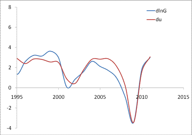
I continue model the change in unemployment rate as a linear function of the change rate  of real GDP per capita. (See my previous posts)

For Canada, I have estimated the following relation with a structural break in 1985
dlnG = -2.7du + 3.1, t<1995
dlnG = -2.7du + 1.2, t>1994
Figure 1 presents the observed dlnG curve and the scaled du, i.e. the change in GDP predicted from the change in the rate of unemployment.  The agreement is excellent, but both curves are volatile. I have smoothed them with MA(3).

For Spain, the result is really fantastic! the following relation is obtained with a structural break in 1987:
dlnG = -2.0du + 5, t<1987
dlnG = -0.8du + 2.1, t>1986

Figure 2 presents the observed and predicted dlnG. There might be another structural breal around 1970.

For Australia, the result might be not so exciting but is very good:
dlnG = -1.7du + 2.5, t<1995
dlnG = -3.0du + 1.3 t>1994

Figure 3 presents the observed and predicted curves smoothed with MA(3) and a structural breal in 1995. 
Figure 1. Annual growth rate of real GDP per capita, dlnG, and the scaled rate of unemployment, du. The lower panel shows the curves smoothed with MA(3)


Figure 2. Same as in Figure 1 for Spain .

Figure 3. Same as in Figure 1 for Australia


On the link between real growth and rate of unemployment again

My previous post was very exciting. Not every day one can find highly correlated economic time series.  The first move was to introduce a structural break into the link between the change in unemployment rate, du, and the change rate of GDP per capita, dlnG. In my previous post, I have found the following relationship:

                 dlnG = -2.4du+2.25
where dlnG  in the annual growth rate of real GDP per capita, du is the annual increment in the rate of unemployment, u. It also was shown that the sensitivity of the du to dlnG becomes lower after 2000, and the slope of -1.6 and the intercept of 2.1 better describe the link.   Actually, there is a structural break around 1984 and the new relationship is as follows
dlnG = -1.6du + 1.75, t>1984

Figure 1 depicts the predicted (with a structural break) dlnG and scaled du. Figure 2 presents regression results with Rsq.=0.84.  The agreement is more than exiting – it is breathtaking.
There is a more urgent question. Does it work for other developed countries? The answer is yes!
For France, I have estimated the following relation with a structural break in 1987
dlnG = -5.0du + 4.6, t<1987
dlnG = -1.5du + 1.4, t>1986
Figure 3 presents the observed dlnG curve and the scaled du, i.e. the change in GDP predicted from the change in the rate of unemployment.  The agreement is excellent, but both curves are volatile. I have smoothed them with MA(3).
For the UK, the following relation is obtained with a structural break in 1987:
dlnG = -1.5du + 2.5, t<1987
dlnG = -2.0du + 1.7, t>1986
Figure 4 presents the observed and predicted dlnG. The OECD reported the rate of unemployment only after 1972 for the UK.
Paul Krugman is right. One should not expect the rate of unemployment to fall before the rate of real GDP growth will exceed 2-3% per year in the US, UK and France.
Figure 1. Annual growth rate of real GDP per capita, dlnG, and the scaled rate of unemployment, du.
Figure 2. Scatter plot of the curves in Figure 2 and linear regression.

Figure 3. Same as in Figure 1 for France . The lower panel shows the curves smoothed with MA(3)
Figure 4. Same as in Figure 1 for the UK

Bravo, Krugman!

A month ago I presented a graph linking the growth rate of real GDP per capita and the rate of unemployment. Figure 1 is borrowed from this post and shows that one can expect the rate of unemployment to  fall fast in the second half of 2011.

Figure 1. The annual change rate of real GDP, dlnGDP/dt, and the scaled rate of unemployment, UE.
Paul Krugman has modified this graph in order to prove that the current  rate of unemployment is a direct consequence of slow real growth. He plotted the change in unemployment rate against the change rate of real GDP.  In his scatter plot, correlation was very high.  I decided to repeat his result using GDP per capita instead of the overall GDP, which is a biased measure of growth in econometric assessments.  The only thing I have to say:
Bravo, Krugman!
This is almost the best economic graph I have ever seen. Figure 2 presents it in my interpretation and shows that the change in unemployment rate, du, almost coincides with the change rate of GDP per capita, dlnG. In Figure 2, we have scaled the du with the following relationship:
dlnG = -2.37du+2.25
or
du= -0.42 dlnG + 0.95
Figure 3 presents results of regression: Rsq.=0.81. For the scaled du, the slope is 1.0.

However, the current fall in the rate of unemployment exceeds the predicted one. Somehow, the sensitivity of the du to dlnG becomes lower after 2000, and the slope of -1.6 and the intercept of 2.1 better describe the link.  For these values of slope and intercept, the rate of real economic growth, dlnG, should be ~2% per year for the rate unemployment retained at 9.6%. For the rate of unemployment to fall, one needs the real growth rate above 2% per year.
Figure 1 looks a bit biased. We have also to reconsider this post on unemployment as based on the change in labor force, which predicted the rate of unemployment around 8% in 2012.
Figure 2. Annual growth rate of real GDP per capita, dlnG, and the scaled rate of unemployment, du.

Figure 3. Scatter plot of the curves in Figure 2 and linear regression.


Figure 4. Same as in Figure 2 with the slope -1.5 and intercept +2.0 for the period after 1995.

Is the mainstream economics a science?

I like to collect citations from well-known economists. They actually think that economics is a hard science and they are scientists in terms of methodology.  Sometimes they give direct examples and compare economics with some hard sciences. This is one of examples from R.Schiller who compares economics and medicine:
Imagine how the medical profession would view one of its members who recommended to the general public some therapy that had not yet passed scrutiny from the appropriate authorities. Medical professionals know how often seemingly promising new therapies turn out, after careful study, not to work, or even to be harmful. There is a rigorous process of scholarly review of proposed new therapies, associated with professional journals that uphold high research standards. Circumventing that process and promoting new, untested ideas to the general public is unprofessional.
By irony, Robert explains the difference between the medical profession and economists in the very beginning of his post:
... An apparent paradox emerged from the discussion: the boom in popular economics comes at a time when the general public seems to have lost faith in professional economists, because almost all of us failed to predict, or even warn of, the current economic crisis, the biggest since the Great Depression.

Imagine now that the medical profession has the same "success" in the main fields of research. Would anybody go to a  doctor at all?  What were the criteria of " ... scrutiny from the appropriate authorities"  in the economics profession?

Please, do not steal from the hard sciences the merits economics does not deserve. There is no scientific methodology in the current economic knowledge because economits explicitly deny the necessity to compare observations and predictions. This is the core of medical scrutiny.  If to compare an economist and a doctor, the former should never approach the patient.

On the healthy growth in employment

After the employment  report for June, a number of bloggers (e.g. Mark Thoma and David Leonhardt ) suggested that a healthy monthly  increment in employment would be between 100,000 and 150,000. I have addressed this issue in my previous post as  well. The current employment/population ratio is aproximately 58%. One should notice that only people of 16 years of age and over are counted in.
On avearge, this civilian population has been growing since January 2010 by 143,00 per month. With the rate of 0.58 one would expect 83,000 per month. Actually, the increment since January 2010 is 76,000 per month . This estimate is from household employment data, i.e. the same source as for the civilian population.  The difference of 6,000 can not be considered as a dramatic one.

A responsible commenter should check actual data.

7/8/11

Is the employment situation really disappointing? II

This post almost completely repeats our post on employment situation a month ago.
The Bureau of Labor Statistics has published an “Employment Situation Summary” for June. The nonfarm payroll employment has increased by 18,000 (establishment data). The number of employed in the U.S. has decreased by 445,000; from 139,779,000 to 139,334,000 (household data).  As in May 2011, these low numbers have come as a surprise for many experts, who expected 105,000 for the nonfarm payroll employment in June.

We have already demonstrated that the level of labor force in the U.S. has been experiencing an unprecedented fall since 2008. Figure 1 reminds us that the reason for the fall is not the current financial crisis and recession but rather a new trend in the rate of labor force participation, LFP. This is not a short- or mid-term transient process but the change in the long-term tendency. The LFP had been growing between 1955 and 2000, when it reached its peak. One can consider 2001 as a pivot point manifesting a fundamental change in the labor market behavior in the U.S. It is worth noting that the change in LFP behaviour started ten years ago, not in 2008. (The reader might be interested in the explanation of this phenomenon. We had accurately predicted the 2010/2011 fall in the LFP many years before it happened.)

As a result of the new long-term tendency, one should not expect the same pace of employment growth as it was between 1960 and 2000. In addition to the fundamental shift in the secular LFP evolution, one should not forget another source of employment growth – the level of working age population. Figure 2 depicts monthly increments of the working age population, i.e. 16 years old and over.  One can clearly see that the influx of the population has been decelerating since 2000 as well. The deep negative corrections in Figure 2 are associated with annual revisions to population controls. It is not wise to wait that the growth in employment will exceed the influx of working age population in the situation with the falling LFP.    

It is important that even decreasing unemployment can not compensate the effects of LFP and population. Figure 3 shows the evolution of monthly increments in employment, E, after 2003 with MA(12). One should not expect that E will be growing at a pace which was considered as a healthy one before 2000 any time soon. As a month before we can conclude that the today’s BLS figures are not disappointing. Really disappointing is the unjustified expectation of any large increase in the U.S. employment.  


Figure 1. Measured LFP in the U.S.


Figure 2. Monthly increment in working age popualtion (16 years of age and over) in the U.S.


Figure 3. Monthly increment of employment in the US with its MA(12).

An open letter to the U.S. Bureau of Labor Statistics

Five years ago I published a paper on the link between inflation and labor force in the U.S. There was one stupid problem with the estimates of labor force level provided by the BLS. They competely  ignored the changes in so called population controls after decennial censuses. Briefly, any census reveals the difference between projected and directly enumerated populations. The former figures are projected from the previous census using estimated birth and death rates and net immigration. After any census, this difference called "the error of closure"  is proportionally distributed by the U.S. Census Bureau  (CB) over the previous decade. This prodecure makes all population time series reported by the CB smooth.

The BLS does not address this problem at all. Therefore, its labor force time series has several "bumps" of a million an more people per one month. One should not use this time series as it is in statistical of econometric assessments.  I had to redistribute all known bumps back into their  past and obtained relatively smooth time series. This simple procedure did not work well in 1991 and additional investigation was needed to recover the reason of ~1,000,000 step in the labor force series.

Recently, I have found a paper written by Marisa Di Natale "Creating Comparability in CPS Employment Series"  from the BLS (no publication date is specified). The author used the same method of the error of closure redistribution. It is a good paper with a simple but correct methodology. But do not believe it. The original time series has not been smoothed. I downloaded the most recent version of labor force time series )July 1, 2011) and found no changes in 1991 and 2001. Same sharp spikes:

Figure. Monthly increment of labor force in the U.S.


Conclusion: Do not trust BLS!

Drang nach Osten — «натиск на Восток»

ИИ гугла написал « Drang nach Osten — «натиск на Восток») — это исторический термин, обозначающий германскую экспансию на славянские и восто...