6/13/11

Angry Bear on the relation between S&P 500 and GDP

A month ago Mike Kimel had a post on Angry Bear dealing with the relationship between the S&P 500 market index and nominal GDP. His naive regression showed correlation of ~94%. One should not forget that Clive Granger introduced the idea of spurious regression 30 years ago. (A surrogate Nobel Prize for this finding in 2003.) This correlation is a good example; both variables are nonstationary, I(1), and are not cointegrated. Hence, the above correlation is spurious.

Actually, the S&P 500 returns are coitegrated with the change rate of real GDP per capita and this correlation is not spurious as shown in this blog and our paper on S&P 500.

On decreasing income inequality in the US

Five years ago I published a working paper arguing that the measures of income inequality derived from the IRS data are highly biased as estimated from a varying share of population. Physics students are well aware that no conservation laws are applicable to open systems with unknown exchange with environment. For economists, it is not a good hint and they continue to present lots of inequality estimates associated with highly fluctuating population basis.  Figures 1 shows the evolution of the share of population with income and Figure 2 depicts the share of personal income in real GDP as determined by the IRS and by the Census Bureau during the Current Population Survey. One can see that the IRS population basis varying around 60% from the level of working age population and the CB covers around 90% of the population. Moreover, the share of personal income in real GDP is only 55% for the IRS and 70% for the CB. For a physicist, the estimates based on the CB data look more reliable than those from the IRS data. It should be noted, however, that people without income have to be included in the estimates of inequality to cover the whole working age population. (We have estimated the Gini ratio for the whole population.)
The Census Bureau has been reporting detailed results of the CPS since 1994. Figure 3 depicts the evolution of Gini ratio for the U.S.  It has been decreasing since 1994 with a clear minimum in 2007.   We also included the share of population without income in order to illustrate the decreasing basis for the Gini ratio estimate. When these people without income are included the Gini estimates should increase and the inequality should be slightly higher.    
Figure 1. Share of population with income as estimated by the IRS and Census Bureau.
Figure 2. Share of personal income in total GDP as estimated by the IRS and Census Bureau.
Figure 3. Evolution of Gini ratio and the share of population without income as estimated by the U.S. Census Bureau.  

6/12/11

People without income. Worrying trends.

The U.S. Census Bureau conducts a Current Population Surveys (CPS) every March. The CPS includes a number of questions related to personal incomes. A new questionnaire   was introduced in 1994 and many detailed tables have been published since. People not reporting any personal income during the previous year are considered as people without income. We have plotted the share of people without income as a function of time for various age groups. In all groups, the share has been growing over time. The most prominent increase was observed in the youngest group between 0 and 9 years of work experience marked in Figure 1 as “5”. (All other groups are marked by the relevant central points of 5 years bins of work experience.) The share grew from 25% to 38% between 1994 and 2009, i.e. by 0.9% per year, as the slope in Figure 1 shows. This is a worrying tendency.  

Young men do not feel real economic growth


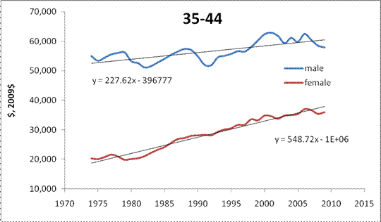
The U.S. Census Bureau publishes many tables on income distribution. One of many reported features is the evolution of the age and gender distribution of real incomes. In several figures below we illustrate the time history of real mean income since 1974. The most striking feature is that young men between 15 and 24 do not see any improvement in the mean income – only $34 per year. Despite the level of mean income for young women is lower than that for young men the former experience a three times faster growth.   
An interesting feature, which is likely the legacy of the 1960s and 1970s, is a much faster growth of mean income for men over 65 years of age. Other age groups are characterized by steady improvements in income inequality.  The most successful women (in relative terms) are between 25 and 34 years of age. Their mean income has been increasing by ~$400 per year compared to only $70 per year for men of the same age. If this tendency holds beyond 2040, the mean income trends will intercept. For other age groups it may happen after 2050.
We have described these and many other phenomena of personal income distribution in our previous posts and papers.


Shimmy in economic gear. How far is the U.S. economy from a runaway?

Shimmy is a well-known mechanical effect in aircraft landing gear. During landing and take-off, the nose wheel oscillates about the vertical axis, sometimes with increasing amplitude. In the case of severe resonance oscillation, shimmy may result in the wheel  destruction.  Instructively, shimmy usually occurs in a specific band of aircraft velocities.  (A much safer but typical case of shimmy is observed in a shopping trolley.) The shimmy effect is well known and relatively well understood and modelled, although not completely.  

As an economic analogue of shimmy, we propose to take a look at the current oscillations in commodity prices.  Is it actually an economic shimmy? In several figures below we present the evolution of relative prices, pi, of selected commodities, iPPI. In order to remove the base effect we calculate the deviation from the overall PPI, PPI, and normalize it to the PPI:
pi(t)= (PPI-iPPI)/PPI
where i corresponds to iron&steel, gold ores, crude petroleum (domestic production),  copper ores, aluminium base scrap and grain. Four from these six basic commodities demonstrate a clear start of shimmy around 2005.  Aluminium base scrap and grain had higher oscillations in the past, but can be also characterized by an elevated volatility during the past 5 years.

Overall, a higher volatility is not a surprise for the market but since 2005 is has a coherent driving force behind all commodities. It is likely that there is a positive feed back in the loop of commodity pricing with money flooding into the commodity market without any restriction. For a nose wheel, similar mechanical feedback leads to shimmy and aircraft accidents. For the U.S. economy, one can expect a price runaway (gold is a candidate) if the positive feedback observed since 2005 is further retained. How far is the current situation from an accident?


6/11/11

Krugman on the effect of quantitative easing in Japan

Paul Krugman shows in this post that the original quantitative easing (QE) in Japan did not help at all. Money supply did not react to an artificial increase in the monetary base. This observation raises a question on the effectiveness of a similar monetary policy in the U.S.

We have a simple explanation of the observed insensitivity of price inflation on QE:  inflation depends on the change in labor force, LF, not on monetary policy. The following models for the GDP deflator, DGDP, and CPI inflation, CPI, were obtained and presented in our previous posts:

DGDP(t) = 1.9d(lnLF(t))/dt – 0.0084      

CPI(t) = 1.3d(lnLF(t))/dt + 0.0004

Two figures below illustarte these models. There is no room for the BOJ to influence deflation after 1995.  

How long will last the crisis in Greece?

In our previous posts, we discussed the evolution of real GDP per capita in selected developed countries. One of striking examples of dramatic changes is Ireland, where we predicted a deep fall many years ago. This prediction was based on the empirically justified concept of constant annual increase in real GDP per capita, G, in developed countries. We found that in the long run the trajectory of G is a linear function of time:
G(t-t0)= G0+B(t-t0) 
where G0 is the initial level of GDP per capita at time t0 in a given country, B is the country dependent increment measured in (chained) dollars. Because of the constancy of the annual increment of real GDP per capita (in the long run) in developed countries we call this type of real economic growth the inertial growth. It is an analog of mechanical notion of inertia.
It should be noticed that the rate of growth, dlnG/dt, has to decelerate with time:
dlnG/dt = B/G
Empirically, the introduction of a constant increment gives excellent statistical results and explains the evolution of real GDP per capita in the biggest developed countries. For Greece, we first calculated coefficients A and B in 2003 using data from the Conference Board (http://www.conference-board.org/economics/database.cfm). Figure 1 depicts two curves dG/dt vs G. The original curve is based on the published data. The corrected curve takes into account the ratio between total and working age population. Technically, one should not calculate per capita values using total population since only working age population produces all goods and services. In 2002, the slope of the annual increment (also show in the Figure) was large and positive. It was lower than that for Ireland or Norway but larger than in the biggest European countries. Since we predicted a deep fall in Ireland, we also could expect a smaller drop in the increment for Greece. It was not our primary interest, however.
Fig. 1. Annual increment of real GDP per capita in Greece as obtained from the Conference Board database. The mean value for the period between 1951 and 2002 is shown for the population corrected time series.
 The current economic and financial crisis in Greece has attracted enormous attention. The reasons behind the crisis were actively discussed and we propose a simple explanation as based on the inertial economic growth.  Figure 2 demonstrates that the constancy of annual increment is a fundamental feature of real GDP growth. Several years of extraordinary fast growth in Greece observed in the 2000s must be finished in order to return the trend of the increment curve back to the mean value. The slope in Figure 2 is much smaller than that in Figure 1. Thus, one can expect that the annual increment of real GDP per capita in Greece may return to the level of $520 any time soon. The fall between 2008 and 2010 has played its stabilizing role and the Greek economy is almost ready to continue its healthy growth.

Figure 2. The increment of real GDP per capita vs. real GDP per capita in Greece between 1951 and 2010.

Drang nach Osten — «натиск на Восток»

ИИ гугла написал « Drang nach Osten — «натиск на Восток») — это исторический термин, обозначающий германскую экспансию на славянские и восто...