5/14/11

Do you really believe that the economic authority can control labor force and unemployment?

Lately, we presented a graph with the rate of participation in labor force, LFP, in the USA. Our task was to show that the change in LFP between 1965 and 2000 induced much bigger variations in labor force than the biggest historical change in unemployment. At the same time, nobody considers the change in LFP as related to real economic growth. Unemployment always takes the front pages and represents a major responsibility of the economic authority. Briefly, when unemployment rate is high the economy likely underperforms.    
Today we would like to discuss a different aspect of Figure 1 which depicts the measured LFP and that predicted from real GDP per capita. (Both variables are borrowed from the Total Economy Database provided by the Conference Board.) Since 1960, the LFP curve has been steadily increasing from 58% to 67% in 2000. After 2001, the curve is characterized by a secular decrease which will likely extend deep into the 2010s. Our quantitative explanation satisfies our understanding of scientific approach. If the reader does not believe in science we would like to ask: 

Do you really believe that the secular oscillation in the measured LFP curve displayed in Figure 1 is somehow controlled by the US economic (and/or political) authority?  

If not, 

Do you believe that the rate of unemployment can be managed by the same authority?


Figure 1. Measured and predicted LFP in the U.S

Overall and core CPI in April 2011

The surge in oil and energy price (19% from April 2010) has ignited a fierce discussion on the future of the overall price inflation and the actions needed from the Feds in response to the danger associated with hyperinflation. The FOMC has decided not to change the overnight interest rate in order to help real economy to recover quickly and thus got under severe criticism.  Let’s look at the data on prices and inflation and evaluate the near future of the CPI.

The Bureau of Labor Statistics has published an estimate of consumer price index and its components for April 2011. The rate of headline CPI inflation (year-on-year) jumped to 3.13 percent from 2.70 percent in March, and the rate of core inflation has slightly increased to 1.34% from 1.2% in March. Figure 1 compares these rates from 1985 to 2011. What can we say about the influence of the overall price growth on core inflation, which excludes energy and food prices?  The most important observation is that there is no correlation between the high-amplitude fluctuations in energy/food prices and the core CPI. Even the biggest deviations in 2008 and 2009 have no effect of the trajectory of the rate of core inflation. Moreover, the current gap between the rate of core and headline inflation is by far lower than it was in 1986. Why should the current deviation influence the core CPI? All in all, the Federal Open Market Committee had and has a good reason to believe that oil price will fall in the near future and the curve of overall inflation will cross that of core inflation during 2011 at the level below 2% without any specific actions.  

We still expect that the core CPI inflation will fall below the zero line in 2012 and the headline CPI will rebound from its current higher level below the core CPI manifesting a deflationary period in the US.

Figure 1. The rate of price inflation as defined by the headline and core CPI.

Update. See also a similar post by Paul Krugman

5/11/11

BRICS vs BRIC

South Africa is suggested as a new member of the BRIC with the extension of the abbreviation to BRICS. We have a working model to estimate the SA’s economic performance relative to other BRICS countries. As in the previous post, we calculate the difference between real GDP per capita in the USA and that in South Africa. Figure 1 shows all differences (1990 US dollars at Geary-Khamis PPPs, as published by the Conference Board). Four of the five were already analysed. What can we say about the new member? Honestly, its performance is far from standard, when the difference does not change over time. South Africa underperforms as India and Brazil did during the past 20 years. These BRIC members are really big (in top ten worldwide) what makes their membership justified by the size of economy. It is not valid for SA.

Figure 1. The differences between real GDP per capita in the USA and the BRICS countries

Who is the best performer in the BRIC?

We have a very simple and empirically correct concept of real economic growth based on the finding that annual increment of real GDP per capita is constant in the long run. All developed countries obey this empirical law, at least between 1950 and 2010.

Developing and emerging countries demonstrate various level of performance relative to developed countries. In the previous post we presented Brazil and Russia. These are two representatives of the BRIC. In this post we compare all four countries. Figure 1 depicts the differences between real GDP per capita in the USA and the BRIC countries. A positive slope indicates a poorer when expected performance – the line must be parallel to the x-axis for equivalent performance.

From Figure 1, one can easily decide that India and Brazil were under par (between 1990 and 2010) relative to the standard performance of the USA. China has been growing faster than expected in the 2010s and significantly reduced the gap. Russia had a period of very poor performance in the 1990s as associated with the transition to capitalist economic system. Since 1999, its performance was on a par with China. Obviously, a higher rate of growth in China was related to a lower level of GDP per capita.

Figure 1. The differences between real GDP per capita in the USA and the BRIC countries

5/10/11

Is the Brazilian economy doing well?

There is general opinion that four countries of the BRIC are doing exceptionally well and have been catching up developed countries at a healthy pace. For example, Finn Kydland recently mentioned that some developing countries and emerging economies have been closing the gap in real GDP per capita. Figure 1 presents the difference between real GDP per capita in the US and Brazil. There is no sign that the gap has been closing since 1990. There we two years of countermotion in 2008 and 2009, but in 2010 did not give any further improvement. The Brazilian economy cannot provide the same annual increment of GDP per capita as the US does, and thus, its performance is not good.

Figure 1. The difference of real GDP per capita in the US and Brazil (1990 US dollars). The gap has been increasing since 1990.

Some countries do demonstrate an exceptionally high growth rate, however. Figure 2 presents the case of Trinidad and Tobago. Is that the country of interest for the world-wide economic growth?


Figure 2. The difference of real GDP per capita in the US and Trinidad and Tobago (1990 US dollars).

5/9/11

The reason of no economic growth in Tajikistan and Kyrgyzstan

We developed a model for the transition from socialism to capitalism 7 years ago. It described the evolution of real GDP per capita in a parsimonious way. The original model had three defining parameters empirically estimated for a number of former socialist countries. These parameters are:
αs -  the exponent related to the disintegration of the socialist system, which included both depopulation and the free fall in  real GDP per capita;
αc – the growth rate of the number of people in the capitalist part of the overall system during the transition;
α – the rate of endogenous growth of the capitalist subsystem.
Almost all countries have already passed the transition and their populations are fully in the capitalist mode of production. There are few poor examples, however. Tajikistan had an estimated exponent of real GDP per capita growth only 0.5 percent per year and Kyrgyzstan was even worse – 0.0 percent per year. Two figures below show that our model still works accurately. Unfortunately.
The problem is in very slow conversion of their populations into the capitalist system. At the same time, the rate of socialism distraction was very high and a very big portion of the populations is still out of both systems.

Figure. Observed and predicted evolution of real GDP per capita in Tajikistan and Kyrgyzstan both normalized to their levels in 1991.

Economic growth: Russia vs Russia vs USA

There are several ways to estimate real economic performance of a given country. Here we present three different approaches to the case of Russia.
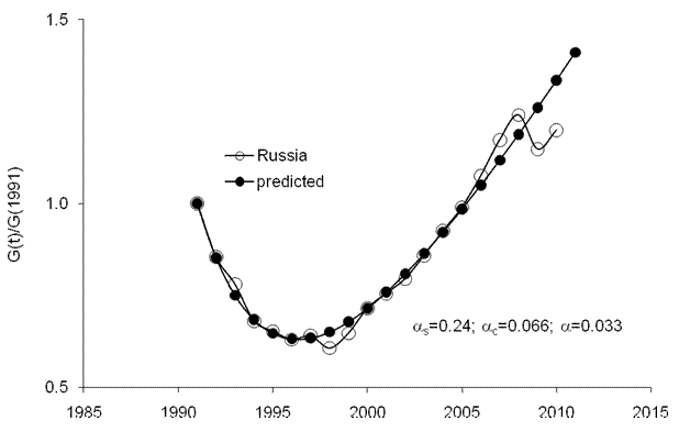
We have modelled the transition from socialism to capitalism in a number of socialist countries. Figure 1 displays the observed and predicted GDP per capita. We used the total economy database published by the Conference Board in 2011 (GK PPPs, 1990 US dollars). Both curves are normalized to their values in 1991. This is the start point of the transition, which was effectively finished around 2000. Since then the Russian economy has been evolving according to general rules applied to capitalist countries. The long term rate of growth was estimated as 0.033 1/y. Figure 1 shows that this rate is likely a good estimate irrelevant to shirt-term deviations. Thus, one can expect that the Russian economy will return to the trend in the near future.

Figure 1. Observed and predicted evolution of real GDP per capita (Geary- Khamis PPPs) in Russia.
Several posts in May 2011 were devoted to the evolution of real GDP per capita in developed countries. We have shown that the difference between the US and other countries has quasi-linear trends. This observation followed from our general (empirically derived) concept of constant annual increment in GDP per capita. This should also work for all former socialist countries turned to the capitalist railway. Russia is not an exclusion as Figure 1 confirms. Thus, Figure 2 compares the mean annual GDP increment for the USA (between 1950 and 2010), which is $387 in 1990 US dollars, and the estimates of annual increment in Russia since 1989. Obviously, it was very slow start because of the transition; real GDP in 1998 was ~60% of its value in 1991.  After 2003, Russia has experienced a period of quick growth with annual increments well above $387. This was a period of good performance. In 2009, all countries suffered a deep fall in real GDP per capita. The year of 2010, looks very average.

Figure 2. Annual increment of real GDP per capita in Russia compared to the long-term average in the USA.
The above comparison with the long-term average demonstrates the healthy pace of the Russian economy in the long-run. This is also valid for the short run. Figure 3 depicts the difference between GDP per capita in the US and Russia between 1990 and 2010. The concept of the constant increment implies that the gap in real GDP can be never decreased since the rate of growth falls inversely proportional to the level of GDP. This means that all former socialist countries will never approach the most developed countries. According to this principle, the gap in Figure 3 must return to the level between $13000 an $1500 in the near future. Russia has been growing too fast in the 2000s. This growth is not likely to be repeated.   

 Figure 3. The difference between real GDP per capita in the USA and Russia.

Now on arXiv.org "Effects of stochastic and natural seismic noise on the performance of waveform cross-correlation used to recover low-magnitude seismicity prior to the July 29, 2025, Kamchatka earthquake"

arXiv.org link :  [2607.16226] Effects of stochastic and natural seismic noise on the performance of waveform cross-correlation used to reco...