1/24/11

Inflation in Australia

This is an earlier report on the quantitative model of  price inflation in Australia. We use our general approach well described in this blog.

Introduction
To create an inflation model for Australia we use our concept linking inflation solely to the change in labor force. As for other developed countries we use data obtained from various sources. Because of definitional and measuring problems data compatibility over time is not routinely provided by statistical agencies and one has to check for artificial breaks in data series. The OECD reports the following:

Series breaks: A new questionnaire was introduced in 2001 and employment and unemployment series were re-estimated from 1986. From April 1986, employment data include unpaid family workers having worked less than 15 hours in a family business or on a farm. Previously, such persons who worked 1 to 14 hours or who had such a job but were not at work, were defined as either unemployed or not in the labor force, depending on whether they were actively looking for work.
Many central banks shifted their monetary policy to inflation targeting around 1995. This can also introduce a break in underlying time series and the generalized dependence between three economic variables under study. This is the case for France.

The data
Here we introduce the estimates of all variables used in the study. There are two time series for inflation, unemployment and the level of labor force. Figures 1 and 2 introduce the overall behavior of all time series.


Figure 1. Upper panel: Comparison of CPI inflation and GDP deflator in Australia. Lower panel: Comparison of two estimates of unemployment according to US and OECD definitions.

Figure 2. Comparison of two estimates of the change rate of labor force level – according to the OECD and US definition (BLS).

The Phillips curve
Here we plot the rate of unemployment in Australia against reduced CPI inflation. The period between 1974 and 1994 shows a relatively good agreement, but then the curves diverge. This might be related to the new central bank monetary policy, as observed in France. All in all, the Phillips curve does not exist in Australia for the entire period between 1978 and 2009, i.e. for the period of accurate measurements presented by the Australian Bureau of Statistics.


Figure 3. Upper panel: Comparison of the measured unemployment (US definition) and that predicted from the CPI inflation according to the relationship obtained in the lower panel. The curves are close between 1974 and 1994. The following deviation might result from changes in monetary policy after 1994 and also be associated with revisions to corresponding definitions and measuring procedures. Lower panel: Scatter plot and linear regression of the CPI inflation and unemployment between 1974 and 1994.

Inflation as a linear function of the change in labor force
According to the change in definition of labor force in 1986, as described above, we have slit the period after 1978 (the start of reliable measurements (as reported by the Australian Bureaus of Statistics) into two segments and obtained the following models for inflation (GDP deflator) :

DGDP(t) = 4.2dLF(t)/LF(t) – 0.042; t>1985
DGDP(t) = 7.8dLF(t)/LF(t) – 0.024; t<1986 (1)

Figures 4 and 5 display the observed DGDP curve and that predicted according to (1).


Figure 4. Modeling of unemployment using the change rate of labor force level. Coefficients in the linear relationship are presented in the text and obtained by the trial-and-error method to fit the cumulative curves in Figure 5 between 1978 and 2009.


Figure 5. Modeling the cumulative GDP deflator as a function of the change rate of labor force level. The break in 1985 is explained by the changes in definition the labor force definition and corresponding measurement procedure.


Figure 6. Absolute and relative modeling error for the cumulative inflation in Figure 5. The curves converge in relative terms and one can replace the price deflator with the growth in labor force with the accuracy incrasing with time.

Generalized model for the link between labor force, inflation and unemployment
Because of breaks in the definition of labor force and unemployment/inflation relationship in 1995 (as shown in Figure 3) we spit the entire period of modeling into three segments:

CPI(t) = 3.9dLF(t)/LF(t) +0.88UE(t) - 0.1; t>1995
CPI(t) = 3.9dLF(t)/LF(t) +0.97UE(t) - 0.1; 1985
CPI(t) = 8.3dLF(t)/LF(t) +0.97UE(t) - 0.1; t<1986 (2)

Figure 7 presents the model.
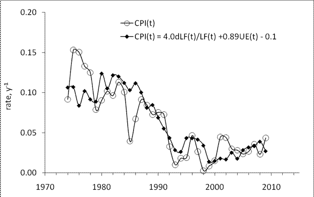
Figure 7. Upper panel: Illustration of the generalized relation between inflation, unemployment and the change rate of labor force leveling Australia. The CPI inflation is modeled using the change rate of labor force level and unemployment. Lower panel: Cumulative curves use to estimate all coefficients in defining relationships (2).

Conclusion
Price inflation in Australia is a one-off function of the change in labor force. This conclusion validates earlier models for many developed countries: the US, Japan, Germany, France, Italy, Canada, the Netherlands, Sweden, Austria, and Switzerland.

1/22/11

Dominion Resources' model

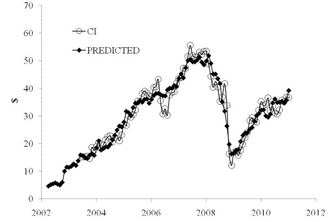
Dominion Resources (D) is a company associated with production and transportations of energy in the United States. The model for D is stable during the past ten months. It is a deterministic one and has been defined by the consumer price index of pets, pet products and services (PETS) and transportation services (TS). The former CPI component does not lead the share price and the latter one leads by 4 months. Figure 1 depicts both involved indices. Relevant coefficients are both negative. Therefore the growth in both indices causes the share price to fall. The slope of time trend is positive. The best-fit 2-C model for CI(t) is as follows:

CI(t) = -2.55*PETS(t) – 2.01*TS(t-4) + 29.29(t-2000) + 343.52

where t is calendar time.

The predicted curve in Figure 2 repeats the measured one. The residual error is $3.26 for the period between June 2003 and December 2010. The model provides an excellent and very stable prediction of the share price.


Figure 1. Evolution of the price of PETS and TS.

Figure 2. Observed and predicted CI share prices.

Income inequality: age-gender dependence

We have demonstrated the difference in mean income between men and women and the evolution of mean income over work experience (age). In this post we join both representation and display the evolution of mean income with work experience for each sex and for both sexes together. As before, we use personal income measurements published by the U.S. Census Bureau (CB). These data come from the CPS Annual Social and Economic Supplement of the Current Population Surveys (http://www.census.gov/cps/). It is worth noting that approximately 90% of working age population, i.e. 15 years of age and over, reports nonzero incomes. This portion is much higher than the rate of participation in labor force (~65% in the USA). Obviously the number of people with income is much higher than the number of employed. This makes consideration of income inequality based on wages slightly weird. There are many people having large incomes but not in the employment. Since employment is not the only way to get reasonable income why should we consider it as a crucial economic variable? In this sense, the rate of participation in labor force strongly varies across developed countries, with higher amplitudes than the rate of real GDP growth.


Figure 1 shows mean income as a function of work experience for male and female group separately since 1967. The male curves demonstrate a clear shift in the age of peak income, as was presented in the previous posts. The female mean income has a more stable shape and clear jump around 1987. It might be associated with new income definition introduced in 1987.


Figure 1. Mean income vs. work experience (i.e. age-15 years) for men and women since 1967.

Figure 2 displays the mean incomes presented in Figure 1 as normalized to the peak mean income for each year. The jump of the peak mean income from the age group between 35 and 44 years into the group between 45 and 54 years of age is well seen in the male curves. For women, the peak age is lower and one can observe the change from the group between 10 and 20 years of work experience to the group between 20 and 30 years. This is in line with the dependence of the peak age on mean income. With time the peak mean income will be drifting into elder age groups. Therefore, people with highest income become older over time. The youngest age group has been suffering relative decrease in the portion of total income, i.e. younger people are getting poorer in relative terms.


Figure 2. Same as in Figure 1 normalized by the peak mean income for given year.

Finally, Figure 3 displays the normalized mean income dependence on age for both sexes. The observed curves also show the increase in the work experience with peak income.
Figure 3. Same as in Figure 2 for the overall population with income.

Yahoo! share in January 2011

The model for Yahoo! (YHOO) is a weird example of the deterministic character of share price evolution. Our model for YHOO is stable over the past year but is defined by somewhat unexpected indices: the consumer price index of meat, poultry, fish and eggs (MEAT) and the index of motor vehicle parts and equipment (MVP). Both defining indices seem to have no relation to the internet services. On the other hand these CPIs are the most basic ones and are in the root of any economic activity.

The MEAT index leads the share price by 6 months and the MVP one - by 1 month. Figure 1 depicts the overall evolution of both involved indices. These two defining components provide the best fit model between June 2010 and December 2010. The MEAT coefficient is positive and thus the increasing price of meats, poultry, fish and eggs causes the share price to grow. The MVP index has a negative coefficient and causes the share to fall. The slope of time trend is positive revealing the price tendency to increase over time. The best-fit 2-C model for YHOO(t) is as follows:

YHOO(t) = 0.49*MEAT(t-6) – 3.27*MVP(t-1) + 10.47(t-2000) + 145.67

where t is calendar time.

The predicted and observed curves are presented in Figure 2. The residual error is of $2.51 for the period between June 2003 and December 2010. The model provides a relatively good prediction of the share price in the past. Currently, the predicted price shows no tendency to rise. All in al, one should not expect the YHOO price to grow fast.

Figure 1. Evolution of the price of MEAT and MVP.


Figure 2. Observed and predicted YHOO share prices.

Wal-Mart share in 2011

Here we present a pricing model for Wal-Mart Stores (WMT), as based on the decomposition of a share price into a sum of two selected consumer price indices. This is a new model defined by the index of hospital and related services (HOSP) and the price index of miscellaneous personal services (MISS), as reported by the US BLS. The former CPI component leads the share price by 10 months and the latter one evolves in sync with the price. Figure 1 depicts the overall evolution of both involved indices. These two defining components provide the best fit model between June 2010 and December 2010. Relevant coefficients are both positive. Therefore the growth in both indices causes the share price to increase. The slope of time trend is negative. The best-fit 2-C model for WMT(t) is as follows:

WMT(t) = 0.50*HOSP(t-10) + 1.42*MISS(t) - 28.39(t-2000) – 158.12

where t is calendar time. The predicted curve in Figure 2 evolves in sync with the observed price. The residual error is $1.99 for the period between June 2003 and December 2010, as Figure 3 presents. Since both defining components are on a steady rise one can expect the WMT price to grow in 2011.

Figure 1. Evolution of the price of HOSP and MISS.

Figure 2. Observed and predicted WMT share prices.

Figure 3. Residual error of the model.

1/21/11

Price model for H.J. Heinz Company

The model for H.J. Heinz Company (HNZ) is another example of the deterministic character of share price evolution. Our model is stable over the past year and is defined by the consumer price index of other food less beverages (FB) and the index of miscellaneous service (MISS). The former CPI component leads the share price by 4 months and the latter evolves in sync with the share price. Figure 1 depicts the overall evolution of both involved indices. These two defining components provide the best fit model between January 2010 and December 2010. The FB coefficient is negative and thus the increasing food price leads to a decline in the share price four months later. The MISS index has a positive coefficient and causes the share price to grow. The slope of time trend is negative revealing the price tendency to decline over time. The best-fit 2-C model for HNZ(t) is as follows:

HNZ(t) = -1.21*FB(t-4) + 1.19*MISS(t) - 2.34(t-2000) – 64.78

where t is calendar time.

The predicted and observed curves are presented in Figure 2. The residual error is of $1.70 for the period between June 2003 and December 2010. The model provides and an excellent and very stable prediction of the share price in the past. Currently, the predicted price is lower than the observed one. One can expect a slight correction of the price down.


Figure 1. Evolution of the price index of FB and MISS.

Figure 2. Observed and predicted HNZ share prices. Black diamonds present the contemporary prediction to fit actual data.

Deterministic prediction of CVS share price

Deterministic prediction of share prices has been long considered as an impossible task in the current market paradigm. Stochastic approach to market prices has really won the hearts of market participants. This conclusion has been made in rash, however. Logically, no finite number of failures to describe and predict a measurable process is enough to prove that it has deterministic nature. People do fail to describe processes and events in scientific way, but this is the characteristic of people not processes. On the contrary, one (or several) example is enough to demonstrate that the link between share prices and CPIs is deterministic in principle, and thus, to demonstrate that the stochastic approach is not fully correct.

The model for CVS Caremark Corporation has been very stable over the past two years and helps to prove the deterministic character of share price setting. A very exciting feature of the CVS price model we developed two years ago is the possibility of prediction at a 4 months horizon. As with Avery Dennison Corporation we have been following the CVS share of since 2009, i.e. since we started to develop our concept of share pricing as related to consumer price indices.

The CVS model has not been changing much and is still defined by the consumer price index of other food at home (OFH) and that transportation services (TS). The former CPI component leads the share price by 4 months and the latter one - by 5 months. Figure 1 depicts the overall evolution of both involved indices. These two defining components provide the best fit model between August 2009 and December 2010. Relevant coefficients are both negative. Therefore the growth in both indices causes the share price to fall with a several month delay. The slope of time trend is positive. The best-fit 2-C model for CVS(t) is as follows:

CVS(t) = -0.51*OFH(t-4) – 1.23*TS(t-5) + 12.15(t-2000) + 195.93

where t is calendar time.

The predicted curve in Figure 2 leads the observed price by 4 months with the residual error of $1.88 for the period between June 2003 and December 2010. The model provides and an excellent and very stable prediction of the share price in the past. Moreover, it foresees a period of no growth in the first quarter of 2011. It is necessary to stress again that the model has been predicting the CVS share price since August 2009 with the same accuracy. The prediction for the first quarter of 2011 is the next step to validate the model.

Figure 1. Evolution of the price of OFH and TS.

Figure 2. Observed and predicted CVS share prices. Black diamonds present the contemporary prediction shifted 4 months ahead to fit actual data.


Now on arXiv.org "Effects of stochastic and natural seismic noise on the performance of waveform cross-correlation used to recover low-magnitude seismicity prior to the July 29, 2025, Kamchatka earthquake"

arXiv.org link :  [2607.16226] Effects of stochastic and natural seismic noise on the performance of waveform cross-correlation used to reco...