1/20/11

Avery Dennison in 2011Q1

We have been following the share of Avery Dennison Corporation since 2009. The model for AVY has not been changing much and is still defined by the index of food (F) and that of new and used motor vehicles (NUMV). The former CPI component leads the share price by 5 months and the latter one - by 3 months. Figure 1 depicts the overall evolution of both involved indices. These two defining components provide the best fit model between August 2009 and December 2010. Relevant coefficients are both negative. Therefore the growth in both indices causes the share price to fall with a several month delay. The slope of time trend is also positive.

So, the best-fit 2-C model for AVY(t) is as follows:

AVY(t) = -4.10*F(t-5) – 2.95*NUMV(t-3) + 22.62(t-2000) + 754.97

where t is calendar time. The predicted curve in Figure 2 leads the observed price by 3 months with the residual error of $2.66 for the period between June 2003 and December 2010. The model does predict the share price in the past and foresees a period of no growth in the first quarter of 2011.

Figure 1. Evolution of the price of F and NUMV.

Figure 2. Observed and prdicted AVY share prices. Black diamonds present the contemporary prediction shifted 3 months ahead to fit actual data.

Figure 3. Residual error of the model.

Personal income inequality: age factor

Another traditional inequality topic is associated with age. We again use personal income measurements published by the U.S. Census Bureau (CB). These data come from the CPS Annual Social and Economic Supplement of the Current Population Surveys (http://www.census.gov/cps/). Figure 1 shows the age-dependent mean income since 1967. As mentioned in the previous post, mean income (as expressed in 2009 US$) in the age group between 15 and 24 years has been growing since 1974. The largest growth is observed in the elder age groups between 45 and 54 (marked 50) and between 55 and 64 (marked 60).
Figure 1. Age dependent mean income since 1967.

Figure 2 displays the same curves as in Figure 1 but normalized to the peak (among all age groups) mean income for each year. The overall picture is clear: peak mean income drift in the direction of larger ages. Extrapolating the curve “60” one can estimate that the peak mean income will be measured in this group in approximately 5 to 7 years. All these effects were well described by our model of personal income distribution.

Figure 2. Same as in Figure 1 normalized to the peak mean income for each year.

Personal income inequality: gender factor

There is a traditional inequality topic - men vs. women. We use personal income measurements published by the U.S. Census Bureau (CB). These data come from the CPS Annual Social and Economic Supplement of the Current Population Surveys (http://www.census.gov/cps/).


Figure 1 shows absolute numbers of population with income since 1967, as defined by the CB. A quick rise near 1974 is related rather to new definition of personal income than to real breakthrough in the female participation in economic life. Currently, the curves are very close showing approximately the same shares of people with income in both gender groups.

Figure 1. Absolute number of men and women with income since 1967.

Figure 2 displays male/female mean incomes (2009 US$) as measured for all people with income. We have also added relevant mean incomes in the age group between 15 and 24 years of age in order to stress age-dependent gender differences. The difference between the mean incomes seems to decrease with time, especially after 2000: the male mean income was on a slight decrease with the female mean income still growing. It is interesting that the male mean income in the youngest age group has not been growing since 1967 and the female one has been slowly increasing.


Figure 2. Male/female mean incomes for all populations of 15 years of age and over and those in the age group between 15 and 24 years.

Figure 3 depicts the share of women and their mean income relative to the overall population and mean income, respectively. The population share is close to 0.5 since 1977. The share of mean income has been increasing since 1977. It was only 0.42 in 1997 and reached 0.64 in 2009. Despite the increase the share does not look like decent.

Finally, Figure 4 illustrates the fall in the portion of population with income since 1990. It reached the peak of 0.94 in 1990 and then has been declining to 0.87 in 2009. This effect is not easy to explain.

Figure 3. Shares of female population and mean income in the overall mean values.


Figure 4. The portion of population with income

1/16/11

Price deflation in Switzerland?

We have already presented several empirical quantitative models of price inflation in developed countries in this blog. Our major result is the existence of a long-term equilibrium link between price inflation and the rate of change of labour force. Statistically, these two macroeconomic variables are cointegrated in such countries as the USA, France, Canada, and Austria. In some countries, e.g. the UK and Japan, the length of reliable data is too short for cointegration tests to be significant. However, cumulative inflation is accurately predicted in all countries.

Switzerland is one of the most important (although a middle size one) world economies. The country's statistics is characterized by relatively lengthy observations of labour force (Figure 1) and inflation (Figure 2). Apparently, the labour force series has two breaks: one in 1974 of unknown nature and one in 1991, as the OECD (2008) informs:

Series breaks: From 1998, data are adjusted in line with the 2000 census. Prior to 1991, data refer only to persons who are gainfully employed at least six hours per week.

The link between inflation and labour force also has a break around 1987, as Figure 3 depicts. Same effect was observed in Austria, where the change in the link is completely explained be the introduction of the ILO definition of labor force and unemployment instead of national ones. Linear regression of the observed series on the predicted one is characterized by slope 0.74, free term 0.003, and R2=0.82. According to the well-know problem with OLS, the slope is underestimated. Otherwise, the agreement is excellent. We did not use the cumulative curves for the estimation of coefficients in the linear link between labor force and inflation for Switzerland since corresponding time series are not long enough to provide a robust estimate. Fortunately, the original inflation curve (CPI) oscillates with a significant amplitude, and one only needs to fit the peaks of the oscillations in order to find appropriate coefficients, as shown in the Figure.

Hence, we have price inflation defined by a linear function of labor force with both coefficients changing in 1987:

CPI(t)= 1.1*dLF(t-2)/LF(t-1) + 0.005, before 1987
CPI(t)= 2.0*dLF(t-2)/LF(t-1) + 0.055, after 1987

It is worth noting that the predicted curve has two segments and covers the period between 1967 and 2008. All in all, the predictive power of the model is good and timely fits major peaks and troughs. Because the lag between the change in labor force and inflation is two years one can foresee the change in prices at this time horizon. In Switzerland, one should not expect high price inflation since the level of labor force has not been growing fast enough during the last two decades. It is very likely that inflation will be very low or even negative (deflation) in Switzerland over the next decade due to demographic problems and ageing population.


Figure 1. The rate of labour force change in Switzerland according to national definition (NAC) and the definition adopted in the US.


Figure 2. Two definitions of the rate of price inflation in Switzerland: GDP deflator and CPI inflation according to OECD definition.


Figure 3. Upper panel: The rate of CPI inflation in Switzerland as predicted by the  model with a structural break neat 1987 related to the change in measuring units. Notice that the predicted series is smoothed with MA(3). Lower panel: Linear regression of the data in the upper panel.

1/15/11

On the likelihood of deflation in Canada

Three years ago we published a paper on inflation and unemployment in Canada, where we presented a model linking inflation and unemployment with the change in labor force. This earlier prediction was revisited in 2010 and demonstrated excellent predictive power of the original model. Today we add two more readings, for 2008 and 2009, to all time series and extend the prediction.

Skipping the part introducing data and presenting individual models linking inflation and unemployment to labor force separately, we revisit our generalized relationship. It gathers all individual ones. We find the best-fit coefficients for the generalized equation:

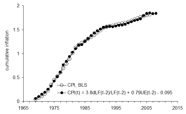
pi(t) = 3.8dLF(t-2)/LF(t-2) + 0.79UE(t-2) - 0.095 (1)

Figure 1 depicts the case associated with the data provided by the BLS. Both cumulative curves are very close. Moreover, these curves reveal three periods of different behaviour and prove that there was no change in the long-term equilibrium relation between these three studied variables.

The difference between the cumulative curves is very small compared to the net change between 1969 and 2004. Moreover, this difference decreases with time as Figure 2 shows. One can easily find that the coefficients obtained by linear regression of the CPI on the LF and UE do not provide such a closeness between cumulative curves as those coefficients, which are estimated by visual fit between the cumulative curves.

Figure 1. Comparison of cumulative curve for the measured CPI and that predicted using the BLS definition of labour force.


Figure 2. The difference between the cumulative curves in Figure 1.

Figure 3 demonstrates the advantages of the moving average technique applied to the annual measurements of labour force, unemployment, and CPI inflation in Canada. As discussed above, these measurements are characterized by random errors, which are weighted through years in accordance with benchmark measurements. It means that the average measurement error approaches zero for the increasing length of time series. Therefore, a five-year moving average, MA(5), should significantly suppress random errors and provide close cumulative curves, as one can observe in Figure 1.


Figure 3. Comparison of MA(5) curve for the measured CPI and that predicted according to relationship (1).

Considering the accuracy of the CPI prediction between 1971 and 2009, one can expect the rate of consumer price inflation in Canada to fall very close zero on average during the next 5 years. It is very likely that few years will bring negative inflation rates, i.e. formal deflation.

1/14/11

IBM share in 2011 and 2012

In July 2010 we presented a share price model for IBM for the period between July 2003 and May 2010:

IBM(t) = 4.93MVR(t-12) – 3.51TS(t-4) - 10.39(t-2000) + 39.39

where MVR is the index of motor vehicle maintenance and repair (CUUR0000SETD) and TS is the index of transportation services ( CUUR0000SAS4). The former CPI component led the share price by 12 months and the latter one led by 4 months.

Here we extend the modeling period in both directions - between January 1995 and December 2010. As before, the model coefficients are obtained by minimizing the RMS residual error. Current IBM model is as follows:

IBM(t) = -4.32*H(t-1) – 1.48*MVI(t-1) + 40.69(t-2000) + 779.0

where H is the index of housing and MVI is the index of motor vehicle insurance. Figure 1 depicts the overall evolution of both involved indices. The index of housing was on rise before 2009. Since December 2008, this index has been slightly decreasing. Since it has negative influences on the share price, one can expect an increase in IBM price. The MVI index has been quickly growing over the entire period, except during some short segments. Thus, did not allow the share to increase to fast since linear trend also has positive influence on the price. All in all, these two defining components provide the best fit model between December 2009 and December 2010.

The predicted curve in Figure 2 leads the observed price by 1 month with the residual error of $9.49 for the period between January 1995 and December 2010. Currently, the price is slightly underestimated by the model, as Figure 3 shows, and one cannot exclude a downward correction in the first quarter of 2011.

In the long run, the index of housing will be decreasing during the next 10 years. This is a helpful background for IBM share. The MVI has a clear rise/plateau structure. The next segment is likely to be a shelf, starting in 2011 of 2012. Hence, the price share looks good at a two-year horizon.

Figure 1. Evolution of the price of H and MVI.

Figure 2. Observed and predicted IBM share prices.

Figure 3. Residual error of the model. Mean residual error is 0 with standard deviation of $9.49.

General Electric share between 1995 and 2011

We use the same pricing model as previously. In its general form, this pricing model is as follows:

sp(tj) = Σbi∙CPIi(tj-i) + c∙(tj-2000 ) + d + ej (1)

where sp(tj) is the share price at discrete (calendar) times tj, j=1,…,J; CPIi(tj-i) is the i-th component of the CPI with the time lag i, i=1,..,I; bi, c and d are empirical coefficients of the linear and constant term; ej is the residual error, which statistical properties have to be scrutinized. By definition, the bets-fit model minimizes the RMS residual error. The time lags are expected because of the delay between the change in one price (stock or goods and services) and the reaction of related prices. It is a fundamental feature of the model that the lags in (1) may be both negative and positive. In this study, we limit the largest lag to fourteen months. Apparently, this is an artificial limitation and might be changed in a more elaborated model. In any case, a fourteen-month lag seems to be long enough for a price signal to pass through.

System (1) contains J equations for I+2 coefficients. For General Electric (GE) we use a longer time series from January 1995, i.e. 192 monthly readings. Due to the negative effects of a larger set of defining CPI components their number for all models is (I=) 2. To resolve the system, we use standard methods of matrix inversion. As a rule, solutions of (1) are stable with all coefficients far from zero. In the GE model, we use 73 CPI components. They are not seasonally adjusted indices and were retrieved from the database provided by the Bureau of Labor Statistics (2011). All involved indices must start before 1993. That’s why we have excluded 19 indices from the previously used set, including such major ones as communication, education, and recreation. They started after 1994.

Due to obvious reasons, longer time series guarantee a better resolution between defining CPIS. In general, there are two sources of uncertainty associated with the difference between observed and predicted prices. First, we have taken the monthly close prices (adjusted for splits and dividends) from a large number of recorded prices: monthly and daily open, close, high, and low prices, their combinations as well as averaged prices. Second source of uncertainty is related to all kinds of measurement errors and intrinsic stochastic properties of the CPI. One should also bear in mind all uncertainties associated with the CPI definition based on a fixed basket of goods and services, which prices are tracked in few selected places. Such measurement errors are directly mapped into the model residual errors. Both uncertainties, as related to stocks and CPI, also fluctuate from month to month.

Currently, General Electric (GE) is the second biggest company in the S&P 500 list just shy from Exxon Mobil. The defining indices are as follows: the index of motor vehicle maintenance and repair (MVR) and the index of motor vehicle insurance (MVI), both are subcategories of the transportation index. Both CPI components are contemporary with the share price. Figure 1 depicts the evolution of both indices which provide the best fit model, i.e. the lowermost RMS residual error, between January and December 2010:

GE(t) = -1.72*MVR(t) – 0.46*MVI(t) +15.67(t-2000) + 292.6

The predicted curve in Figure 2 is in sync with the observed one. The residual error is of $2.84 for the period between January 1995 and December 2010. Both defining components, especially MVI, grew at a slightly higher than usual rate between 2007 and 2009. This effect has pushed down the share price in 2008 and in the beginning of 2009. Since 2009, both indices evolve at a lower rate and the price has been showing a weak increase. The GE price will hardly be growing at a healthy rate in 2011 and looks slightly overestimated, as Figure 3 demonstrates.


Figure 1. Evolution of the price indices MVR and MVI.

Figure 2. Observed and predicted GE share prices.

Figure 3. Residual error of the model. Mean residual error is 0 with standard deviation of $2.84.

Now on arXiv.org "Effects of stochastic and natural seismic noise on the performance of waveform cross-correlation used to recover low-magnitude seismicity prior to the July 29, 2025, Kamchatka earthquake"

arXiv.org link :  [2607.16226] Effects of stochastic and natural seismic noise on the performance of waveform cross-correlation used to reco...