1/11/11

The rate of participation in labor force: an accurately predicted fall

In August 2009, we made a short term (five years) prediction of the rate of labor force participation, LFPR, in the US as based on our model [1]. A prediction at a longer horizon is also available from the population age pyramid. The contemporary level of LFPR was 65.4%, as reported by the Bureau of Labor Statistics (http://data.bls.gov/cgi-bin/surveymost). We predicted a quick fall in the level of LFPR in 2010:

In order to predict the evolution of the LFPR we used projections of real GDP based on the projections of population. Figure 4 depicts the predicted and observed LFPR curves for the years between 2000 and 2014. In 2010, the rate should drop by approximately 1.3%. When translated into absolute numbers, it gives more than 2,500,000 people leaving the labor force in 2010 at once. Really, the wave of the boomer’s retirement has just started and it is likely that nobody will replace many of them in the labor force.

Figure 4. Prediction of the LFPR evolution in the USA between 2000 and 2014 from the number of 3-year-olds. Flat segment between 2004 and 2009 will end up in a rapid drop by 1.3% after 2010. This is the effect of an elevated (above potential) real economic growth in 2010.
In 2011, the BLS reported the level of LFPR in December 2010. It is 64.3%, i.e. only 0.2% higher than predicted in August 2009. We consider this prediction as an excellent one and thus the model is validated and having a godd predcitive power. Has anybody made a better prediction?

References
1.  Kitov, I., Kitov, O., (2008). The Driving Force of Labor Force Participation in Developed Countries, Journal of Applied Economic Sciences, Spiru Haret University, Faculty of Financial Management and Accounting Craiova, vol. III(3(5)_Fall), pp. 203-222.

Goldman Sachs pricing model

We have been trying to build a preliminary pricing model for Goldman Sachs (GS) since 2008. This company was included in our study of bankruptcy cases in the USA [1]. All in all, the model was not stable over time and the prediction for 2009 was wrong. Originally, the stock price was defined by the index of housing operations (HO) and that of food away from home (SEFV).

In this post we present a new model as based on the CPIs available till November 2010 and the December closing price of GS. Now, the defining CPIs are the index of other food at home (OFH) and the housing index (H). Thus, the difference between the preliminary and current models might be not large because the original indices are very close to the new ones. Our quantitative approach is described in [1,2].

Figure 1 depicts the overall evolution of both involved consumer price indices. These two defining components provide the best fit model between March 2010 and December 2010 and the best-fit 2-C model for GS(t) is as follows:

GS(t) = -11.06*OFH(t) +11.06H(t-12) - 1.82(t-2000) – 99.4

The predicted curve in Figure 2 does not lead the observed price. The residual error is of $14.45 for the period between March 2003 and December 2010. The price of a GS share is relatively well defined by the behaviour of the two defining CPI components but the model does not foresee the price. During the last quarter of 2010, the predicted price is well below the observed one and the residual error is large. We expect the residual to return to the zero line in the first or second quarter of 2011. A drop in the actual price is likely but the predicted price might rise as well.


Figure 1. Evolution of the price of OFH and H.


Figure 2. Observed and predicted GS share prices.

Figure 3. Residual error of the model. Mean residual error is 0 with standard deviation of $14.45.

References
1. Kitov, I. (2010), Modelling share prices of banks and bankrupts, Theoretical and Practical Research in Economic Fields, ASERS, vol. I(1(1)_Summer), pp. 59-85

2. Kitov, I. (2010). Deterministic mechanics of pricing. Saarbrucken, Germany, LAP Lambert Academic Publishing.


Johnson & Johnson in February 2011

We have been following Johnson & Johnson (JNJ) share price from 2009. A preliminary model was obtained in September 2009. From the very beginning, this stock was defined by the index of appliances (APL) and that of transportation services (TS). We have revisited the stock in September 2010 and found that the model did not change, except a slight change in the defining coefficients well explained by the uncertainty of the monthly closing price as a parameter characterizing the stock behavior and the estimation accuracy of individual CPIs. In this post we present an updated model as based on the CPIs available up to November 2010 and the December closing price of JNJ. Our quantitative approach is described in [1]. Briefly, we decompose a share price into a weighted sum of two individual CPI components and minimize the RMS model error.

Figure 1 depicts the overall evolution of both involved consumer price indices. These two defining components provide the best fit model between March 2009 and December 2010. Since the index of appliances has been on a steady decline since the early 2000s, its negative coefficient (-1.40) has actually resulted in the growth of the share price. The negative influence of TS (-1.26) has been also compensated by all other terms in the model. The best-fit 2-C model for JNJ(t) is as follows:

JNJ(t) = -1.40*APL(t-2) – 1.26TS(t-6) + 9.99(t-2000) + 298.88

Actually, the predicted curve in Figure 2 leads the observed price by 2 months with the residual error of $2.29 for the period between March 2003 and December 2010. One may conclude that the price of a JNJ share is well defined by the behaviour of the two defining CPI components.

Comparing the evolution of the observed and predicted prices since the start of modelling (2008) we have found that the model does predict the share price in the past and foresees at a two month horizon. One may expect this share will experience a slight growth in the first quarter of 2011. In January, the model predicts the closing price of $63.54. i.e. an approximately $2 gain (the December closing price of $61.85).


Figure 1. Evolution of the price of APL and TS.

Figure 2. Observed and predicted JNJ share prices.


Figure 3. Residual error of the model. Mean residual error is 0 with standard deviation of $2.29. The largest errors were observed in 2007 and 2010.

References
Kitov, I. (2010). Deterministic mechanics of pricing. Saarbrucken, Germany, LAP Lambert Academic Publishing.

1/10/11

Equity Residential on rise

Among many other stocks, in our post on May 30, 2010 we presented a price model for Equity Residential (EQR). It was based on the monthly (adjusted for dividends and splits) closing prices between June 2003 and March 2010. Today we revisited the model and found that it is still valid with almost the same coefficients. The model predicts at a two month horizon with RMSFE=$2.28 (RMSFE – root-mean-square forecasting error).

Our quantitative approach is described in [1]. Briefly, we decompose a share price into a weighted sum of two individual CPI components to minimize the RMS model error.

The set of CPI components consists of 92 independent price indices. When both defining components lead the modeled price, one can predict future evolution of the stock; at least in the near future. The bets-fit two-component (2-C) model for EQR is as follows:

EQR(t) = -3.05SEFV(t-2) + 0.95PDRUG(t-5) + 12.48(t-2000) + 95.29,

where SEFV in the index of food away from home leading the stock price by 2 months, PDRUG is the index of prescribed drugs leading by 5 months, (t-2000) is the elapsed time. The model error is RMSFE=$2.28 for the period between June 2003 and December 2010. This model has been valid during the past fourteen months and we expect it to be valid in the first half of 2011. The stock price might experience some growth in the first quarter of 2011: the index of food away from home has been demonstrating relatively weak growth and other defining parameters have positive influence on the price. The price index of prescribed drugs has a stable positive trend.

Figure 1. Observed and predicted (contemporary – red line, and 2 months shifter – black diamonds) EQR share price, with the model error.

References
1. Kitov, I. (2009), Modelling share prices of banks and bankrupts, Theoretical and Practical Research in Economic Fields, ASERS, vol. I(1(1)_Summer), pp. 59-85

The long-term fall in the housing price index

The price index of housing has the biggest input into the overall CPI among all major expenditure categories (e.g. food, transportation, etc.) Thus, the evolution of this index might have the largest influence on the rate of price growth in the USA. Two years ago we wrote a paper predicting the long-term behavior of the housing index relative to the overall (headline) CPI. This is a short excerpt:

“… Figure 9 displays the difference between seasonally adjusted headline CPI and the housing index for the period after 1967. Figure 10 details the period after 1998. One can conclude that after 2008 the housing index will be likely evolving at a lower rate than that associated with the headline CPI. Currently, we observe a turning period with higher volatility. The difference between the core CPI and the housing index is characterized by an almost constant duration of negative and positive trends – around 11 years. Accordingly, the next linear trend has to be positive.
Conclusion
...
The difference between the headline CPI and the housing index is characterized by an almost constant duration of negative and positive branches – around 11 years. The current period of negative slope in the difference is closing to its turning point in the next year or two and characterized by higher volatility. The next trend has to be positive, i.e. the housing index will be growing at a lower rate than the headlining CPI.
 
Figure 9. The difference between the headline CPI and the housing index between 1967 and 2007. Notice three periods of practically linear trend and two very short periods of trend change: in 1987 and 1998. The observed linear trend has been practically changing every 11 years. Notice an elevated relative volatility of the difference at higher frequency.


Figure 10. Same as in Figure 9 for the period after 1998. The housing index has been growing faster than the headline CPI. Currently, a period of the trend change is likely observed with the housing index changing to a rate below that associated with the CPI. One can expect that the next 10 years will be poor for the housing market.”

Two years later we can compare the above prediction with the measured time history of the index. Figure 1 presents the difference between the headline CPI and the index of housing for the period between 1998 and 2010. All our predictions on the future evolution of the difference were right. Firstly, volatility was very high in 2008 and 2009. Secondly, one can observe the new trend which has been emerging since 2009. Thirdly, this new trend in the difference is a positive one.

Considering the aforementioned duration of the previous trends one may expect the new trend to last around 11 years, i.e. till 2010. Without loss of generality, the difference may also have a different duration and thus a different slop of the positive trend. The next two to three years might help resolving the slop value.

All in all, the index of housing will be growing at a lower rate than the headline CPI. Since we expect the overall CPI to be falling during the next five to ten years (see our posts on deflation) the index of housing will be also decreasing in absolute terms. Other expenditure subcategories may grow in absolute terms, however.
Figure 1. The difference between the core CPI and the index of housing between 1998 and 2010. One can observe a new trend in the difference – the index of housing has been growing at a lower rate than the core CPI since 2009.

1/9/11

Food price: US and worldwide

In 2007, we predicted the linear trend in the difference between core CPI and the price index of food. Is it correct?

In June 2009, we revisited our early prediction of the linear trend in the difference between the core CPI and the consumer price index of food. Originally, in 2007, we predicted the evolution of several consumer price indices relative to core CPI in the USA [1]. Therefore, we have now more than 30 months to compare the prediction and actual estimates. The years of 2008 and 2009 were characterized by high volatility in the behaviour of all expenditure subcategories: energy, food, housing, etc. We are going to revise our prediction. In [1] we wrote:

“Figure 7 displays the difference between the core CPI and the index for food for the period after 1960. This curve differs from that in Figure 5. The first large change in the difference occurred in 1973 (not in 1979 as for energy) and lasted only 7 years. Around 1980, the difference started to grow from -7.0 to 13.0 in 1996. Between 1996 and 2003, the difference was effectively constant at the level of ~13.5 units of price index, i.e. a lengthy flat segment was observed. After 2003, the difference has been decreasing at a rate of 1.2 units per year, as Figure 8 demonstrates.


Overall, the difference between the core CPI and the food index was always lower than that between the energy index and the core CPI. The largest difference was only around 14 units. Since 2003, the food price index has been slowly catching up the core CPI. Extrapolating the current linear trend one can estimate the intercept point when the food price index will reach the core CPI. According to Figure 8, this will happen in 2014. Such behaviour differs from that observed for the energy index in terms of timing and amplitude, but the overall behaviour distinguishing periods of linear growth and bifurcation is very similar. Therefore, principal mechanisms behind the evolution of the food price index are similar to those behind the energy index. They are likely not related to the changes in supply pressure induced by good crops and draughts. These mechanisms have to be a part of economic system itself and should be related to relationships between economic agent not to production of goods and services.
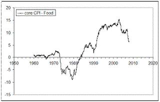


Figure 7. The difference between the core CPI and the index for food between 1960 and 2007. There are three periods of linear trend and two turning periods. The most recent period of linear trend started in 2003.


Figure 8. The difference between the core CPI and the food index between 2002 and 2007. The current period of linear trend will be likely finished in 2014. Since 2003, the food price index has been slowly catching up the core CPI. “

In 2008 and 2009, the index of food grew at a higher rate compared to that predicted by the long-term-trend in Figure 8 in the excerpt. Figure 1 displays the difference between the (seasonally adjusted) core CPI and the index for food (beverages not included) we reported in June 2010. We suggested that the remarkable rally in food prices was forced the index for food to grow faster than predicted and the deviation from the trend predicted in 2007 reached ~7 units in 2008. This behaviour was likely related to the outstanding rally in oil price finished in July 2008. Correspondingly, almost all prices were driven up. After July 2008, the same prices have been declining at a higher rate sharing the faith of crude oil price. Accordingly, from January 2009, the index for food started to decline in absolute terms at its returning path to the old trend shown by pink line in Figure 1. The contemporaneous trend, as shown by black line, was far enough from the old one, but the difference was approaching the pink line.

Originally, the predicted difference (pink line) intersected the zero line around 2014. In June 2010, the (black line) trend crossed the zero line in 2010. Among many other conclusions made in June, there was the following one:

• The new trend for the index for food will start emerging somewhere between 2011 and 2014. Since the turn to the new trend, the index for food will start to lose its ground relative to goods and services comprising the core CPI. In other word, food will become cheaper in relative terms."


Figure 2 demonstrates that the difference between the core CPI and the index of food has returned to its current trend, however, at a somewhat lower level. The intercept with the zero line and likely the pivot to the decreasing food price now seems to start in 2012-2013. We will keep reporting on the difference which is crucially important for the population with low income. The UN reports the probability of world-wide food crisis as related to the all-time peak in food price.


Figure 1. Comparison of the trend predicted in 2007 and that in 2009. Current change in the index for food shifts the new trend towards the old one.

Figure 2. Same as in Figure 1 with new data for 2010.

References
1. Kitov, I., Kitov, O., (2008). Long-Term Linear Trends In Consumer Price Indices, Journal of Applied Economic Sciences, Spiru Haret University, Faculty of Financial Management and Accounting Craiova, vol. 3(2(4)_Summ), pp. 101-112.

Is Allergan stock price stable?

Here we present a quantitative price model for Allergan (AGN). We are modelling monthly (adjusted for dividends and splits) closing prices between June 2003 and December 2010. It is found that the final model has been valid with almost the same coefficients during the past year.

The pricing model assumes a linear link between a share price and a difference between CPI components. The intuition behind the original model was simple. A higher pricing power of goods and services associated with energy, and thus with energy companies, is expressed in a faster increase in corresponding price index. In the first approximation, the deviation between appropriate price indices is proportional to the ratio of pricing powers of related companies. However, one should be very careful in selecting proper indices: it was found that the index for energy itself does not explain the evolution of share prices for energy-related companies. The change in energy price influences the share prices through deeper economic chains which include price reaction of many goods and services. (Our concept and quantitative approach are described in the paper “Modelling share prices of banks and bankrupts” published in Theoretical and Practical Research in Economic Fields, ASERS, vol. I(1(1)_Summer), pp. 59-85.)

Briefly, we decompose a share price into a weighted sum of two individual CPI components, linear time trend component and constant free term. We allow positive and negative time lags between variables and seek to minimize the RMS model error by varying all involved coefficients. The set of CPI components consists of 92 independent price indices (see the aforementioned paper) of different level: from major (overall and core CPI) to very small (photo and related materials). When both defining components lead the modeled price, one can predict future evolution of the stock; at least in the near future.

The bets-fit two-component (2-C) model for AGN is as follows:

AGN(t)= -1.85*FH(t-3) – 1.77*THI(t-1) +16.33(t-2000) + 346.8

where FH in the index of food at home leading the stock price by 3 months, THI is the index of tenants’ and household insurance leading by 1 months, (t-2000) is the elapsed time. Quantitatively, the best fit model provides RMSE=$3.29 for the period between June 2003 and December 2010. Also, it has been valid during the past fourteen months and we expect it to be valid in the first half of 2011. The most recent period was characterized by a outburst in the price, which has ended near the predicted level for December 2010. Since the price index of food is on a negative trend relative to the overall CPI as well as housing index the stock price might not change much in the first quarter of 2011.


Figure 1. Observed and predicted share prices, AGN.

Now on arXiv.org "Effects of stochastic and natural seismic noise on the performance of waveform cross-correlation used to recover low-magnitude seismicity prior to the July 29, 2025, Kamchatka earthquake"

arXiv.org link :  [2607.16226] Effects of stochastic and natural seismic noise on the performance of waveform cross-correlation used to reco...