11/7/10

Black Tuesday?

I assume that the closing S&P 500 level of 1183 in October 2010 and its following growth to 1225 in November 2010 is not good news for the US stock market. Figures 1 and 2 update the previous versions published in this blog in September. Both Figures demonstrate that the difference between the predicted and observed curves has been increasing since September.

This observation raises a question on the following events. Our concern about possible repetition of the 1987 fall, if the index would continue its deviation from the predicted trend into October 2010 is on again. So, I see a danger of a severe panic on the stock market. Because Tuesday is a common day for such events, I cannot exclude that one of Tuesdays in the nearest future will end in a return of the observed curves to the predicted one.

There is also a chance that the population estimates underlying the prediction become wrong since September 2010. The methods of population projection and updates used by the Census Bureau are also not well predicted.

Below we repeat a mandatory part with a bit of mathematics for the readers interested in details of our model. The model is also presented in our working paper [1] and monograph [2].

The original model links the S&P 500 annual returns, Rp(t), to the number of nine-year-olds, N9. In order to extend the prediction in time we use the number of three-year-olds, N3, as a proxy to N9 and obtain a forecast at a six-year horizon:

Rp(t+6) = 100dlnN3(t) - 0.23 (1)

where Rp(t+6)is the S&P 500 return six years ahead (in 2010 one can foresee the returns in 2016). Figure 1 depicts germane S&P 500 returns, both actual one and that predicted by relationship (1). Both curves are coinciding in practical terms.

Because of the observed linear growth in N3 one can replace it with linear trends for the period between 2008 and 2011, as Figure 2 shows. This model predicts that the S&P 500 stock market index will be gradually decreasing at an average rate of 37 points per month. All fluctuations in N3, as observed in Figure 1, are smoothed in this linear representation.


Figure 1. Observed and predicted S&P 500 returns. The last point for the observed series is October 31, 2010.


Figure 2. The observed monthly closing level of the S&P 500 stock market index and the trend predicted from the number of nine-year-olds. The slope is of -37 points per month. The same but positive slope was observed between February 2009 and April 2010. The last point in the observed series is October 31, 2010. The deviation between the predicted and observed curves has been increasing since September 2010.

11/5/10

Monographs

We have published three monographs this year. All three reflect the problems and topics, which have always been the main topic of this blog: Economics as Classical Mechanics. If one has been following the blog from the very beginning s/he could have a great deal of knowledge about our concept and results. Random readers might be interested in specific topics from inequality to stock pricing.

Our publisher, the LAP Lambert Academic Publishing, encourages us and we are also happy to request a favour of all readers to help the overall promotion of these monographs. We would appreciate very much if you could leave a short review and/or evaluate the books on amazon.com:

Mechanics of personal income distribution: The probability to get rich


Deterministic mechanics of pricing


mechanomics: Economics as Classical Mechanics


Thanks for your kind assistance

Ivan Kitov

10/28/10

Our brand-new monograph: Economics as Classical Mechanics

Finally, our book "mechanomics" or " Economics as Classical Mechancis" is published by the LAP Academic Publishing. We have collected all individual studies on macroeconomics issues published as working papers and journal articles and updated empirical relationships where possible.

The monograph is available on amazon.com:
http://www.amazon.com/mec-anomics-Economics-Classical-Mechanics/dp/3843361223/ref=sr_1_1?ie=UTF8&s=books&qid=1288264906&sr=8-1


Abstract
Macroeconomics is represented as a hard science like physics and, specifically, classical mechanics. Due to this similarity we have called our concept ?mec?anomics? highlighting its mechanistic entity. There exist statistically reliable deterministic links between measured macroeconomic variables. In the order of causality, the overall population and its age structure drives the evolution of real GDP which, in turn, determines the rate of participation in workforce. The level of labour force unambiguously defines the rate of price inflation and unemployment. The age structure also controls the S&P 500 returns. Statistically, the goodness-of-fit between measured and predicted macroeconomic time series is at the level of 0.9, with the residuals likely related to measurement errors. Tests for cointegration confirm the presence of long-term equilibrium relations. We have extended the sets of econometric tools by the method of boundary elements well-known in physics. As a bonus to the prolific concept of mec?anomics, we have modelled real GDP per capita during the transition from socialism to capitalism combining two physical processes: radioactive decay and saturation.

9/14/10

1987, 2001, 2008 … 2011

The essence of any quantitative model consists in the accuracy of prediction or predictive power. The higher is signal/noise ratio in a given data set the better can be the estimate of model parameters or the uncertainty of corresponding prediction. For the S&P 500 stock market index, the most prominent signals were measured during the periods of the fastest change: 1987, 2001 and 2008.

We have developed a model [1] linking the S&P 500 and its returns to the population of some characteristic age. The original model links the S&P 500 annual returns, Rp(t), to the number of nine-year-olds, N9:

Rp(t) = AdlnN9(t) + B (1)

where Rp(t) is the S&P 500 yearly return, A and B are empirical coefficients to be determined by some fitting procedure. They may change depending on the approximation used to represent N9. In the previous post on the S&P 500 returns we have approximated N9 by the number of three-year-olds, N3, six years before. Accordingly, we have obtained a prediction of the S&P return at a six year horizon, i.e. in 2010 one can foresee the returns in 2016. Relevant empirical relationship is as follows”

Rp(t+6) = 100dlnN3(t) - 0.23 (2)

Figure 1 depicts the S&P 500 returns, both actual one and that predicted by relationship (2). Both curves are coinciding in practical terms between 2008 and the middle of 2010.

In 1987 and 2001 abrupt falls in the returns were also observed. In this respect, the model also demonstrates an excellent predictive power, as Figures 2 and 3 depict. There are obvious differences between the measured S&P 500 returns. In 1987, the fall was very fast but not deep, from +0.3 to -0.1. In 2001, the returns declined gradually from +0.3 to -0.3 in 2002. In 2008, the observed curve fell from 0 to -0.5, i.e. approximately same as in 1987.

In all cases the model gives a good prediction of the timing and amplitude of the observed returns. So, the model has a good predictive power, considering that the prediction can be obtained at a nine year horizon with the birth rate used as a proxy to N9.

Therefore, one might treat our prediction of the 2011 fall as a reliable one.

During the last two weeks, the S&P 500 has been growing at a healthy pace. Currently, it exceeds the predicted level by approximately 50 to 100 points. This is a good reason to suggest that a significant force, which must eventually return the index to the trend line, has been developing in September 2010. If the growth continues into the second half of September one might expect a dramatic drop in October 2010. However, this will be just a part of the overall decrease to the level of -0.5 expected in July-August 2011.

Figure 1. The prediction of the S&P 500 annual return for the period between 2008 and 2012. We tentatively put the September's closing level at 1030.

Figure 2. The prediction of the S&P 500 annual return for the period between 1985 and 1989.


Figure 3. The prediction of the S&P 500 annual return for the period between 1998 and 2003.

References
1. Kitov, I., Kitov, O. (2010). S&P 500 returns revisited, http://ideas.repec.org/p/pra/mprapa/21733.html.

9/12/10

Economics as an iterative research program

1. We do not know how it has happened …


2. The importance of the economic profession just grows …

3. Give us more time and resources …

4. Our models has been dramatically improved since the last unpredicted event …

5. We do not how it has happened again (and again) …

9/11/10

On deflation, once again

Five years ago we developed an empirical model describing inflation in developed countries and published a forecast for the USA at a ten year horizon in 2006 (Kitov, 2006ab) as a linear and lagged function of labour force. For the USA the model is as follows:

DGDP(t) = 4.0dLF(t-2)/LF(t-2) – 0.03 (1)

where DGDP is the GDP deflator at time t, and LF is the level of labour force two years before, t-2. In equation (1), the slope of linear relationship is 4.0 and intercept is -0.03. With labour force constant (dLF=0), the overall price inflation in the USA would remain negative at the level of -3% per year. For inflation to be sustainable at the level of 2% (the fed’s unannounced target) the growth in labour force of 1.25% per year is required.

Eventually, the link between price inflation and labour force was successfully tested for cointegration (Kitov, Kitov, Dolinskaya, 2007) and validated using 1-D boundary elements methods (Kitov, Kitov, 2010). This links holds for other developed countries as well (Kitov, Kitov, 2010).

Figure 1 illustrates the linear and lagged relationship between inflation (GDP deflator) and the change rate of labour force in the USA for the period between 1960 and 2006. The estimates of the change rate of labour force are shifted by two years ahead in order to synchronize the predicted peaks of inflation with those actually observed in 1975 and 1984. Due to the uncertainty in the labour force (and inflation) measurements the most reliable readings correspond to the changes of the largest magnitude, as described by the BLS. Every sound model of price inflation must explain these peaks.

Figure 1. Measured inflation (GDP deflator) and that predicted from the dLF/LF (shifted 2 years ahead). An agreement is observed throughout the whole period with some short fluctuations in labour force potentially induced by the population corrections implemented by the Census Bureau in the census years.

Figure 2 presents two smoothed inflation curves – the measured and the predicted one. The smoothing was attained by a 7-year moving average, MA(7), with a one-year step. The predicted curve is shifted by 2.5 years (we used two time scales with a half-a-year shift) ahead in order to fit the inflation peak near 1978. The original (not shifted) predicted curve is also shown in order to illustrate that it is actually leading by 2.5 years.

Figure 2. MA(7) of the predicted and measured inflation. The prediction is made according to the relationship (1). The predicted curve is shifted by 2.5 years ahead.

Figure 3 displays the observed and predicted cumulative inflation curves starting from 1965. The predicted cumulative curve is obtained by a progressive summation of values from 1963 and is also shifted ahead by 2 years. There is an almost complete agreement between the cumulative curves for the whole period. The only small deviation occurred around 1993 and corresponds to a sharp drop of the rate of labour force growth as induced by the baseline working age population correction.

The predicted cumulative curve is very sensitive to free term in (1). Even the initial difference of 0.0001 results in a tangible deviation from the measured curve after 50 years. Therefore, the value of free term in (1) can be estimated with a good accuracy. With cumulative curves, one can obtain the most accurate coefficients solely on the basis of visual fit. Also, since these two cumulative curves have R2>0.999 and actually represent indexes one can replace the secular growth in the overall price as the cumulated growth in labour force two years before. In a sense, these curves are similar to conservation laws or integral equations in physics (Kitov, Kitov, 2010).
Figure 3. Comparison of the cumulative values of the observed and predicted inflation presented in Figure 1. The predicted curve starts from 1963 and is shifted by 2 years ahead. An agreement is observed with a notable change from convexity before 1980 to concavity one after 1980.

Relationship (1) can be used for a prediction at a larger time horizons using labour force projections made by various institutions. For example, the projections made by CBO (2004) and BLS (2005) undoubtedly indicate a decrease in the participation rate and a decaying growth rate of the working age population. According to these projections, staring from 2010, the annual increase in labour force will be less than 1,200,000 – the value separating inflation and deflation. Hence, the year of 2012 is likely to mark the beginning of the deflationary era in the USA (which hopefully is the global disaster the Mayans talked about) because of the two-year lag between the labour force change and inflation. Figure 4 details the prediction based on the CBO’s projection of the labour force. After peaked at 3.2% in 2007, the rate of price inflation has been at a gradual decrease, which will lead to the first red figure in 2012.

Hence, we are waiting an extended deflationary period in the USA since 2012.
Figure 4. Predicted inflation rate for the period between 2006 and 2016 according to the CBO’s (2004) labour force projection. A deflationary period starts in 2012.

References
Bureau of Labor Statistics. (2005a). Labor force projections to 2014: retiring boomers. Monthly Labor Review, November 2005.

Congressional Budget Office. (2004). CBO’s Projections of the labor force. September 2004.

Kitov, I. (2006a). Inflation, unemployment, labor force change in the USA, Working Papers 28, ECINEQ, Society for the Study of Economic Inequality,http://ideas.repec.org/p/inq/inqwps/ecineq2006-28.html

Kitov, I. (2006b). Exact prediction of inflation in the USA, MPRA Paper 2735, University Library of Munich, Germany

Kitov, I., Kitov, O., Dolinskaya, S. (2007). Inflation as a function of labor force change rate: cointegration test for the USA, MPRA Paper 2734, University Library of Munich, Germany

Kitov, I., Kitov, O. (2010). Dynamics of Unemployment and Inflation in Western Europe: Solution by the 1-D Boundary Elements Method, Journal of Applied Economic Sciences, Spiru Haret University, Faculty of Financial Management and Accounting Craiova, vol. V(2(12)_Summer), pp. 94-113.

9/10/10

Does crude drive the price index of steel and iron?

This is a quarterly update.

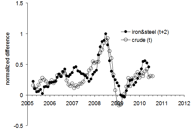
In September 2009, we reported that the price index of crude oil had been likely evolving in sync with that of iron and steel, but with a lag of two months. In order to present both indices in a comparable form, the difference between a given index, iPPI, and the overall PPI was normalized to the PPI: (iPPI(t)-PPI(t))/PPI(t). The normalized differences represent the evolution of the rate of deviation from the PPI over years.

Figure 1 depicts the corresponding time histories of the normalized deviations from the PPI, including the most recent period since June 2010. Simple visual inspection reveals the following feature: the (normalized deviation from the PPI of the) index of iron and steel lags by two months behind the (normalized) index of crude oil.


Figure 1. The deviation of the iron and steel price index and the index of crude oil from the PPI, normalized to the PPI.

In order to reduce both deviations to the same scale we additionally normalized the curves in Figure 1 to their peak values between 2005 and 2009:

(iPPI(t)-PPI(t))/[PPI(t)*max{iPPI-PPI)}]

This scaling allows a direct comparison of corresponding shapes. In Figure 2, we display the normalized index of iron and steel shifted by two months ahead to synchronize its peak with that observed in the normalized index for crude petroleum. (The period between May and July 2010 is included.) The scaled index of crude demonstrates just minor discrepancies from the index of iron and steel in the overall shape and timing of the peak and trough. Simple smoothing with MA(3) makes the curves resemblance even better. As an invaluable benefit of the resemblance, one can use the two-month lag to predict the future of the iron and steel price index.
Figure 2. Deviation of the iron and steel price index from the PPI, normalized to the PPI and the peak value after 2005 as compared to the deviations of the index for crude petroleum normalized in the same way. The normalized index for iron and steel is shifted two months ahead.


Conclusion
Between 2006 and 2010, the deviation of the price index of iron and steel from the PPI in the USA repeats the trajectory of the deviation of the index of crude petroleum (domestic production) with a two-month lag. Therefore, the prediction of iron and steel price for at this horizon is a straightforward one. It is likely that in the fourth quarter of 2010 the index of iron and steel will be decreasing following the observed fall in the index for crude petroleum.

References
Kitov, I., Kitov, O., (2009). Sustainable trends in producer price indices, Journal of Applied Research in Finance, Spiru Haret University, Faculty of Financial Management and Accounting Craiova, vol. I(1(1)_ Summ), pp. 43-51


Drang nach Osten — «натиск на Восток»

ИИ гугла написал « Drang nach Osten — «натиск на Восток») — это исторический термин, обозначающий германскую экспансию на славянские и восто...