8/10/09

Unemployment in Japan at 5.4% in June

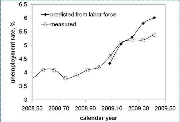
Here we are following our previous article on unemployment in Japan, where we predicted the rate to be at 6.0 in August. A new reading 5.4% for June 2009 was published on July 31. At the same time, a new estimate of labor force is also available for June and it is possible to quantitatively predict the unemployment rate using the empirical relationship introduced in the previous article:

UE(t)= -1.5*dLF(t)/LF(t) +0.045 (1)

where UE is the unemployment rate at time t, LF is the level of labor force at the same time. There is no time delay between the change in the LF and UE. Figure 1 updates the observed and predicted curves in 2009. Both unemployment and labor force are estimated in labor force survey, which is not usually an accurate procedure in the short-term. So, the discrepancy between the observed and predicted curves likely manifests the problems with measurements, because in the long run the curves fit much better.
Figure 1. Observed and predicted rate of unemployment in Japan.
All in all, the rate of unemployment in Japan has been increasing since the mid 2008. Results for August 2009 will be published in the end of September. Meanwhile, the estimate for July should show another uptick.

8/8/09

Unemployment situation

Three simple graphs illustrating the unemployment situation

Figure 1 presents monthly growth in civilian (non-institutional) population (dCP) and in labor force (dLF) between the January 2007 and July 2009. All estimates are obtained in the monthly Current Population Surveys (household data) conducted by the US Census Bureau for the BLS and are seasonally adjusted ones. One can observed three benchmark revisions to the civilian population, which are carried out every January. The estimates of labor force are also affected by the CP revisions. Otherwise, the change in labor force is very volatile. The last three months demonstrate a decrease in the rate of labor force growth from +653 in April to -422 in July. One can expect that the labor force will start to grow again soon.

Figure 1. Monthly growth in civilian non-institutional population (dCP) and labor force (dLF).

Figure 2 compares the change in labor force and in the number of employed people. The latter has also been volatile over the last three years but has clear trends before and after January 2009. These trends are obviously associated with the current recession, with the bottom of the employment market in December 2008. Since January 2009, the number of employed has been decreasing at a decelerating rate. This trend implies that the employment will start to grow in August or September 2009.

Figure 2. Monthly growth in employment (dE) and labor force (dLF).


Figure 3 addresses the change in unemployment. It has been increasing in absolute number since April 2008. However, in July 2009 the unemployment first showed a decrease by 267,000. Considering the long-term behavior of all time series one can make some assumptions about the near future:

The labor force will be growing due to the growth in employment.
The number of unemployed will be decreasing. Due to the increase in the labor force the rate of unemployment will be falling faster than the absolute number of unemployed.


Figure 3. Monthly growth in the number of unemployed (dUE) and labor force (dLF).

7/31/09

BEA's comprehensive revision of GDP

As foreseen in my previous post, the overall result of the comprehensive revision of real GDP growth rate is positive, with the annual average correction of +0.07% between 1995 and 2008. Figure 1 presents the difference between annual growth rates before (retrieved from the BLS web site at 6:00 31.07.2009) and after (retrieved from the BLS web site at 8:35 31.07.2009) the comprehensive revision. Negative differences correspond to higher rates after the revision. At first glance, the largest positive correction is related to the years between 1998 and 2003, i.e. during the period which includes previous “recession”. The new readings just confirm our old conclusion on the absence of any recession in 2001. In any case, a +1% increase in real GDP is not a recession. Figure 2 presents quarterly readings of (annualized) growth rate after the comprehensive revision. This Figure also denies any recession in 2001, as defined by two subsequent quarters with negative growth.
At the same time, despite the annual growth in real GDP in 2008 was positive (revised by 0.6% down, there were two consecutive quarters of negative growth. So, we likely observed a recession in 2008. However, it is too early to make a firm conclusion about the recession in 2009. One might fail as in 2001. Even the Q2 advance estimate of -0.8% is not the final reading. Figure 3 shows that the most recent estimates of real GDP growth are prone to the highest revisions. So, the past of real GDP is not well predicted.

Figure 1. The difference between annual growth rates of real GDP before (retrieved from the BLS web site at 6:00 31.07.2009) and after (retrieved from the BLS web site at 8:35 31.07.2009) the comprehensive revision. Negative differences correspond to higher growth rates after the revision.

Figure 2. Quarterly (annualized) growth rates of real GDP in the USA after the comprehensive revision.


Figure 3. The difference between quarterly (annualized) growth rates of real GDP in the USA before and after the comprehensive revision

S&P 500 in July 2009

Stock market behavior has always been a source of surprises for researchers, traders, and investors. The long term aggregate price trends have been explained as related to fundamental factors. These factor, however, are numerous and not well defined. As a result, no prediction is possible.
In [1] we presented selected results of modelling, which demonstrate the robustness of long-term (years!) prediction. In the model, only one factor drives trends and fluctuations ain S&P 500. Therefore, our results are easy to interpret and repeat. Since March 2009, S&P 500 has been growing. This fast growth was foreseen in February 2009. Since March 2009, we have been reporting comparisons of monthly returns – observed and predicted. So far, the match is excellent.
In this post, preliminary results for July 2009 are reported, as accompanied by formal introduction of the model. The model is an empirical one and needs to be assessed and (sometimes) updated when new data are available. The last assessment (published in this blog) was carried out in June 2009. Since the model links S&P 500 to the growth rate in real GDP, we made relevant forecast for the second quarter of 2009 as +5%. This value is very high compared to the consensus (Conference Board) prediction of -0.7% .

1. S&P 500 vs. the number of nine-year-olds
To begin with, in Figure 1 we present observed and predicted S&P 500 returns for the period between 1985 and 2003 and their residual. Main finding is that the observed and predicted time series are cointegrated [1], both according to the Engle-Granger tests and the Johansen approach, i.e. there exists a long-term equilibrium relation between S&P 500 returns and the number of 9-year-olds in the USA. The latter is the driving force of the stock market and real GDP.


We have been carefully tracking the evolution of S&P 500 since 2007, when predicted a sharp fall in 2008 [1]. The updated relationship between S&P 500 returns and the (extrapolated) number of nine-year-olds is as follows:

Rp(t) = 165dln[N3(t+6)] - 0.17 (1),

In (1), Rp is the 12-month cumulative return; N3 is the number of three-year-olds; N9 is the number of 9-year-olds; t+6 – time shifted by six years ahead to extrapolate the number of 3-year-olds into the number of 9-year-olds.

Figure 2 predicts S&P 500 index using the number of 9-year-olds extrapolated from the number of 3-year-olds. There are two new points, June (919) and July (~990) 2009, since the last update in June 2009. The latter figure is a preliminary one as picked on July 30, 2009. It is not likely that this figure will change dramatically during the last trading day in July.
A sudden drop in 2008 and 2009 to the level of 700 should be followed by an increase to 1800 in 2010. Notice that the start of the current growth in S&P 500 was first predicted in March 2009, when the market was very low with the close at ~735 in February. The last five points together with the turn to the growth were forecasted.
Figure 2. Evolution of S&P 500. Red line – observations; black line – prediction from the number of 9-year-olds. The prediction is obtained using (1).

2. S&P 500 vs. real GDP per capitaThe main problem for an accurate prediction consists in the fact that the number of 9-year-olds in the end of any decade is prone to high bias. Only decennial censuses (next due in 2010) allow adequate estimates. Because of high uncertainty in N9, we have proposed to use real GDP per capita, GDPpc, as a proxy to the N9 [2-3]. Originally, the link between real GDP growth rate and the change rate of the number of 9-year-olds was found by Kitov [4]. Corresponding relationship should work in both directions, i.e. one can estimate the growth rate of real GDP from population measurements, and the number of 9-year-olds from real GDP measurements.

In relationship (1), we replace N9(t) with GDPpc(t), taking into account that second term in the relationship between real GDP per capita and population is constant. Figure 3 displays the observed S&P500 returns and those obtained using real GDP, as presented by the US Bureau of Economic Analysis (http://www.bea.gov/). As before, the observed returns are 12-month cumulative values. The predicted returns are obtained from the relationship

Rp(t) = 15.0*dln(GDPpc(t)) - 0.32 (2)

where GDPpc(t)) is represented by the average (annualized) growth rate during four previous quarters. It is worth noting that there are no monthly readings of real GDP available. Hence, only quarterly figures can be compared.

The period after 2000 is well predicted including the sharp increase in 2003. Therefore, it is reasonable to assume that the 9-year-old population was not well estimated by the US Census Bureau after 2003. This conclusion is supported by the cointegration test conducted for real GDP per capita and the charge rate of the number of 9-year-olds [3], which proves the existence of a long-term equilibrium linear relation between these two variables since the early 1960s. As a result, one can use either N9(t) or GDPpc(t) for the modelling of the S&P 500 returns, where one of them is more appropriate. Obviously, the GDPpc(t) is consistent with the S&P 500 returns after 2007. The years between 2007 and 2010 should confirm or reject this statement.
Currently, relationship (2) holds. The deep fall in 2008-2009 is well described. It also predicts that real GDP will start to increase in the nearest future following the observed increase in S&P 500. It would be very strong evidence in favour of (2).
Today the BEA will announce the Q2 figure. In Figure 3, red circle is our prediction (made a month ago) for 2009Q2. The rate of growth should be +5% relative to the previous quarter. The BEA should also provide a comprehensive revision to all historical reading of GDP. We expect a positive revision to real GDP estimates during the last four years.
In June, S&P 500 did not change from its May level of 919. (In May 2009, it grew by +47 units from 872 to 919). In July, the June non-growth is likely to be compensated with a rise by approximately 80 points from 919 to ~1000. Figure 4 shows the past and future predictions using the number of 3-year-olds.

Figure 3. The link between S&P 500 returns and real GDP per capita between 2000 and 2009. Red circle is a prediction of the growth rate for 2009Q2. The rate of growth is taken at the level of +5% relative to previous quarter.


Figure 4. Observed and predicted S&P 500 returns. The July level of S&P 500 index is around 1000, from its level of 919 in June 2009. The past five months are relatively well predicted.
ConclusionBetween 1985 and 2009, the S&P 500 returns can be accurately described by population estimates and readings of real GDP per capita. The model based on the number of 9-year-olds produces a time series which is cointegrated with the S&P 500 returns, i.e. reveals a weak causality, as proved by the cointegration tests. The next event to support the presence of the link between GDP and S&P 500 is the announcement of the growth rate in Q2 2009. From Figure 3, one can expect a positive figure, which is likely to be larger than 1 or 2 percentage points.


References[1] Kitov, I., Kitov, O., (2007). Exact prediction of S&P 500 returns, MPRA Paper 6056, University Library of Munich, Germany, http://ideas.repec.org/p/pra/mprapa/6056.html

[2] Kitov, I., Kitov, O., Dolinskaya, S., (2008). Comprehensive Macro – Model For The US Economy, Journal of Applied Economic Sciences, Spiru Haret University, Faculty of Financial Management and Accounting Craiova, vol. 3(4(6)_Wint), pp. 405-418. http://www.jaes.reprograph.ro/articles/winter2008/ComprehensiveArticle8.pdf

[3] Kitov, I., Kitov, O., Dolinskaya, S., (2009). Modelling real GDP per capita in the USA: cointegration tests, Journal of Applied Economic Sciences, Spiru Haret University,Faculty of Financial Management and Accounting Craiova, vol. 4(1(7)_ Spr), pp. 80-96. http://www.jaes.reprograph.ro/articles/spring2009/KitovI_KitovO_DolinskayaS.pdf

[4] Kitov, I., (2006). GDP growth rate and population, Working Papers 42, ECINEQ, Society for the Study of Economic Inequality, http://ideas.repec.org/p/inq/inqwps/ecineq2006-42.html


7/25/09

PPI of metals revisited

We have demonstrated that the evolution of various components of CPI and PPI in the United States is not a random but rather a predetermined process with long-term sustainable trends [1-4]. Using these trends, we have predicted consumer and producer price indices for various goods, services and commodities [5-7].

In this post, we present the PPI of three commodities related to metals: steel iron, nonferrous metals, and metal containers. All these items have been already studied in our article [4]. Therefore, it is worth to revisit old predictions and to update them if necessary.

Figure 1 compares old (upper panel) and updated differences. According to [4], as repeated in the upper panel, “the normalized difference between the PPI and the index for iron and steel (101) is characterized by the presence of a sharp decline between 2001 and 2008: from +0.2 to -0.4. Between 1980 and 2000, the curve fluctuates around the zero line, i.e. there was no linear trend in the absolute difference. One could expect the negative trend is now transforming into a positive one.“ Between March and June 2009, the difference continued to increase, and likely reached its peak in June (Figure 2). In July or August 2009, the difference will stall around its peak value and then will start to decrease. As a result, the index for iron and steel will be growing faster than the PPI. In the short run, one can expect a fast recovery of iron and steel prices to the level observed in January-March 2008, i.e. the index will reach the level 210 to 220. However, this recovery will not stretch into 2011, and the index of iron and steel will be declining in the long run to the level of 2001, as depicted in Figure 3. In other words, the period between 2008 and 2010 is characterized by very high volatility, which will fade away after 2011.

According to [4], “the index for non-ferrous metals (102) shows an example of the absence of sustainable trends in the normalized difference. The curve is rather a comb with teeth of varying width. Although varying, the distance between consecutive troughs is several years at least. Therefore, one should not expect a quick recovery in the price for nonferrous metals”. Figure 4 displays the original and updated predictions. There is almost nothing to add to the previous statement. The recovery in March-June 2009 is likely only a short-term one, as the past experience shows.

It was stated in [4] that, “the index for metal containers (103) provides an excellent example of linear trends in the normalized difference. There are two distinct periods between 1960 and 2008 with a turning point in 1987. A sudden drop in the difference in the end of 2008 may symbolize the start of transition to a new period with a negative trend. Then the price for metal containers will be increasing at an elevated rate, i.e. the index will get back its price setting power.” Figure 5 presents the original and updated versions of the difference between the PPI and the index of metal containers. The negative overshoot in the difference reached its peak in March and currently the difference started to increase. One can not exclude short-period oscillations in the near future. The future of the index for metal containers is vague.

All in all, the index for metals and its components is not expected to grow to the level recorded in 2008 any time soon. Currently observed increase in some components will not last long.


Figure 1. Upper panel: The evolution of the difference between the PPI and the price index of iron and steel between July 1985 and March 2009 (borrowed from [4]). Lower panel: Same for the period between 1985 and June 2009. Red and blue lines highlight segments between 1988 and 2001, and from 2001 to 2008, respectively. Green line predicts the evolution of the difference after 2008, as a mirror reflection of the linear trend between 2001 and 2008.

Figure 2. The evolution of the difference between the PPI and the price index of iron and steel between January 2005 and June 2009. Red line predicts the evolution of the difference after 2008. Red circles represent the difference between April and June 2009. We expect the difference will start growing in August-September 2009.
Figure 3. The evolution of the PPI, the index for iron and steel, and their difference in the long-run between 2009 and 2016. The index for iron and steel is predicted to decrease from the level of 220, which it will reach by the end of 2009, to ~185 in 2016. Accordingly, the difference will be growing as shown in Figure 1. The PPI will be also slowly growing.

Figure 4. Upper panel: The evolution of the difference between the PPI and the index of nonferrous metals from 1960 to March 2009 (borrowed from [4]). Lower panel: Same as in the upper panel for the period between 1985 and June 2009. There are no linear trends in the difference, but its behavior demonstrates a clear periodic structure with relatively deep but short troughs, which reflect the fast growth in the PPI for nonferrous metals. The last excursion ended in 2009. A period of hovering near the zero line is expected.


Figure 5. Upper panel: The evolution of the difference between the PPI and the index of metal containers from 1960 to March 2009 (borrowed from [4]). Lower panel: Same as in the upper panel for the period between 1985 and June 2009. There are distinct linear trends in the difference. One can not exclude that the fall in the difference is a start of the transition to a new trend.


References

1. Kitov, I., Kitov, O., (2008). Long-Term Linear Trends In Consumer Price Indices, Journal of Applied Economic Sciences, Spiru Haret University, Faculty of Financial Management and Accounting Craiova, vol. 3(2(4)_Summ), pp. 101-112.
2. Kitov, I., (2009). Apples and oranges: relative growth rate of consumer price indices, MPRA Paper 13587, University Library of Munich, Germany.
3. Kitov, I., Kitov, O., (2009). A fair price for motor fuel in the United States, MPRA Paper 15039, University Library of Munich, Germany,
4. Kitov, I., Kitov, O., (2009). Sustainable trends in producer price indices, Journal of Applied Research in Finance, v. 1, issue 1.
5. Kitov, I., Kitov, O., (2009). PPI of durable and nondurable goods: 1985-2016, MPRA Paper 15874, University Library of Munich, Germany
6. Kitov, I., (2009). Predicting gold ores price, MPRA Paper 15873, University Library of Munich, Germany
7. Kitov, I., (2009). Predicting the price index for jewelry and jewelry products: 2009-2016, MPRA Paper 15875, University Library of Munich, Germany

7/17/09

The price index of gold ores in June 2009

Previously, we have demonstrated that gold ores price can be predicted at a several year horizon[1]. The prediction was based on the observation that the difference between the overall producer price index, PPI, and the producer index for gold ores shows sustainable trends. A new trend has been emerging since 2008 and the difference can be foreseen at a five to ten-year horizon. As the PPI will be likely constant over the next decade, the difference provides a direct prediction of the price index for gold ores. In this article, we update the forecast using a new reading of the PPI for June 2009.

Currently, we are struggling through a period of high volatility in all macroeconomic variables including the difference between various PPI subcategories and commodities. Figure 1 illustrates the observation that this volatile period is related to the turn to a new trend in the difference after 2008. We have made a naïve assumption about the new trend shown by green line - it should repeat the trend observed between 2001 and 2008 but with an opposite sign. Actual trend may be different but inevitably with a positive slope. The green line has a positive slope. Therefore the index for gold ores will be growing at a lower rate than the overall PPI. According to our assumption, the rate of the deviation from the PPI will be +11 units of index per year.

Figure 1. Evolution of the difference between the PPI and the price index for gold ores between July 1985 and June 2009. Red and blue lines highlight segments between 1988 and 2001, and from 2001 to 2008, respectively. Green line predicts the evolution of the difference after 2008, as a mirror reflection of the linear trend between 2001 and 2008.


We will continue reporting on the long-term prediction, i.e. on the evolution of the difference between the PPI and the index for gold ores. This is an ongoing task which does not need monthly updating. However, it is of interest to look into the short-term behavior of the difference and evaluate the index for gold ores at a several months horizon, as we reported for crude petroleum.
Figure 2 displays the trajectory of the difference since 2005. A characteristic feature is the presence of low-amplitude and high-frequency (monthly) oscillations in the curve since 2006. Bearing in mind the absence of such oscillation if the difference between the PPI and the index of crude petroleum mentioned above, the cause of the oscillations is not clear. In any case, this is a feature, which should be taken into account when predicting gold ores price at time horizons of several months. The reading for June supports the importance of the high-frequency oscillations – the curve, which was expected to go upwards to intersect the new trend in 2009, suffers a local decline. It would be an unusual behavior for the index of crude oil, but it is normal for the index of gold ores.
Despite many local deviations in the past, the curve always returned to the trends. Therefore, the larger is the deviation the bigger should be a countermovement. Accordingly, one can expect that the index for gold ores will soon accelerate to the new trend shown by red line in Figure 2. In other words, the increase in gold price in May and June (and likely in July) should be compensated by an opposite move of the curve to the level above the red trend line. As a result, the index price should fall by ~50 units, i.e. to the level between 180 and 2000, which was observed between April 2006 and August 2007.
Apparently, the prediction is based on the assumption of a natural (in physical sense) behavior of the difference, as has been observed since 1985. The forces behind such behavior are prone to secular changes and there is a non-zero probability that the new trend will never emerge. In any case, we are going to continue reporting on the evolution of the difference.
Figure 2. Evolution of the difference between the PPI and the price index for gold ores between January 2005 and June 2009. Red line predicts the evolution of the difference after 2008. Red circles represent the difference between April and June 2009. We expect the difference will start growing in July-August 2009.

References
[1] Kitov, I., (2009). Predicting gold ores price, MPRA Paper 15873, University Library of Munich, Germany, http://mpra.ub.uni-muenchen.de/15873/01/MPRA_paper_15873.pdf

7/15/09

Oil price - on its way to $100 per barrel

In June 2009, we presented a prediction of crude petroleum price for 2009 (Crude Will Reach $100 by December 2009). Briefly, our analysis has shown that oil will overcome $100 per barrel before the end of 2009. As promised, we evaluate the prediction every month, after new readings of producer price index (PPI) with all its components become available. In this article, we report the results for June 2009.
The period between January 2008 and likely the end of 2010 is characterized by an elevated volatility in oil price, but the evolution of the price is not random. Moreover, even after the start of crisis in 2008, the price has been following a predetermined trajectory, as it has been demonstrating since 1980.
The June reading of the PPI shows a rise to 174.1 from 170.2 in May, and the producer price index of crude petroleum (domestic production) has increased by ~32 points: 188.9 after 157 in May. Our assumption on the average monthly increment for the crude petroleum index was +20, and for the PPI +1. So, the increase in June was larger than predicted. This increment might be compensated by weaker growth in the following months. For example, oil price in the first half of July demonstrate rather a slight decrease.
Figure 1 presents the new readings in a graphical form. The evolution of the difference between the PPI and the index for crude petroleum accurately follows the predetermined path – from its peak in February 2009 to the bottom of a through, which will likely be reached by December 2009. This is a natural path for a pendulum, as discussed in the previous article. Hence, there is not sign that the oil price deviates from the predicted trajectory.
Figure 2 depicts the evolution of crude oil price. Values for the period between July and December 2009 are shown by solid red circles. According to the prediction, the price should break the $100 level before the end of 2009.
The next update is expected in a month, when data for July are published.

Figure 1. The evolution of the difference between the PPI and the index for crude petroleum (domestic production). Solid circles – the readings between March and June 2009, which were anticipated in February 2009. Open circles – the predicted difference between July and December 2009.


Figure 2. The evolution of crude oil price. Red circles – oil price predicted for the period between July and December 2009. According to the prediction, the price should break the $100 level before the end of 2009.

Он раб моды ...

"  Вот, например, когда в моде было загорать, он загорел до того, что стал черен, как негр. А тут загар вдруг вышел из моды. И он решил...