5/31/11

Motor fuel price to fall in the near future

Our task is to estimate relative growth in a given price with time.  We use the ratio of price index, P(t), and GDP per capita in current prices, Y(t) (the idea borrowed from V.Kossov): 

Z(t)=P(t)/Y(t)

Figure 1 presents the evolution of the price index of motor fuel since 1935 (obtained from the BLS) and Figure 2 – nominal GDP per capita.   The share of motor fuel price in GDP per capita can be presented as a function of Y as well as time.  Figure 3 shows that there exist a long-term negative trend for Z(t) (notice the log-log scale) with two major fluctuations.  The trend looks sustainable and deviations seem to be of transient character.  Therefore, one can expect the fall in Z in the near future – motor fuel will be falling against GDP per capita. Oil price is likely to fall as well.  Figure 4 presents log(Z) as a function of time.
Figure 1. The consumer price index of motor fuel (not seasonally adjusted).
Figure 2. Nominal GDP per capita
Figure 3. LogZ vs. GDP per capita.
Figure 4. LogZ vs. time

Food is getting cheaper

Food is getting more and more expensive. Everybody knows that.  Figure 1 illustrates the evolution of the price index of food since 1913. At the same time, the US economy also grows including the growth in real GDP per capita which is shown in Figure since 1929 (chained, in 2005$).  One can easily estimate which of these two variables grows faster. Figure 3 depicts the ratio of CPI and GDP per capita relative to that in 1929. Overall, the food price falls relative to the GDP per capita, i.e. one has to pay a lower share of income (a fixed portion of GDP per capita)  for the same amount of food (we do not consider nomenclature and quality of food here).  Food is getting cheaper with time. It is interesting that the ratio in Figure 3 has not been falling much since 1975.

Figure 1.

Figure 2.

Figure 3.

5/28/11

The New Keynesian Phillips Curve – methodological dead-end


Couple days ago we presented a Phillips curve for Germany.  When unemployment leads inflation (the GDP deflator) by one year in the model, one can explain about 80 per cent of the variability in the inflation time series. The model residual error can be explained by measurement errors and with increasing accuracy one could reach a much higher predictive power. This is a simple way of explanation which meets general requirements of scientific methodology. Economics and econometrics are likely to violate this methodology in order to fit own understanding of reality.
The new Keynesian Phillips curve (NKPC) and many other economic and econometric models are based on an assumption that the future inflation value must depend on its current and/or past values and additional variables related to economic activity. Among many others, it might be unemployment , output gap or marginal labor cost.  To define the input of the activity variable one has to apply an econometric model which is similar (but not equivalent) to linear regression and calculate relevant coefficients in the relationship:

P(t+1)=a0P(t) +a1P(t-1)+ ….anP(t-n) + b0U(t)+b1U(t-1) ….
where P(t) is the inflation time series and U(t) is the rate of unemployment.  Instead of using advanced VAR models we apply simple linear regression to the German inflation (Figure 1) and unemployment (Figure 2) time series. There is a series of models with increasing complexity. In model M1, the original time series is regressed against itself with lag 1. The slope of 0.86 and R2=0.744 in table 1 demonstrate a high level of correlation which is well expected. The inflation time series varies with a period larger than 1 year. A crucial characteristic of the model is its accuracy as expressed as RMSE=0.00955. Thus, the uncertainty of one year ahead forecast is 0.96% in Germany between 1973 and 2010. For a purely naïve model, which does not include the intercept in the regression, RMSE=0.0097.  
In model M2, we use lags 1 and 2. This model is even worse than model 1 with R2=0.738 and RMSE=0.00967. Therefore, lag=2 does not help much and we include U(t) in model 3. This new term dramatically change the model. Coefficient b0=-0.34 steals some input from a0, which is now only 0.57. It means that one can explain same variations in the DGDP time series using its lagged values or the unemployment series. In model 3, individual inputs are shared almost proportionally, as required for collinear parts of regressed time series. Is it a fair division of influence?  Let’s look closer.
The input of U(t) can be masked by  the influence of the lagged values of inflation. In order to estimate the true effect of unemployment on inflation one needs to exclude all past values of inflation.  Models 5 and 6 try the unemployment time series and its lagged version. We have expected the outcome since it was obtained previously and described in our post on the Phillips curve in Germany. Model M6 with unemployment lagged by one year has all merits: R2=0.80 and RMSE=0.0084. Why should one use the NKPC if it does not reach the predictive power of the original Phillips curve? The explanation is simple and sad. Economics and, in part, econometrics are the hostages of prejudice and unjustified assumptions (rational expectations and likes). 
Mathematically, any student knows that one must not decompose a function into any set of functions which are not orthogonal. Otherwise, the decomposition cannot be completely resolved, and thus, is unreliable.  The NKPC makes this school-level mistake and decomposes inflation into a set of non-orthogonal functions. This is a methodological dead-end. It will always mask real influence of true inflation drivers, such as unemployment as models M3 and M4 demonstrate. One can check that the VAR models with the same lags give almost the same coefficients as in table 1.

Table 1
model
a0
a1
b0
b1
Rsq.
RMSE
M1
0.86
0.744
0.00955
M2
0.81
0.05
0.738
0.00967
M3
0.57
-0.04
-0.34
0.821
0.00799
M4
0.43
-0.04
-0.1
-0.31
0.828
0.00783
M5
-0.66
0.691
0.01050
M6
-0.65
0.804
0.00840


 Figure 1. The GDP deflator in Germany between 1971 and 2010

Figure 2. The rate of unemployment in Germany.

Real economic growth. The importance of being … small


Here, we compare real economic growth based on real GDP per capita, G. In developed countries, annual increment of GDP per capita is constant over time with all fluctuations caused by the change in the age pyramid. The average value of the annual increment of GDP per capita varies between countries, however. Among large economies, the USA grows with the highest annual increment.  In that sense, it is the most efficient economy.

Lately, we presented several posts showing the difference between real GDP per capita in the USA, Gusa,  and select countries, Gi:

dG = Gusa-Gi

When the difference dG has a positive trend, the gap with the USA increase with time. When dG has a negative trend, this country grows faster than the USA. There are not many economies outperforming the U.S. since 1990. Six developed countries deserve special consideration: Ireland, Norway, Luxembourg, Hong Kong, Singapore, and Trinidad and Tobago which joined recently.  Figure 1 demonstrates that these six economies all have negative trend in the dG time series. Ireland, the biggest among them, has been experiencing problems since 2006.

Hence, one can conclude that small countries have higher probability to grow fast. To be small is not enough, however!  

Figure 1. The differences between real GDP per capita in the USA and six select countries

5/27/11

Mark Thoma on the trend in real economic growth

Mark Thoma has published a long post on the evolution of real economy in the U.S. The question is -When will real GDP intercept its long-term trend? Or will it intercept at all? Mark also cited some related posts by Mankiw, Krugman, DeLong and own papers.

Before any discussion of real growth models one must replace real GDP with real GDP per capita in order to exclude the exponential working age population growth. This is a major source of confusion also missed by Mark. Then, one should compare other developed countries in order to reveal common features. Also, one has to test predictive power of all models.

My recent post on the growth model was based on observations in developed countries and showed that the growth rate of real GDP per capita has a trend decaying proportionally to the reciprocal value of the real GDP per capita. All fluctuations in the growth rate in developed countries, including the USA, return to this trend, at least since 1950 (no reliable data before).

Thus, the US economy will likely return to the decaying trend, not to the linear trend in the growth rate as borrowed from the Lucas lecture.

When discussing models one has to validate them by data. Otherwise this discussion is worthless.

5/25/11

New Zealand. Sad economic forecasts

Here we introduce a new model of unemployment in New Zealand.  It extends the set of models linking the rate of unemployment and the change in labour force.  The agreement between the measured and predicted unemployment estimates in New Zealand validates our concept which states that there exists a long-term equilibrium (causal) linear and lagged link between unemployment, ut, and the rate of change of labour force, lt=dLF/LFdt. For this purpose, we use data borrowed from the OECD.

The estimation method is standard – we seek for the best overall fit between observed and predicted curves by trial-and-error method. All in all, the best-fit equation is as follows:
ut = -2.0lt-3  + 0.09         (1)
Therefore, the lead of lt is three years. The intercept of 0.09 implies the rate of unemployment at the level of 9% when the labour force does not change. Hence, New Zealand needs increasing labour force in order to reduce unemployment.   
Figure 1 presents the observed unemployment curve and that predicted using the rate of labour force change 3 years before and equation (1). Since the estimates of labour force in New Zealand are very noisy we have smoothed both annual curves with MA(3). All in all, the predictive power of the model is excellent and timely fits major peaks and troughs after 1984.
Relationship (1) allows a relatively accurate prediction of the rate of unemployment at a three-year horizon. Figure 1 demonstrates that unemployment will likely grow to the level of 7% in 2012 from the current level of 6.5%.  Hence, the drop in the rate of real economic growth will be accompanied by an elevated unemployment.


Figure 1. Observed and predicted rate of unemployment in New Zealand. The lower panel shows the cumulative curves for the annual curves in the upper panel.

The Phillips curve in Germany

In the posts on the USA and the UK, we mentioned the anti-Phillips curve in which unemployment lags behind inflation by several years. This contradicts the paradigm of the modern economic theory. There are cases, however, which comply with the theory. The Phillips curve in Germany is a good example where unemployment leads inflation by one year.
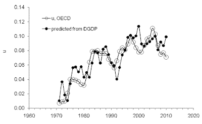
Figure 1 displays the observed rate of unemployment, u, and that predicted from inflation, which is represented by the GDP deflator, DGDP, according to the following relationship:
u(t-1) = -1.30[0.1]DGDP(t) + 0.105[0.005]              (1)
where u leads by one year. Standard deviation of the residual error is (s=) 0.013 for the period between 1971 (start of DGDP time series) and 2010. Both coefficients in (1) are reliable, and thus, there exists a linear and lagged relation between unemployment and inflation in Germany.

Figure 1. Unemployment and DGDP (both reported by the OECD) in Germany between 1971 and 2010. The lower panel shows the cumulative curves for the annual readings in the upper panel.
Both coefficients in (1) are determined from the cumulative curves with a higher accuracy when provided by linear regression. Figure 2 depicts the Phillips curve in a standard way. The slope of -0.645 instead of the linear coefficient -1.30 in (1) is highly underestimated due to the uncertainty in both time series. At the same time, the determination coefficient R2=0.83 is a strong evidence in favour of the Phillips curve in Germany.
 The existence of a conventional Phillips curve in Germany raises a question about the consistency of monetary policy of the Bundesbank. Does the bank conduct a monetary policy, which balances inflation and unemployment? Affirmative answer is counter-intuitive as in the past twenty five years show the unwillingness of the bank to reduce unemployment in exchange for higher inflation.

Figure 2. The Phillips curve for Germany. The unemployment readings are shifted by one year ahead to synchronize with the GDP deflator estimates.

5/24/11

The Phillips curve and anti-Phillips curve in the U.K.

Looking at two pictures below, please decide which is closer to reality. I have found  a version of the Phillips curve for the U.K. in this paper - "What Drives Inflation in the Major OECD Economies?" by
Diego Moccero, Shingo Watanabe, Boris Cournède. To my mind, their presentation is misleading if compared to the anti-Phillips curve where unemployment lags behind inflation.

Their figure:
My figure: 


I do not understand what makes economists to have so strong prejudice against inflation leading unemployment when it is really  observed. Smells as a sect.

Deflation in Japan. The other view

Our previous post showed that inflation in Japan can be completely explained by the change in labor force. Obviously, there are different (and wrong) explanations based on monetary policy of the Bank of Japan. Below is an abstract of  a working paper on this issue. In my view, it is absolutely worthless as not describing any period or major change in the inflation evolution. How can they seriously publish this kind nonsense?

Japan's Deflation and the Bank of Japan's Experience with Non-traditional Monetary Policy

This paper offers a brief summary of non-traditional monetary policy measures adopted by the Bank of Japan (BOJ) during the last two decades, especially the period between 1998-2006, when the so-called Zero Interest Rate Policy (ZIRP) and Quantitative Easing (QE) were put in place. The paper begins with a typology of policies usable at low interest and inflation rates. They are: strategy (i), management of expectations about future policy rates; strategy (ii), targeted asset purchases; and strategy (iii), QE. Alternatively, QE may be decomposed into a pure attempt to inflate the central bank balance sheet, QE0, purchases of assets in dysfunctional markets, QE1 and purchases of assets to generate portfolio rebalancing, QE2. Strategy (ii), when non-sterilized, is either QE1 or QE2. Using this typology, I review the measures adopted by the BOJ and discuss evidence on the effectiveness of the measures. The broad conclusion is that strategies (i) and (ii) have affected interest rates, while no clear evidence exists so far of the effectiveness of strategy (iii), or QE0. Strategy (ii) has been effective especially in containing risk/liquidity premiums in dysfunctional money markets; that is, QE1 has been effective. The effectiveness of QE2, however, is unclear. The strategies, however, have failed to bring the economy out of the deflation trap so far. I discuss some possible reasons for this and also implications for the current U.S. situation.

The GDP deflator in Japan

We have already mentioned that Japan is the best illustration of our concept linking inflation/unemployment to the change in labour force. In the previouspost on inflation in Japan, we modelled the overall CPI. Here we illustrate the long term equilibrium relation between the GDP deflator, DGDP, and labour force. All data were obtained from the OECD.
By trial-and-error, we seek for the best-fit coefficients in the linear and lagged link between inflation and labour force. Because of the structural (measurement related?) break in the 1980s, we have chosen the period after 1981 for linear regression, which is common for almost all economic studies related to Japan. By varying the lag and coefficients we have found the following relationship:

DGDP(t)= 1.9dLF(t-t0)/LF(t-t0) – 0.0084        (1)
where the time lag t0=0 years; Figure 1 depicts this best-fit case. There is no time lag between the inflation series and the labour force change series in Japan. Free term in (1), defining the level of price inflation in the absence of labour force change, is close to zero but negative.
A more precise and reliable representation of the observed and predicted inflation consists in the comparison of cumulative curves shown in the lower panel of Figure 1. We always stress that the cumulative values of price inflation and the change in labour force are the levels of price and labour force, respectively. Therefore, the summation of the annual reading gives the original estimates of price and workforce, which when are converted into rates.
Another advantage of the cumulative curves is that all short-term oscillations and uncorrelated noise in data as induced by inaccurate measurements and the inevitable bias in all definitions are effectively smoothed out. Any actual deviation between these two cumulative curves persists in time if measured values are not matched by the defining relationship. The predicted cumulative values are very sensitive to free term in (1).
For Japan, the DGDP cumulative curves are characterized by very complex and unusual for economics shapes. There was a period of intensive inflation growth and a long deflationary period. The labour force change, defining the predicted inflation curve, follows all the turns in the measured cumulative inflation with the coefficient of determination R2=0.96. (Again, these are actually measured curves.) With shrinking population, and thus, labour force, the GDP deflator will be falling through 2050 and likely beyond.

Figure 1. Measured GDP deflator and that predicted from the change rate of labour force. Upper panel:  Annual curves smoothed with MA(3). Lower panel: Cumulative curves between 1981 and 2010. A good agreement between the cumulative curves illustrates the predictive power of our model.

The anti-Phillips curve indicates that the rate of unemployment in the UK must drop below 7% by the end of 2013.

We introduced a model of unemployment in the USA and other developed countries six years ago. The rate of unemployment, ut, and price inflation, CPIt, are driven by the same force - the rate of change of labour force. Briefly, there exists a long-term equilibrium (linear and lagged) link between unemployment, inflation and labour force. As a consequence, the rate of inflation and unemployment are also linked by a linear and lagged relationship.  In the USA, unemployment lags behind both CPI and labour force by 3 and 5.5 years, respectively. This creates a situation contradicting any mainstream macroeconomic theory. Under the conventional framework, which is usually described by the Phillips curve, the change in unemployment must be contemporary or leading price inflation. As a joke, we proposed to call the actual link between inflation and unemployment in the USA the anti-Phillips curve. As always, the economics profession ignores observations and looks for the answer in the reservation limited by theoretical barbed wire.  Here we present the case of the United Kingdom. Monthly estimates of the rate of unemployment and CPI, both obtained from the OSCD, completely confirm the concept of the anti-Phillips curve. Unemployment in the UK lags behind inflation by 24 months.
In practice, we are looking for the best-fit linear and lagged equation in the following form:
ut = aCPIt-j  + b      (1) 
where a and b are empirical coefficients, and j is the time lag between these variables, which can be positive, zero, or negative. Figure 1 displays the best fit model with a=0.9, b=0.041 and j=24 months. Since the monthly estimates of CPIt are very noisy we have smoothed the predicted curve with MA(24). Overall, the rate of unemployment repeats the shape of the scaled inflation curve two years later.  The coefficient of determination R2=0.89 for the period between 1981 and 2011, i.e. for 360 readings.
From Figure 1 one can conclude that there exists an anti-Phillips curve in the UK as it was revealed for the USA. Inflation does lead unemployment and the economic theory can not ignore this observation. A good validation of the model would be the fall in the rate of unemployment in the UK below 7% by the end of 2013. The observed curve should intercept the predicted one in the near future.

Figure 1. Observed and predicted rate of unemployment in the UK. Lower panel presents the cumulative values of the curves in the upper panel. This is the best control of the link.

5/22/11

Labour force participation in Sweden and the Sveriges Riksbank Prize in Economic Sciences in Memory of Alfred Nobel

We have published a number of models for the rate of participation in labour force, LFP. The intuition behind the model is very simple. The growth in real GDP influences the labour force supply through redistribution of personal incomes. Fluctuations in real GDP per capita relative to that defined by inertial economic growth, A1/G, provide variations in the distribution of personal income relative to some inertial (or neutral) growth rate. The influence of the growth in real GDP on the LFP has to be complicated by the presence of exponential distribution of personal inputs to real GDP. If the effect of real growth is based on the excess of the total personal income above its potential (inertia) level, then higher levels of LFP are more sensitive to real growth. Really, more people can be included in or excluded from the redistribution because of their smaller personal incomes for paid jobs, which are replaced by some other (not measured) mechanisms of personal income earning. It is reasonable to assume that the sensitivity of LFP to the difference between actual and potential (inertial) growth rates, e(t)=dG/GA/G, grows exponentially with increasing LFP. In addition, there might be a time delay between action and reaction and the LFP may lag behind the e(t). Now we are ready for a quantitative analysis with a tentative relationship: 

{B1dLFP(t)/LFP(t) + C1}exp{ a1[LFP(t) - LFP(t0)]/LFP(t0) =

          = {dG(t-T))/G(t-T) – A/G(t-T)}dt

Here we present the model of labour force participation in Sweden. Figure 1 shows that the LFP is very well predicted since 1975. This model is valid for all developed countries. No macroeconomic model can predict the observed changes in LFP using only one macroeconomic parameter. Since the presented model describes the case of Sweden I also mean the latter laureates of the Sveriges Riksbank Prize in Economic Sciences in Memory of Alfred Nobel awarded “for their analysis of markets with search frictions” have failed to model the labour market and predict its evolution at the same level of accuracy and forecast horizon.

Why we need the sophisticated model not describing reality if there exists a simple model predicting as accurately as one can only dream?

                  
Figure 1. Observed and predicted LFP in Sweden: T=0.

Inflation in the UK - no sign of deflation any time soon

There exists a long-term equilibrium link between price inflation, CPIt, unemployment, ut, and the rate of change of labour force, lt=dLF/LFdt, as was demonstrated in this blog for many countries. The UK is one of the world biggest economies with a relatively good statistics started chiefly from 1973.  It is a major challenge to model inflation in the UK using our approach.
We have to separate two periods to fit observations: before and after 1985:
CPIt = 1.0lt  + ut  - 0.046; t>1985
CPIt = -1.0lt -1.7 ut + .025; t<1985              (1)
For both periods, inflation does not lag behind unemployment and lt. Figure 1 presents the observed and predicted CPI curves, all variables were obtained from the OECD database in 2011. All in all, the predictive power of the model is good and timely fits major peaks and troughs. The change from negative to positive linear coefficient in 1985 needs a special explanation. But such effects were observed in other developed countries as well.  A labour force projection could help to predict the future inflation. Since the inflow of new employees is still positive,  lt >0, and the rate of unemployment does not foresees any dramatic decline in the long run one can be sure that inflation will be positive in the near future.

Figure 1. The rate of CPI inflation in the UK, predicted and measured.

Unemployment in Italy

We introduced a model of unemployment in Italy in 2008 with data available only for 2006. The rate of unemployment was near its bottom at the level of 6%. The model predicted a long-term growth in the rate unemployment to the level of 11% in 2013. In this post we revisit the model. The agreement between the measured and predicted unemployment estimates in Italy validates our concept which states that there exists a long-term equilibrium link between unemployment, ut, and the rate of change of labour force, lt=dLF/LFdt. Italy is a unique economy to validate this link because the time lag of unemployment behind lt  is eleven (!) years. 
The estimation method is trivial – we seek for the best overall fit between observed and predicted curves by trial-and-error method. All in all, the best-fit equation is as follows:
ut = -5.0lt-11  + 0.07        (1)
As mentioned above, the lead of lt is eleven years. This defines the rate of unemployment many years ahead of the current change in labour force. Figure 1 presents two versions of unemployment as defined by the U.S. Bureau of Labor Statistics (BLS) and the OECD. We describe the estimates provided by the OECD (labour force estimates also obtained from the OECD) but have to emphasise that the divergence before 1994 makes it difficult to find a unique model for both agencies.
Figure 2 presents the observed unemployment curve and that predicted using the rate of labour force change 11 years ago and equation (1). Since the estimates of labour force in Italy are very noisy we have smoothed the annual predicted curve with MA(5). All in all, the predictive power of the model is excellent and timely fits major peaks and troughs after 1988. The period between 2006 and 2010 was predicted almost exactly. This is the best validation of the model – it has successfully described a major turn in the evolution of unemployment near its bottom. No other macroeconomic model is capable to describe such dramatic turns many years ahead. As four years ago, we expect the peak in the rate of unemployment in 2013-2014 at the level of 11%.
The evolution of the rate of unemployment in Italy is completely defined 10 year ahead.  Since the linear coefficient in (1) is positive one needs to reduce the growth in labour force in order to reduce unemployment in the 2020s.
 
Figure 1. The rate of unemployment in Italy as measured by the BLS and OECD.
Figure 2. Observed and predicted rate of unemployment in Italy.

5/21/11

The reason of high unemployment in Spain

Here we model the rate of unemployment, ut, in Spain using its dependence on the change in labor force, lt=dLF/LFdt. This is another country joining the set of most developed economies with the same relationships between employment and labor force. For Spain, we used data provided by the OECD. Figure 1 depicts unemployment and the change rate of labor force between 1960 and 2010. In line with the OECD description of the breaks in the labor force series: 
Series breaks: In 2005, changes in the questionnaire and the implementation of CATI system in the field work affected the estimates. The 2005 questionnaire produced an additional increase of employment (132 000) and a decrease of unemployment (78 000). From 2001, the new unemployment definition established by the European Commission in 2000 has been introduced. From 1994, persons employed in the “Guardia Civil” are not included in the armed forces. As an indication, this category represented 59 600 people in 1994. In 1976, the lower age limit for inclusion in the Labour Force Survey was raised from 14 to 16, at the same time other modifications to the survey were introduced.
 there are two spikes in the dLF/LF series near 1976 and 2001 as related to step revisions to the level. The spike around 1988 has no explanation in terms of the revisions to labor force, but is of the same amplitude. One can not exclude the opportunity that this spike is related to the processes of joining the EU in 1986.              
As expected, the same functional form of dependence is valid for Spain. The estimation method is based on trial-and-error approach and seeks for the fit between annual curves.  The final model is as follows
ut = -7.0lt  + 0.31; t>1986

Figure 2 depicts observed and predicted curves. Before 1986, the curves diverge and another model is likely holds.   Because of high-amplitude oscillations in the original time series for the rate of labour force change, lt,  we have to smooth it by MA(5). For the period after 1986, R2=0.82. Thus, the change in labor force has been driving the rate of unemployment in Spain. The negative coefficient implies that unemployment is Spain goes down when labor force starts to increase.


 Figure 1. Unemployment rate, u, and the rate of labor force change, l,  in Spain according to the definition introduced by the OECD.
Figure 2. Prediction of inflation by labor force. R2=0.82 for the period between 1986 and 2009.

Доходность вкладов россиян в пересчете на курс доллара упала вдвое

  Доходность банковских вкладов россиян в пересчете на курс доллара упала вдвое. Об этом «Газете.Ru» сказал кандидат экономических наук, про...