Showing posts with label USA. Show all posts

10/6/12

The rate of unemployment in the U.S. will fall to 6.2% by 2014

On March 1, 2012 we predicted (in a Seeking Alpha post) the rate of unemployment in the U.S. to fall down to 7.8% by 2013. The BLS announced 7.8% for September 2012. Here we present our basic model and predict the evolution of unemployment in 2013.

In 2006, we developed three individual empirical relationships between the rate of unemployment, u(t), price inflation, p(t), and the change rate of labour force, LF(t), in the United States. We also built a general relationship balancing all three variables simultaneously. Since measurement (including definition) errors in all three variables are independent it may so happen that they cancel each other (destructive interference) and the general relationship might have better statistical properties than the individual ones. For the USA, the best fit model for annual estimates was a follows:

u(t) = p(t-2.5) + 2.5dLF(t-5)/dtLF(t-5) + 0.0585 (1)

where inflation (CPI) leads unemployment by 2.5 years (30 months) and the change in labor force leads by 5 years (60 months). We have already posted on the performance of this model several times.

For the model in this post, we use monthly estimates of the headline CPI, u, and labor force, all reported by the US Bureau of Labor Statistics. The time lags are the same as in (1) but coefficients are different since we use month to month-a-year-ago rates of growth. We have also allowed for changing inflation coefficient. The best fit models for the period after 1978 are as follows:

u(t) = 0.63p(t-2.5) + 2.0dLF(t-5)/dtLF(t-5) + 0.07; between 1978 and 2003

u(t) = 0.90p(t-2.5) + 4.0dLF(t-5)/dtLF(t-5) + 0.30; after 2003

There is a structural break in 2003 which is needed to fit the predictions and observations in Figure 1. Due to strong fluctuations in monthly estimates of labor force and CPI we smoothed the predicted curve with MA(24).

The structural break in 2003 may be associated with the change of sensitivity of the rate of unemployment to the change of inflation and labor force. Alternatively, definitions of all three (or two) variables were revised around 2003, which is the year when new population controls were introduced by the BLS. The Census Bureau also reports major revisions to the Current Population Survey, where the estimates of labor force and unemployment are taken from.

On March 1, 2012 the monthly model predicted a drop from 8.3% in February to 7.8% by the end of 2012. Figure 1 depicts the original prediction (upper panel) and the observed fall in the rate of unemployment (lower panel). Figure 2 shows that the observed and predicted time series are well  correlated (Rsq.=0.81). This is a good statistical support to the model.

Figure 3 depicts the predicted rate of unemployment for the next 12 months. The model shows that the rate will fall to 6.2% by September 2013. For 105 observations since 2003, the modelling error is 0.4% with the precision of unemployment rate measurement of 0.2% (Census Bureau estimates in Technical Paper 66).
 
Hence, one may expect 6.2% [±0.4%].
 
 
Figure 1. Observed and predicted rate of unemployment in the USA as obtained in March and October 2012.


Figure 2.  Observed vs. predicted rate of unemployment between 1967 and 2012. The coefficient of determination   Rsq=0.81.


Figures 3. The predicted rate of unemployment. We expect the rate to fall down to 6.2% in September 2013.

10/5/12

How many democrats are needed to bias unemployment figures?


I do not consider any possibility that the Current Population Survey conducted by the U.S. Census Bureau for September 2012 is biased by CB or by the BLS, This is not the case. There is another hypothetical way to bias the data. There are around 70000 households surveyed by the CB. These households include approximately 200000 persons (mean household is 2.5 people). All these people (excluding several percent not responding ones) answer a few questions associated with their current status: employed, unemployed or not in the labor force. There current level of civilian labor force is approximately 155,000,00 with 12,000,000 unemployed. These figures are calculated by a projection of 200,000 to 310,000,000 using population controls. In essence, one person represents 1550 people.

How many people are needed to increase the rate of unemployment by 0.1%? The rate of unemployment is calculated as the ratio of the number of unemployed and labor force.   So, 0.1% of unemployment rate with the level of labor force of 155,000,000 corresponds to 155000. Since one person in the CPS represents 1550 people, one needs only 100 people to increase the rate of unemployment by 0.1%. To decrease the rate by 0.3% , only 300 (democrats -Spartans?) are needed.

I do not say that the result for September 2012  is biased. I say that the Current Population Survey procedure is wide-open for manipulations.

7.8% unemployment was predicted in April 2012


In 2006, we developed three individual empirical relationships between the rate of unemployment, u(t), price inflation, p(t), and the change rate of labour force, LF(t), in the United States. We also built a general relationship balancing all three variables simultaneously. Since measurement (including definition) errors in all three variables are independent it may so happen that they cancel each other (destructive interference) and the general relationship might have better statistical properties than the individual ones. For the USA, the best fit model for annual estimates is a follows:

u(t) = p(t-2) + 2.5dLF(t-5)/dtLF(t-5) + 0.0585 (1)

where inflation (CPI) leads unemployment by 2 years and the change in labor force by 5 years. We have already posted on the performance of this model several times.

Here a model with monthly estimates of CPI, u, and labor force is presented. The time lags are the same as in (1) but coefficients are different since we use month to month a year ago rates of growth. We have also allowed for changing inflation coefficient. The best fit models for the period after 1978 are as follows:

u(t) = 0.63p(t-2) + 2.0dLF(t-5)/dtLF(t-5) + 0.07; between 1978 and 2003

u(t) = 0.90p(t-2) + 4.0dLF(t-5)/dtLF(t-5) + 0.30; after 2003

There is a structural break in 2003 which is needed to fit the predictions and observations in Figure 1. Due to strong fluctuations in monthly estimates of labor force and CPI we smoothed the predicted curve with MA(24). The rate of unemployment became more sensitive to the change of inflation and labor force. Alternatively, definitions of all three (or two) variables were revised around 2003, which is the year when new population controls were introduced by the BLS.

All in all, the monthly model predicts the observed rate of unemployment which has recently dropped to 8.3%. We expect the rate to fall further to the level of 7.8% by the end of 2012.


Figure 1. Observed and predicted rate of unemployment in the USA.

9/11/10

On deflation, once again

Five years ago we developed an empirical model describing inflation in developed countries and published a forecast for the USA at a ten year horizon in 2006 (Kitov, 2006ab) as a linear and lagged function of labour force. For the USA the model is as follows:

DGDP(t) = 4.0dLF(t-2)/LF(t-2) – 0.03 (1)

where DGDP is the GDP deflator at time t, and LF is the level of labour force two years before, t-2. In equation (1), the slope of linear relationship is 4.0 and intercept is -0.03. With labour force constant (dLF=0), the overall price inflation in the USA would remain negative at the level of -3% per year. For inflation to be sustainable at the level of 2% (the fed’s unannounced target) the growth in labour force of 1.25% per year is required.

Eventually, the link between price inflation and labour force was successfully tested for cointegration (Kitov, Kitov, Dolinskaya, 2007) and validated using 1-D boundary elements methods (Kitov, Kitov, 2010). This links holds for other developed countries as well (Kitov, Kitov, 2010).

Figure 1 illustrates the linear and lagged relationship between inflation (GDP deflator) and the change rate of labour force in the USA for the period between 1960 and 2006. The estimates of the change rate of labour force are shifted by two years ahead in order to synchronize the predicted peaks of inflation with those actually observed in 1975 and 1984. Due to the uncertainty in the labour force (and inflation) measurements the most reliable readings correspond to the changes of the largest magnitude, as described by the BLS. Every sound model of price inflation must explain these peaks.

Figure 1. Measured inflation (GDP deflator) and that predicted from the dLF/LF (shifted 2 years ahead). An agreement is observed throughout the whole period with some short fluctuations in labour force potentially induced by the population corrections implemented by the Census Bureau in the census years.

Figure 2 presents two smoothed inflation curves – the measured and the predicted one. The smoothing was attained by a 7-year moving average, MA(7), with a one-year step. The predicted curve is shifted by 2.5 years (we used two time scales with a half-a-year shift) ahead in order to fit the inflation peak near 1978. The original (not shifted) predicted curve is also shown in order to illustrate that it is actually leading by 2.5 years.

Figure 2. MA(7) of the predicted and measured inflation. The prediction is made according to the relationship (1). The predicted curve is shifted by 2.5 years ahead.

Figure 3 displays the observed and predicted cumulative inflation curves starting from 1965. The predicted cumulative curve is obtained by a progressive summation of values from 1963 and is also shifted ahead by 2 years. There is an almost complete agreement between the cumulative curves for the whole period. The only small deviation occurred around 1993 and corresponds to a sharp drop of the rate of labour force growth as induced by the baseline working age population correction.

The predicted cumulative curve is very sensitive to free term in (1). Even the initial difference of 0.0001 results in a tangible deviation from the measured curve after 50 years. Therefore, the value of free term in (1) can be estimated with a good accuracy. With cumulative curves, one can obtain the most accurate coefficients solely on the basis of visual fit. Also, since these two cumulative curves have R2>0.999 and actually represent indexes one can replace the secular growth in the overall price as the cumulated growth in labour force two years before. In a sense, these curves are similar to conservation laws or integral equations in physics (Kitov, Kitov, 2010).
Figure 3. Comparison of the cumulative values of the observed and predicted inflation presented in Figure 1. The predicted curve starts from 1963 and is shifted by 2 years ahead. An agreement is observed with a notable change from convexity before 1980 to concavity one after 1980.

Relationship (1) can be used for a prediction at a larger time horizons using labour force projections made by various institutions. For example, the projections made by CBO (2004) and BLS (2005) undoubtedly indicate a decrease in the participation rate and a decaying growth rate of the working age population. According to these projections, staring from 2010, the annual increase in labour force will be less than 1,200,000 – the value separating inflation and deflation. Hence, the year of 2012 is likely to mark the beginning of the deflationary era in the USA (which hopefully is the global disaster the Mayans talked about) because of the two-year lag between the labour force change and inflation. Figure 4 details the prediction based on the CBO’s projection of the labour force. After peaked at 3.2% in 2007, the rate of price inflation has been at a gradual decrease, which will lead to the first red figure in 2012.

Hence, we are waiting an extended deflationary period in the USA since 2012.
Figure 4. Predicted inflation rate for the period between 2006 and 2016 according to the CBO’s (2004) labour force projection. A deflationary period starts in 2012.

References
Bureau of Labor Statistics. (2005a). Labor force projections to 2014: retiring boomers. Monthly Labor Review, November 2005.

Congressional Budget Office. (2004). CBO’s Projections of the labor force. September 2004.

Kitov, I. (2006a). Inflation, unemployment, labor force change in the USA, Working Papers 28, ECINEQ, Society for the Study of Economic Inequality,http://ideas.repec.org/p/inq/inqwps/ecineq2006-28.html

Kitov, I. (2006b). Exact prediction of inflation in the USA, MPRA Paper 2735, University Library of Munich, Germany

Kitov, I., Kitov, O., Dolinskaya, S. (2007). Inflation as a function of labor force change rate: cointegration test for the USA, MPRA Paper 2734, University Library of Munich, Germany

Kitov, I., Kitov, O. (2010). Dynamics of Unemployment and Inflation in Western Europe: Solution by the 1-D Boundary Elements Method, Journal of Applied Economic Sciences, Spiru Haret University, Faculty of Financial Management and Accounting Craiova, vol. V(2(12)_Summer), pp. 94-113.

7/2/10

Second half of 2010 - second wave of crisis

As discussed in our working paper, there exists a trade-off between the growth rate of real GDP, G(t), and the S&P 500 returns, R(t). The predicted returns, Rp(t), can be obtained from the following relationship:

Rp(t) = 0.0062dlnG(t) - 0.01,

where G(t) is represented by (six month moving average) MA(6) of the (annualized) growth rate during six previous months or two quarters, because only quarterly readings of real GDP are available.

Figure 1 displays the observed S&P 500 returns and those obtained using real GDP, as presented by the US Bureau of Economic Analysis. The observed returns are MA(12) of the monthly returns. The period after 1996 is relatively well predicted including the increase in 2003. Therefore, it is reasonable to assume that G(t) can be used for modeling of the S&P 500 index and returns. Reciprocally, current S&P 500 may be used for the estimation of GDP.

In the previous article, we have predicted the future of S&P 500 and its returns. Now we invert the predicted figures and calculate real GDP for the same period. The bets-fit GDP figures are obtained from the cumulative curves shown in Figure 2. Our estimates from 2009Q3 to 2010Q4 are shown by red circles and red diamonds. The estimated GDP growth rates are as follows:
2009Q3: 3% (2.2%)
2009Q4: 7% (5.6%)
2010Q1: 6% (2.6%)
2010Q2: +2%
2010Q3: -2%
2010Q4: -3%

In the brackets, the current estimates of the growth rate of real GDP are given, which will be all revised in July 2010. So, our model shows that GDP was slightly underestimated in the second half of 2009 and heavily underestimated in the first quarter of 2010. In 2010Q2 the growth will slow down and then a period of GDP contraction will start. Some people call it the second wave of crisis. This is what our model foresees.

Figure 1. Observed and predicted S&P 500 returns 1985 to 2011.The future S&P 500 returns are converted into GDP growth rates. Corresponding re-estimates of the returns are shown by red diamonds.

Figure 2. Cumulative observed and predicted S&P 500 returns. Red diamonds represent GDP figures which fit the predicted S&P 500 returns.

7/1/10

S&P 500 in July 2010

We continue tracking the evolution of the S&P 500 and our prediction made in the beginning of 2009 for the next six years. Since March 2009, the prediction fits the observed S&P 500 with minor deviations likely related to the emotion component of the stock market. However, the trend and its turn in May 2010 were forecasted precisely. All in all, fifteen months in a row we are right and do not see any source which may disturb our prediction for the period between June 2010 and 2014. The prediction was documented in a working paper (S&P 500 returns revisited) and several posts .

The original model links the S&P 500 annual returns, Rp(t), to the number of nine-year-olds, N9. To obtain a prediction we use the number of three-year-olds, N3, as a proxy to N9 at a six-year horizon:


Rp(t+6) = 100dlnN3(t) - 0.23


where Rp(t+6)is the S&P 500 return at a six-year horizon. Because of the properties of the N3 distribution one can replace it with linear trends for the period between 2008 and 2011, as Figure 1 shows. The model shown in Figure 1 predicts that the S&P 500 stock market index will be gradually decreasing at an average rate of 37 points per month. (Correction from the previous post where 46 points per months was used by mistake.) In June, actual closing level was 1030 (-60 relative to May 2010). This level is about 90 points below that predicted in Figure 1. This is the continuation of the May’s panic. Such dynamic "overshoot" in the beginning of a new trend is a common feature.


Figure 1. Observed S&P 500 monthly close level and the trend predicted from the number of nine-year-olds. The slope is of -37 points per month. The same but positive slope was observed between February 2009 and April 2010.

The deviation from the new trend is a big one and one can expect the end of panic in July/August 2010. This is a nice feature of the trend. Any deviation, whatever amplitude it has, must return to the trend. So, by the past experience we may judge that 90 points should be compensated quickly. This means that the level of S&P 500 should not change much in July and August 2010. We would expect the close level between 1020 and 1050 in July 2010.

Then, the index will continue gradual decrease into 2011. Figure 2 demonstrates that the S&P 500 annual return will sink below zero in the third-fourth quarter of 2010.

Figure 2. Observed and predicted S&P 500 returns.

6/9/10

Does crude drive the price index of steel and iron?

In September 2009, we reported that the price index of crude oil had been likely evolving in sync with that of iron and steel, but with a lag of two months. In order to present both indices in a comparable form, the difference between a given index, iPPI, and the overall PPI was normalized to the PPI: (iPPI(t)-PPI(t))/PPI(t). The normalized differences represent the evolution of the rate of deviation from the PPI over years.
Figure 1 depicts corresponding time histories of the normalized deviations from the PPI. Simple visual inspection reveals the following feature: the (normalized deviation from the PPI of the) index of iron and steel lags by two months behind the (normalized) index of crude oil.

Figure 1. The deviation of the iron and steel price index and the index of crude oil from the PPI, normalized to the PPI.
In order to reduce both deviations to the same scale we additionally normalized the curves in Figure 1 to their peak values between 2005 and 2009:
(iPPI(t)-PPI(t))/[PPI(t)*max{iPPI-PPI)}]
This scaling allows a direct comparison of corresponding shapes. In Figure 2, we display the normalized index of iron and steel shifted by two months ahead to synchronize its peak with that observed in the normalized index for crude petroleum. The scaled index of crude demonstrates just minor discrepancies from the index of iron and steel in the overall shape and timing of the peak and trough. Simple smoothing with MA(3) makes the curves resemblance even better. As an invaluable benefit of the resemblance, one can use the two-month lag to predict the future of the iron and steel price index.

Figure 2. Deviation of the iron and steel price index from the PPI, normalized to the PPI and the peak value after 2005 as compared to the deviations of the index for crude petroleum normalized in the same way. The normalized index for iron and steel is shifted two months ahead.
Conclusion
Between 2006 and 2010, the deviation of the price index of iron and steel from the PPI in the USA repeats the trajectory of the deviation of the index of crude petroleum (domestic production) with a two-month lag. Therefore, the prediction of iron and steel price for at this horizon is a straightforward one. It is likely that in 2010 the index of iron and steel will approach closely the level attained in August 2008. From this level, it will be declining in the long run following the new trend of oil price, as shown in our previous post.
References
Kitov, I., Kitov, O., (2009). Sustainable trends in producer price indices, Journal of Applied Research in Finance, Spiru Haret University, Faculty of Financial Management and Accounting Craiova, vol. I(1(1)_ Summ), pp. 43-51

6/8/10

Copper ores and grains. A year after

About a year ago we published a prediction for copper and grain:

Therefore, copper price will likely not be growing to its peak in April 2008 (491.7), but will likely return to heights around 350.

In the short-run, the index for copper will be growing at least till the end of 2009. The index for grains will continue its decline relative to the PPI. As a consequence, one can expect that the index for food will be also decreasing and this decline will stretch into the 2010s.

Figure 1 compares the prediction and actual behavior for the producer price index of copper ores relative to the overall PPI. All in all, the prediction was right: by the end of 20009 the price index of copper has reached the level of 350 (375) and even higher in the beginning of 2010 (443 in April). However, it has not reached the 2008 level. It is difficult to foresee further evolution, but one cannot exclude the price to grow beyond that in 2008.

Figure 2 illustrates the accuracy of our prediction of the index of grains. The index has been falling relative to the PPI and the trajectory actually repeats that observed 142 months before, as explained the previous post:

It is instructive to compare two major spikes in the grains index in 1996 and 2008 relative to the PPI. In order to avoid comparing absolute values, which undergo secular growth, the evolution of the difference between the PPI and the price index of grains normalized to the PPI. Figure 3 presents the normalized curves. The left panel shows that the spike in the grains PPI in July 1996 is similar in relative terms to that observed in 2008. The right panel tests this hypothesis: the spikes are synchronized - for the black line is shifted forward by 142 months. From this comparison, it is likely that decline in the grains index relative to the PPI will extend into the 2010s.


Figure 1. Evolution of the price index of copper ores relative to the PPI. Upper panel: September 2009. Lower panel: April 2010.


Figure 2. Evolution of the difference between the PPI and the price index of grains normalized to the PPI. Left panel: September 2009. Right panel: April 2010.

Short term prediction

In the short-run, the index for copper will NOT be growing too long, at least NOT till the end of 2010. The index for grains will continue its decline relative to the PPI. As a consequence, one can expect that the index for food will be also decreasing and this decline will stretch into the 2011.

We can also repeat the conclusion from the post one year ago

In the long run, the producer price index for copper and that of grains both demonstrate practically unpredictable behavior with unclear future. This observation only emphasizes the importance of sustainable trends observed for other commodities. In the US economy, as in many natural systems, there exist trend components, oscillating components, and random components.

PPI of metals: annual revision

About a year ago we revised the evolution of several price indices of metals. Our general approach is based on the presence of long-term sustainable trends in the evolution of the CPI and PPI in the United States. The difference between various components of these indices is not a random but rather a predetermined process, as shown in a series of papers we published in 2008-2009 [1-4]. Using these trends, one can predict consumer and producer price indices for select goods, services and commodities [5-7]. We have summarized these papers and some more studies in a monograph “Deterministic mechanics of pricing” published by LAP [8].

In this post, we revisit the trends in the PPI of three commodities related to metals: steel iron, nonferrous metals, and metal containers. Originally, these items were studied in our article [4]. This is a regular revision with the next scheduled to the end of 2010.

1. Figure 1 compares the original (upper panel), revised (middle panel) and the newly updated differences. According to [4]:
“the normalized difference between the PPI and the index for iron and steel (101) is characterized by the presence of a sharp decline between 2001 and 2008: from +0.2 to -0.4. Between 1980 and 2000, the curve fluctuates around the zero line, i.e. there was no linear trend in the absolute difference. One could expect the negative trend is now transforming into a positive one.“

A year ago we wrote:
“Between March and June 2009, the difference continued to increase, and likely reached its peak in June (Figure 2). In July or August 2009, the difference will stall around its peak value and then will start to decrease. As a result, the index for iron and steel will be growing faster than the PPI. In the short run, one can expect a fast recovery of iron and steel prices to the level observed in January-March 2008, i.e. the index will reach the level 210 to 220. However, this recovery will not stretch into 2011, and the index of iron and steel will be declining in the long run to the level of 2001, as depicted in Figure 3. In other words, the period between 2008 and 2010 is characterized by very high volatility, which will fade away after 2011. “

This prediction was right, as Figures 2 and 3 in this post demonstrate.

2. According to [4]:
the index for non-ferrous metals (102) shows an example of the absence of sustainable trends in the normalized difference. The curve is rather a comb with teeth of varying width. Although varying, the distance between consecutive troughs is several years at least. Therefore, one should not expect a quick recovery in the price for nonferrous metals”.

A year ago we wrote:
Figure 4 displays the original and updated predictions. There is almost nothing to add to the previous statement. The recovery in March-June 2009 is likely only a short-term one, as the past experience shows.

We also display in Figure 4 the newly updated trajectory. As forecasted, the producer price index of nonferrous metals has regained its price setting power, and the March-June 2009 excursion in the difference was only temporary. It should not last long, however.


3. It was stated in [4] that,
“the index for metal containers (103) provides an excellent example of linear trends in the normalized difference. There are two distinct periods between 1960 and 2008 with a turning point in 1987. A sudden drop in the difference in the end of 2008 may symbolize the start of transition to a new period with a negative trend. Then the price for metal containers will be increasing at an elevated rate, i.e. the index will get back its price setting power.”

A year ago we wrote:
Figure 5 presents the original and updated versions of the difference between the PPI and the index of metal containers. The negative overshoot in the difference reached its peak in March and currently the difference started to increase. One can not exclude short-period oscillations in the near future. The future of the index for metal containers is vague.

The difference was on an upward trend since June 2009 with a short-period fluctuation, as expected. The evolution along the positive trend should continue into 2011, i.e. the price index of metal containers will be losing its pricing power relative to the overall PPI.


Conclusion
Our simple predictions were good enough and validate the general concept of the sustainable trends in the CPI and PPI differences. Will keep reporting on the further developments.


Figure 1. Upper panel: The evolution of the difference between the PPI and the price index of iron and steel between July 1985 and March 2009 (borrowed from [4]). Middle panel: Same for the period between 1985 and June 2009. Red and blue lines highlight segments between 1988 and 2001, and from 2001 to 2008, respectively. Green line predicts the evolution of the difference after 2008, as a mirror reflection of the linear trend between 2001 and 2008. Lower panel: The difference updated for the period between June 2009 and April 2010. As expected, the difference has been decreasing during the reported period and sank below the new trend (green). The trajectory has to turn up in the near future and reach the new trend by July 2011. This means that the price index for iron and steel will be growing at a lower rate than the overall PPI.


Figure 2. Upper panel: The evolution of the difference between the PPI and the price index of iron and steel between January 2005 and June 2009. Red line predicts the evolution of the difference after 2008. Red circles represent the difference between April and June 2009. We expect the difference will start growing in August-September 2009. Lower panel: The newly updated trajectory. The difference precisely obeyed our prediction a year ago and sank below the green line (new trend).


Figure 3. Upper panel: The evolution of the PPI, the index for iron and steel, and their difference in the long-run between 2009 and 2016. The index for iron and steel is predicted to decrease from the level of 220, which it will reach by the end of 2009, to ~185 in 2016. Accordingly, the difference will be growing as shown in Figure 1. The PPI will be also slowly growing. Lower panel: The newly updated trajectory.


Figure 4. Upper panel: The evolution of the difference between the PPI and the index of nonferrous metals from 1960 to March 2009 (borrowed from [4]). Middle panel: Same as in the upper panel for the period between 1985 and June 2009. There are no linear trends in the difference, but its behavior demonstrates a clear periodic structure with relatively deep but short troughs, which reflect the fast growth in the PPI for nonferrous metals. The last excursion ended in 2009. A period of hovering near the zero line is expected. Lower panel: The newly updated trajectory. As forecasted, the producer price index of nonferrous metals has regained its price setting power, and the March-June 2009 excursion in the difference was only temporary. It should not last long, however.


Figure 5. Upper panel: The evolution of the difference between the PPI and the index of metal containers from 1960 to March 2009 (borrowed from [4]). Middle panel: Same as in the upper panel for the period between 1985 and June 2009. There are distinct linear trends in the difference. One can not exclude that the fall in the difference is a start of the transition to a new trend. Lower panel: The newly updated trajectory.


References

1. Kitov, I., Kitov, O., (2008).
Long-Term Linear Trends In Consumer Price Indices, Journal of Applied Economic Sciences, Spiru Haret University, Faculty of Financial Management and Accounting Craiova, vol. 3(2(4)_Summ), pp. 101-112.
2. Kitov, I., (2009).
Apples and oranges: relative growth rate of consumer price indices, MPRA Paper 13587, University Library of Munich, Germany.
3. Kitov, I., Kitov, O., (2009). A fair price for motor fuel in the United States, MPRA Paper 15039, University Library of Munich, Germany,
4. Kitov, I., Kitov, O., (2009). Sustainable trends in producer price indices, Journal of Applied Research in Finance, v. 1, issue 1.
5. Kitov, I., Kitov, O., (2009). PPI of durable and nondurable goods: 1985-2016,
MPRA Paper 15874, University Library of Munich, Germany
6. Kitov, I., (2009). Predicting gold ores price,
MPRA Paper 15873, University Library of Munich, Germany
7. Kitov, I., (2009). Predicting the price index for jewelry and jewelry products: 2009-2016,
MPRA Paper 15875, University Library of Munich, Germany
8. Kitov, I. (2010). Deterministic mechanics of pricing. LAP Academic Publishing, Saarbrucken, Germany.

6/7/10

CPI and core CPI. Two years later

Two years ago we published a paper on the presence of long-term sustainable trends in the differences between various components of the CPI in the USA. We started with the difference between core CPI (i.e. CPI less food and energy) and overall CPI. Two Figures below are borrowed from the paper Figure 1. Linear regression of the difference between the core CPI and CPI for the period from 1981 to 1999. The goodness-of-fit is 0.96, and the slope is 0.67.

Figure 2. Linear regression of the difference between the core CPI and CPI after 2002. The goodness-of-fit is 0.86, and the tangent is -1.57. An elevated volatility has been observed from 2005.

We also suggested in this and later papers on the sustainable trends in the CPI and PPI (see here) that the negative trend shown in Figure 2 should reach some bottom point and turn to a positive trend. It was also mentioned that such processes in the past had been accompanied by an elevated volatility in the difference, i.e. high amplitude fluctuations.


Now, two years later, we plot the difference again and are happy to conclude that our prediction has realized in practice. We announce the beginning of the positive trend, as Figure 3 shows. The trend should be observed at least five to eight years and will be characterized by a faster growth in prices of goods and services not associated with food and energy. We will keep posting on the difference.


Same pivot is observed in many other, but not all(!), differences mentioned in the original paper.

Figure 3. A positive trend has been emerging since December 2010. The differnce will likely grow from 3 in the beginning of 2010 to 11 in 2016. Accordingly, energy and food will lose their pricing power relative to the core CPI goods and services.


4/5/10

CRUDE OIL AND MOTOR FUEL: FAIR PRICE REVISITED

CRUDE OIL AND MOTOR FUEL: FAIR PRICE REVISITED
Ivan O. Kitov, Oleg I. Kitov
Institute for the Geospheres’ Dynamics, Russian Academy of Sciences


Abstract
In April 2009, we introduced a model representing the evolution of motor fuel price (a subcategory of the consumer price index of transportation) relative to the overall CPI as a linear function of time. Under our framework, all price deviations from the linear trend are transient and the price must promptly return to the trend. Specifically, the model predicted that “the price for motor fuel in the US will also grow by 50% by the end of 2009. Oil price is expected to rise by ~50% as well, from its current value of ~$50 per barrel.” The behavior of actual price has shown that this prediction is accurate in both amplitude and trajectory shape. Hence, one can conclude that the concept of price decomposition into a short-term (oscillating) and long-term (linear trend) components is valid. According to the model, the price of motor fuel and crude oil will be falling to the level of $30 per barrel during the next 5 to 8 years.

Key words: CPI, PPI, crude oil, motor fuel, price, prediction, USA
JEL Classification: E31, E37


Introduction
In the beginning of 2009 we developed a model [1, 2] predicting the long-term price evolution for various subcategories of consumer and producer price indices as well as major commodities: gold, crude oil, metals, etc. The model was based on one prominent feature of the difference between consumer (producer) prices of individual components and the overall consumer (producer) price index. These differences are characterized by the presence of sustainable long-term (quasi-) linear trends. For many producer price indices, these trends are slightly nonlinear but still robust. They are observed in subcategories with varying weights in the CPI and PPI: meats [3], gold ores [4], durables and nondurables [5], jewelry and jewelry related products [6], and motor fuel [7].

For major subcategories these trends last between five and twenty years and then turn to trends with opposite slopes. The transition to new trends lasts three years at most. However, there are subcategories without slope changes as reported by the Bureau of Labor Statistics [8], where all CPI and PPI time series were retrieved from. The best example of such a one-leg trend since 1980 is the price index of medical care [1]. The index of communication has been linearly deviating from the headline CPI since 1998 (in this study we use seasonally adjusted CPIs and not seasonally adjusted PPIs), i.e. since the beginning of reporting; before it had been reported as an indistinguishable part of the index of education and communication.


In the short run, actual prices oscillate around the long-term trends with varying amplitudes. In a sense, the trends represent the lines of gravity centers for given prices and any large deviation from the trends must be compensated promptly. As a result, both short- and long-term predictions of commodity prices are feasible. In the long run, the prices follow up the trends. In the short-run, the next move in a given price depends on the current position relative to corresponding trend. When very far from the trend, the price is more likely to start returning. When approaching the trend, the price may choose any direction for the further evolution, i.e. it should not inevitably go the other side of the trend. Using long-term trends and short-term deviations we predicted the evolution of prices for gold, durables and nondurables, jewelry and a number of consumer price indices. These predictions will be revisited in due course. In this paper, we focus on crude oil and motor fuel.


For the price index of motor fuel, Kitov and Kitov [7] developed a similar model as based on the deviation from the core CPI, i.e. the headline CPI less food and energy. Using this model, we predicted the evolution of oil price as well. The overall performance of the model between March and December 2009 was reported in [9]. Here we also revise the long-term prediction of crude petroleum and motor fuel price and make necessary corrections to the model as related to the observations since March 2009.

The model
The model derived in [1, 2] implies that the difference between the overall CPI (same for the PPI), CPI (PPI), and a given individual price index iCPI (iPPI), can be described by a linear time function over time intervals of several years:

CPI(t) – iCPI(t) = A + Bt (1)

, where A and B are the regression coefficients, and t is the elapsed time. Therefore, the “distance” between the CPI and the studied index is a linear function of time, with a positive or negative slope B. Free term A compensates the difference related to the start levels for a given year. For example, the index of communication was started from the level of 100 in December 1997 when the overall CPI was already at the level of 161.8 (base period 1982-84 =100).
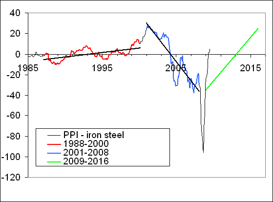
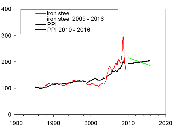
Figure 1 displays examples of linear trends in the two differences related to the scope of this paper. In the left panel, the evolution of the index of motor fuel relative to the headline CPI is shown. Notice that in the original paper [7] we referred the index of motor fuel to the core CPI, but the discrepancy between the headline and core CPI is negligible relative to the change in the index of motor fuel. There are two distinct periods of linear dependence on time: from 1980 to 1999 and from 2001 to 2008. Apparently, there is one finished transition period between 1999 and 2001, where the trend with a positive slope (B=+4.2) changed to a negative one (B=-21.1), in both cases the goodness-of-fit being very high: R2~0.9. The first transition period is characterized by elevated price volatility. Since 2008, the negative trend in the difference has been suffering a transition to a positive one, which is shown in Figure 1 by a dashed line. This transition is characterized by a much higher volatility and has been fading away since the end of 2009. A new trend has been emerging since the beginning of 2010. Without prejudice, we drew the new trend as a mirror reflection to the previous one. Supposedly, it will last seven years. As a result, the difference will increase from -50 in 2009 to +75 in 2016 since the index of motor fuel will be falling at a rate of 17.9 units per year relative to the headline CPI. This casts the long-term prediction of the motor fuel index.


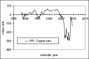
In the right panel, the difference between the PPI and the index of crude petroleum (domestic production) is shown between 1985 and 2010. Expectedly, there are two distinct periods of linear dependence on time: from 1988 to 1999 and from 2001 to 2008. The regression coefficients in both periods are different from those for the index of motor fuel: +2.9 and -17.1, respectively. In other words, the motor fuel index magnifies the change in oil price. There was one transition period between 1999 and 2001, where the original positive trend was turned down. Even a simple visual inspection of the transition period reveals several differences in timing and amplitude between motor fuel and crude oil: the former started to fall three months later and came to the level of 1999 in the end of 2001. The index of crude oil fell by ~15 units relative to its level in 1999.


Figure 1. Illustration of linear trends. Left panel: the difference between the headline CPI and the index of motor fuel between 1980 and 2010. Right panel: The difference between the overall PPI and the (producer price) index of crude petroleum (domestic production). In both panels: there are two quasi-linear segments with a turning point near 2000. Since the end of 2008, both differences have been passing a transition. Linear trends with relevant linear regression lines and corresponding slopes are also shown.

From Figure 1 (and many others published before), one can conclude that the presence of linear trends is a basic feature of the CPI and PPI. Another fundamental characteristic of the differences consists in the fact that all deviations from the trends were only short-term ones. This implies that any current or future deviations from the new trends in Figure 1, which have been under development since 2008, must be compensated promptly. This feature allows short-term (months) price predictions.

Predicted vs. actual
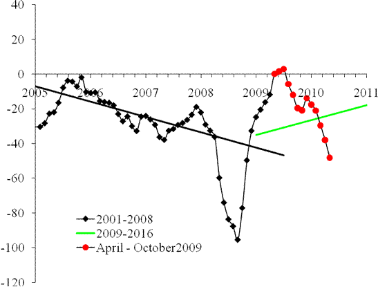
Originally, we presented a model for the price evolution for motor fuel and crude oil from March to December 2009. For the motor fuel index, we drew a straight line shown in the left panel of Figure 2. This line said that motor fuel price would be growing faster than the price of all goods and services. Specifically, we predicted that:

In March 2009, the difference was at the level of +45, i.e. much higher than the level predicted by the new trend. As happened in the past with numerous individual price indices [9,10], such a strong deviation (one might call it “dynamic overshoot”) should be compensated in the near future. Without loss of generality, we have restricted the recovery to the trend by the end of 2009. As a result the index for motor fuel should growth by 90 units during the next 9 months, or by 10 units per month. Red filled circles represent the evolution of the difference from April to December 2009. In 2010, the difference may undergo an overshoot in the opposite direction with additional rise in the index for motor fuel.
Translating indices into prices, the rise in the difference by 90 units (from 173 in March to 263 in December) means an increase in price by 50%. Therefore, it is very likely that the price for motor fuel in the beginning of 2010 will be 60% to 70% larger than in March 2009 due to the overshoot.

We have been also tracking the evolution of crude oil price, which obviously affects the price index of motor fuel. As Figure 1 demonstrates, these prices have no one-to-one correspondence and it might be instructive to model them separately. So, for oil price we used an alternative approach and assumed that the price trajectory would continue the pendulum-like motion observed since 2008. This implied the difference between the PPI and the index of crude petroleum should sink below the new trend and stop at the level of -120, which roughly corresponds to $120 per barrel.
So, there were two approaches: 1) motor fuel (oil) price would to be stopped at the new trend and then be evolving along it; 2) oil (motor fuel) price should follow up the observed free pendulum oscillation and penetrate deep below the trend line in a dynamic overshoot. The second approach implies that the price will rebound above the trend. Both predictions are shown in Figure 2 by solid diamonds for the period between March and December 2009.
Figure 2 also presents actual prices for the predicted period. Overall, the evolution of the difference between the CPI and the index of motor fuel follows the predetermined path: from its peak in February 2009 to the new trend line, which was reached in December 2009. In January 2010, the actual time series likely started to align along the new trend. One may expect the next move will be below the trend with small-amplitude short-term (few months) oscillations around the trend in 2010 and 2011. In the long run motor fuel will be losing its pricing power relative to the CPI.
Obviously, the assumption behind the oil price prediction was wrong. There was no free pendulum motion observed beyond June 2009. When reached the new (dashed) trend line, the difference started the alignment along the line. Instead of $120 per barrel oil price has been hovering around $75, as was predicted by the motor fuel model. There is no sign that petroleum price will significantly deviate from the trend in the near future. In March and April 2010, we expect the price to rise above the new trend. It must return below the line by the third quarter, however.
Figure 2. Left panel: The difference between the headline CPI and the index for motor fuel. Solid diamonds represent the prediction given in March 2009 through December 2009. The total increase in the difference is +60 units of index or +35%: from 173 in March to 233 in December. Dashed line represents the new trend, which is a mirror reflection to that between 2001 and 2008 shown by solid black line. Right panel: Evolution of the difference between the PPI and the index for crude petroleum (domestic production). Solid diamonds represent the predicted values between March and December 2009, as anticipated in April 2009 with a dynamic overshoot below the new trend. Open circles – the observed difference between September and December 2009. Dashed line represents the new trend as described in the text.

From Figure 2, it is clear that the oil price differnce leads that of motor fuel by six to eight months. It is likely that the index of motor fuel will follow up the trajectory drawn by oil price and fluctuate around its trend with slightly larger amplitude. The predictive power of this assumption will be tested by the end of 2010. We are going to track and report on actual behavior. Our model needs further validation in both short- and long run.

Discussion
All in all, our prediction of the price index of motor fuel was based on a sound assumption and thus is accurate. The forces behind the observed long- and short-term behavior are not accessible yet but very powerful. We dare say they are fundamental and affect the economy to its deepest roots. These forces retain equilibrium among all economic agents and originate the sustainable trends in the differences between consumer (producer) price indices. At some point, the forces meet their limits and should be re-balanced in order not to harm the economy. As a result, the sustainable trends in the CPI and PPI turn.

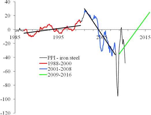
Meanwhile, it is instructive to revise our long-term prediction of oil price shown in Figure 1. After a few minor adjustments to the initial and final levels of the PPI and the index of crude petroleum, Figure 3 depicts the revised prediction after 2010. It is very similar to the previous prediction with oil price in 2016 set at $30 per barrel. The index of motor fuel will follow up the trend with a delay and larger amplitude. Short-term fluctuations can not be predicted at a horizon of several years. However, the larger is a given deviation from the trend the larger is the returning force. Figure 3. The evolution of crude oil price. Solid line – oil price for the period between 2001 and 2010. Dashed line – the new developed trend between 2009 and 2016. According to the prediction, the price should fall to the level of $30 per barrel by 2016.

References
1. Kitov, I., Kitov, O. (2008). Long-Term Linear Trends In Consumer Price Indices, Journal of Applied Economic Sciences, Spiru Haret University, Faculty of Financial Management and Accounting Craiova, vol. III(2(4)_Summ), pp. 101-112.
2. Kitov, I., Kitov, O. (2009). Sustainable trends in producer price indices, Journal of Applied Research in Finance, vol. I(1(1)_ Summ), pp. 43-51.
3. Kitov, I., Kitov, O., (2009). Apples and oranges: relative growth rate of consumer price indices, MPRA Paper 13587, University Library of Munich, Germany
4. Kitov, I. (2009). Predicting gold ores price, MPRA Paper 15873, University Library of Munich, Germany
5. Kitov, I., Kitov, O. (2009). PPI of durable and nondurable goods: 1985-2016, MPRA Paper 15874, University Library of Munich, Germany,
6. Kitov, I. (2009). Predicting the price index for jewelry and jewelry products: 2009-2016, MPRA Paper 15875, University Library of Munich, Germany
7. Kitov, I., Kitov, O. (2009). A fair price for motor fuel in the United States, MPRA Paper 15039, University Library of Munich, Germany
8. Bureau of Labor Statistics. (2010). Databases, Tables & Calculators by Subject, retrieved 30.03.2010 from http://www.bls.gov/data/
9. Kitov, I. (2010). Deterministic mechanics of pricing. Saarbrucken, Germany, LAP Lambert Academic Publishing

3/28/10

The probability to get rich

Another monograph has been published and is available on amazon.com
Mechanics of personal income distribution. The probability to get rich


The processes behind distribution of personal incomes and related measures of inequality have always been in the center of political and economic discussions. We have developed a microeconomic model which accurately describes the shape of personal income distribution (PID), as estimated in the Current Population Surveys. The model predicts the age-dependent PIDs as a function of real economic growth and demography. The underlying physical concept was borrowed from geo-mechanics. Our approach serves as a firm basis for definitions of income inequality. Officials, both government and financial, might be interested in the projections of poverty levels and mean incomes. For economists, the model provides a new tool of quantitative research. For the broader scientific community, the model links economics to hard sciences. All readers may estimate the probability to get rich depending on age and current income.

2/5/10

Unemployment fell by 0.3%

As predicted several hours ago, the unemployment has decreased by 0.3% to 9.7%.
This was not expected by the market with the average forecast of 10% and the range from 9.9% to 10.2%. The decrease will accelerate in February. The reason behind the drop is the secular decline in the rate of participation in labor force, as decribed in this post.

Unemployment in the USA on a rapid decline

We would like to present one simple figure before the announcement of the employment situation in the USA. This is the link between unemployment and inflation. In the short run, they compensate each other, i.e. a large increase in the unemployment is compensated by a decline in the inflation (with CPI as a measure of inflation). Figure demonstrates that the inflation leads by six months and has been picking since August 2009. As a result, the unemployment in January or February will start to decline as well. By June 2010, the unemployment will drop to the level of 6% to 7%.


10/26/09

Dramatic decline in labor force participation

Michael Mandel at “Economics Unbound” is really interested in labor force participation rate (LFPR). He devoted couple previous posts to related problems in an attempt to explain the evolution of labor force participation rate and productivity by some modern and fancy reasons. It is not worth to repeat his posts here and I just refer to Figure 1 as a general argument against any short-term force driving LFPR. The overall trajectory has a very clear picture of secular oscillations. Between 1965 and 2000, the LFPR was growing with just minor plateaus near 1980m and 1990. After 2000, the LFPR has been declining. This is a robust downward trend which hardly to be compensated by innovations, as Michael suggests.

In 2009, the LFPR has decreased from 66% to 65.4% in Q3 with average over the three quarters of 65.6%. A 0.6% drop in LFPR is a dramatic one. It corresponds to ~2,000,000 people leaving labor force in the US almost at once! (It is worth noting that such a drop may severely affect the rate of unemployment because people without job are more likely to leave labor force). According to our model [1], this the decline in the LFPR was expected in 2010. However, the population estimates, which are used for the prediction, have never been accurate enough for sharp timing. In any case, the model developed in [1-3], which links LFPR and productivity in developed countries to real GDP per capita has proved its consistency. The next two to three years should serve for further validation, as Figure 2 assumes.

Figure 1. The evolution of LFPR between 1960 and 2009.
Figure 2. The observed LFPR and that predicted from real GDP per capita. We expect the LFPR to fall down to 64.5% by 2013.


The observed increase in productivity is directly related to the decrease in the LFPR. As a consequence, it was also well predicted by our model in [2]. We used the projection of the number of 9-year-olds from the number of 1-year-olds for the prediction of real GDP per capita in the 2010s. Since 2010, the productivity has to be growing, as Figure 5 in [2], demonstrates.

a)
b)

Figure 5. Prediction of the number of 9-year-olds by extrapolation of population estimates for younger ages (1- and 6-year-olds).
a) Total population estimates. The time series for younger ages are shifted ahead by 8 and 3 years, respectively.
b) Change rate of the population estimates, which is proportional to the growth rate of real GDP per capita. Notice the difference in the change rate provided by 1-year-olds and 6-year-olds for the period between 2003 and 2010. This discrepancy is related to the age-dependent difference in population revisions.
A downward trend in productivity, as has been observed since 2003, will turn to an upward one in the 2010s. This also means an elevated growth rate of real GDP per capita during the period between 2010 and 2017.


References

[1] Kitov, I., Kitov, O., (2008). The Driving Force of Labor Force Participation in Developed Countries, Journal of Applied Economic Sciences, Spiru Haret University, Faculty of Financial Management and Accounting Craiova, vol. III(3(5)_Fall), pp. 203-222. http://www.jaes.reprograph.ro/articles/3_TheDrivingForceofLaborForceParticipationinDevelopedCountries.pdf

[2] Kitov, I., Kitov, O., (2008). The driving force of labor productivity, MPRA Paper 9069, University Library of Munich, Germany, http://ideas.repec.org/p/pra/mprapa/9069.html
http://mpra.ub.uni-muenchen.de/9069/01/MPRA_paper_9069.pdf

[3] Kitov, I., Kitov, O., (2009). Modelling and predicting labor force productivity, MPRA Paper 15152, University Library of Munich, Germany, http://mpra.ub.uni-muenchen.de/15152/01/MPRA_paper_15152.pdf


10/9/09

Semi-annual report on SP 500: from April to September 2009

This is a semi-annual report on the evolution of S&P 500 index. It compares the actually observed monthly closing levels to those predicted by our model, as originally presented in [1]. The major conclusion is that the prediction of a monotonic growth in S&P level made in March 2009 is correct. There is no indication that the growth will end before May 2010, where we foreseen the turn to a negative slope. Accordingly, the S&P 500 annual return will soon reach positive figures and will be growing at an accelerated rate till May 2010.

The model links S&P 500 annual returns to the number of 9-year-olds and has passed econometric tests for cointegration, with goodness-of-fit reaching 0.9. Since the number of 9-year-olds can be accurately predicted using younger cohorts, one can predict S&P returns at a several-year horizon. (Standard demographic projections may be used to predict over a decade ahead.)

We revealed the link between S&P 500 and the number of 9-year-olds in December 2007 using historical data since 1985. Since the very beginning of 2008, we have been carefully tracking the evolution of S&P 500. The original model actually predicted a sharp fall in 2008 [1]. (As in many scientific studies, the attempt to improve the original model, in order to fit data between 2003 and 2007, had failed, as we reported in this blog at several occasions.) The re-calibrated version of the original model developed in March 2009 is as follows:

Rp(t) = 165dln[N3(t+6)] - 0.17 (1),

In (1), Rp is the 12-month cumulative return; N3 is the number of three-year-olds; t+6 – time shifted by six years ahead to extrapolate the number of 3-year-olds into the number of 9-year-olds; dln is the rate of growth, i.e. the monthly increment in N3 normalized to the contemporary level. The time step is one month or 1/12 of a year.
Figure 1 compares the initial prediction of the S&P 500 evolution, the observed trajectory for the period since February 2009, and a new prediction till 2011. Relationship (1) is used with the number of 9-year-olds extrapolated from the number of 3-year-olds. In March 2009, we used a preliminary calibration of the original model and assumed the monthly increment in S&P 500 would be 80 points. This assumption was too optimistic and the growth was weaker. The original prediction is shown by blue lin with solid circles in Figure 1, and the observed values are shown by red diamonds. The black line represents an updated prediction since September 2009. It reproduces the old prediction but with a 46-point monthly increment since October 2009, as discussed below.

All in all, Figure 1 presents strong evidence in favour of our original model. Six months of almost monotonic growth were not expected by many market players in March 2009. The next nine months should bring additional validation to the model. The most important event will be the turn in May 2010. But the growth before this date is of crucial importance as well.


Figure 1. The evolution of S&P 500. Blue line - the original prediction using (1) with 80 unit per month increment. Red line – observations. Black line – the updated prediction since October 2009 with a 46-point monthly increment.

In any case, the model predicts a sudden drop in 2008 and 2009 to the level of 700, which has been followed by constant growth to the level 1050 in September 20009. Initially, we estimated the peak value in 2010 as 1800. But the last six months demonstrated the necessity to re-calibrate the model using new data. (In physics, even fundamental constants are under permanent re-estimation, and empirical and even fundamental models are constantly recalibrated.) Therefore, we also re-estimated coefficients in (1) to fit the last six S&P 500 (monthly) readings. The new model is as follows:

Rp(t) = 135dln[N3(t+6)] - 0.17 (2),

Actually, we needed to reduce the coefficient of linear term from 165 to 135 with free term unchanged. Figure 2 depicts the updated prediction of the S&P 500 annual returns. The peak S&P 500 value in May 2010 should be 1425 (not 1800) if the future increment will be 46 points per month, as observed between March and September 2009.


Figure 2. Observed and predicted S&P 500 returns. The September level of S&P 500 index is 1057. The past six months are relatively well predicted.

Conclusion
Between 1985 and 2009, the S&P 500 returns can be accurately described by population estimates. The model based on the number of 9-year-olds produces a time series which is cointegrated with the S&P 500 returns, i.e. reveals a weak causality, as proved by the cointegration tests.

The re-calibrated model predicts the continuation of S&P 500 growth into 2010 with the peak level of ~1400 in May. The annual returns will reach positive zone soon and also peak in May 2010 at the level of 50% to 70%.


References
[1] Kitov, I., Kitov, O., (2007). Exact prediction of S&P 500 returns, MPRA Paper 6056, University Library of Munich, Germany, http://ideas.repec.org/p/pra/mprapa/6056.html

Как проверить версию Германии о взрывах на Северном потоке?

Скоро исполнится три года с момента взрыва труб «Северный поток» и СП-2. Одним из главных доказательств того, что взрыв был осуществлён той ...