1/25/22

Five graphs on the male/female income gap

Figure 1. Mean income: male vs. female. Chained 2020 dollars


Figure 2. Mean income: male vs. female. Current dollars


Figure 3. The ratio of male/female mean income


Figure 4. Male and female with income between 1947 and 2020. Notice the growth in the female’s share with income before 1979. Partly, it was because of the change in income definition. It explains the growth in the male/female ratio between 1947 and 1960.


Figure 5. The difference between male and female real mean income. After 1980, the gap varies between $21000 and $27000.


The evolution of higher incomes in the USA: 2019 and 2020 comparison

 Personal income (PI) is the key economic parameter. The aggregated personal income has to be equal to the GDP if to count all sources of income as personal. At the end of the day, all money belongs to physical persons in one of the numerous ways. In reality, there are so many official and unofficial ways to count personal income that it is hard to find a person with full knowledge of all details of all the measurements. Here, we compare two measures of personal income as reported by the US Census Bureau (CB) and by the Bureau of Economic Analysis (BEA).  Figure 1 presents the evolution of the (nominal) personal income reported by the CB and BEA since 1967. The deviation between these two curves in relative terms is shown in Figure 2 (the sources of personal income differ between the BEA and CB, e.g. the BEA includes the imputed rent). One can see that the CB/BEA ratio has been slowly growing from 0.8 in 1970 to 0.88 in 2019. The years after the Great Recession (2011-2019) are characterized by slightly higher ratios than at the beginning of the 21st century. The years of the Great Recession are well seen in Figure 1 but they produce different effects on the CB and BEA curves. For the BEA curve, only the year 2009 is characterized by a fall and then the curve is back to growth. The CB curve has a shelf between 2007 and 2010: people reported no money income growth during these years, but the BEA includes some other income sources, e.g. special kinds of social security money transfer as shown in Figure 3.

 The Current Population Survey of the CB gives an expected result for 2020 – almost the same PI as in 2019 (Figure 1). This means that the personal income distribution, PID, should not be affected much. One of the most sensitive parameters of the personal income distribution is the number or share of people with high incomes. Figure 4 presents the age-dependent curves for the number of people with a nominal personal income above $100,000. In 2020, no overall growth is observed and the change in each group is likely within the uncertainty limits of the measurements in the CPS ASEC (March) Supplement. Figure 5 illustrates the fact that the growth in population with income >$100,000 in 2020 was small in all age groups. Only young people likely demonstrated reliable income growth. Elder people are rather characterized by income decline relative to 2019. 

Because of the population growth, inflation, and real economic growth, the number of people increases with time in all age groups between 2010 and 2019. Relative growth is a more reliable characteristic in this case. Figure 6 presents the share of people with income >$100,000 in the same age groups. The basis is the number of people with income (a total number less the number without income or loss) and it varies between the age groups as Figure 6 shows for 2020. Finally, the shapes of the relative shares of people with income >$100,000 are shown in Figure 7. All curves are close to each other, as expected for the power (Pareto) law income distribution for the higher incomes. 

The question is why the income from the government supposedly was not counted in the money income of the Census Bureau in 2020. The government transfer under “Social Security” and “Others” was larger than 1 trillion, and people obtained part of this money in cash. The income distribution was likely not affected. 

Figure 1. Personal income measured by the CB and BEA since 1967.


Figure 2. The ratio of the personal income estimates reported by the CB and BEA since 1967


Figure 3. Sources of personal income used by the BEA but likely not used by the Census Bureau.

Figure 4. The evolution of the number of people with income >$100,000 as a function of age between 2010 and 2020.

Figure 5. Share of people with income >$100,000 as a function of time in various age groups


Figure 6. The share of the number of people with income in various age groups.


Figure 7. The evolution of the share of people with income >$100,000 as a function of age between 2010 and 2020.  The curves in Figure 4 are normalized to their respective peak values.


1/24/22

Some long-term observations before the Federal Reserve will change the overnight rate

Five years ago, we wrote in this blog about the strict proportionality between the CPI inflation and the actual interest rate defined by the Board of Governors of the Federal Reserve System, R. Briefly, the cumulative interest rate is just the cumulative CPI times 1.4. There are periods when the interest rate deviates from the long-term inflation trend, which has been almost linear since 1972. Here, we extend the observational dataset and discuss the most probable reason why the FRS actually not control inflation by presenting the actual economic force behind price inflation, as we presented in a series of papers [e.g., 1, 2, 3, and 4].  Overall, inflation is a linear lagged function of the change in the labor force. The latter is driven by a secular change in the participation rate in the labor force (LFPR) together with a general increase in working-age population. In other words, increasing the labor force pushes inflation up, and decreasing the labor force leads to deflation.

Introducing new data obtained from 2016, we depict in Figure 1 the effective rate R divided by a factor of 1.37 (see our previous post for details) and the consumer price inflation. One can see that R lags behind the CPI since 1980, i.e. inflation grows at its own rate and R has to follow up. The idea of interest rate is that a higher R should suppress price inflation when it is high due to the effect of expensive money. During deflationary periods with a slow economy, low (in some countries negative) R has to channel cheap money into the economic growth. The reaction of inflation is also expected not shortly but with some time lag.

The cumulative influence of the interest rate should produce a desired effect in the long run, and inflation should go in the direction towards acceptable values. Figure 2 displays the cumulative effect, i.e. the cumulative values of the monthly estimates of R and CPI multiplied by 1.37. This is an intriguing plot. In the long run, the R curve fluctuates around the CPI one and returns to it. It is hard to believe that the sign of deviation of R from the 1.37CPI curve affects the behavior of the CPI, which is practically linear. Therefore, the influence of monetary policy is under doubt.

The FRS has tried all means to return the CPI to R without any success and has to return R to the CPI!

We have already described the secular changes in LFPR in 2013, 2014, 2015, and 2021. Figure 3 illustrates the genuine periodicity of the LFPR change and Figure 4 describes the evolution of LFPR as measured by the Bureau of Labor Statistics as a function of time: the LFPR curve is accurately approximated by a simple function: LFPR(t) = 62.7+4.3SIN(2π[t-1978]/T). The period T=74 years and the double amplitude is 8.6, i.e. the largest LFPR change is 8.6%. Currently, the LFPR is strictly in the center of the range and in the middle of the fall from 1996 to 2034.

In 2016, R and 1.37CPI 2 coincided.  We predicted that R has to be retained below CPI at least before 2020.   This prediction was correct. The surge in CPI in 2021 is short term, however, and R will not be above CPI any time soon except during the deflation period in 2022-2023.


Figure 1. The federal funds rate, R, divided by 1.37, and the rate of consumer price inflation, CPI, between 1955 and 2021.

Figure 2. Cumulative values of the curves in Figure 1.

Figure 3. LFPR evolution: direct and time inverted (mirrored) LFPR with the peak in 2000.

Figure 4 .The rate of participation in the labor force (LFPR). LFPR is accurately approximated by a simple function: LFPR(t) = 62.7+4.3SIN([t-1978]/T). The period T=74 years. Red (start) and green (end) vertical lines highlight two periods of accelerated growth. The periods of accelerated growth last 1/4T =18 years. The next period will start in 2034.

1/23/22

Real GDP per capita growth: any blink by Blinken will be considered as fear and will destroy the belief in the US possibility to protect

The evolution of the annual increment of the real GDP per capita in the USA can be represented as stochastic fluctuation around the mean value of $648 between 1960 and 2020. This observation is presented in Figure 1, where the regression line of the annual increment (in chained (2012) dollars) is shown in red. The mean value is presented by a dashed line and highlights the negative slope of the regression line. This observation confirms our model of real GDP growth as introduced in 2004. The essence of this model can be formulated as follows:


There is no exponential economic growth in a capitalist economy and the return to capital is decreasing.

Therefore, a strong capitalist country has to rob all weaker countries.

In other words, the US (and other capitalist countries) future is grim because their prosperity depends on their capability to control and rob other countries. China and Russia make this route not easy to follow. It will be accompanied by extreme risks. The current US-Russia collision is just a start. China is a bigger challenge and any loss against Russia makes a tremendous crack in the NATO (West) defense. 

Any blink by Blinken will be considered as fear and will destroy the belief in the US possibility to protect.


Figure 1. Annual increment in real GDP per capita


The idea of constant annual increment of the real GDP per capita in developed counties was first introduced fifteen years ago in this working paper. I wrote “The trend has the simplest form – no change in absolute growth (annual increment) values and is expressed by the following relationship: 

dG/dt=A (1) 

where G is the absolute value of real GDP per capita, A is a constant. The solution of this equation is as follows: 

G(t)=At+B (2) 

where B=G(t0), t0 is the starting time of the studied period. Hence, the evolution of real GDP per capita is represented by a straight line if the second factor of growth has no cumulative effect. As discussed below, only some developed countries are characterized by a significant influence of the second factor. 

Then, the relative growth rate can be expressed by the following relationship:

dG/Gdt=A/G(t) (3) 

Relationship (3) indicates that the relative growth rate of per capita GDP is inversely proportional to the attained level of real GDP per capita, i.e. the observed growth rate should asymptotically decay to zero with increasing GDP per capita. “


Using (3) one can replace time, t, with G(t) and obtain the link between the G(t) and dG(t). For example, Figure 22 in this paper is copied here and presents the case of the US. The open circles are the estimates of real GDP per capita between 1950 and 2002. The regression line for the original data has a positive coefficient, i.e. the G(t) growth is slightly exponential.  

                                                      Figure 22 of the 2006 paper

 In 2012, we revisited the model and re-estimated the annual increment in the USA. The Figure below is copied from the 2012 paper and includes data from 1950 to 2007, i.e. just before the Great Recession. The slope of the regression line is still positive. The Great Depression put the regression line to that observed in Figure 1 as we suggested in 2006.

                                                Figure 17 from the 2012 paper


.


1/21/22

How many steps does Russia need to ruin the US stock market? From guarantees of safety to guarantees of instability

In this post, I asked how many escalation steps Russia needs to ruin the US stock market. Just a month after this question it is clear that the current situation focused on the bifurcation point - transition from the guarantees of safety for Russia to the guarantees of military instability of the whole world. The US stock market is of no interest anymore. The question is about the survival of the world. However, the US stock market collapse will be the first step to economic degradation. Biden has insane political and military advisers by his economic advisers are even worse. Recovery of industrial production within the US leads to exponential inflation growth - the US production factors are extremely expensive. 

1/12/22

Переоценка инфляции в США с поправкой на изменение активов ФРС с 2010 по 2021 гг.

Девальвация валюты — это процесс, отличный от инфляции цен, которая обусловлена только внутриэкономическими факторами. "Вертолетные" деньги, вливаемые в экономику, эквивалентны девальвации: человек получает больше единиц платежа без 
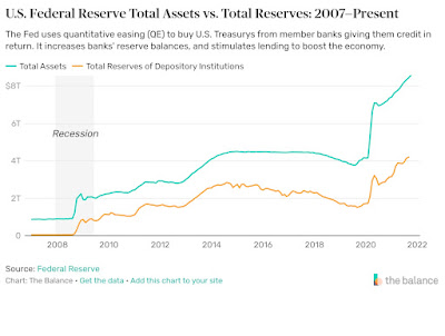
соответствующего изменения количества товаров и услуг для покупки. Федеральная резервная система США вводила в экономику деньги через различные механизмы с 2009 года, как показано на рисунке 1 (заимствовано с веб-сайта Federal Reserve). Можно видеть, что всплеск 2020 года был чрезвычайно большим как взрыв. Мы уже обсудили этот эффект и описали его влияние на текущие оценки инфляции в этом блоге. Мы ожидаем ценовой дефляции во второй половине 2022 года. 

Модель, связывающая скорость изменения реального ВВП на душу населения, rGDPpc, и уровня безработицы, u, критически зависит от точности оценок обоих параметров. Реакция на меры Федеральной резервной системы в период с 2009 по 2020 год должна быть аналогична реакции на рост активов в 2020 и 2021 годах — девальвация, проявляющаяся в виде ценовой инфляции. Разницу между реальным экономическим поведением и денежными спекуляциями следует рассматривать в долгосрочной эволюции экономической связи между rGDPpc и u. Как видно из рис. 1, фактор девальвации до 2009 г. отсутствовал. Таким образом, введение столь значимого фактора в основные экономические показатели (влияние совокупного количества денег на номинальный ВВП) должно было проявляться в виде структурного разрыва в долговременной функциональной связи rGDPpc и u. Такой разрыв мы нашли в 2010 г. – коэффициент линейной регрессии составлял -0,465 до 2010 г. и только -0,26 после. Эти оценки были сделаны методами, основанными на среднеквадратичных ошибках. Константа регрессии также изменилась с 0,907 до -0,25. Изменение этих коэффициентов позволило сопоставить данные за период с 2010 по 2019 год, как показано на рисунке 2. Коэффициенты регрессии, рассчитанные для периода между 1979 г. (год значительного пересмотра определения ВВП и безработицы) и 2009 г. (показаны красным), не могут предсказать уровень безработицы на основе реального ВВП на душу населения. Тем не менее, даже обновленная модель выходит из строя в 2020 году, о чем говорится в этом посте.


Учитывая (вертолетные) деньги, влитые в экономику США, мы предполагаем, что экономически обоснованные оценки реального ВВП на душу населения были искажены девальвацией, добавленной к фактической инфляции цен. Эта гипотеза предполагает, что реальные значения ВВП были занижены, поскольку уровень инфляции в США был завышен. При компенсации на девальвацию коэффициенты регрессии, полученные за период с 1979 по 2009 год, должны быть действительными, и мы можем оценить rGDPpc из u, используя долгосрочную связь. Чтобы спрогнозировать правильный уровень инфляции и, следовательно, реальный ВВП, мы ввели линейную функцию инфляции, изменяющуюся с 3,8% в 2010 г. до 2,8% в 2019 г. - впрыск денег не был постоянным во времени. На рис. 3 сравниваются опубликованные и скорректированные оценки rGDPpc, а на рис. 4 представлено соответствие модели между 2010 и 2019 годами с исходными коэффициентами регрессии. На рисунке 5 сравниваются скорости изменения rGDPpc для скорректированных и опубликованных значений. Фактические темпы инфляции цен были ниже опубликованных на разницу между скорректированными и опубликованными значениями rGDPpc, как показано на рисунке 6. 

Поправка инфляции цен на девальвацию, вызванную действиями ФРС,  предполагает, что реальный ВВП на душу населения рос в среднем на 3,2% в год в период с 2010 по 2019 год вместо опубликованного значения (в среднем) 1,5% в год за тот же период. Это результат денежной поддержки Федеральной резервной системы. Эта разница в скорости изменения в 1,7% соответствует общей сумме активов ФРС: ВВП  примерно 20 трлн в год, умноженный на 0,017 = 0,34 трлн в год, или 3,4 трлн всего в период с 2010 по 2019 год. Это означает, что все деньги, влитые ФРС в экономику, в нее попали и вызвали общее повышение цен ровно на сумму повышения активов ФРС. Таким образом связь rGDPpc-u в период между 1979 и 2009 годами все еще работает при очистке данных по инфляции. На рис. 4 показана измеренная кривая уровня безработицы на основе этой связи. Для прогнозируемой кривой реальный ВВП на душу населения должен упасть на 8,1% в 2020 г. и увеличиться на 7,5% в 2021 г. На рис. 4 представлена ​​ оценка на 2021 г.: 67200 долл. США.


Рисунок 1. Активы Федеральной резервной системы  


Рис. 2. После 2010 г. связь между rGDPpc и u с обновленными коэффициентами регрессии (черный) и с коэффициентами регрессии, полученными за период с 1979 по 2009 г. (красный). До 2010 г. исходный временной ряд представлен черными точками. 


Рисунок 3. Опубликованный (красный) и скорректированный (черный) реальный ВВП на душу населения в период с 2010 по 2020 год. Модельная оценка на 2021 год составляет 67200 долларов США. 


Рисунок 4. Соответствие между измеренным и прогнозируемым уровнем безработицы для скорректированного rGDPpc. 


Рисунок 5. Скорость изменения rGDPpc для опубликованных и скорректированных оценок.


Рисунок 6. Разница между опубликованным и скорректированным уровнем инфляции, полученная из рисунка 5.


Re-estimation of price inflation in the US by correction for the change in the Federal Reserve's assets from 2010 to 2021

 Currency devaluation is a process different from price inflation driven by economic factors. The helicopter money poured into an economy is an equivalent of devaluation – one gets more units of payment without a corresponding change in the amount of goods and services to buy. The US Federal Reserve inserted money through various mechanisms since 2009 as Figure 1 shows (borrowed from the Reds website). One can see that the 2020 surge was extremely large like an explosion. We discussed this effect and described its effect at the current inflation estimates. We are expecting price deflation in the second half of 2022. 

The model linking the change rate of the real GDP per capita, rGDPpc, and of the unemployment rate, u, is critically dependent on the estimates of both parameters. The reaction to the measures of the Federal Reserve between 2009 and 2020 should be similar to that to the asset growth in 2020 and 2021 – devaluation measured as price inflation. The difference between real economic behavior and money speculations should be seen in the long-term evolution of the economic link between rGDPpc and u. There was no devaluation factor before 2009. Thus the introduction of such a significant factor into major economic measures (aggregate money influence on nominal GDP) should be manifested as a structural break in the rGDPpc and u link. We have found such a break in 2010 – the coefficient of linear regression was -0.465 before 2010 and -0.26 after. These estimates were made by the RMS-based methods. The regression constant also changed from 0.907 to -0.25. This allowed fitting the data between 2010 and 2019 as Figure 2 shows. The regression coefficients estimated for the period between 1979 (major definitional revision to GDP and unemployment) and 2009 (shown in red) fail to predict the rate of unemployment from the real GDP per capita. Nevertheless, even the updated model fails in 2020, as discussed in this post. 

Considering the (helicopter) money injected into the US economy we suggest that the economically based estimates of real GDP per capita were distorted by devaluation added to actual economically driven price inflation. This hypothesis suggests that the real GDP values were underestimated as the US inflation rate was overestimated. In this case, the regression coefficients obtained for the period 1979 to 2009 should be valid and we can estimate rGDPpc from u using the long-term link. To predict the correct inflation rate and thus the real GDP we introduced a linear function changing from 3.8% in 2010 to 2.8% in 2019. This is needed to match the Federal Reserve history in asset change during this period (Figure 1) as the money injection was not constant in time. Figure 3 compares the published and corrected rGDPpc estimates and Figure 4 presented the model fit between 2010 and 2019 with the original regression coefficients. Figure 5 compares the change rates in the rGDPpc for the corrected and published values. The actual rate of price inflation was lower than published by the difference between the corrected and published rGDPpc values as Figure 6 illustrates. 

The price inflation correction suggests that the real GDP per capita has been growing at an average rate of 3.2% per year between 2010 and 2019 instead of the published value of 1.5% per year on average for the same period. This is the result of the Federal Reserve's money support. This 1.7% change rate difference fits the total amount of assets: the GDP of 20 trillion per year times 0.017 = 0.34 trillion per year or 3.4 trillion in total between 2010 and 2019.  The injected money added its fake value to the economically based price inflation. The rGDPpc-u link between 1979 and 2009 is still working when cleaning the inflation data. Figure 4 shows the unemployment rate predicted curve based on this link. For the predicted curve, the real GDP per capita has to drop by 8.1% in 2020 and increase by 7.5% in 2021. Figure 4 presents an estimate for 2021: $67,200.


Figure 1. Federal Reserve assets


Figure 2. After 2010, the link between rGDPpc and u with the updated regression coefficients (black) and with the regression coefficients obtained for the period between 1979 and 2009 (red). Before 2010, the original time series is presented by black dots.  


 Figure 3. The published (red) and corrected (black) real GDP per capita between 2010 and 2020.  For 2021, the model estimate is $67,200.

Figure 4. The fit between the measured and predicted rate of unemployment for the corrected rGDPpc.


Figure 5. The change rate in the rGDPpc for the published and corrected estimates.


Figure 6. The difference between the published and corrected inflation rate as obtained from Figure 5.


Helicopter money distort the GDP estimates in the USA

In our previous post, we described the difference between the (BEA) published and predicted by our model values of the real GDP per capita, rGDPpc. We have developed and tested since 2005 a model linking the change rate in rGDPpc, and the change rate of the unemployment rate, u (paper here): 

            du = a + bd[ln(rGDPpc)] , 

where a and b are regression coefficients, which depend on the change in measurement units. This difference between the published and predicted values was explained by the government transfer in 2020 and 2021 which has never been observed before. This was “helicopter” money taken from some sources out of the US economy, i.e. not generated in any economic activity, and considered as a part of the economy. In this post, we describe the unique properties of this transfer and explain the conflict between rGDPpc and u.   

One of the largest components of the (nominal) GDP is Personal Income, PI, which is published by the BEA. This parameter served as the main channel to pour the “helicopter” money into the US economy in 2020 and 2021. Among its constituent components, the PI contains “Personal current transfer receipts”, PCTR, which is a parameter including “Government social benefits to persons” as a major component. Figure 1 presents the evolution of the PI and PCTR since 1947. (Please notice the logarithmic income scale.) Figure 2 presents the evolution of these two parameters normalized to their respective levels in 1947. The PCTR share in the PI has been growing much faster than the PI itself. The surge in the PCTR’s share published for 2020 and 2021 has never been observed during the measurement period. One can also notice that the PI curve had a short-term fall in 2009 accompanied by a significant rise in the PCTR curve. This effect has a clear explanation – the unemployment benefits (a part of the PCTR) compensated for the surge in unemployment. In 2020 and 2021, there is no fall in the PI curve which is accompanied by a dramatic surge in the PCTR. This pattern means that the fall in the PI induced by a dramatic increase in the unemployment rate was overcompensated by the surge in PCTR. The PI in 2021 was 105% of the GDP in 2020! If real, such a configuration of the PI and GDP would mean the economic "Perpetual Motion Machine". 

Figure 3 presents the PCTR/PI ratio to illustrate the growth in the PCTR share since 1947. The spike in 2020 and 2021 is unprecedented. In 2008, the growth in PCTR was much smaller. Figure 4 stresses the difference between the government reaction in 2009 and 2020. The PI fell by approximately 400 billion dollars in 2009 as a reaction to the Great Recession. The PCTR was increased by approximately 100 billion dollars in 2008 and 2009 relative to the 2007 level. This was an economic reaction to the recession despite the dangerous situation later called the Great Recession. The growth between 2010 and 2019 was not accompanied by an increase in the PCTR. There were other channels to pump money into the economy and galvanize it. In 2020, one could expect a much deeper fall in the PI than that in 2009. The PCTR was used to avoid such a fall and one can see that the PI annual increment grew instead. The same situation was observed in 2021. 

In 2008, the rise had economic reasons and was accompanied by a drop in real GDP per capita described by a long-term linear relationship. In 2020, the surge in u was non-economic and was not accompanied by a proportional fall in the real GDP per capita. The difference in reaction is explained by the government transfer of a few trillion dollars. The decrease in u between 2009 and 2019 was driven by economic growth. The drop in 2021 is also caused by a 9% spike in real GDP per capita.


Figure 1. The evolution of Personal Income, PI, and Personal Current Transfer Receipts, PCTR: 1947 to 2021. Notice logarithmic scale.

Figure 2. The evolution of Personal Income and Personal Current Transfer Receipts normalized to their respective values in 1947. Notice the surge in 2020 and 2021. 

Figure 3. The evolution of PCTR/PI ratio 

Figure 4. Annual increment of the PI and PCTR. Notice the difference in reaction in 2008 and 2020. 

Figure 5. The rate of unemployment between 1947 and 2021. The largest annual rises were observed in 2008 (to 9.3 from 5.8 in 2007) and in 2020 (to 8.1 from 3.7 in 2019).


1/11/22

The rate of unemployment in the USA in 2020 and 2021 indicates the the real GDP per capita in 2021 is only 87.5% of that in 2019

 We have developed and published (last version in 2021) an economic model linking the change rate in the real GDP per capita and the rate of unemployment. Figure 1 presents the performance of this model since 1947 when the real GDP and unemployment estimates became more or less reliable. There are four structural breaks in the model due to severe changes in the real GDP (e.g., imputed rent introduction) and unemployment estimates. These breaks are introduced in the years of the definitional changes, not from data behavior, and thus are legitimate. Statistical estimates (regression and the error) of the model for the period between 1947 and 2019 are presented in Figures 2 and 3. Overall, the model is excellent in the prediction of unemployment from the real GDP per capita and vice versa. We do not discuss the causality direction here, since both parameters depend on more fundamental factors. Essentially, the real GDP and unemployment are different measures of economic growth. 

The current pandemic ruins the model, as Figure 3 shows. The rate of unemployment (data from bls.gov) is much higher than that predicted by the real GDP per capita change (data from bea.gov). For 2020, the unemployment rate was 8.1% and the prediction was only 4%. The model failure may have different causes, and we assume that the estimates of real GDP per capita are wrong because it includes the government transfer taken from sources outside the US economy. The COVID-19 driven money transfer is counted as an internal economic source and passes to the real GDP estimates through the Personal Consumer Expenditures. Since the causality direction is not applicable to the model, we have two estimates of the same economic parameter driving both measures, GDP, and unemployment. Unemployment is easier to count, and the estimate of 8.1% is rather accurate for 2020. The real GDP per capita corresponding to this rate has to drop by 19.8% from the 2019 level. In this blog, we made a similar estimate of a 21.7% drop in real GDP a year ago. The reason for the difference between the published and predicted real GDP per capita was the same – government transfers. Now, the estimate of the unemployment rate supports our previous finding.  Figure 4 shows the same curves as in Figure 1, but the real GDP estimates are calculated from the observed unemployment rates in 2020 and 2021. The drop in real GDP per capita in 2020 was 19.8% and the growth in 2021 – 9%. These estimates mean that, in real terms, the US economy is currently at the level of 87.5% of that in 2019. The real economic fall since 2019 is 12.5%


Figure 1. The observed and predicted from real GDP per capita rate of unemployment.


Figure 2. Statistical link between the measured and predicted rates of unemployment between 1947 and 2019.


Figure 3. Time evolution of the model error between 1947 and 2019


Figure 4. Same as in Figure 1 for the period 2005 to 2021 and the real GDP estimates obtained from the rate of unemployment.

1/10/22

Employment-population ratio in the USA - far from a healthy state

The long-term decrease in the labor force participation rate described in this post is accompanied (and is a principal part of) by the drop in the employment-population ratio. Figure 1 presents the most recent data and two trends from 1975 to 2000 and from 2000 to 2025. Two drops in 2009 and 2020 are the most prominent. The workforce leakage is a challenge to the US economy: 1% drop is equivalent to 2,600,000. The drop by 7.5% in 25 years is equivalent to 18,000,000 people leaving the workforce. For me, it is not clear what is behind such an exodus. As mentioned before - older people (50+) are rather increasing their participation.  Younger people's failure to get jobs in the same proportion as in the past is a clear economic symptom  as based on the increasing difficulties in personal income growth. 


Figure 1. employment-population ratio in the USA


The labor force in the USA: participation of older people rising – younger on the fall

The labor force participation rate, LFPR, is on a long-term decline in the USA. Figure 1 demonstrates that the bottom value of approximately 58% will be reached around 2030. In 2021, the LFPR was at 61.7%. The red curve is the time inverted original (black) curve. For the periodic evolution, such an inversion can predict the future. We assumed the periodicity fifteen years ago and this prediction is still working accurately. 

At the same time, one can split the overall decline into the age-dependent groups as Figure 2 shows. The most vulnerable fractions of the population are younger people, especially the youngest (16-17). The older groups (55-59 and 60-64)  partially compensate for the drop in the younger groups and their LFPR has been growing since 2000, i.e. from the start of the long-term decline (Figure 1). The mid-age groups are not suffering any big changes in the LFPR.  


Figure 1.


Figure 2.

1/4/22

Productivity in manufacturing fails to show any growth in the USA since 2001

 In the USA, productivity in manufacturing in 2021 is the same as in 2001. In business, productivity growth is fast. The reason behind such a deviation is not clear. Could it be insufficient funding of industry? Something like "defund the industry"?