On March 1, 2012 we
predicted (in a Seeking Alpha post) the rate of unemployment in the U.S. to fall down to 7.8% by 2013. The BLS announced 7.8% for September 2012. Here we present our
basic model and predict the evolution of unemployment in 2013.


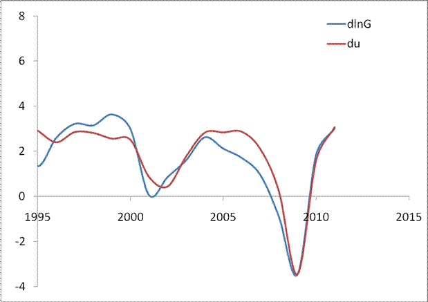
In 2006, we developed
three individual empirical relationships between the rate of unemployment,
u(t), price inflation, p(t), and the change rate of labour force, LF(t), in the
United States. We also built a general relationship balancing all three
variables simultaneously. Since measurement (including definition) errors in
all three variables are independent it may so happen that they cancel each
other (destructive interference) and the general relationship might have better
statistical properties than the individual ones. For the USA, the best fit
model for annual estimates was a follows:
u(t) = p(t-2.5) +
2.5dLF(t-5)/dtLF(t-5) + 0.0585 (1)
where inflation (CPI) leads unemployment by 2.5
years (30 months) and the change in labor force leads by 5 years (60 months).
We have already posted
on the performance of this model several times.
For the model in this post, we
use monthly estimates of the headline CPI, u, and labor force, all reported by
the US Bureau of Labor Statistics. The time lags are the same as in (1) but
coefficients are different since we use month to month-a-year-ago rates of
growth. We have also allowed for changing inflation coefficient. The best fit
models for the period after 1978 are as follows:
u(t) = 0.63p(t-2.5) +
2.0dLF(t-5)/dtLF(t-5) + 0.07; between 1978 and 2003
u(t) = 0.90p(t-2.5) +
4.0dLF(t-5)/dtLF(t-5) + 0.30; after 2003
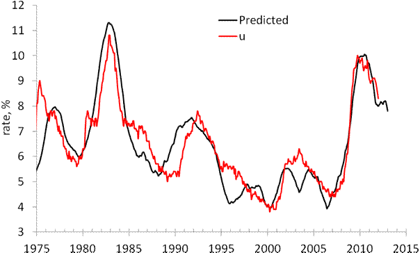
There is a structural break in
2003 which is needed to fit the predictions and observations in Figure 1. Due
to strong fluctuations in monthly estimates of labor force and CPI we smoothed
the predicted curve with MA(24).
The structural break in 2003 may
be associated with the change of sensitivity of the rate of unemployment to the
change of inflation and labor force. Alternatively, definitions of all three
(or two) variables were revised around 2003, which is the year when new
population controls were introduced by the BLS. The Census Bureau also reports
major revisions to the Current Population Survey, where the estimates of labor
force and unemployment are taken from.
On March 1, 2012 the monthly
model predicted a drop from 8.3% in February to 7.8% by the end of 2012. Figure
1 depicts the original prediction (upper panel) and the observed fall in the rate
of unemployment (lower panel). Figure 2 shows that the observed and predicted time
series are well correlated (Rsq.=0.81).
This is a good statistical support to the model.
Figure 3 depicts the predicted
rate of unemployment for the next 12 months. The model shows that the rate will
fall to 6.2% by September 2013. For 105 observations since 2003, the modelling error
is 0.4% with the precision of unemployment rate measurement of 0.2% (Census
Bureau estimates in Technical
Paper 66).
Hence, one may expect 6.2% [±0.4%].

Figure 1. Observed and predicted
rate of unemployment in the USA as obtained in March and October 2012.

Figure 2. Observed vs.
predicted rate of unemployment between 1967 and 2012. The coefficient of determination
Rsq=0.81.

Figures 3. The predicted rate of
unemployment. We expect the rate to fall down to 6.2% in September 2013.


