As an investor, I have
some emergent market bonds, and thus, I am highly interested in the performance
of the countries in this category. As a
Russian, I always prefer to know more about its potential relative to other countries.
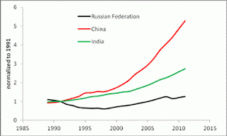
Below are several simple graphs showing
the growth of GDP per capita in absolute and relative terms. Per
head values say more about actual potential not related to population
fluctuations.
I compare Russia to
four different country groups: China and India; countries from the former USSR;
East European countries (former socialist countries); a few Asian countries. There
are three time points of interest: 1991 (the start of transition period), 2001 (the
start of sustainable growth as a capitalist country), and 2008 (the peak before
the current crises). Therefore, I have normalized the GDP per capita time
series to their respective values in 1991, 2001, and 2008. The normalized curves
illustrate the evolution of the corresponding economies in relative terms. Figures
1 through 4 display the obtained result for four country groups (Russia is always
shown by a black line). All data are
borrowed from the Total Economy Database
(TED) compiled by the Conference Board (as of October 5, 2012). The GDP per capita figures are in 2011 US$ converted
to 2011 price levels with updated 2005 EKS PPPs.
There are several
conclusions from the graphs:
1.
Since 1991,
India and China have been doing better than Russia in relative terms but still
lag behind the Russian level of GDP per capita. Since 2001, India and Russia are close with
China opening a larger gap. Since 2008,
the Russian economy has been falling apart. Hopefully, the negative deviation
is an indication of a higher rate associated with a recovery growth in the near
future. In any case, I am lucky to have the Indian and Chinese bonds in my portfolio
together with the Russian ones.
2.
Among
Former Soviet countries, Russia is not a good performer as well. It is in the
middle of the growth curves since 1991, 2001, and 2008. The level is almost the
highest, however. Hence, Russia is a
good representative on average. It is not the best performer, but is less
sensitive to the current crisis than many of the FSU countries. Therefore,
there is no reason to diversify investments over the FSU countries - one will
get the result close to the Russian one. When investing in the best performers one may
meet a higher risk of slow down. The poor performers with a higher recovery
potential are also characterized by a higher risk.
3.
Russia
is in the middle of the GDP per capita distribution among East European countries.
It has been growing slowly since 1991, but outperformed almost all countries
since 2001. As mentioned above, Russia was very sensitive to the 2008 crisis
and the GDP per capita fell by 9%. It is one of the worst performances among East
European countries. The rate of recovery since 2009 is the highest, however. If
continued to intersect the paths of Poland and Albania, this recovery growth may
bring a fortune for an investor.
4.
Among
Asian countries, Russia is a good performer since 2001, but the poorest one
since 2008.
Figure 1. The level of
GDP per capita (upper panel) and the evolution of GDP per capita normalized to
1991, 2001, and 2008. The case of India, China and Russia.
Figure 2. The level of
GDP per capita (upper panel) and the evolution of GDP per capita normalized to
1991, 2001, and 2008. The case of the countries from the former USSR.
Figure 3. The level of
GDP per capita (upper panel) and the evolution of GDP per capita normalized to
1991, 2001, and 2008. The case of the East European countries.
Figure 4. The level of
GDP per capita (upper panel) and the evolution of GDP per capita normalized to
1991, 2001, and 2008. The case of the selected Asian countries.


No comments:
Post a Comment