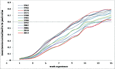
A simple graph below shows how it becomes more and more difficult for a young population to get 60% of the current mean income between 162 and 2013. In 1962, only 9 years of work experience was needed to get 60% of the largest mean income among all ages. In 2013, it takes 14 years or 50% more time. For 70%, the difference grows, but people with 15+ tears of work experience (16+15 years of age) are rather not young. The data are taken from the Census Bureau. The relative decrease in income makes the younger population stay longer in their childhood state.
Subscribe to:
Post Comments (Atom)
Nevada Test Site seismicity on January 21, 2026 recovered using waveform cross correlation
Following my previous posts on the recovery of seismic events at the Nevada Test Site on June 22, 2020 and around, it's to continue to...

-
These are two biggest parts of the Former Soviet Union. To characterize them from the economic point of view we borrow data from the Tot...
-
These days sanctions and retaliation is a hot topic. The first round is over and we will likely observe escalation well supported by po...
-
Yesterday I missed the absolute hero of deflation in the US – the consumer price index of information technology, hardware and software (see...


No comments:
Post a Comment