In this section of the series of posts devoted to the evolution of real GDP per capita, we present results of analysis based on the Maddison Project Database (MPD) data. The period of data coverage is 1960 to 2018. Since we have demonstrated the difference between the original (2008) and later (2012) studies based on the Total Economic Database data and the current dataset using Austria and the USA, we are not going to compare the MPD and TED data for other countries. Figure 1 shows three plots for Australia. The upper panel depicts the annual GDPpc increment between 1961 and 2018 with the average value for the studied period of $618 (2011 prices). The middle plot presents the same annual increment as a function of GDPpc level with the same mean value. In the lower panel of Figure 1, the relative growth rate of the GDPpc is a function of the GDPpc, where the relative rate is the ratio of the GDPpc increment and the level at the beginning of the one year period, i.e. the growth rate in 1961 is [GDPpc(1961)-GDPpc(1960)]/GDPpc(1960). The straight average increment (red dashed) line in the middle panel is converted in the line $618/GDPpc(t). Australia demonstrates excellent (much above the average) economic growth between 1992 and 2007. The global recession reduced the rate of growth but did not harm the growth much. The 2020 catastrophic fall induced by COVI-19 may also push the GDPpc growth rate in Australia below the zero line and thus the slope 0.115 $/$ in the middle panel may drop closer to the mean GDPpc line. The Australian GDPpc level in 1960 was $14013 (2011 prices). The start GDPpc value is an important parameter used in this study. Our model suggests that the total growth in a fixed period depends on the start value and the mean annual increment. For the same annual increment, a larger start value results in lower total growth.


Figure 1. The upper panel: the annual GDPpc increment between 1961 and 2018 with the average value for the studied period of $618 (2011 prices). The middle panel: the same annual increment as a function of GDPpc level. The lower panel: the relative growth rate of the GDPpc as a function of the GDPpc.


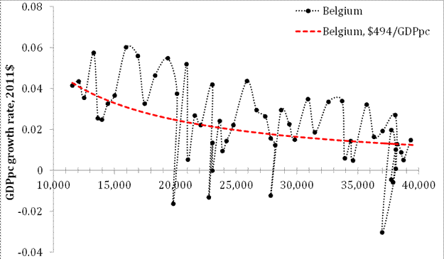
Figure 2 presents the case of Austria. The mean annual GDPpc increment line ($562) is practically the same as the regression line for the increment with a slightly negative slope indicating that the annual increment has been decreasing since 1960. This observation is close to the findings in the previous post, but the years between 1950 and 1959 were less successful for Austria and the slope for the longer period since 1951 is positive and the mean increment is only $547. The GDPpc level in 1960 was $10391, i.e. is much lower than in Australia.


Figure
4. Same as in Figure 1 for Canada.


The GDPpc level in Denmark (Figure 5) in 1960 was $14046 and the annual increment between 1960 and 2018 is $556. This is a successful country with a high start value and healthy annual growth.


No comments:
Post a Comment