Just
two weeks ago we reported
on the evolution of S&P 500 in December 2012 and expected to sell the index
at 1430, which we had bought at 1352 in November. On Wednesday, December 12, the
index was slightly above 1430 (high 1438) and closed at 1428. For technical reasons
not related to our investing decisions, we were able to sell the whole lot only
on Friday at 1420. As expected, the return from November is 4.7%; and from May
2012, when we first formulated this tactics, we made around 15%. As mentioned
in our previous article, we expect to buy the S&P 500 when it is below 1400
and will obtain another 10% return selling at 1550 in October 2013. Our investing
tactics is simple and straightforward – we follow the trajectory of the S&P
500 observed during the previous rally.
In
March 2012, we first published
a graph which showed that the S&P 500 index would have a local fall in May
2012 at the level 1300. In a few sessions, we bought S&P 500
index in May/June 2012 at the level 1287 to 1322. The initial idea was to sell by the end of
2013 at 1525 and get a 12% to 14% return. In
September, the S&P was at 1450, which
was far above the expected level, and we decided to sell and wait a negative
correction to 1350 to 1375 to re-enter the index. Selling at ~1460, we obtained
an approximately 10% return in September.
In
October, the S&P 500 fell to 1350 as
had been predicted in September and we re-entered in two sessions at 1348 and
1355. By the end of November the S&P 500 regained 4.5% (1416). Two weeks
ago, we expected the index to rise to 1430 to 1450 in December 2012. This was considered
as the best time to sell before the next negative correction in December 2012/ January
2013.
Below
we present the evolution of the S&P 500 and the step-by-step assumptions illustrating
the decisions we have made since March 2012.
Figure
1 shows the evolution of the S&P 500 index since 1980. After 1995, the
index behavior reveals some saw teeth with peaks in 2000 and 2007. The current
growth resembles those between 1997 and 2000 and from 2003 and 2007. There are two deep troughs in 2002 and 2009
which are marked by red and green lines.
For the current analysis we assume that the repeated shape of the teeth
is likely induced by a degree of similarity in the evolution of macroeconomic
variables. The intuition behind such an assumption is obvious – in the long run
the stock market depends on the overall economic growth.
Having
two peaks and troughs between 1995 and 2009, what can we say about the current
growth in the S&P 500? Before making any statistical estimates, in Figure 2
we have shifted forward the original curve in Figure 1 in order to match the 2009
trough (blue line). When the 2002 and
2009 troughs are matched, one can see that the current growth path closely
repeats that after 2002. The first big deviation from the blues curve in Figure
2 started in 2011 and had amplitude of 150 units (from 1210 to 1360). The black curve returned to the blue one in
August/September 2011. From December 2011, we observed a middle-size deviation
of about 100 units.

Figure 1. The evolution of the S&P 500 market index between 1980 and 2012.
In April 2012, we predicted a drop in the S&P 500 to the level of 1300 by the end of May. Figure 2 shows the predicted behavior in April and May 2012, with the predicted segment shown by red line. We expected that the path observed in the previous rally would be repeated with the bottom points coinciding. When this prediction realized, we invested at the average price 1320. In May 2012,the expected exit level was 1500 in October 2013.
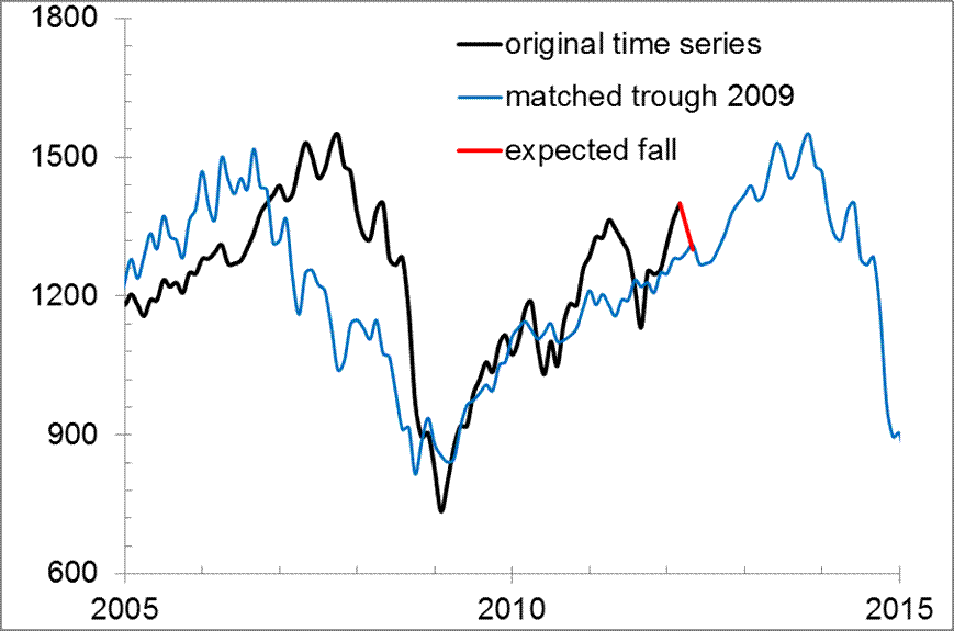
Figure 2. The original S&P 500 curve (black line) and that shifted forward to match the 2009 trough (blue line). Red line – expected fall in the S&P 500: from 1400 in March to 1300 in May.
Figure 3 shows the evolution of the S&P 500 monthly closing price between May and August 2012. The S&P 500 closing level for August was 1430 and reached 1469 in the middle of September. This level provided a ten percent return over approximately 4 months. One can see that the observed level was far above the expected level (blue line). The return and the deviation from the expected level both made us think that this was the best time to exit. We sold the index on September 21 (1460) anticipating strong turbulence (economic, financial, and political) and an overall fall to 1375 at a few month horizon.

Figure 3. Same as in Figure 2 with an extension between May and August.
Figure 4 shows the evolution of the S&P 500 monthly closing price in September-November 2012. The October’s closing level was 1411. On October 26 , we put the November’s level down to 1375. One can see that the red line intersects the blue curve. The previous history of the black and red lines intersection with the blue one made us think that the time to enter the market (S&P 500 index) was approaching. We expected to buy at 1350 to 1375.

Figure 4. Same as in Figure 2 with an extension between September and November 2012.
Finally, Figure 5 depicts the current (December 15) state of the S&P 500. The index had a local minimum of 1347 in the middle of November and recovered to 1416 on November 30. This was 15 points less than the expected level of 1430 in December 2012. The red line intersects the blue one in January 2013 and then a negative correction to 1400 (or less) is expected again. Figure 5 shows that the S&P 500 may regain 10 points in February. Therefore, we have in view to buy the S&P 500 in January at 1400 (or below) and obtain another 10% return selling at 1550 in October 2013, as the blue line implies. Since the blue curve is from the past we do not link the fall in December/January to any financial or political events.


No comments:
Post a Comment