5/29/16

The worthless efforts of the Board of Governors of the Federal Reserve System and investment opportunities


Four years ago, we wrote in this blog about the strict proportionality between the CPI inflation and the actual interest rate defined by the Board of Governors of the Federal Reserve System, R. Briefly, the cumulative interest rate is just the cumulative CPI times 1.4. There are periods when the interest rate deviates from the long term inflation trend, which has been almost linear since 1972. Here, we extend observational dataset and discuss the most probable reason why the FRS actually not controlling inflation by presenting the actual economic force behind price inflation, as we presented in a series of papers [e.g., 1, 2, 3, and 4].  Overall, inflation is a linear lagged function of the change in labor force. The latter is driven by a secular change in the participation rate in labor force (LFPR) together with general increase in working age population. In other words, increasing labor force inflate process and decreasing labor force leads to deflation.
Introducing new data obtained from 2012, we depict in Figure 1the effective rate R divided by a factor of 1.37 (see our previous post for details) and the consumer price inflation. One can see that R lags behind the CPI since 1980, i.e. inflation grows at its own rate and R has to follow up. The idea of interest rate is that a higher R should suppress price inflation when it is high due to the effect expensive money. During deflationary periods with slow economy, low (in some countries negative) R has to channel cheap money into the economic growth. The reaction of inflation is also expected not shortly but with some time lag. The
The cumulative influence of the interest rate should produce a desired effect in the long run and inflation should go in the direction towards acceptable values. Figure 2 displays the cumulative effect, i.e. the cumulative values of the monthly estimates of R and CPI multiplied by 1.37. This is an intriguing plot. In the long run, the R curve fluctuates around the CPI one and returns to it. It is hard to believe that the sign of deviation of R from the 1.37CPI curve affects the behavior of the CPI, which is practically linear. Therefore, the influence of monetary policy is under doubt.
The FRS has tried all means to return the CPI to R without any success and have to return R to the CPI!
We have already described the secular changes in LFPR in 2013, 2014, and 2015. Figure 3 illustrates the evolution of LFPR as measured by the Bureau of Labor Statistics. The LFPR curve is accurately approximated by a simple function: LFPR(t) = 62.7+4.3SIN(2π[t-1978]/T). The period T=74 years and the double amplitude is 8.6, i.e. the largest LFPR change is 8.6%. Currently, the LFPR is strictly in the center of the range and in the middle of the fall from 1996 to 2034.
Our concept is based on the observation that the periods of high inflation are related to accelerated labor force growth. Therefore, we have highlighted the most recent and the next period of accelerated growth as marked red (start) and green (end) vertical lines highlight two periods. These periods of accelerated growth lasts 1/4T =18 years. Figure 4 presents the first and second time LFPR derivatives, which are used to select the accelerated growth, i.e. the period when both derivatives are positive. There is a clear coincidence between the period of two-digit inflation and the peak in the first derivative near 1978.  This is one of many facts supporting our concept of inflation. This is not the purpose of this post, however. Here, we compare the FRS decisions on discount rates and the behavior of the LFPR curve.
Figure 5 compares the difference between the R and 1.37CPI in Figure 2 (red curve) and the product of the LFPR’ and LFPR’’, i.e. the curve representing the change in acceleration. The latter curve is shifted by 6 years back in time (phase shift of approximately -30 degrees for period of 74 years). The peaks in the difference curve are well synchronized with the acceleration curve, which is leading by 6 years.  In reality, FRS decisions are fully driven by the LFPR. Moreover, the FRS is very slow in understanding status quo.
Now, R and 1.37CPI in Figure 2 coincide.  This means that the best R has to be 1.37 of the current CPI, but we all know that R will be retained below this value at least before 2020.  We are thinking now on the investment opportunities resulting from the predictable FRS behavior.

Figure 1. The federal funds rate, R, divided by 1.37 and the rate of consumer price inflation, CPI, between 1955 and 2016.

Figure 2. Cumulative values of the curves in Figure 1.


Figure 3. The rate of participation in labor force (LFPR). LFPR is accurately approximated by a simple function: LFPR(t) = 62.7+4.3SIN([t-1978]/T). The period T=74 years. Red (start) and green (end) vertical lines highlight two periods of accelerated growth. The periods of accelerated growth lasts 1/4T =18 years. The next period will start in 2034.

Figure 4. First and second time derivatives of the approximating SIN function.

Figure 5. The difference between the cumulative sum of effective federal funds rate (monthly, not seasonally adjusted) and the cumulative sum of the monthly rate (y/y) of consumer price inflation compared to the acceleration periods in the LFPR.


Strong leadership or democracy?


The figure below is self-explanatory. This is the cumulative real GDP growth in the former socialist countries (FSC) after 1990 (i.e. the past 25 years) as presented in the Total Economy Database.  The most successful (>60%) countries are Armenia, Azerbaijan, Belarus, Estonia, Kazakhstan, Poland, Slovakia, Turkmenistan, and Uzbekistan. Three to four of them are recognized democracies and the other five are under strong leadership (euphemism for pure economic discussion).  The absolute losers are Tajikistan and Ukraine (the winner with -26.2%), Serbia and Montenegro, with Moldova being still below the 1990 GDP level. All four countries have quite a controversial political configuration. Other FSC are above the zero line ranging from Croatia (4%), Kirgizia (7%) and Georgia (10%) to Latvia (55%), Bulgaria (44%) and Slovenia (43%).
It is hard to deny the general observation that strong leadership was able to create better economic conditions for growth in the countries of the former Soviet Union, except Baltic countries. Political turmoil is not creative, but we know it very well.  
I would not invest in a country without a stable political configuration.


Figure 1. The cumulative real GDP growth between 1990 and 2015 in the former socialist countries


Figure 2. The evolution of real GDP in the FSC

5/23/16

European Union does not grant harmonized solution of demographic problems: part 2

Many European countries are missing in the first part of this post. All they deserve to be presented but we illustrate the diversity of and similarities in population trajectories rather than create a comprehensive view on the development in EU demography. We still use the OECD database which allows covering the century between 1950 and 2050. Here we present a few older EU representatives together with newcomers.  Figure 1 demonstrates that three East European countries: Poland, Bulgaria and Czech Republic and five western countries with longer capitalist economic history.  Germany serves as a watershed for these two groups of countries.

Bulgaria  shows behavior similar to that in Latvia and Lithuania - extremely steep depopulation trajectory after 1990. According to the OECD projection, Bulgaria  will lose from more than  40% of its population measured in 1990.  Depopulation is striking and dangerous for survival as a nation. Poland and Czech Republic are similar to Germany – approximately 5% to 10% fall in total population before 2050.  

Switzerland looks to have all chances to succeed in healthy population growth together with Austria, who also shows gradual growth into the future. Spain, Italy and Holland are a bit controversial but also have hopes for future population rise in the next decades.

Taking into account France and the UK in the previous post one can conclude that East European countries that entered the EU are all are prone to depopulation of varying degree, while the founding members feel much better. 


Figure 1. the evolution of total population in selected EU countries between 1950 and 2050. All curves are normalized to their respective values in 1990.

European Union does not grant harmonized solution of demographic problems

Everybody knows that European Union is not homogeneous. The idea behind unification was to overcome all kinds of disparity by joint efforts. The inherent demographics processes in European countries do not obey the unification plan, however.  The OECD database allows taking a specific look at the past and future of all countries … and found that some countries go wrong way after joining the EU. Figure 1 demonstrates that three Baltic countries have been and extremely steep depopulation trajectory after 1990. In 2015, they were by 15% to 25% smaller in terms of total population when in 1990 (notice that they grew by 30% from 1950 to 1990). According to the OECD projection, three Baltic countries will lose from 35% to 40% of their population relative to 1990. This is rather grim future.
On the other hand, France and UK were, are and continue to be on a healthy growth path with a perspective of 35% larger population in 2015 than it was in 1990.  Russia has stabilized its population around 146 million, i.e. 99% of that in 1990, and will not change much in the future.

The case of Germany is most illustrative for the current political discussion of immigration in Europe. Germany loses now and will be losing its population in the future. The OEDC projection says that the UK will overtake Germany in 2045 and France in 2050. Germany is losing its biggest population position against major European economies. This might be the reason for mercantile Merkel to invite as many immigrants as possible to boost German population and return it on the growing trajectory.  Die Kanzlerin is wise.

All in all, European Union will suffer strong demographic problems, which are related to emergent recognition of fading national identity. 

Figure 1. Total population in selected European countries according to the OECD historical time series and population projections. All curves are normalized to their respective values in 1990. 

5/22/16

Some tricks with real GDP

We have discussed the incompatibility of real GDP data caused by the change in definition of the GDP deflator, dGDP, many times (in the USA - in 1977) [here, here, and here]. Time just strengthen our assumption that the growth of real GDP per capita (rGDPpc) in the USA is a linear function of time. The estimates of rGDPpc borrowed from the Total Economy Database illustrate this finding for all developed countries.
Here, we update (with two new annual estimates) the GDP curves, the original one and that corrected for the difference between the dGDP definition before and after 1977.  Figure 1 shows details of the deviation between the dGDP and the consumer price index, CPI, as expressed by the cumulative inflation rates. Before 1977, the CPI (red) and dGDP (black dotted) lines are absolutely synchronized. Essentially, there is no difference in the GDP price deflator and the CPI. However, since 1978 one can observe that the CPI inflation rate is approximately equal to the rate of the GDP deflator change multiplied by a factor of 1.22, as shown in Figure 1.  The coincidence between the observed CPI and the corrected dGDP (open circles) curves after 1977 is striking with Rsq>0.98.
The reason behind the change is not clear but the problem emerged with the difference between definitions used before and after 1977. (The Bureau of Economic Analysis warns economists that the real GDP time series is incompatible over time.) It is like to use the same nominal speed limit, say 45, after transition from miles to km per hour. By definition, real GDP is nominal GDP reduced by inflation rate. We are sure that it is necessary to use the same definition over time in order to have a real GDP time series without structural breaks. This is not the case in the data reported by the Bureau of Economic Analysis. Fortunately, the factor of 1.22 allows recovering the dGDP time series back in time using the strong statistical link between CPI and dGDP (1.22dGDP = CPI). The dashed line is the estimate of dGPD before 1977 when the same definition is applied as after 1977. We prefer to correct the dGDP time series instead of using the CPI for the period after 1977.
Figure 2 shows real GDP and real GDP per capita in the USA from 1929 to 2013. The latter time series has rather a linear trend since 1929 with Rsq. =0.97. The real GDP series deviates from the long term exponential trend since 2000 – the year then the rate of population growth fell below 1% per year.
In Figure 3, we correct real GDP per capita for the difference between CPI and dGDP after 1977 and compare the original and corrected time series. One can see that the corrected curve has Rsq.=0.98 and does not deviate from the long-term trend. Currently, the corrected growth rate goes exactly the linear long-term trend and strongly deviates from exponential function also shown in Figure 3.

USA will follow linear growth trend, which is identical to the rate of growth falling inversely proportionally to the level of real  GDP per capita. Also, one should not use any data published by the BEA withour corrections.


Figure 1.  Cumulative rates of CPI and dGDP inflation, original and scaled by a factor of 1.22.


Figure 2. Real GDP and real GDP per capita in the USA from 1929 to 2015. The latter time series has rather a linear trend since 1929. The real GDP series deviates from exponential trend since 2000 – the year then the rate of population growth fell below 1% per year.


Figure 3. The real GDP per capita time series corrected for the difference between CPI and dGDP since 1978. Linear trend is obvious in the corrected time series. Currently, the growth rate is slightly below the long-term trend.

5/21/16

WTI price between $20 and $30 after 2020

In this blog, we made a mid-term prediction on the evolution of crude oil price in September 2012:
“The level of oil price in 2016 is expected between $30 and $60 per barrel. “
This is a revision to our oil price prediction as based on the difference between the overall PPI and the index of crude oil. Figure 1 compares our previous prediction in 2012 (upper panel) with actual oil price trajectory between 2012 and 2016 (lower panel). Both panels present price range, which expresses the slow fall through 2016, with the uncertainty bounds for the long-term trend in oil price. In April 2016, the observed oil price was close to the average value of $45 per barrel in 2016. Following our analysis of the difference between the core and headline CPI, we expect the price of oil to fall to $25 at a five to ten year horizon. 

The price range will likely hovert between $20 and $30 since 2020. 


Figure 1. The evolution of oil price since 2001 as estimated from the differnce of the overall PPI and the PPI of crude petroleum.

5/19/16

The price of steel and iron will be falling, but not long

In December 2014, we posted on the falling producer price of steel and iron in 2014 and on further fall in 2015-2016. This prediction was right and the PPI of iron and steel has been falling from 226 (January 2014) to 173 (February 2016). The overall PPI has also dropped by 20 points since 2014.  Here we report that we foresee no general change in the declining trend in the short-term. In 2017, we expect that the producer price index of iron and steel will reach its bottom and start to grow, likely during the next decade. Moreover, the overall PPI will stop falling and dragging consumer prices down.

For price prediction of various commodities, our general approach is based on the presence of long-term sustainable (linear and nonlinear) trends in the evolution of the CPI and PPI in the United States [1, 2]. The difference between components of these indices is not a random one but is rather a predetermined process. Using these trends, one can predict consumer and producer price indices for select goods, services and commodities.

On Seeking Alpha, we first reported on the evolution of the producer price index (PPI) for iron and steel in July 2009. We compared our earlier prediction from 2008 with the actual evolution of the difference between the PPI of steel and iron and the headline PPI and made the following forecast:

“In the short run, one can expect a fast recovery of iron and steel prices to the level observed in January-March 2008, i.e. the index will reach the level 210 to 220. However, this recovery will not stretch into 2011, and the index of iron and steel will be declining in the long run to the level of 2001, as depicted in Figure 3. In other words, the period between 2008 and 2010 is characterized by very high volatility, which will fade away after 2011.”

Figure 1 in this post reproduces Figure 3 from the 2009 post, where the green line gives a prediction of the future evolution. Since 2009, we made several updates considering new data on both PPIs (June 2010, February 2012,  December 2012, August 2013, and aforementioned December 2014). According to our long-term tradition, we revisit the previously predicted fall in the producer price index of steel and iron and formulate a preliminary hypothesis on the evolution in 2016-2017.  Please notice that the green line was predicted in 2008.

Figure 2 displays the difference between the PPI and the index for iron and steel (BLS code 101) since 1985. Between 1985 and 2000, the curve fluctuates around the zero line, i.e. there was no linear trend in the absolute difference. The difference is characterized by a sharp decline between 2001 and 2008. Our main assumption described in this post was right - the negative trend observed before 2008, after a short period of large fluctuations, started its transformation into a positive trend after 2010. In Figure 2, the (slightly updated according to actual data between 2009 and 2011) new trend is shown by green line. This trend suggests that the PPI grows faster (or falls slower) than the index of steel and iron by approximately 2 units of index per year.

Figure 3 demonstrates the most recent period and confirms that our prediction for 2014 was correct – the difference fluctuates around the green line. The overall trend is still positive, i.e. the price of iron and steel falls faster than the overall PPI. There is no much room left for further growth in the difference from the historical point of view, however. One could suggest that the difference will reach its maximum somewhere in 2017-2018 and then will turn to a negative trend similar to that observed between 2000 and 2008.

It might be good time to think about investment in steel and iron. The pivot point is close.


Figure 1. The prediction of steel and iron price made in 2009.


Figure 2. The difference of the PPI and the index of steel and iron for the period between January 1985 and November 2014. The green line was first introduced in 2008.


Figure 3. Same as in Figure 2 for the period between January 2005 and April 2016. Green line predicts the evolution of the difference after 2009. Upper panel from the 2014 post and the lower panel used the most recent data. The overall trend is still positive, i.e. the price of iron and steel falls faster than the overall PPI.

5/18/16

Copper price may fall deeper and aluminum is close to the bottom


Since 2008, we have been reporting that the evolution of various components of CPI and PPI in the United States is not a random process but rather a predetermined one with long-term sustainable trends [1, 2]. Using these trends, one can predict consumer and producer price indices for various goods, services, and commodities.  For example, in [3, 4], we presented the evolution for many goods and services with varying weights in the CPI. There are more goods, services, and commodities of interest for producers, consumers, and investors, however. Here we revisit and report the success of our predictions for the index for copper ores (the previous revision was two years ago). This is an example showing that some commodity prices are well predictable.
Figure 1 displays the difference between PPI and the index for copper ores since 1988. This difference has a remarkable history: no big change between 1988 and 2003, and then a sudden surge in the copper index started. The peak was reached in the middle of 2006. It survived before the second quarter of 2008. Then the copper index dropped by almost 300 units back to the overall PPI level. In 2009, the PPI of copper increased above 500.  Since 2012, the price index of copper has been falling along a linear trend. One may consider these changes as associated with the rise-fall cycles in oil price, but there is no one-to-one correspondence.
We have to admit that there are no sustainable trends in the copper index and the future of the copper ores index cannot be predicted at a ten-year horizon. Since 2012, the difference is on its way to the zero level. Soon it may reach the trough observed in 2009 (see Figure 2 for relative or normalized prices). Two years ago, we formulated our prediction in a form that there was “no sign that the PPI of copper is going to change its long-term decline. And this was a correct forecast – the copper price still follows negative trend. If the pivot point for the current trend in the difference between copper PPI and the overall PPI is around 0 then the copper price will be falling another two years. This is in line with our prediction of further decrease in energy prices in our previous post.


Figure 1. Evolution of the price index of copper ores relative to the PPI.


Figure 2. Evolution of the difference between the overall PPI and the price index of copper ores normalized  to the PPI.

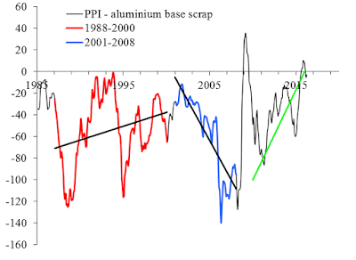
Aluminium price had a short-term excursions into higher figures in 2014 and quickly returned to  ite negative trend in 2015. This was a dramatic fluctuation, but not the biggest one in the past 10 years as Figure 3 shows. In 2014, we expected the difference to follow the green line into 2016, and this fluctuation was a major deviation from the expected behavior. Aluminum is a commodity, which suddenly changed its behavior. Currently, the price of aluminum follows the green-line-negative linear trend. From historical perspective, however, there is no room for further fall in aluminum price as Figure 4 shiows. It might be the best time to consider investment strategy for the next 5 years.  


Figure 3. Evolution of the difference between the overall PPI and the price index of aluminum scrap.


Figure 4. Historical time series for the difference between aliminium and overall PPI. Aluminum price may soon reache the historical minimum. 

5/16/16

The fall in energy and food prices will be long and deep

last time I posted on the difference between the headline and core CPI in 2013. There is a good reason to touch upon slow economic processes regularly but not often. Our concept of cyclic evolution was formulated in 2007 and its updated version was posted many times in this blog in the form of normalized difference (cCPI-CPI)/CPI. Essentially, the concept says that the future trajectory has to repeat the path observed thirty years ago, i.e. the cycle has a 30 years period. Figure 1 presents the state of the difference as observed at the end of 2013 (dotted red line) and the predicted trajectory (blue dotted line), which is the current curve shifted by 30 years ahead. Figure 2 presents the current state and proves our hypothesis.

We have been routinely reporting on the difference between the headline and core CPI since 2008 and predicted the era of low energy+food prices (core CPI is the headline CPI less food and energy) since 2014 and for the following 20 years. So far, it is a good prediction fitting our concept since 2007. For energy companies, Figure 2 implies that oil/energy prices will be on a negative trend until 2030. We are just in the middle of the fall, which is supposed to be dramatic in the next two to four years. Fasten your belts.


Figure 1. The difference between core (cCPI) and headline (CPI) CPI normalized to CPI. The period of cycle is 30 years and dotted  blue line presents the future of the normalized difference before 2044.


Figure 2. The current state of our prediction. Red line follows up the blue line.


5/13/16

On the rate of economic growth in BRIC

This post extends our previous analysis of the long term GDP growth in developed countries with BRIC.

Table 1 lists average annual increment of GDP per capita (1990 USD) in developed countries. The best countries demonstrated increments above $350 per year. Many European countries are between $300 and $350 per year. It is possible to conclude that intertial economic growth is somewhere between $320 and $390 per year (in PPP 1990 US dollars). Some European countries demonstrate poor performance, e.g. Italy, France, Portugal, Greece.
The long term annual increment for a given country completely defines the rate of economic growth. According to their GDP per capita levels, all developed countries are characterized by the rate of inertial growth within the range between 1.5% per year and 2.5% per year. One should not expect higher rates, with a low probability of short term fluctuations.
Let’s apply the notation of inertial economic growth to BRIC countries and assess their performance in terms of their potential rate of inertial growth. Table 2 lists mean annual increment in GDP per capita in four BRIC countries, which are rather low:  from $64 in India to $114 in China over the same period between 1960 and 2015. This is three to four times smaller than that in developed countires. Hence, BRIC countries demonstrate poor performance over longer period.
However, China figures look much better at a shorter interval of the past 20 years. The annul increment is $242, i.e. approximately 70% of that in Austria and at the level of France. Since the level of GDP per capita in China is extremely small by European standards, the rate of growth is much  higher – between 3% and 10% per year. (Here we use data for China, not China-old, from the Total Economy Database.)  
The current rate of 3% to 4% per year is much smaller than  one could expect when China would grow along intertial trajectory of European countries. Figures 1 thru 4 depict various versions of growth trajectories for BRIC countries.

Table 1. Mean annual increment of GDP per capita

Mean, 1960-2015
Austria
340
Belgium
326
Denmark
282
Finland
320
France
274
Germany
281
Greece
159
Ireland
357
Italy
212
Netherlands
304
Norway
363
Portugal
191
Spain
240
Sweden
313
Switzerland
262
United Kingdom
286
Canada
323
United States
387
Australia
338
New Zealand
203
Japan
345

Table 2. Annual GDP per capita increment in BRIC countries

1960-2015
1995-2015
China
114
242
India
64
134
Brazil
83
82
Russia
105
201


Fig. 1. The evolution of real GDP per capita in China from 1960 to 2015. Three graphs demonstrate annual increment as a function of GDP per capita, annual increment as a function of time, and the growth rate (1/year) as a function of GDP per capita.


Fig. 2. The evolution of real GDP per capita in India from 1960 to 2015. Three graphs demonstrate annual increment as a function of GDP per capita, annual increment as a function of time, and the growth rate (1/year) as a function of GDP per capita.


Fig. 3. The evolution of real GDP per capita in Brazil from 1960 to 2015. Three graphs demonstrate annual increment as a function of GDP per capita, annual increment as a function of time, and the growth rate (1/year) as a function of GDP per capita.


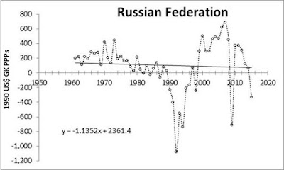
Fig. 4. The evolution of real GDP per capita in Russia from 1960 to 2015. Three graphs demonstrate annual increment as a function of GDP per capita, annual increment as a function of time, and the growth rate (1/year) as a function of GDP per capita.

Illustration of falling economic growth in developed countries

In this post, we continue analysis of GDP per capita in developed countries and BRIC. It was shown in two previous posts that the evolution of real GDP per capita is rather linear (not exponential) since 1960 and in many cases the growth rate is much lower than its linear potential (so called inertial growth). Extended analsyis was presented in our papers and we would like here just to stress the fact that many developed countiries demonstarte poor performance.


Fig. 1. Austria: annual increment of real GDP per capita (upper panel) and the corresponding rate of growth (lower). On average, the annual increment between 1960 and 2015 is $340.  The growth rate has clear negative trend from 1960 to 2015. The current growth rate fluctuates around 1.5% per year.


Fig. 2. Same as in Fig. 1 for Belgium. On average, the annual increment between 1960 and 2015 is $326


Fig. 2. Same as in Fig. 1 for Denmark. On average, the annual increment between 1960 and 2015 is $282.


Fig. 4. Same as in Fig. 1 for Ireland. On average, the annual increment between 1960 and 2015 is $357. There was a period of extremely high growth rate, which ended with a tremendous fall completely compensating the years of growth.


Fig. 5. Same as in Fig. 1 for Netherlands. On average, the annual increment between 1960 and 2015 is $304
 

Fig. 6. Same as in Fig. 1 for Norway. On average, the annual increment between 1960 and 2015 is $363


Fig. 7. Same as in Fig. 1 for Portugal. On average, the annual increment between 1960 and 2015 is $191


Fig. 8. Same as in Fig. 1 for Sweden. On average, the annual increment between 1960 and 2015 is $313


Fig. 9. Same as in Fig. 1 for Canada. On average, the annual increment between 1960 and 2015 is $323


Fig. 10. Same as in Fig. 1 for Australia. On average, the annual increment between 1960 and 2015 is $338


Fig. 11. Same as in Fig. 1 for New Zealand. On average, the annual increment between 1960 and 2015 is $203


Fig. 12. Same as in Fig. 1 for Japan. On average, the annual increment between 1960 and 2015 is $345

Трамп: лидер, системный человек или безумец?

 Каждый человек, обладающий высшей государственной властью, должен разделять в уме три разных способности решать вопросы, относящиеся к долж...