7/30/13

The most important message for Japan is that the overall level of prices associated with GDP is back to 1980 and the long term fall will continue into the next few decades.


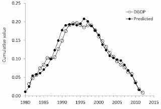
We have already mentioned that Japan is the best illustration of our concept linking inflation/unemployment to the change in labour force. In our previous post on the GDP deflator in Japan in 2011, we showed two cumulative curves for observed and predicted inflation since 1980. Here we add two more readings in both curves and conclude that our concept is quantitatively excellent. It gives an extremely accurate long term equilibrium relation between the GDP deflator, DGDP, and labour force. The underlying data have been borrowed from the OECD and Japan Statistics.


The most important message for Japan is that the overall level of prices associated with GDP is back to 1980 and the long term fall will continue into the next few decades.


By trial-and-error, we seek for the best-fit coefficients in the linear and lagged link between inflation and labour force. Because of the structural (measurement related) break in the 1980s, we have chosen the period after 1981 for linear regression, which is common for almost all economic studies related to Japan. By varying the lag and coefficients we have found the following relationship: 

p(t) = 1.9dLF(t-t0)/LF(t-t0) – 0.0084         (1) 

where the time lag t0=0 years; Figure 1 depicts this best-fit case. There is no time lag between the inflation series and the labour force change series in Japan. Free term in (1), defining the level of price inflation in the absence of labour force change, is close to zero but negative.  

A more precise and reliable representation of the observed and predicted inflation consists in the comparison of cumulative curves shown in the lower panel of Figure 1. We always stress that the cumulative values of price inflation and the change in labour force are the levels of price and labour force, respectively. Therefore, the summation of the annual reading gives the original estimates of price and workforce, which when are converted into rates.

Another advantage of the cumulative curves is that all short-term oscillations and uncorrelated noise in data as induced by inaccurate measurements and the inevitable bias in all definitions are effectively smoothed out. Any actual deviation between these two cumulative curves persists in time if measured values are not matched by the defining relationship. The predicted cumulative values are very sensitive to free term in (1). 

For Japan, the DGDP cumulative curves are characterized by very complex and unusual for economics shapes. There was a period of intensive inflation growth and a long deflationary period. The labour force change, defining the predicted inflation curve, follows all the turns in the measured cumulative inflation with the coefficient of determination R2=0.97 (R2=0.77 for the annual estimates). (Again, these are actually measured curves.) With shrinking population, and thus, labour force, the GDP deflator will be falling through 2050 and likely beyond.  


Figure 1. Measured GDP deflator and that predicted from the change rate of labour force in Japan. Upper panel:  Annual curves smoothed with MA(3). Lower panel: Cumulative curves between 1981 and 2012. The extremely accurate agreement between the cumulative curves illustrates the predictive power of our model.

Price deflation and increasing unemployment in Australia


Two years ago we wrote a paper on price inflation and unemployment in Australia. It allowed us making a projection into 2050:  

“As a final remark on the evolution inflation (DGDP) and unemployment in Australia we present two predictions as based on the labour force projection provided by the Productivity Commission (2005) and the coefficients in (7) and (8) estimated for the period after 1994: a1=3.299, a2=-0.0259; b1=-2.08, b2=0.0979. We assume that there will be no change in the definitions of all involved macroeconomic variables through 2050 and these coefficients will hold.  Unfortunately, the accuracy of labour force projection has a poor historical record, taking into account the projection between 1999 and 2016. Nevertheless, it may be useful for assessment of the long-term evolution.  Figure 15 displays both predictions, with the period before 2010 represented by actual labour force measurements since the projected ones were not accurate. 


Figure 15. Prediction of inflation and unemployment in Australia through 2050 as based on the labour force projection provided by the Productivity Commission.
 

            The level of price inflation after 2015 will likely fall below zero and will remain at -1.5% per year through 2050. This lengthy period of deflation will be accompanied by an elevated rate of unemployment approaching 9% around 2030. The evolution of both variables is not fortunate for the Australian economy and is chiefly associated with the population ageing. The latter suppresses demographic growth and reduces the rate of participation in labour force. Australia will likely need a larger international migration to overcome deflation and high unemployment. This is the means to overcome deflation the U.S. has been using for many years, but even with a large positive migration the Australian economy will be on the brink of deflation during the next four decades. Without migration, Australia will soon join Japan having the same demographic problems and price deflation since the late 1990s.”
 

Here, we update our projections with three new readings for 2010 through 2012. (We have borrowed all estimates from the Australia Bureau of Statistics.) The Australian economy is heading into a long deflation period with an elevated unemployment. In 2013, the rate of unemployment will rise to 6.5% or even 7.0%. The GDP deflator will likely be negative in 2013 following the 2012 trend.

The reason behind these processes is the same as in Japan – the fall in labor force. 


7/23/13

Fifth meeting of the Society for the Study of Economic Inequality (ECINEQ)


The Fifth Meeting of the Society for the Study of Economic Inequality (ECINEQ) will be held at the University of Bari (Italy) from July 22 to July 24, 2013.

The ECINEQ conference provides a forum for a rigorous analysis of inequality, welfare and redistribution issues, both at the theoretical and at the empirical level, as well as for a discussion of the policy implications of the research findings in this field.

ECINEQ aims at achieving high scholarly standards in both the selection of topics and their debates, whether they concern theoretical issues, empirical analyses or the implementation of policies.


Oleg I. Kitov, Ivan O. Kitov

We model the evolution of age-dependent personal money income distribution and income inequality as expressed by the Gini ratio. In our framework, inequality is an emergent property of a theoretical model we develop for the dynamics of the individual income growth with age. The model relates the evolution of personal income to the  individual’s capability to earn money, the size of her work instrument, her work experience and aggregate output growth. Our model is calibrated to the single-year population cohorts as well as the personal incomes data in 10-and 5- year age bins provided by the Census Bureau. We predict the dynamics of personal incomes for every single person in the working-age population in the USA between 1930 and 2011. The model output is then aggregated to construct annual age-dependent and overall personal income distributions (PID) and to compute the Gini ratios. The latter are predicted very accurately - up to 3 decimal places. We show that Gini for people with income is  approximately constant since 1930, which is confirmed empirically. Because of the increasing proportion of people with income between 1947 and 1999, the overall Gini reveals a tendency to decline slightly with time. The age-dependent Gini ratios have different trends. For example, the group between 55 and 64 years of age does not demonstrate any decline in the Gini ratio since 2000. In the youngest age group (from 15 to 24 years), however, the level of income inequality increases with time. We also find that in the latter cohort the average income decreases relatively to the age group with the highest mean income. Consequently, each year it is becoming progressively harder for young people to earn a proportional share of the overall income. 


7/21/13

Economics: eternal war on data

There is an eternal fight between economics and science. One of the most active fronts that economics holds against scientific knowledge and even common sense is data. Behind this front, in the realm of economics, the soldiers and commanders of economic knowledge commit suicide. Every time, when they use own data.
For a physicist, high data quality is a must. Economists revise their estimates at a high rate and deliberately make them incompatible over time. This is a suicide. Today, I ran across a dramatic update to the  Total Economy Database (TED) maintained by the Conference Board. I use this database extensively and always considered it as a reliable source of macroeconomic estimates. Before today.
So, what is the problem? When modeling labor productivity in developed countries I used the Geary-Khamis estimates expressed in 1990 US dollars. The data gave excellent results reported in this blog and a few papers (1, 2, 3).  For Turkey, I presented the following figure in 2010:

Figure 1. Comparison of the measured and predicted labor force productivity in Turkey based on the 2010 Total Economy Database.
 
Today, I tried to update the previous model using the 2013 version of TED and found the following pattern:

Figure 2. Comparison of measured and predicted labor force productivity in Turkey based on the 2013 Total Economy Database.
 What the …? – was my first thought. Has the model failed? The second thought was more creative – Does the economics profession continue its war on data? And this was a correct assumption.  Figure 3 shows that the 2013 TED contains a $2500 step (~15%!) in 2003 without any change in real GDP per capita in the very same year. I found that weird and checked some other countries. Figure 4 shows that in some cases the revision to the labor force productivity estimates was really dramatic.
 How dare economists claim that their theories should not be corroborated by data? They slaughter data every day with a big rusty knife of insane revisions.  
Figure 3. The difference between the 2013 and 2010 versions of the TED for labor force productivity (LP) and GDP per capita in Turkey.
Figure 4. The difference between the 2013 and 2010 versions of the TED for labor force productivity in selected developed countries.
 

7/20/13

Belgium is on a recovery track


The growth in labor productivity, P, is the driver of real economic growth. Since 1970, the growth rate, dP/P,  in Belgium was on a falling trend. We published two papers [1, 2] five years ago. Figure 3 from paper [2] is reproduced below.  Our prediction was that the rate of labor force growth would fall below zero. Here we revisit this prediction and provide a new projection 5 years ahead. We begin with the model, which is also described in both papers


Figure 3. Observed and predicted (from real GDP per capita) change rate of productivity in Belgium.  The observed curve is represented by MA(5) of original version. Model parameters are as follows: A2=$280, N(1959)=150000, B=-1900000, C=0.13, T=5 year. 

For the estimation of labor productivity one needs to know total output (GDP) and the level of employment, E (P=GDP/E), or total number of working hours, H (P=GDP/H). In the first approximation and for the purposes of our modeling, we neglect the difference between the employment and the level of labor force because the number of unemployed is only a small portion of the labor force. There is no principal difficulty, however, in the subtraction of the unemployment, which is completely defined by the level of labor force with possible complication in some countries induced by time lags. The number of working hours is an independent measure of the workforce. Employed people do not have the same amount of working hours. Therefore, the number of working hours may change without any change in the level of employment and vice versa. In this study, the estimates associated with H are not used.

Individual productivity varies in a wide range in developed economies. In order to obtain a hypothetical true value of average labor productivity one needs to sum up individual productivity of each and every employed person with corresponding working time. This definition allows a proper correction when one unit of labor is added or subtracted and distinguishes between two states with the same employment and hours worked but with different productivity. Hence, both standard definitions are slightly biased and represent approximations to the true productivity. Due to the absence of the true estimates of labor productivity and related uncertainty in the approximating definitions we do not put severe constraints on the precision in our modeling and seek only for a visual fit between observed and predicted estimates.

In this study, we use the estimates of productivity and real GDP per capita reported by the Conference Board (http://www.conference-board.org/economics/database.cfm). Recently, we developed a model [3] describing the evolution of labor force participation rate, LFP, in developed countries as a function of a single defining variable – real GDP per capita. Natural fluctuations in real economic growth unambiguously lead to relevant changes in labor force participation rate as expressed by the following relationship:
 
{B1dLFP(t)/LFP(t) + C1}exp{ a1[LFP(t) - LFP(t0)]/LFP(t0) =

= ∫ {dG(t-T))/G(t-T) – A1/G(t-T)}dt                                      (1)

where B1 and C1 are empirical (country-specific) calibration constants, a1 is empirical (also country-specific) exponent, t0 is the start year of modeling, T is the time lag, and dt=t2-t1, t1 and t2  are the start and the end time of the time period for the integration of g(t) = dG(t-T))/G(t-T) – A1/G(t-T) (one year in our model). Term A1/G(t-T), where A1 is an  empirical constant, represents the evolution of economic trend. The exponential term defines the change in sensitivity to G due to the deviation of the LFP from its initial value LFP(t0). Relationship (1) fully determines the behavior of LFP when G is an exogenous variable.

It follows from (1) that labor productivity can be represented as a function of LFP and G, P~G∙Np/Np∙LFP = G/LFP, where Np is the working age population. Hence, P is a function of G only. Therefore, the growth rate of labor productivity can be represented using several independent variables. Because the change in productivity is synchronized with that in G and labor force participation, first useful form mimics (1):


dP(t)/P(t) = {B2dLFP(t)/LFP(t) + C2}·exp{ a1[LFP(t) - LFP(t0)]/LFP(t0)}                      (1′)


where B2 and C2 are empirical calibration constants. Inherently, the participation rate is not the driving force of productivity, but (1′) demonstrates an important feature of the link between P and LFP – the same change in the participation rate may result in different changes in the productivity depending on the level of the LFP.

In order to obtain a simple functional dependence between P and G one can use two alternative forms of (1), as proposed in [1]:

 
{B3dLFP(t)/LFP(t) + C3} exp{a2[LFP(t) - LFP(t0)]/LFP(t0)} = Ns(t-T)                       

dP(t)/P(t)  = B4Ns(t-T)+ C4                                      (2)
 
where Ns is the number of S-year-olds, i.e. in the specific age population, B3,…, C4 are empirical constant different from B2, C2, and a2=a1. In this representation, we  use our finding that the evolution of real GDP per capita is driven by the change rate of the number of S-year-olds. Relationship (2) links dP/P and Ns directly.

The following relationship defines dP/P as a nonlinear function of G only: 

N(t2) = N(t1)·{ 2[dG(t2-T)/G(t2-T) - A2/G(t2-T)] + 1}    (3)


dP(t2)/P(t2) = N(t2-T)/B + C                                                (4)

where N(t) is the (formally defined) specific age population, as obtained using A2 instead of A1; B and C are empirical constants. Relationship (3) defines the evolution of some specific age population, which is different from actual one.           

Productivity prediction
Here we revisit the case of Belgium using 5 new readings (between 2007 and 2012). For the prediction, we use the previously obtained model [2] as described in Figure 3. Figure 3’ displays the measured and predicted rate of productivity growth. The curves are very close with R2=0.82 for the period between 1967 and 2012. For Belgium, the range of productivity change varies from 0.05 y-1 in the 1970s to -0.03 y-1 in 2008 and 2009. As predicted in our previous paper , P was rather negative after 2007. 
 
The current rate of productivity growth is close to 0.0 y-1.  The case of Belgium is characterized by a 5-year lag of the productivity reaction to the change in GDP. Therefore, we can predict the evolution of dP/P five years ahead. Figure 3’ shows that the rate of growth in labor productivity will be positive after 2013. This is a good news.

Figure 3’. Same as in Figure 3 with 5 new readings.

Трамп: лидер, системный человек или безумец?

 Каждый человек, обладающий высшей государственной властью, должен разделять в уме три разных способности решать вопросы, относящиеся к долж...