The Census Bureau measures incomes and reports figures. Experts discuss
and panic. The fame depends on the claim of disaster with inequality. It must
grow; otherwise economic commenter would lose public power. Who is interested in
the topic when no change is observed? Let’s
try to dig into raw data and find the reason for the observed tendency. Our first
point is that the Gini ratio ( the most famous measure of inequality) for personal incomes reported by the Census
Bureau from the very same data set (CPS ASEC conducted every March) does not change
much since 1994. Figure 1 reproduces the Gini ratio, which varies from 0.494 to
0.512 – a relatively narrow window.
Figure 1 . Personal incomes: Gini ratio evolution since 1994.
In Figure 2, we present a sad
history of Gini ratio for households. We
intentionally normalized the ratio to its maximum value (0.477 in 2011) in order
to show that this inequality measure has risen by 20% since 1967. This dramatic
increase is interpreted as harm for the US. Unlike personal incomes, the
household data are collected for entities which can evolve in size. (A person always
has a unit size.) The Census Bureau does not explicitly reports the distribution
household sizes and one has to make an own estimate, which is easy, however.
Figure 3 presents the total household population (different from civil population
or residential population) and the number of households reported by the CB. Figure 4 depicts the evolution of the average household
size since 1967. Actually, it was quite spectacular: from 3.2 in 1967 to 2.49
in 2011.
Does it matter for the income inequality? Sure - yes. The simplest ways is a household
split - instead of one big household one gets two smaller households. The Gini
ratio depends of the distribution of sizes. More low-income households result
in a higher Gini ratio. The fall in average size says that one gets more and more smaller
households over time and … the Gini
ratio increases accordingly. There is no linear link between the average size
and the Gini ratio but Figure 5 shows the product of the Gini curve for
households and the curve in Figure 4. Now we see a corrected Gini history. This corrected Gini is not fully compensated
for the household size changeover time but
tells a different story to the educated audience: the Gini for
households has not been changing since the 1970s. In 1993, there was a revision
to income definition and all time series were subject to dramatic chances. This
step is fully artificial.
Overall, the Gini ratio for households has not been changing as the CB
estimate say because these estimates do not take into account the change in
household size distribution.
This is a methodological (i.e. unprofessional) mistake.
The
same corerction logic must be applied to the family income distribution - also biased in its current version. Another sufferer is the mean (and aslo median)
income. Since the size of household has
been decreasing the number of households has been growing faster than the total
household population. The mean household income must also be
corrected for the changing size. Figure 6 shows the actual evolution of the mean
income (median income is harder to recover). The history is much brighter than many experts
would like to comment on.
Figure 2. The evolution of normalized Gini ratio for households.
Figure 3. The evolution of total household population and the number of
households (both in thousands)
Figure 4. The evolution of an average household size.
Figure 5. Corrected Gini ratio.
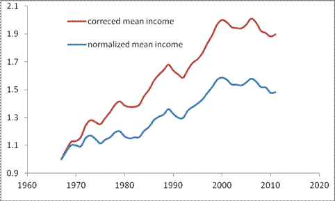
Figure 6. The growth of normalized (household ) mean income and that
corrected for the fall in the household average size.


Not sure I am getting what you are saying here. Try going to this url:
ReplyDeletehttp://www.peterrosenmai.com/lorenz-curve-graphing-tool-and-gini-coefficient-calculator
Let's say we have 5 households with incomes of $10,$20,$30,$40 and $50. We find the Gini Ratio to be .2667.
Now these households split in half so we have 2 with $5, 2 with $10, and so on to 2 with $25. We find the Gini Ratio of these smaller households to be .2667 as well.
The Gini Ratio is, well, a ratio. Whether or not household size decreases does not seem to matter...
Please explain your point again.
This is a trick what you have done. Obviously, when you scale all readings by a factor of two )three ...) nothing happens to the Gini ratio. If you split just one household (as happens in reality - just few households do split), say, $20,000 into two $10,000 the Gini increases - you have more poor households and the Lorenz curve goes further from the center.
ReplyDeleteIf it had been the rich households instead of the poor households that split then the Gini ratio would have gone down. For the Gini ratio to increase the household split has to impact the poor more than the rich. I think you need data on household size by income in order to correctly back out the impact.
ReplyDelete1. the size of broken households does not matter since this process creates units with lower income without change of total income. This mean a higher portion (number) of households with lower incomes. See the definition of the Lorenz curve and Gini ratio.
ReplyDelete2. if you re-read the post it says that the CB must do what you propose to me. They have to prove that the change in household size distribution (which is really observed) does not affect the Gini they publish. I consider these estimates as biased since they are taken from different configurations of sizes. It looks like the mile lenght is reduced every year but the speed limit is not changed.
3. I have more posts (after this one) in this blog which address the problem of the household universe composition.
On #1 you need to run the numbers. It should be obvious if you only split the high income households the Gini ratio will go down not up. The only way to get the Gini ratio to change with household size is to split the households unevenly. That is a significant problem with your line of reasoning here.
ReplyDeleteThis is not my duty to prove that the households split unevenly. This is the task of the CB to prove that they break evenly and their Gini estimates are snot biased due to decreasing average household size. The latter implies the change in composition and income distribution over time.
ReplyDeleteI see your point. However the CB is just providing data not analysis on that data. It is up to the economists that are researching inequality to do the analysis. So it is good that you point this out because certainly it has an impact. It could be the that the social choices of the poor (possibly more divorce, possibly more single parent households) is as an important a factor on increasing equality as wage differences.
ReplyDeleteYou have to take into account that the Gini ratio for personal incomes is practically constant over time. This is the same people as in the households.
ReplyDeleteWhen corrected for the decreasing average household size (Figure 5 in the post) the household Gini ratio is also constant over time.
This is a strong argument in favor of constant household Gini whatever are the details of size redistribution.
On the other hand, the biased Gini is used by many economists as a well established fact. It does more harm than good for economics as a science.
Where are you getting the Gini ratio data for personal incomes? The best thing I found with a quick perusal of CB was here:
ReplyDeletehttp://www.census.gov/hhes/www/income/data/historical/people/
That page has a bunch of data but the one I looked at was Table P-7:
http://www.census.gov/hhes/www/income/data/historical/people/2010/P07AR_2010.xls
This had median and mean income for both sexes all races. The data only goes back to 1974 but since that time there has been a considerable widening of the median and mean. I see what you are saying that since 1994 it really hasn't increased (of course 1994 is a local maximum). So I might agree that the increase in inequality since 1994 is more driven by social grouping rather than wages. But it appears that if you look further back there has been a significant increase in wage inequality as well.
"Income main" has "Detailed Tables" folder (you have tried "Historical Tables"), then "year" - "Person" - "PINC-01" - "Total Work Experience, Both Sexes, All Races"; and you get an excel file. Gini ratios are in the end of the table. For example, for 2011 the link is
ReplyDeletehttp://www.census.gov/hhes/www/cpstables/032012/perinc/pinc01_000.htm
This works to 1994, and then only pdf files are available. I digitized them many years ago and published several papers, which are available via RePEc and were published by the Society for the Study of Economic Inequality, where I am a founding member.
One paper http://ideas.repec.org/p/pra/mprapa/10107.html
Modeling the evolution of age-dependent Gini coefficient for personal incomes in the U.S. between 1967 and 2005
may answer your questions. A full version of the study with mean and median incomes modeled is also available:
Mechanical model of personal income distribution
http://ideas.repec.org/p/inq/inqwps/ecineq2009-110.html
Thanks for the info. I need to investigate a little more. Definitely an interesting idea and seems like it is missed by the mainstream talking points on inequality.
ReplyDeleteAn interesting post, and a wonderful exchange.
ReplyDeleteAn observation for Coding Monkey, who wrote: "It could be the that the social choices of the poor (possibly more divorce, possibly more single parent households) is as an important a factor on increasing equality as wage differences."
As an outsider to the debate, it strikes me that "the social choices of the poor" are probably closely related to "wage differences".
I can not agree with the assumption that poor households have a higher propensity to split. Obviously, poor families save lots of money living together. I would suggest that rich families have more reasons to break - their pieces have higher economic and financial viability. And the probability to break should increase with the average income.
ReplyDeleteUnfortunately, the Census Bureau does not provide these important measurements for a longer time period and we can not prove any of the statements quantitatively.
Actually, I am wrong and data exist since 1994. The are income distributions of household sizes, but to $100,000 only. The CB inreased the limit in 2010.
ReplyDeleteAnyway, this is a good idea to write a paper - "The evolution of the household mean size and Gini ratio in the USA since 1994." I'll submit it to the ECINEQ. Thank you for the idea and discussion. Will acknowledge your input, Coding Monkey and Arthurian.
I have added a post which might be a prototype of a paper. It shows the evolution of the household size distribution since 1994.
ReplyDeleteHowdy! I know this is kinda off topic however , I'd figured I'd
ReplyDeleteask. Would you be interested in trading links or maybe guest authoring a blog article or vice-versa?
My site addresses a lot of the same subjects as yours and I feel we could greatly benefit from each other.
If you happen to be interested feel free to shoot me an e-mail.
I look forward to hearing from you! Wonderful blog by the way!
My website; chapter 13 bankruptcy florida